Preview image. Unlock full-res
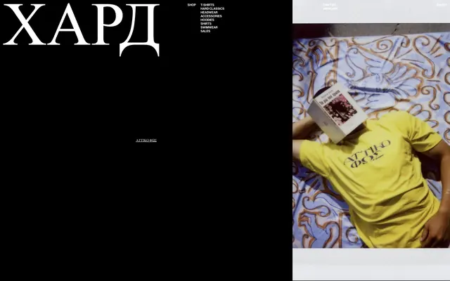
monochrome cinematic canvas — stark black and white drama
Color palette
Page backgrounds, element backgrounds, primary canvas for content, creates depth for crisp white typography
Hairline borders, dividers, input outlines, and card edges on light surfaces. Do not promote it to the primary CTA color
Typography
- Weights
- normal
- Fallback
- serif
Decorative brand headings and primary hero text, conveying a sense of classic elegance and bold presence. The size and weight make it a dominant visual element.
- Weights
- 400, 500
- Sizes
- 10px, 101px
- Line height
- 1, 1.2, 1.4
- Letter spacing
- -0.5
- Fallback
- Helvetica Neue, Arial
All functional text including navigation, body text, links, and product details. Its compact, slightly tracked-in nature reinforces the efficient, direct aesthetic.
Spacing & shape
Components
Text link using Haas Grot Disp 65, size 10px, weight 400, color Polar White (#ffffff). Hover state involves an underline. Tightly tracked at -0.5px.
Text link on Midnight Noir background. Text color Polar White (#ffffff), Haas Grot Disp 65, size 10px, weight 400. Features a bottom border of 1px Polar White (#ffffff); often used for secondary interactive elements or footers.
Guidelines
- Prioritize Midnight Noir (#000000) for all significant background areas to maintain the stark, high-contrast dark theme.
- Use Polar White (#ffffff) for all interactive text, primary content, and headlines to ensure maximum readability against the dark background.
- Apply Haas Grot Disp 65 (or Helvetica Neue, Arial as substitute) at 10px with -0.5px letter-spacing for all functional and navigation text.
- Reserve Playfair Display (or serif as substitute) at 101px for large, impactful brand headings and hero statements.
- Maintain a clear visual hierarchy by limiting color primarily to the achromatic scale, allowing imagery to be the only source of vividness.
- Utilize 1px Polar White (#ffffff) solid borders for interactive elements requiring emphasis, such as links or outlined buttons.
- Avoid introducing additional chromatic colors for UI elements; color should be reserved for product imagery.
- Do not use generic system fonts for branding or display text; stick to Playfair Display for visual impact.
- Do not use subtle variations of gray for backgrounds or text; the system relies on extreme black-and-white contrast.
- Avoid complex gradients or shadows across UI components; surfaces should remain flat and direct.
- Do not break the compact letter spacing of -0.5px for Haas Grot Disp 65 text, as this is integral to its visual character.
- Do not use excessive radii; components should retain a crisp, sharp edge without rounded corners.
About this system
ShowHide
HARDCLO uses a stark, high-contrast dark mode aesthetic, emphasizing content through pure black backgrounds and clean white typography. The design language is minimal and direct, leveraging large, expressive serif typography for brand identity and a single sans-serif family for all functional text. The intentional lack of color creates a raw, utilitarian feel, where the product imagery is the only source of visual vibrancy. Layouts are spacious and structured, preventing the high contrast from becoming overwhelming.
The page primarily uses a split, full-bleed layout. The left side is a pure black canvas for UI and typography, while the right side is dominated by large, immersive, full-height product or lifestyle photography. Content often stacks vertically within these sections. Navigation is minimal, presented as a compact list. The layout feels spacious, with significant vertical and horizontal gaps, allowing elements to breathe within the high-contrast environment. The overall page avoids a defined max-width, embracing the full viewport.
The site uses photography extensively, often featuring full-bleed, striking product or lifestyle shots. The imagery is central to the visual identity, providing the main source of color and visual interest against the monochrome UI. Photos appear to be minimally treated, maintaining a raw, authentic feel, and are frequently used to fill significant portions of the screen, creating an immersive experience.
Reminiscent of Yeezy Supply, Acne Studios, Balenciaga (certain collections), A-COLD-WALL*.
# HARDCLO — Style Reference
> monochrome cinematic canvas — stark black and white drama

**Theme:** dark

**Site:** https://hardclo.com

HARDCLO uses a stark, high-contrast dark mode aesthetic, emphasizing content through pure black backgrounds and clean white typography. The design language is minimal and direct, leveraging large, expressive serif typography for brand identity and a single sans-serif family for all functional text. The intentional lack of color creates a raw, utilitarian feel, where the product imagery is the only source of visual vibrancy. Layouts are spacious and structured, preventing the high contrast from becoming overwhelming.

## Tokens — Colors

| Name | Value | Token | Role |
|------|------|------|------|
| Midnight Noir | `#000000` | `--color-midnight-noir` | Page backgrounds, element backgrounds, primary canvas for content, creates depth for crisp white typography |
| Polar White | `#ffffff` | `--color-polar-white` | Hairline borders, dividers, input outlines, and card edges on light surfaces. Do not promote it to the primary CTA color |

## Tokens — Typography

### Playfair Display
- **Substitute:** serif
- **Weights:** normal
- **Role:** Decorative brand headings and primary hero text, conveying a sense of classic elegance and bold presence. The size and weight make it a dominant visual element.

### Haas Grot Disp 65
- **Substitute:** Helvetica Neue, Arial
- **Weights:** 400, 500
- **Sizes:** 10px, 101px
- **Line height:** 1, 1.2, 1.4
- **Letter spacing:** -0.5
- **Role:** All functional text including navigation, body text, links, and product details. Its compact, slightly tracked-in nature reinforces the efficient, direct aesthetic.

## Tokens — Type Scale

| Role | Size | Line height | Letter spacing |
|------|------|------|------|
| caption | 10px | 1.2 | -0.5px |
| display | 101px | 1 | — |

## Tokens — Spacing

- **Section gap:** 40px
- **Card padding:** 12px
- **Element gap:** 12px

## Tokens — Radius

- **none:** 0px

## Layout

The page primarily uses a split, full-bleed layout. The left side is a pure black canvas for UI and typography, while the right side is dominated by large, immersive, full-height product or lifestyle photography. Content often stacks vertically within these sections. Navigation is minimal, presented as a compact list. The layout feels spacious, with significant vertical and horizontal gaps, allowing elements to breathe within the high-contrast environment. The overall page avoids a defined max-width, embracing the full viewport.

## Imagery

The site uses photography extensively, often featuring full-bleed, striking product or lifestyle shots. The imagery is central to the visual identity, providing the main source of color and visual interest against the monochrome UI. Photos appear to be minimally treated, maintaining a raw, authentic feel, and are frequently used to fill significant portions of the screen, creating an immersive experience.

## Components

### Navigation Link
*Primary site navigation, sub-navigation items.*

Text link using Haas Grot Disp 65, size 10px, weight 400, color Polar White (#ffffff). Hover state involves an underline. Tightly tracked at -0.5px.

### Underlined Text Link
*Interactive text anywhere on the canvas.*

Text link on Midnight Noir background. Text color Polar White (#ffffff), Haas Grot Disp 65, size 10px, weight 400. Features a bottom border of 1px Polar White (#ffffff); often used for secondary interactive elements or footers.

## Guidelines

### Do

- Prioritize Midnight Noir (#000000) for all significant background areas to maintain the stark, high-contrast dark theme.
- Use Polar White (#ffffff) for all interactive text, primary content, and headlines to ensure maximum readability against the dark background.
- Apply Haas Grot Disp 65 (or Helvetica Neue, Arial as substitute) at 10px with -0.5px letter-spacing for all functional and navigation text.
- Reserve Playfair Display (or serif as substitute) at 101px for large, impactful brand headings and hero statements.
- Maintain a clear visual hierarchy by limiting color primarily to the achromatic scale, allowing imagery to be the only source of vividness.
- Utilize 1px Polar White (#ffffff) solid borders for interactive elements requiring emphasis, such as links or outlined buttons.

### Don't

- Avoid introducing additional chromatic colors for UI elements; color should be reserved for product imagery.
- Do not use generic system fonts for branding or display text; stick to Playfair Display for visual impact.
- Do not use subtle variations of gray for backgrounds or text; the system relies on extreme black-and-white contrast.
- Avoid complex gradients or shadows across UI components; surfaces should remain flat and direct.
- Do not break the compact letter spacing of -0.5px for Haas Grot Disp 65 text, as this is integral to its visual character.
- Do not use excessive radii; components should retain a crisp, sharp edge without rounded corners.

## Agent Prompt Guide

Quick Color Reference:
text: #ffffff
background: #000000
border: #ffffff
accent: none observed
primary action: no distinct CTA color

Example Component Prompts:
1. Create a large brand heading: Playfair Display, 101px, normal weight, color Polar White (#ffffff), lineHeight 1.0. Place it on a Midnight Noir (#000000) background.
2. Design a navigation link: Haas Grot Disp 65, 10px, weight 400, color Polar White (#ffffff), letter-spacing -0.5px, lineHeight 1.2. On hover, add a 1px solid underline in Polar White (#ffffff).
3. Create a block of secondary metadata text: Haas Grot Disp 65, 10px, weight 400, color Polar White (#ffffff), letter-spacing -0.5px, lineHeight 1.2. Ensure it has a vertical spacing of 12px from adjacent elements.
More like this








Keep what you find
A free account saves references to boards and can send you a weekly email of picks based on what you save.
To see every result, go Pro.