Preview image. Unlock full-res
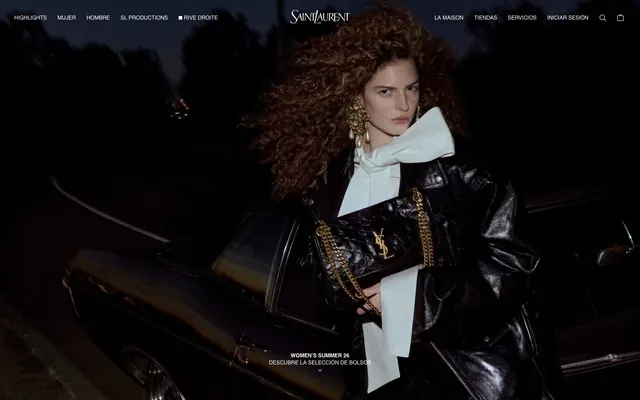
Black Tie Photography — a high-contrast canvas for arresting visuals.
Color palette
Internal UI elements like sliders (swiper-theme-color), but not directly used for prominent branding or CTAs.
Primary text, navigation links, button borders, page backgrounds for specific sections.
Page backgrounds, card surfaces, primary button text, prominent headings.
Typography
- Sizes
- 12px, 14px
- Line height
- 1
- Fallback
- Arial, Helvetica, sans-serif
Primary text for navigation, body text, and button labels. Its understated presence ensures brand imagery maintains dominance.
Spacing & shape
Components
Text only, `Midnight Ink` (#000000) or `Polar White` (#ffffff) depending on background. No background, no border, no padding. Font: SaintLaurent sans-serif, 12px, weight 400.
Transparent background (`rgba(0, 0, 0, 0)`) with `Midnight Ink` (#000000) text and a `Midnight Ink` (#000000) border. No padding, no border radius. Font: SaintLaurent sans-serif, 12px, weight 400.
Transparent background (`rgba(0, 0, 0, 0)`) with `Polar White` (#ffffff) text and a `Polar White` (#ffffff) border. No padding, no border radius. Font: SaintLaurent sans-serif, 12px, weight 400.
Solid `Midnight Ink` (#000000) background, `Polar White` (#ffffff) text, and `Polar White` (#ffffff) border. Padding: 10px top/bottom, 20px left/right. No border radius. Font: SaintLaurent sans-serif, 12px, weight 400.
Completely borderless and shadowless, with `Polar White` (#ffffff) background. Content is usually an image followed by text. No padding, 0px border radius.
Typically `Midnight Ink` (#000000) or `Polar White` (#ffffff) depending on context. Font: SaintLaurent sans-serif, likely larger size like 18-24px, weight 400 with potential letter spacing for emphasis.
Guidelines
- Maintain a monochromatic palette of `Midnight Ink` (#000000) and `Polar White` (#ffffff) for all core UI elements.
- Use 0px for all border radius values across buttons, cards, and interactive elements to preserve angularity.
- Prioritize full-bleed, dramatic photography as the primary visual interest, allowing UI elements to recede.
- Employ the SaintLaurent sans-serif font family at weight 400 for all text, varying size for hierarchy.
- Ensure generous spacing: `sectionGap` of 68px and standard `elementGap` of 4px between smaller components.
- Utilize transparent backgrounds for border-only buttons unless a primary, filled action is required (`Midnight Ink` background, `Polar White` text).
- Avoid decorative shadows or complex gradients; rely on photography for depth perception.
- Do not introduce rounded corners on any UI elements; maintain sharp, crisp edges.
- Refrain from using any color other than `Accent Blue` (#007aff) for internal, non-brand specific UI signals.
- Do not use highly saturated colors for text or backgrounds; stick to the achromatic theme.
- Avoid dense UI layouts; allow ample white/black space around elements to convey luxury.
- Do not use multiple font families or weights outside of SaintLaurent sans-serif 400.
About this system
ShowHide
This design system projects a mood of stark, high-fashion minimalism through a monochromatic palette. Visual energy stems from deep photographic imagery rather than UI ornamentation. The rigid, unforgiving aesthetic is defined by zero border radius and a strict black-and-white color scheme, creating a canvas where product photography and brand typography command full attention. Subtle spacing maintains a sense of luxury without clutter, allowing each element to breathe within a visually demanding context.
The page primarily uses a full-bleed layout, where hero imagery extends to the edges of the viewport, particularly on the initial screen. Content sections often alternate between these dark, immersive visual blocks and more functional, information-dense areas. The overall structure favors a centered stacking of content, especially for headings and short descriptions overlaying images, with a clear vertical rhythm. Navigation is a minimalist top bar, split into left and right groups of text links, suggesting a clear brand hierarchy. Content arrangement within sections appears to be flexible, supporting large hero images, product grids (not explicitly visible but implied by e-commerce nature), and simple text blocks. Density is spacious, emphasizing individual elements and imagery rather than compact information.
The visual language is dominated by high-impact, editorial photography, often dark and moody, shot at night or in dramatically lit environments. Photography is typically full-bleed, immersive, and features models or products in a stylized, high-fashion context. Images serve a decorative and brand-building role, conveying atmosphere and aspiration rather than purely explanatory content. Product shots are embedded within these rich compositions, often featuring metallic or reflective elements that catch subtle light. There are no illustrations or abstract graphics; the focus is exclusively on realistic yet highly curated photography. Icons are minimal, represented by simple monochrome outlines (e.g., search, cart).
Reminiscent of Louis Vuitton, Gucci, Dior, Balenciaga.
# Ysl — Style Reference
> Black Tie Photography — a high-contrast canvas for arresting visuals.

**Theme:** dark

**Site:** https://ysl.com

This design system projects a mood of stark, high-fashion minimalism through a monochromatic palette. Visual energy stems from deep photographic imagery rather than UI ornamentation. The rigid, unforgiving aesthetic is defined by zero border radius and a strict black-and-white color scheme, creating a canvas where product photography and brand typography command full attention. Subtle spacing maintains a sense of luxury without clutter, allowing each element to breathe within a visually demanding context.

## Tokens — Colors

| Name | Value | Token | Role |
|------|------|------|------|
| Accent Blue | `#007aff` | `--color-accent-blue` | Internal UI elements like sliders (swiper-theme-color), but not directly used for prominent branding or CTAs. |
| Midnight Ink | `#000000` | `--color-midnight-ink` | Primary text, navigation links, button borders, page backgrounds for specific sections. |
| Polar White | `#ffffff` | `--color-polar-white` | Page backgrounds, card surfaces, primary button text, prominent headings. |

## Tokens — Typography

### SaintLaurent sans-serif
- **Substitute:** Arial, Helvetica, sans-serif
- **Sizes:** 12px, 14px
- **Line height:** 1
- **Role:** Primary text for navigation, body text, and button labels. Its understated presence ensures brand imagery maintains dominance.

## Tokens — Spacing

- **Section gap:** 68px
- **Card padding:** 0px
- **Element gap:** 4px

## Tokens — Radius

- **all:** 0px

## Layout

The page primarily uses a full-bleed layout, where hero imagery extends to the edges of the viewport, particularly on the initial screen. Content sections often alternate between these dark, immersive visual blocks and more functional, information-dense areas. The overall structure favors a centered stacking of content, especially for headings and short descriptions overlaying images, with a clear vertical rhythm. Navigation is a minimalist top bar, split into left and right groups of text links, suggesting a clear brand hierarchy. Content arrangement within sections appears to be flexible, supporting large hero images, product grids (not explicitly visible but implied by e-commerce nature), and simple text blocks. Density is spacious, emphasizing individual elements and imagery rather than compact information.

## Imagery

The visual language is dominated by high-impact, editorial photography, often dark and moody, shot at night or in dramatically lit environments. Photography is typically full-bleed, immersive, and features models or products in a stylized, high-fashion context. Images serve a decorative and brand-building role, conveying atmosphere and aspiration rather than purely explanatory content. Product shots are embedded within these rich compositions, often featuring metallic or reflective elements that catch subtle light. There are no illustrations or abstract graphics; the focus is exclusively on realistic yet highly curated photography. Icons are minimal, represented by simple monochrome outlines (e.g., search, cart).

## Components

### Product Card

### Button Group

### Campaign Caption Banner

### Primary Navigation Link
*Header and footer navigation elements.*

Text only, `Midnight Ink` (#000000) or `Polar White` (#ffffff) depending on background. No background, no border, no padding. Font: SaintLaurent sans-serif, 12px, weight 400.

### Standard Button - Default
*Interactive elements, calls to action.*

Transparent background (`rgba(0, 0, 0, 0)`) with `Midnight Ink` (#000000) text and a `Midnight Ink` (#000000) border. No padding, no border radius. Font: SaintLaurent sans-serif, 12px, weight 400.

### Standard Button - Inverted
*Primary calls to action on dark backgrounds.*

Transparent background (`rgba(0, 0, 0, 0)`) with `Polar White` (#ffffff) text and a `Polar White` (#ffffff) border. No padding, no border radius. Font: SaintLaurent sans-serif, 12px, weight 400.

### Filled Primary Button
*Key action buttons, such as 'Add to Cart' or 'Explore'.*

Solid `Midnight Ink` (#000000) background, `Polar White` (#ffffff) text, and `Polar White` (#ffffff) border. Padding: 10px top/bottom, 20px left/right. No border radius. Font: SaintLaurent sans-serif, 12px, weight 400.

### Product Card
*Displaying product listings.*

Completely borderless and shadowless, with `Polar White` (#ffffff) background. Content is usually an image followed by text. No padding, 0px border radius.

### Section Heading
*Primary titles for content blocks.*

Typically `Midnight Ink` (#000000) or `Polar White` (#ffffff) depending on context. Font: SaintLaurent sans-serif, likely larger size like 18-24px, weight 400 with potential letter spacing for emphasis.

## Guidelines

### Do

- Maintain a monochromatic palette of `Midnight Ink` (#000000) and `Polar White` (#ffffff) for all core UI elements.
- Use 0px for all border radius values across buttons, cards, and interactive elements to preserve angularity.
- Prioritize full-bleed, dramatic photography as the primary visual interest, allowing UI elements to recede.
- Employ the SaintLaurent sans-serif font family at weight 400 for all text, varying size for hierarchy.
- Ensure generous spacing: `sectionGap` of 68px and standard `elementGap` of 4px between smaller components.
- Utilize transparent backgrounds for border-only buttons unless a primary, filled action is required (`Midnight Ink` background, `Polar White` text).

### Don't

- Avoid decorative shadows or complex gradients; rely on photography for depth perception.
- Do not introduce rounded corners on any UI elements; maintain sharp, crisp edges.
- Refrain from using any color other than `Accent Blue` (#007aff) for internal, non-brand specific UI signals.
- Do not use highly saturated colors for text or backgrounds; stick to the achromatic theme.
- Avoid dense UI layouts; allow ample white/black space around elements to convey luxury.
- Do not use multiple font families or weights outside of SaintLaurent sans-serif 400.

## Agent Prompt Guide

### Quick Color Reference
- Text: #000000 (Midnight Ink)
- Background: #ffffff (Polar White)
- CTA Background: #000000 (Midnight Ink)
- CTA Text: #ffffff (Polar White)
- Border: #000000 (Midnight Ink)

### 3-5 Example Component Prompts
1. Create a header navigation: transparent background, `Midnight Ink` (#000000) text (SaintLaurent sans-serif, 12px, weight 400), 0px padding around each link, no borders. Links are 'HIGHLIGHTS', 'MUJER', 'HOMBRE'.
2. Create a primary call-to-action button: solid `Midnight Ink` (#000000) background, `Polar White` (#ffffff) text (SaintLaurent sans-serif, 12px, weight 400), 10px vertical and 20px horizontal padding, 0px border radius, with a `Polar White` (#ffffff) 1px border. Text should be 'EXPLORAR'.
3. Create a secondary outline button: transparent background, `Midnight Ink` (#000000) text (SaintLaurent sans-serif, 12px, weight 400), 0px padding, 0px border radius, with a `Midnight Ink` (#000000) 1px border. Text should be 'INICIAR SESIÓN'.
4. Create a hero text overlay for a dark full-bleed image: `Polar White` (#ffffff) text for a heading 'WOMEN’S SUMMER 26' (SaintLaurent sans-serif, 18px, weight 400), and a subtext 'DESCUBRE LA SELECCIÓN DE BOLSOs' (SaintLaurent sans-serif, 14px, weight 400), vertically and horizontally centered over the image.
5. Create a product card: `Polar White` (#ffffff) background, no border, no shadow, no padding, 0px border radius. Content will be a product image followed by a product name in `Midnight Ink` (#000000) SaintLaurent sans-serif, 14px, weight 400.
More like this








Keep what you find
A free account saves references to boards and can send you a weekly email of picks based on what you save.
To see every result, go Pro.