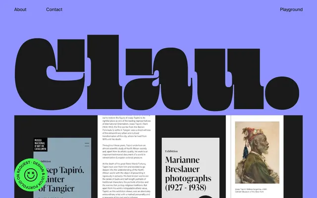
Preview image. Unlock full-res
Playful Serif on Lavender
Color palette
Primary page background, expansive section fills — a dominant, playful brand color
Interactive elements, action backgrounds (e.g., mailto links), badges — a high-contrast accent color that signals engagement
Primary text, navigation links, borders, dark backgrounds for emphasis
Elevated card backgrounds, text contrast against dark surfaces
Typography
- Weights
- 400
- Sizes
- 288px, 504px
- Line height
- 1, 1.05
- Letter spacing
- normal
- Fallback
- Playfair Display
Hero display text, large decorative headlines – commands attention with its massive scale and distinctive, almost calligraphic form.
- Weights
- 400
- Sizes
- 20px, 30px, 144px
- Line height
- 1.15, 1.3, 1.33, 1.5
- Letter spacing
- normal
- Fallback
- Inter
Primary headings, subheadings, and larger body text – a crisp, modern sans-serif that balances the display font's expressiveness.
- Weights
- 400
- Sizes
- 16px
- Line height
- 1.15
- Letter spacing
- normal
- Fallback
- Times New Roman
Body text, paragraphs, smaller descriptive content – provides a classic, readable counterpoint to the more stylized display fonts.
Spacing & shape
Components
Filled with Digital Green (#47f654), black text Midnight Ink (#1a1a1a), and a radius of 75px. Padding is implicitly generous, creating a soft, inviting shape.
Uses Suisse Intl clauworks, weight 400, size 16px. Text color is Midnight Ink (#1a1a1a). Features a subtle underline on hover.
White background (Paper White #ffffff), with Midnight Ink (#1a1a1a) as border color and text. Padding is spacious, typically around 58px on the sides. No explicit border radius is applied, creating sharp corners.
Guidelines
- Prioritize Canvas Lavender (#8e93ff) as the dominant background color for most sections.
- Use Beastly clauworks for all hero and large decorative text, leveraging its large sizes (288px, 504px) and tight line-height.
- Apply a 75px border-radius to all circular or pill-shaped interactive elements like the Digital Green (#47f654) accent button.
- Maintain generous spacing, with section gaps typically at 130px and internal element gaps around 30px, to create an airy feel.
- Use Midnight Ink (#1a1a1a) for all primary body text and UI elements against light backgrounds.
- Introduce Digital Green (#47f654) only for explicit interactive actions or strong accents, never for large content areas.
- Do not introduce complex shadow systems; elevation is indicated primarily by color contrast and surface changes.
- Avoid using multiple chromatic colors; stick to Canvas Lavender and Digital Green as the only brand-identifying hues.
- Do not center-align large blocks of body text; maintain a left-aligned reading rhythm for longer content.
- Do not use overly dense layouts or small text sizes that compromise the spacious visual language.
- Avoid strictly symmetrical layouts; embrace slight asymmetries in content arrangement to add visual interest.
- Do not use subtle variations of neutrals; the contrast between Midnight Ink (#1a1a1a) and Paper White (#ffffff) is sharp and intentional.
About this system
ShowHide
Clau.as.kee employs a distinct, playful visual style foregrounding bold, oversized typography. A vibrant lavender canvas (#8e93ff) provides a backdrop for crisp black text and an occasional pop of vivid green as a functional accent. The layout is spacious, allowing typography to breathe and creating a sense of openness. Components are minimal, relying on stark color contrast and large round radii for visual identity rather than complex shadows or borders.
The layout is primarily full-bleed, with the Canvas Lavender (#8e93ff) background extending edge-to-edge, especially in hero and key sections. Content, when present, is loosely contained and allows very large typography to occasionally break visual bounds. Section rhythm is marked by consistent vertical spacing (130px) and distinct color blocks. Content arrangement often uses a large centered display headline over a colored background, followed by more conventional multi-column arrangements or card grids when showcasing project content. There is no strict fixed grid; elements are positioned with a confident, almost playful looseness.
The site primarily features a 'no imagery' UI, focusing instead on stark typography and color. Where visuals do appear, they are contained within rigid card structures or serve as background elements for large text. The only illustrative elements are playful, outlined emoji-style icons (like the green 'portfolio on request' badge). Its purpose is almost purely decorative and atmospheric, rather than content-focused, reflecting a design-centric brand identity.
Reminiscent of The Browser Company (Arc), Figma, Muzli, Superside.
# clau.as.kee — Style Reference
> Playful Serif on Lavender

**Theme:** light

**Site:** https://clauaskee.com

Clau.as.kee employs a distinct, playful visual style foregrounding bold, oversized typography. A vibrant lavender canvas (#8e93ff) provides a backdrop for crisp black text and an occasional pop of vivid green as a functional accent. The layout is spacious, allowing typography to breathe and creating a sense of openness. Components are minimal, relying on stark color contrast and large round radii for visual identity rather than complex shadows or borders.

## Tokens — Colors

| Name | Value | Token | Role |
|------|------|------|------|
| Canvas Lavender | `#8e93ff` | `--color-canvas-lavender` | Primary page background, expansive section fills — a dominant, playful brand color |
| Digital Green | `#47f654` | `--color-digital-green` | Interactive elements, action backgrounds (e.g., mailto links), badges — a high-contrast accent color that signals engagement |
| Midnight Ink | `#1a1a1a` | `--color-midnight-ink` | Primary text, navigation links, borders, dark backgrounds for emphasis |
| Paper White | `#ffffff` | `--color-paper-white` | Elevated card backgrounds, text contrast against dark surfaces |

## Tokens — Typography

### Beastly clauworks
- **Substitute:** Playfair Display
- **Weights:** 400
- **Sizes:** 288px, 504px
- **Line height:** 1, 1.05
- **Letter spacing:** normal
- **Role:** Hero display text, large decorative headlines – commands attention with its massive scale and distinctive, almost calligraphic form.

### Suisse Intl clauworks
- **Substitute:** Inter
- **Weights:** 400
- **Sizes:** 20px, 30px, 144px
- **Line height:** 1.15, 1.3, 1.33, 1.5
- **Letter spacing:** normal
- **Role:** Primary headings, subheadings, and larger body text – a crisp, modern sans-serif that balances the display font's expressiveness.

### Times
- **Substitute:** Times New Roman
- **Weights:** 400
- **Sizes:** 16px
- **Line height:** 1.15
- **Letter spacing:** normal
- **Role:** Body text, paragraphs, smaller descriptive content – provides a classic, readable counterpoint to the more stylized display fonts.

## Tokens — Type Scale

| Role | Size | Line height | Letter spacing |
|------|------|------|------|
| body | 16px | 1.15 | — |
| body-lg | 20px | 1.15 | — |
| heading-sm | 30px | 1.33 | — |
| heading | 144px | 1.3 | — |
| display-lg | 288px | 1.05 | — |
| display-xl | 504px | 1 | — |

## Tokens — Spacing

- **Section gap:** 130px
- **Card padding:** 58px
- **Element gap:** 30px

## Tokens — Radius

- **Buttons:** 75px

## Layout

The layout is primarily full-bleed, with the Canvas Lavender (#8e93ff) background extending edge-to-edge, especially in hero and key sections. Content, when present, is loosely contained and allows very large typography to occasionally break visual bounds. Section rhythm is marked by consistent vertical spacing (130px) and distinct color blocks. Content arrangement often uses a large centered display headline over a colored background, followed by more conventional multi-column arrangements or card grids when showcasing project content. There is no strict fixed grid; elements are positioned with a confident, almost playful looseness.

## Imagery

The site primarily features a 'no imagery' UI, focusing instead on stark typography and color. Where visuals do appear, they are contained within rigid card structures or serve as background elements for large text. The only illustrative elements are playful, outlined emoji-style icons (like the green 'portfolio on request' badge). Its purpose is almost purely decorative and atmospheric, rather than content-focused, reflecting a design-centric brand identity.

## Components

### Pill Accent Button
*Primary call to action, interactive links*

Filled with Digital Green (#47f654), black text Midnight Ink (#1a1a1a), and a radius of 75px. Padding is implicitly generous, creating a soft, inviting shape.

### Navigation Link
*Global navigation, secondary interactive elements*

Uses Suisse Intl clauworks, weight 400, size 16px. Text color is Midnight Ink (#1a1a1a). Features a subtle underline on hover.

### Text Card
*Content presentation for projects or information blocks*

White background (Paper White #ffffff), with Midnight Ink (#1a1a1a) as border color and text. Padding is spacious, typically around 58px on the sides. No explicit border radius is applied, creating sharp corners.

## Guidelines

### Do

- Prioritize Canvas Lavender (#8e93ff) as the dominant background color for most sections.
- Use Beastly clauworks for all hero and large decorative text, leveraging its large sizes (288px, 504px) and tight line-height.
- Apply a 75px border-radius to all circular or pill-shaped interactive elements like the Digital Green (#47f654) accent button.
- Maintain generous spacing, with section gaps typically at 130px and internal element gaps around 30px, to create an airy feel.
- Use Midnight Ink (#1a1a1a) for all primary body text and UI elements against light backgrounds.
- Introduce Digital Green (#47f654) only for explicit interactive actions or strong accents, never for large content areas.

### Don't

- Do not introduce complex shadow systems; elevation is indicated primarily by color contrast and surface changes.
- Avoid using multiple chromatic colors; stick to Canvas Lavender and Digital Green as the only brand-identifying hues.
- Do not center-align large blocks of body text; maintain a left-aligned reading rhythm for longer content.
- Do not use overly dense layouts or small text sizes that compromise the spacious visual language.
- Avoid strictly symmetrical layouts; embrace slight asymmetries in content arrangement to add visual interest.
- Do not use subtle variations of neutrals; the contrast between Midnight Ink (#1a1a1a) and Paper White (#ffffff) is sharp and intentional.

## Agent Prompt Guide

### Quick Color Reference
- text: #1a1a1a
- background: #8e93ff
- border: #1a1a1a
- accent: #47f654
- primary action: no distinct CTA color

### 3-5 Example Component Prompts
- Create a hero section: Canvas Lavender (#8e93ff) background. Display headline 'C l a u .', using Beastly clauworks, #1a1a1a, size 504px, line-height 1.00. Subheading 'Art direction — Digital design' using Suisse Intl clauworks, #1a1a1a, size 144px, line-height 1.30, with a 30px top margin.
- Design a project card: Paper White (#ffffff) background, border #1a1a1a. Inside, a heading 'Exhibition Marianne Breslauer photographs (1927-1938)' using Suisse Intl clauworks, #1a1a1a, size 30px, line-height 1.33. Body text below with Times, #1a1a1a, size 16px, line-height 1.15. Padding of 58px on sides.
- Build a contact button: Digital Green (#47f654) background, with text 'G e t i n t o u c h' using Suisse Intl clauworks, #1a1a1a, size 20px, line-height 1.15. Apply a 75px border-radius and generous padding.
More like this









Keep what you find
A free account saves references to boards and can send you a weekly email of picks based on what you save.
To see every result, go Pro.