Preview image. Unlock full-res
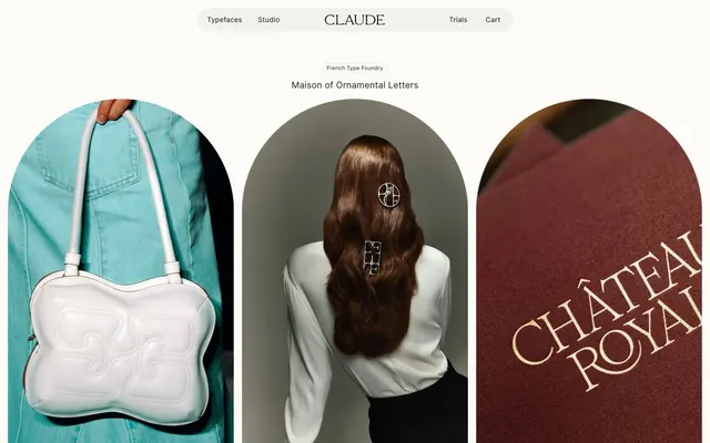
Gallery of Arched Voids
Color palette
Green wash for highlight backgrounds, decorative bands, and soft emphasis behind content. Use as a supporting accent, not as a status color
Page background, large card surfaces, hero backgrounds. Provides a soft, warm white base for content
Slightly desaturated background for select sections and containers, suggesting a subtle paper texture
Primary text color for headlines and body. Its near-black depth offers strong contrast
Secondary text, input text, and subtle borders. Provides a softer dark tone than Midnight Ink for less prominent elements
Very faint background tint for certain cards, providing a barely-there surface distinction
Inverse text color for dark backgrounds and subtle button borders
Typography
- Weights
- 400
- Sizes
- 11px, 12px, 14px, 15px, 18px
- Line height
- 1, 1.4, 1.6, 1.67, 2
- Letter spacing
- Ranges from -0.0230em (tight) to 0.0200em (expanded), providing fine control over typographic texture.
- Fallback
- serif font with good ligature support, such as Optima or ITC Garamond
All text elements, including headings, body, navigation, and buttons. Its single weight and varied sizes emphasize the typographic craft and provide both delicate and impactful expressions through size and meticulous letter-spacing.
Spacing & shape
Components
Text uses MagicUIPro, Midnight Ink, 15px size, 1.4 lineHeight, 0.001em letterSpacing. Underlined on hover. No padding or distinct background.
Transparent background, Deep Charcoal text. Border is 1px solid Deep Charcoal. 100px border-radius (pill-shaped). Padding 0px vertical, 16px horizontal. Font sizing is context-dependent, but often 15px with 0.001em letter-spacing.
Transparent background, Pure White text. Border is 1px solid Pure White. 100px border-radius (pill-shaped). Padding 0px vertical, 14px horizontal.
Deep Charcoal background, Pure White text. 0px border-radius (square). Padding 0px vertical, 14px horizontal. Often appears in conjunction with image cards.
Pure White background, Deep Charcoal text. 100px border-radius (pill-shaped). Padding 0px vertical, 14px horizontal.
Radius of 900px 900px 0px 0px, creating an arched top. Background color of Ghost Fill. No padding, images are full-bleed within the card boundary. Often accompanied by text below the image.
Radius of 900px on all corners, creating an overall arched or 'soft' rectangular shape. Background color of Ghost Fill initially. No padding.
Background of Canvas White, 32px border-radius. Padding 16px vertical, 0px horizontal. No shadow.
Background color #99ff66. Text color Midnight Ink. Padding 0px vertical, 16px horizontal. 100px border-radius.
Transparent background, border is 1px solid Deep Charcoal. No border-radius. Font style determined by parent context, typically MagicUIPro, 15px, Deep Charcoal.
Guidelines
- Prioritize typography as the primary visual element, using MagicUIPro with careful attention to size and letter-spacing.
- Use Canvas White (#fcfbf7) or Paper Gray (#e7e4e0) for all page and section backgrounds to maintain a clean, airy feel.
- Container imagery within large rounded or arched frames (900px radius) to create a gallery aesthetic.
- Apply 100px border-radius to all interactive elements like buttons and chips to achieve a soft, 'pill-shaped' appearance.
- Maintain generous spacing between sections and elements, with a base element gap of 16px and section gap of 180px, to emphasize content scarcity and luxury.
- Use Midnight Ink (#0d0d0f) for all primary text and Deep Charcoal (#2b1b1b) for secondary text or subtle borders.
- Employ the 'dlig' font feature for all MagicUIPro text to render discretionary ligatures, enhancing typographic elegance.
- Avoid strong, vivid chromatic colors. Keep color palette subdued, relying on neutrals and a single subtle accent.
- Do not use sharp 0px corners on any card or actionable UI element; 32px is the minimum for cards, 100px for buttons.
- Do not overcrowd sections with dense content; maintain a comfortable density with ample breathing room.
- Avoid heavy shadows or elevation effects; the design relies on subtle background color shifts for surface distinction.
- Do not use generic system fonts; only MagicUIPro (or its identified substitute) should be used for branding consistency.
- Minimize the use of multiple font weights; the system primarily uses a single weight with size and spacing for visual hierarchy.
- Do not use decorative borders on elements other than subtle outlines for ghost buttons or inputs.
About this system
ShowHide
Claude Type presents a stately, minimalist aesthetic focused on displaying luxury typefaces. Its visual language relies on expansive neutral backgrounds, sparse content arrangements, and high-contrast typography. Typography is the primary visual element, with generous use of letter-spacing and custom font features. Images serve as artistic showcases, contained within large, softly rounded or arched frames, giving a gallery-like feel to the content.
Reminiscent of Kerning Cultures, Future Fonts, Hermès, &Walsh agency.
# Claude Type — Style Reference
> Gallery of Arched Voids

**Theme:** light

**Site:** https://claudetype.com

Claude Type presents a stately, minimalist aesthetic focused on displaying luxury typefaces. Its visual language relies on expansive neutral backgrounds, sparse content arrangements, and high-contrast typography. Typography is the primary visual element, with generous use of letter-spacing and custom font features. Images serve as artistic showcases, contained within large, softly rounded or arched frames, giving a gallery-like feel to the content.

## Tokens — Colors

| Name | Value | Token | Role |
|------|------|------|------|
| Success Green | `#99ff66` | `--color-success-green` | Green wash for highlight backgrounds, decorative bands, and soft emphasis behind content. Use as a supporting accent, not as a status color |
| Canvas White | `#fcfbf7` | `--color-canvas-white` | Page background, large card surfaces, hero backgrounds. Provides a soft, warm white base for content |
| Paper Gray | `#e7e4e0` | `--color-paper-gray` | Slightly desaturated background for select sections and containers, suggesting a subtle paper texture |
| Midnight Ink | `#0d0d0f` | `--color-midnight-ink` | Primary text color for headlines and body. Its near-black depth offers strong contrast |
| Deep Charcoal | `#2b1b1b` | `--color-deep-charcoal` | Secondary text, input text, and subtle borders. Provides a softer dark tone than Midnight Ink for less prominent elements |
| Ghost Fill | `#100401` | `--color-ghost-fill` | Very faint background tint for certain cards, providing a barely-there surface distinction |
| Pure White | `#ffffff` | `--color-pure-white` | Inverse text color for dark backgrounds and subtle button borders |

## Tokens — Typography

### MagicUIPro
- **Substitute:** serif font with good ligature support, such as Optima or ITC Garamond
- **Weights:** 400
- **Sizes:** 11px, 12px, 14px, 15px, 18px
- **Line height:** 1, 1.4, 1.6, 1.67, 2
- **Letter spacing:** Ranges from -0.0230em (tight) to 0.0200em (expanded), providing fine control over typographic texture.
- **Role:** All text elements, including headings, body, navigation, and buttons. Its single weight and varied sizes emphasize the typographic craft and provide both delicate and impactful expressions through size and meticulous letter-spacing.

## Tokens — Type Scale

Major Second (1.125) from 14px base.

| Role | Size | Line height | Letter spacing |
|------|------|------|------|
| caption | 11px | 1.6 | — |
| body-sm | 12px | 1.6 | — |
| body | 14px | 1.6 | — |
| body-lg | 15px | 1.6 | — |
| heading-sm | 18px | 1.6 | — |

## Tokens — Spacing

- **Section gap:** 180px
- **Card padding:** 16px
- **Element gap:** 16px

## Tokens — Radius

- **Buttons:** 100px
- **Cards:** 32px
- **elements:** 10px
- **imagery:** 900px

## Components

### Navigation Link
*Top navigation items and footer links.*

Text uses MagicUIPro, Midnight Ink, 15px size, 1.4 lineHeight, 0.001em letterSpacing. Underlined on hover. No padding or distinct background.

### Ghost Button - Light Outline
*Secondary action buttons, typically against light backgrounds.*

Transparent background, Deep Charcoal text. Border is 1px solid Deep Charcoal. 100px border-radius (pill-shaped). Padding 0px vertical, 16px horizontal. Font sizing is context-dependent, but often 15px with 0.001em letter-spacing.

### Ghost Button - Dark Outline (variant)
*Secondary action buttons against dark backgrounds.*

Transparent background, Pure White text. Border is 1px solid Pure White. 100px border-radius (pill-shaped). Padding 0px vertical, 14px horizontal.

### Filled Button - Dark Background
*Primary action button within dark sections or against images.*

Deep Charcoal background, Pure White text. 0px border-radius (square). Padding 0px vertical, 14px horizontal. Often appears in conjunction with image cards.

### Filled Button - Light Background (variant)
*Primary action button within light sections.*

Pure White background, Deep Charcoal text. 100px border-radius (pill-shaped). Padding 0px vertical, 14px horizontal.

### Image Card - Arched Top
*Display large, artistic images with a distinct visual shape.*

Radius of 900px 900px 0px 0px, creating an arched top. Background color of Ghost Fill. No padding, images are full-bleed within the card boundary. Often accompanied by text below the image.

### Image Card - Arched All Sides
*Primary decorative image container for hero sections or prominent displays.*

Radius of 900px on all corners, creating an overall arched or 'soft' rectangular shape. Background color of Ghost Fill initially. No padding.

### Information Card - Rounded
*Structured content blocks, e.g., for showcasing typefaces with accompanying descriptive text.*

Background of Canvas White, 32px border-radius. Padding 16px vertical, 0px horizontal. No shadow.

### Status Chip
*Small informational tags, often for highlighting product counts or states.*

Background color #99ff66. Text color Midnight Ink. Padding 0px vertical, 16px horizontal. 100px border-radius.

### Input Field
*Text input areas.*

Transparent background, border is 1px solid Deep Charcoal. No border-radius. Font style determined by parent context, typically MagicUIPro, 15px, Deep Charcoal.

## Guidelines

### Do

- Prioritize typography as the primary visual element, using MagicUIPro with careful attention to size and letter-spacing.
- Use Canvas White (#fcfbf7) or Paper Gray (#e7e4e0) for all page and section backgrounds to maintain a clean, airy feel.
- Container imagery within large rounded or arched frames (900px radius) to create a gallery aesthetic.
- Apply 100px border-radius to all interactive elements like buttons and chips to achieve a soft, 'pill-shaped' appearance.
- Maintain generous spacing between sections and elements, with a base element gap of 16px and section gap of 180px, to emphasize content scarcity and luxury.
- Use Midnight Ink (#0d0d0f) for all primary text and Deep Charcoal (#2b1b1b) for secondary text or subtle borders.
- Employ the 'dlig' font feature for all MagicUIPro text to render discretionary ligatures, enhancing typographic elegance.

### Don't

- Avoid strong, vivid chromatic colors. Keep color palette subdued, relying on neutrals and a single subtle accent.
- Do not use sharp 0px corners on any card or actionable UI element; 32px is the minimum for cards, 100px for buttons.
- Do not overcrowd sections with dense content; maintain a comfortable density with ample breathing room.
- Avoid heavy shadows or elevation effects; the design relies on subtle background color shifts for surface distinction.
- Do not use generic system fonts; only MagicUIPro (or its identified substitute) should be used for branding consistency.
- Minimize the use of multiple font weights; the system primarily uses a single weight with size and spacing for visual hierarchy.
- Do not use decorative borders on elements other than subtle outlines for ghost buttons or inputs.

## Agent Prompt Guide

Quick Color Reference:
text: #0d0d0f
background: #fcfbf7
border: #2b1b1b
accent: #99ff66
primary action: no distinct CTA color

Example Component Prompts:
1. Create a primary navigation bar: Background Canvas White, with Navigation Links using text color Midnight Ink, MagicUIPro 15px, 0.001em letter-spacing. Include a Ghost Button - Light Outline for 'Cart' at the end.
2. Design an Image Card - Arched All Sides containing an image. Use Ghost Fill as the background. Place a Ghost Button - Dark Outline at the bottom of the card for an 'Explore' action.
3. Implement an Information Card - Rounded: Background Canvas White, 32px border-radius, 16px vertical padding. Include a bold heading in Midnight Ink and body text in Deep Charcoal, both using MagicUIPro with appropriate sizes from the type scale.
More like this









Keep what you find
A free account saves references to boards and can send you a weekly email of picks based on what you save.
To see every result, go Pro.