Preview image. Unlock full-res
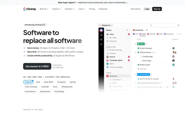
Vibrant productivity hub: a dynamic workspace with energetic highlights.
Color palette
Interactive link text, image accents, decorative strokes – a core brand color, active and inviting
Blue accent for outlined action borders, linked labels, and lightweight interactive emphasis. Do not promote it to the primary CTA color; Decorative backgrounds, illustrative elements, and for conveying a dynamic, modern feel with a broad color spectrum
Background details, subtle decorative elements, less prominent brand mentions. A deeper, more reserved brand color
Violet outline accent for tags, dividers, and focused UI edges. Do not promote it to the primary CTA color
Subtle accent for visual interest or background texture, fading from transparent to a soft orange
Page backgrounds, card surfaces, ghost button backgrounds, default component fills. Creates a bright, expansive foundation
Primary body text, active state indicators, strong borders. Provides high contrast against light surfaces
Backgrounds for prominent buttons, card borders, and primary interactive elements. A deep neutral that commands attention when filled; Subtle background for UI elements, transitioning from dark to light gray
Subtle borders, dividers, disabled states, ghost button borders. Provides separation without visual noise
Muted text, secondary icons, subtle outlines. For less prominent information or decorative details
Subtle background tint for alternating content sections, providing a soft shift in surface elevation
Light background for interactive states or subtle focus elements
Main headings, high-contrast text elements, and specific UI backgrounds where extreme contrast is desired
Typography
- Weights
- 400, 500, 650, 700, 800
- Sizes
- 14px, 16px, 26px, 34px, 40px, 42px, 48px, 52px, 60px, 76px
- Line height
- 1.05, 1.1, 1.12, 1.14, 1.18, 1.2, 1.25, 1.43, 1.5
- Letter spacing
- -0.0500em at 76px, -0.0400em at 60px, -0.0350em at 52px, -0.0110em at 48px
- Fallback
- system-ui, sans-serif
Used for headings and prominent UI elements. Its slightly condensed structure provides a modern, space-efficient feel, especially impactful with subtle negative letter-spacing at larger sizes.
- Weights
- 400, 500, 600, 650, 700
- Sizes
- 8px, 9px, 12px, 13px, 14px, 15px, 16px, 17px, 18px, 19px
- Line height
- 1, 1.14, 1.33, 1.37, 1.38, 1.43, 1.5
- Letter spacing
- -0.0400em at 19px, -0.0200em at 18px, -0.0190em at 17px, -0.0160em at 16px, -0.0140em at 15px, -0.0110em at 14px
- Fallback
- system-ui, sans-serif
Dedicated to body text, UI labels, and captions. Its high legibility and variable font features ensure clarity across various sizes, enhancing the information-dense product experience.
- Weights
- 400, 500
- Sizes
- 12px, 14px, 16px, 24px, 40px
- Line height
- 1.25, 1.29, 1.38, 1.43
- Letter spacing
- 0.0600em
- Fallback
- monospace
Used sparingly for code snippets, timestamps, and specific badge content, providing a technical, precise contrast to the primary sans-serifs.
Spacing & shape
Elevation
Components
Filled with Dark Onyx (#202023), text in Canvas White (#ffffff). Rounded with 9px border-radius, using 4px vertical and 12px horizontal padding. Delivers a visually solid, high-priority action indicator.
Transparent background, text in Midnight Charcoal (#292d34). Features a small 4px border-radius without explicit padding, relying on surrounding layout for spacing, for a subtle interactive element.
Transparent background, text in Charcoal Gray (#646464), with 54px border-radius making them fully rounded. Uses 4px vertical and 12px horizontal padding to create a compact, tag-like appearance.
Transparent background, text in Midnight Charcoal (#000000), bordered by Ash Gray (#000000). Features an 8px border-radius and 4px vertical by 10px horizontal padding, offering a distinct but less assertive interactive state.
Canvas White (#ffffff) background with a 12px border-radius and a light shadow (rgba(0, 0, 0, 0.1) 0px 1px 3px 0px, rgba(0, 0, 0, 0.1) 0px 1px 2px -1px). Includes 12px padding on all sides, providing a clear, visually separated content block.
Fully transparent background (rgba(0, 0, 0, 0)), 20px border-radius, no boxShadow or padding. Designed for content that integrates seamlessly into the background, hinting at a boundary rather than overtly defining one.
Transparent background, text in Midnight Charcoal (#000000). No border-radius or padding. Used for discreet labels or category indicators.
Background rgba(0,0,0,0.1), text in Midnight Charcoal (#292d34). Features a 12px border-radius, 10px vertical and 12px horizontal padding. Used for highlighting short pieces of information such as 'Super Agent' labels.
Guidelines
- Use Plus Jakarta Sans for all headings and prominent brand statements, leveraging its negative letter-spacing at larger sizes for a premium, condensed feel.
- Prioritize Canvas White (#ffffff) as the primary background for all page sections and elevated component surfaces to maintain a bright, open aesthetic.
- Apply Midnight Charcoal (#292d34) for primary body text and main content to ensure readability across all contexts.
- Utilize Electric Blue (#0091ff) or Deep Violet (#7b68ee) as the primary accent colors for interactive elements, links, and key brand highlights.
- Employ a 9px border-radius for buttons and a 12px radius for cards, with a 54px radius reserved for pill-shaped elements and tags.
- Create visual hierarchy and separation using thin, subtle borders in Ash Gray (#e8e8e8) or Dark Onyx (#202023) rather than heavy solid backgrounds.
- Maintain a compact information density with 12px card padding and 9px element gaps, ensuring UI elements feel connected but not overcrowded.
- Avoid using achromatic grays like #000000 for body text; always prefer Midnight Charcoal (#292d34) for content clarity and consistency.
- Do not use strong, opaque background colors for action buttons unless explicitly outlined as a Brand or Accent color; prefer Dark Onyx (#202023) for filled primary actions with white text.
- Do not introduce new shadow styles; stick to the defined, subtle shadows (e.g., rgba(0, 0, 0, 0.1) 0px 1px 3px 0px) to maintain a lightweight elevation philosophy.
- Refrain from using heavily decorative gradients as primary backgrounds; reserve complex gradients for illustrative and atmospheric elements.
- Do not extend the use of Sometype Mono beyond code snippets or technical labels; it is not suitable for general body or heading text.
- Avoid large, unpadded sections; use the defined `elementGap` of 9px and `cardPadding` of 12px to ensure consistent spacing and density.
- Do not use bold weights indiscriminately; the combination of condensed letter-spacing in Plus Jakarta Sans and Inter provides sufficient visual weight when necessary.
About this system
ShowHide
ClickUp's interface channels a vibrant productivity hub atmosphere: an inviting white canvas contrasts with deep charcoal text, punctuated by vivid accents of violet and electric blue. Its visual identity relies on dynamic, lightweight UI elements, thin borders, and soft shadows, creating a sense of clarity and speed. Typography is confident and modern, leveraging condensed sans-serifs for headings and a highly legible sans-serif for body text, maintaining a tight visual rhythm. Gradients are strategically used for subtle flair and to highlight interactive states, reinforcing an energetic, forward-looking aesthetic.
The page maintains a centered, max-width layout, approximately 1200px wide. The hero section is full-bleed, featuring a prominent headline over a product screenshot. Sections alternate between soft white and subtle gray backgrounds, creating a clear visual rhythm. Content is generally arranged in two-column layouts, often with text on the left and visuals or product UI on the right, or centered stacks for feature showcases. Grid patterns are prominent for displaying product capabilities and features, typically in a multi-column card grid. The navigation is a sticky top bar, providing persistent access to global navigation elements.
Imagery primarily consists of bright, clean product screenshots embedded within UI mockups, often demonstrating the platform's features. These are typically contained within card-like structures or placed alongside explanatory text. Illustrations are abstract and organic, using fluid shapes and soft gradients, serving as decorative atmosphere rather than direct content explanation. Icons are predominantly outlined, conveying a lightweight feel, with a consistent stroke weight. The overall density is balanced: images punctuate text blocks to illustrate functionality without overwhelming the layout.
Reminiscent of Notion, Asana, Linear, Figma.
# ClickUp™ — Style Reference
> Vibrant productivity hub: a dynamic workspace with energetic highlights.

**Theme:** light

**Site:** https://www.clickup.com

ClickUp's interface channels a vibrant productivity hub atmosphere: an inviting white canvas contrasts with deep charcoal text, punctuated by vivid accents of violet and electric blue. Its visual identity relies on dynamic, lightweight UI elements, thin borders, and soft shadows, creating a sense of clarity and speed. Typography is confident and modern, leveraging condensed sans-serifs for headings and a highly legible sans-serif for body text, maintaining a tight visual rhythm. Gradients are strategically used for subtle flair and to highlight interactive states, reinforcing an energetic, forward-looking aesthetic.

## Tokens — Colors

| Name | Value | Token | Role |
|------|------|------|------|
| Deep Violet | `#7b68ee` | `--color-deep-violet` | Interactive link text, image accents, decorative strokes – a core brand color, active and inviting |
| Electric Blue | `#0091ff` | `--color-electric-blue` | Blue accent for outlined action borders, linked labels, and lightweight interactive emphasis. Do not promote it to the primary CTA color; Decorative backgrounds, illustrative elements, and for conveying a dynamic, modern feel with a broad color spectrum |
| Rich Plum | `#514b81` | `--color-rich-plum` | Background details, subtle decorative elements, less prominent brand mentions. A deeper, more reserved brand color |
| Vivid Purple | `#6647f0` | `--color-vivid-purple` | Violet outline accent for tags, dividers, and focused UI edges. Do not promote it to the primary CTA color |
| Warm Fade Gradient | `#ff5b36` | `--color-warm-fade-gradient` | Subtle accent for visual interest or background texture, fading from transparent to a soft orange |
| Canvas White | `#ffffff` | `--color-canvas-white` | Page backgrounds, card surfaces, ghost button backgrounds, default component fills. Creates a bright, expansive foundation |
| Midnight Charcoal | `#292d34` | `--color-midnight-charcoal` | Primary body text, active state indicators, strong borders. Provides high contrast against light surfaces |
| Dark Onyx | `#202023` | `--color-dark-onyx` | Backgrounds for prominent buttons, card borders, and primary interactive elements. A deep neutral that commands attention when filled; Subtle background for UI elements, transitioning from dark to light gray |
| Ash Gray | `#e8e8e8` | `--color-ash-gray` | Subtle borders, dividers, disabled states, ghost button borders. Provides separation without visual noise |
| Smoke Gray | `#b3b3b3` | `--color-smoke-gray` | Muted text, secondary icons, subtle outlines. For less prominent information or decorative details |
| Hint of Sky | `#e9ebf0` | `--color-hint-of-sky` | Subtle background tint for alternating content sections, providing a soft shift in surface elevation |
| Shadow Tint Blue | `#edf6fd` | `--color-shadow-tint-blue` | Light background for interactive states or subtle focus elements |
| Deep Space Charcoal | `#090c1d` | `--color-deep-space-charcoal` | Main headings, high-contrast text elements, and specific UI backgrounds where extreme contrast is desired |

## Tokens — Typography

### Plus Jakarta Sans
- **Substitute:** system-ui, sans-serif
- **Weights:** 400, 500, 650, 700, 800
- **Sizes:** 14px, 16px, 26px, 34px, 40px, 42px, 48px, 52px, 60px, 76px
- **Line height:** 1.05, 1.1, 1.12, 1.14, 1.18, 1.2, 1.25, 1.43, 1.5
- **Letter spacing:** -0.0500em at 76px, -0.0400em at 60px, -0.0350em at 52px, -0.0110em at 48px
- **Role:** Used for headings and prominent UI elements. Its slightly condensed structure provides a modern, space-efficient feel, especially impactful with subtle negative letter-spacing at larger sizes.

### Inter
- **Substitute:** system-ui, sans-serif
- **Weights:** 400, 500, 600, 650, 700
- **Sizes:** 8px, 9px, 12px, 13px, 14px, 15px, 16px, 17px, 18px, 19px
- **Line height:** 1, 1.14, 1.33, 1.37, 1.38, 1.43, 1.5
- **Letter spacing:** -0.0400em at 19px, -0.0200em at 18px, -0.0190em at 17px, -0.0160em at 16px, -0.0140em at 15px, -0.0110em at 14px
- **Role:** Dedicated to body text, UI labels, and captions. Its high legibility and variable font features ensure clarity across various sizes, enhancing the information-dense product experience.

### Sometype Mono
- **Substitute:** monospace
- **Weights:** 400, 500
- **Sizes:** 12px, 14px, 16px, 24px, 40px
- **Line height:** 1.25, 1.29, 1.38, 1.43
- **Letter spacing:** 0.0600em
- **Role:** Used sparingly for code snippets, timestamps, and specific badge content, providing a technical, precise contrast to the primary sans-serifs.

## Tokens — Type Scale

Perfect Fourth (1.333) from 16px base.

| Role | Size | Line height | Letter spacing |
|------|------|------|------|
| caption | 12px | 1.43 | -0.14px |
| body-sm | 14px | 1.43 | -0.15px |
| body | 16px | 1.5 | -0.26px |
| subheading | 26px | 1.25 | -0.91px |
| heading-sm | 34px | 1.18 | -1.19px |
| heading | 40px | 1.14 | -1.6px |
| heading-lg | 52px | 1.12 | -1.82px |
| display | 76px | 1.05 | -3.8px |

## Tokens — Spacing

- **Max width:** 1px
- **Section gap:** 24px
- **Card padding:** 12px
- **Element gap:** 9px

## Tokens — Radius

- **Default:** 9px
- **Buttons:** 9px
- **Cards:** 12px
- **circularElements:** 653px
- **largeCards:** 24px
- **pills:** 54px

## Tokens — Elevation

- **Feature Card:** `rgba(0, 0, 0, 0.1) 0px 1px 3px 0px, rgba(0, 0, 0, 0.1) 0px 1px 2px -1px`
- **Hover/Interactive Elements:** `rgba(18, 43, 165, 0.04) 0px 1px 1px -0.5px, rgba(18, 43, 165, 0.04) 0px 3px 3px -1.5px, rgba(18, 43, 165, 0.04) 0px 6px 6px -3px, rgba(18, 43, 165, 0.04) 0px 12px 12px -6px`
- **Button Shadow (subtle):** `rgba(13, 21, 48, 0.04) 0px 4px 4px 0px`

## Layout

The page maintains a centered, max-width layout, approximately 1200px wide. The hero section is full-bleed, featuring a prominent headline over a product screenshot. Sections alternate between soft white and subtle gray backgrounds, creating a clear visual rhythm. Content is generally arranged in two-column layouts, often with text on the left and visuals or product UI on the right, or centered stacks for feature showcases. Grid patterns are prominent for displaying product capabilities and features, typically in a multi-column card grid. The navigation is a sticky top bar, providing persistent access to global navigation elements.

## Imagery

Imagery primarily consists of bright, clean product screenshots embedded within UI mockups, often demonstrating the platform's features. These are typically contained within card-like structures or placed alongside explanatory text. Illustrations are abstract and organic, using fluid shapes and soft gradients, serving as decorative atmosphere rather than direct content explanation. Icons are predominantly outlined, conveying a lightweight feel, with a consistent stroke weight. The overall density is balanced: images punctuate text blocks to illustrate functionality without overwhelming the layout.

## Components

### Primary Filled Button
*Call to action*

Filled with Dark Onyx (#202023), text in Canvas White (#ffffff). Rounded with 9px border-radius, using 4px vertical and 12px horizontal padding. Delivers a visually solid, high-priority action indicator.

### Ghost Button
*Secondary action*

Transparent background, text in Midnight Charcoal (#292d34). Features a small 4px border-radius without explicit padding, relying on surrounding layout for spacing, for a subtle interactive element.

### Pill Button
*Tertiary action/Tag*

Transparent background, text in Charcoal Gray (#646464), with 54px border-radius making them fully rounded. Uses 4px vertical and 12px horizontal padding to create a compact, tag-like appearance.

### Outline Button
*Bordered action/Navigation element*

Transparent background, text in Midnight Charcoal (#000000), bordered by Ash Gray (#000000). Features an 8px border-radius and 4px vertical by 10px horizontal padding, offering a distinct but less assertive interactive state.

### Feature Card
*Content container*

Canvas White (#ffffff) background with a 12px border-radius and a light shadow (rgba(0, 0, 0, 0.1) 0px 1px 3px 0px, rgba(0, 0, 0, 0.1) 0px 1px 2px -1px). Includes 12px padding on all sides, providing a clear, visually separated content block.

### Ghost Content Card
*Visual content container without explicit bounding*

Fully transparent background (rgba(0, 0, 0, 0)), 20px border-radius, no boxShadow or padding. Designed for content that integrates seamlessly into the background, hinting at a boundary rather than overtly defining one.

### Subtle Badge
*Informational tag*

Transparent background, text in Midnight Charcoal (#000000). No border-radius or padding. Used for discreet labels or category indicators.

### Pill Badge
*Compact informational tag*

Background rgba(0,0,0,0.1), text in Midnight Charcoal (#292d34). Features a 12px border-radius, 10px vertical and 12px horizontal padding. Used for highlighting short pieces of information such as 'Super Agent' labels.

## Guidelines

### Do

- Use Plus Jakarta Sans for all headings and prominent brand statements, leveraging its negative letter-spacing at larger sizes for a premium, condensed feel.
- Prioritize Canvas White (#ffffff) as the primary background for all page sections and elevated component surfaces to maintain a bright, open aesthetic.
- Apply Midnight Charcoal (#292d34) for primary body text and main content to ensure readability across all contexts.
- Utilize Electric Blue (#0091ff) or Deep Violet (#7b68ee) as the primary accent colors for interactive elements, links, and key brand highlights.
- Employ a 9px border-radius for buttons and a 12px radius for cards, with a 54px radius reserved for pill-shaped elements and tags.
- Create visual hierarchy and separation using thin, subtle borders in Ash Gray (#e8e8e8) or Dark Onyx (#202023) rather than heavy solid backgrounds.
- Maintain a compact information density with 12px card padding and 9px element gaps, ensuring UI elements feel connected but not overcrowded.

### Don't

- Avoid using achromatic grays like #000000 for body text; always prefer Midnight Charcoal (#292d34) for content clarity and consistency.
- Do not use strong, opaque background colors for action buttons unless explicitly outlined as a Brand or Accent color; prefer Dark Onyx (#202023) for filled primary actions with white text.
- Do not introduce new shadow styles; stick to the defined, subtle shadows (e.g., rgba(0, 0, 0, 0.1) 0px 1px 3px 0px) to maintain a lightweight elevation philosophy.
- Refrain from using heavily decorative gradients as primary backgrounds; reserve complex gradients for illustrative and atmospheric elements.
- Do not extend the use of Sometype Mono beyond code snippets or technical labels; it is not suitable for general body or heading text.
- Avoid large, unpadded sections; use the defined `elementGap` of 9px and `cardPadding` of 12px to ensure consistent spacing and density.
- Do not use bold weights indiscriminately; the combination of condensed letter-spacing in Plus Jakarta Sans and Inter provides sufficient visual weight when necessary.

## Agent Prompt Guide

### Quick Color Reference
text: #292d34
background: #ffffff
border: #e8e8e8
accent: #7b68ee
primary action: #202023 (filled action)

### 3-5 Example Component Prompts
1. Create a Primary Action Button: #202023 background, #ffffff text, 9999px radius, compact pill padding. Use this filled treatment for the main CTA.
2. Design a Feature Card: Canvas White (#ffffff) background, 12px border-radius, shadow: rgba(0, 0, 0, 0.1) 0px 1px 3px 0px, rgba(0, 0, 0, 0.1) 0px 1px 2px -1px. Inside, a heading at 26px Plus Jakarta Sans, weight 700, Deep Space Charcoal (#090c1d), letter-spacing -0.91px, 12px padding. Body text at 16px Inter, weight 400, Midnight Charcoal (#292d34), letter-spacing -0.26px.
3. Implement a Pill Tag: Transparent background, text in Midnight Charcoal (#292d34) at 14px Inter, weight 500, letter-spacing -0.15px. 12px border-radius, 10px vertical / 12px horizontal padding. Border in Ash Gray (#e8e8e8).
4. Create a Navigation Link: Text in Midnight Charcoal (#292d34) at 16px Inter, weight 500, letter-spacing -0.26px. On hover, text color changes to Deep Violet (#7b68ee) and an underline appears.
More like this









Keep what you find
A free account saves references to boards and can send you a weekly email of picks based on what you save.
To see every result, go Pro.