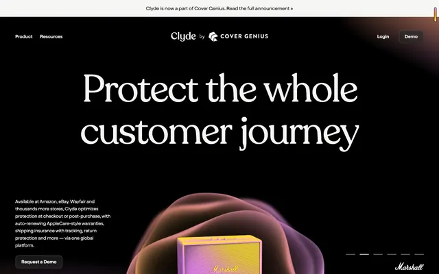
Preview image. Unlock full-res
Iridescent gradients on obsidian glass
Color palette
Decorative gradient accent, hero product highlighting; Decorative gradient accent, hero product highlighting with vertical flow
Page background, primary text on light surfaces, icon fills, strong borders
Primary text on dark backgrounds, ghost button text, accent borders, light surface elements
Secondary background surfaces, ghost button backgrounds, muted text
Subtle inset shadows, light accents
Subtle dark borders
Typography
- Weights
- 400
- Sizes
- 36px, 47px, 61px, 80px, 125px
- Line height
- 1, 1.1
- Letter spacing
- -0.0300em at 125px, -0.0200em at 80px, -0.0100em at 36px
- Fallback
- Playfair Display
Display headlines and page titles — the large, highly tracked text creates a distinct, sophisticated visual statement.
- Weights
- 300, 400
- Sizes
- 15px, 16px, 21px, 80px, 138px
- Line height
- 1, 1.3, 1.4, 1.6
- Letter spacing
- -0.0300em at 138px, -0.0200em at 80px, 0.0100em at 15px
- Fallback
- Inter
Body text, subheadings, and UI elements — its subtle tracking and modern sans-serif form balance the Recoleta headlines, providing clear readability.
- Weights
- 400
- Sizes
- 16px
- Line height
- 1.2, 1.25
- Letter spacing
- normal
- Fallback
- Times New Roman
System fallback for various UI elements where a classic serif provides visual texture.
Spacing & shape
Components
Text in Ghost Ash (#f6f6f4) on a transparent background, with no border and 0px radius. Used for discreet navigation items.
Background in Slate (#7d7d7d) with Ghost Ash (#f6f6f4) text. Has a 100px border-radius, creating a pill shape. Padding is generous at 22px all around, making it a prominent interaction point.
Transparent background with a subtle inset shadow (rgba(255, 255, 255, 0.25) 0px 0.636826px 3.82096px 0px inset). Rounded corners of 16px. Content padding is 10px.
Similar to Feature Card but with a larger 40px border-radius and slightly different boxShadow. No internal padding specified, implying full-bleed content.
Text color in Ghost Ash (#f6f6f4) on a transparent background, with 0px radius. No discernible padding, appears as simple underlined or distinct text.
Transparent background with text in Ghost Ash (#f6f6f4), appearing on the Midnight background. Text likely uses a smaller font size.
Guidelines
- Use Midnight (#000000) for all page backgrounds to maintain atmospheric depth.
- Apply Recoleta for all primary headlines, leveraging its unique tracking values for distinct visual impact.
- Implement 100px border-radius for all primary buttons to achieve a soft, pill-shaped aesthetic.
- Employ the Iridescent Glow gradient (linear-gradient(90deg, #feed7a, #ff8400, #df91f7)) for any elements requiring unique visual emphasis or product highlights.
- Ensure Ghost Ash (#f6f6f4) is the default text color on dark backgrounds, providing maximum contrast and legibility.
- Maintain generous spacing with a base unit of 4px and elemental gaps around 20px, fostering a comfortable content density.
- Avoid harsh, solid borders or backgrounds, except for functional elements that require clear separation.
- Do not use highly saturated colors for text except for specific accent elements; stick to Ghost Ash (#f6f6f4) and Midnight (#000000) for content.
- Do not introduce sharp corners or small radii on interactive elements; favor the 16px and 100px radii for organic, approachable shapes.
- Avoid generic system fonts for any primary heading or body text; always use Recoleta or Oldschool Grotesk.
- Do not use explicit drop shadows for elevation; rely on subtle inset shadows (rgba(255, 255, 255, 0.25) 0px 0.636826px 3.82096px 0px inset) for depth on dark surfaces.
- Do not introduce competing gradients; the Iridescent Glow is the signature gradient.
About this system
ShowHide
Clyde deploys a dark, atmospheric interface punctuated by subtle gradients and an emphasis on dimensional product rendering. The design system uses sparse, highly contrasted typography with a blend of classic serif and modern grotesk fonts, creating a 'luxury tech' feel. Surfaces are dark, with elements softly lit by internal shadows and occasional, vibrant iridescent gradients. The overall density is comfortable, providing generous breathing room for content.
The page primarily employs a full-bleed layout on a Midnight (#000000) canvas. The hero section features a centered, large Recoleta headline over an abstract 3D iridescent background. Main content sections alternate between full-width blocks and content contained within fluid sections that appear centered. A common pattern is a two-column layout with large typography on one side and a product visual or smaller text block on the other, occasionally reversing. Feature lists utilize a grid of card-like elements. Navigation is a minimalist top bar, generally un-sticky, with ghost buttons and a pill-shaped primary action.
The site utilizes 3D abstract graphics with an iridescent, glowing quality, serving as decorative atmosphere rather than direct content. These are often full-bleed backgrounds or large, contained elements. Product visuals are crisp and dimensional, appearing either isolated against the dark backdrop or within simulated screen interfaces, demonstrating a clear focus on showcasing objects with a realistic, high-fidelity render. Icons are minimal, outlined, and monochromatic, primarily in Ghost Ash (#f6f6f4). Imagery density is moderate; illustrative elements occupy significant visual space but are balanced with generous typography.
Reminiscent of Framer, Linear, Apple (product pages).
# Clyde — Style Reference
> Iridescent gradients on obsidian glass

**Theme:** dark

**Site:** https://joinclyde.com

Clyde deploys a dark, atmospheric interface punctuated by subtle gradients and an emphasis on dimensional product rendering. The design system uses sparse, highly contrasted typography with a blend of classic serif and modern grotesk fonts, creating a 'luxury tech' feel. Surfaces are dark, with elements softly lit by internal shadows and occasional, vibrant iridescent gradients. The overall density is comfortable, providing generous breathing room for content.

## Tokens — Colors

| Name | Value | Token | Role |
|------|------|------|------|
| Iridescent Glow | `#ff8400` | `--color-iridescent-glow` | Decorative gradient accent, hero product highlighting; Decorative gradient accent, hero product highlighting with vertical flow |
| Midnight | `#000000` | `--color-midnight` | Page background, primary text on light surfaces, icon fills, strong borders |
| Ghost Ash | `#f6f6f4` | `--color-ghost-ash` | Primary text on dark backgrounds, ghost button text, accent borders, light surface elements |
| Slate | `#7d7d7d` | `--color-slate` | Secondary background surfaces, ghost button backgrounds, muted text |
| White Smoke | `#ffffff` | `--color-white-smoke` | Subtle inset shadows, light accents |
| Dark Charcoal | `#1a1a1a` | `--color-dark-charcoal` | Subtle dark borders |

## Tokens — Typography

### Recoleta
- **Substitute:** Playfair Display
- **Weights:** 400
- **Sizes:** 36px, 47px, 61px, 80px, 125px
- **Line height:** 1, 1.1
- **Letter spacing:** -0.0300em at 125px, -0.0200em at 80px, -0.0100em at 36px
- **Role:** Display headlines and page titles — the large, highly tracked text creates a distinct, sophisticated visual statement.

### Oldschool Grotesk
- **Substitute:** Inter
- **Weights:** 300, 400
- **Sizes:** 15px, 16px, 21px, 80px, 138px
- **Line height:** 1, 1.3, 1.4, 1.6
- **Letter spacing:** -0.0300em at 138px, -0.0200em at 80px, 0.0100em at 15px
- **Role:** Body text, subheadings, and UI elements — its subtle tracking and modern sans-serif form balance the Recoleta headlines, providing clear readability.

### Times
- **Substitute:** Times New Roman
- **Weights:** 400
- **Sizes:** 16px
- **Line height:** 1.2, 1.25
- **Letter spacing:** normal
- **Role:** System fallback for various UI elements where a classic serif provides visual texture.

## Tokens — Type Scale

| Role | Size | Line height | Letter spacing |
|------|------|------|------|
| body-sm | 15px | 1.6 | 0.15px |
| subheading | 21px | 1.4 | 0.21px |
| heading | 36px | 1.1 | -0.36px |
| heading-lg | 47px | 1.1 | -0.94px |
| display | 61px | 1.1 | -1.22px |
| display-lg | 80px | 1 | -1.6px |
| display-xl | 125px | 1 | -3.75px |
| display-xxl | 138px | 1 | -4.14px |

## Tokens — Spacing

- **Section gap:** 50px
- **Card padding:** 22px
- **Element gap:** 20px

## Tokens — Radius

- **Buttons:** 100px
- **Inputs:** 4px
- **Cards:** 16px
- **largeElements:** 38px
- **links:** 12px

## Layout

The page primarily employs a full-bleed layout on a Midnight (#000000) canvas. The hero section features a centered, large Recoleta headline over an abstract 3D iridescent background. Main content sections alternate between full-width blocks and content contained within fluid sections that appear centered. A common pattern is a two-column layout with large typography on one side and a product visual or smaller text block on the other, occasionally reversing. Feature lists utilize a grid of card-like elements. Navigation is a minimalist top bar, generally un-sticky, with ghost buttons and a pill-shaped primary action.

## Imagery

The site utilizes 3D abstract graphics with an iridescent, glowing quality, serving as decorative atmosphere rather than direct content. These are often full-bleed backgrounds or large, contained elements. Product visuals are crisp and dimensional, appearing either isolated against the dark backdrop or within simulated screen interfaces, demonstrating a clear focus on showcasing objects with a realistic, high-fidelity render. Icons are minimal, outlined, and monochromatic, primarily in Ghost Ash (#f6f6f4). Imagery density is moderate; illustrative elements occupy significant visual space but are balanced with generous typography.

## Components

### Ghost Header Button
*Navigation and secondary actions*

Text in Ghost Ash (#f6f6f4) on a transparent background, with no border and 0px radius. Used for discreet navigation items.

### Pill Button
*Primary Call to Action*

Background in Slate (#7d7d7d) with Ghost Ash (#f6f6f4) text. Has a 100px border-radius, creating a pill shape. Padding is generous at 22px all around, making it a prominent interaction point.

### Feature Card
*Content container for features or case studies*

Transparent background with a subtle inset shadow (rgba(255, 255, 255, 0.25) 0px 0.636826px 3.82096px 0px inset). Rounded corners of 16px. Content padding is 10px.

### Large Radius Card
*Prominent content blocks*

Similar to Feature Card but with a larger 40px border-radius and slightly different boxShadow. No internal padding specified, implying full-bleed content.

### Inline Text Link
*Linked text within content*

Text color in Ghost Ash (#f6f6f4) on a transparent background, with 0px radius. No discernible padding, appears as simple underlined or distinct text.

### Announcement Bar Link
*High-visibility information link*

Transparent background with text in Ghost Ash (#f6f6f4), appearing on the Midnight background. Text likely uses a smaller font size.

## Guidelines

### Do

- Use Midnight (#000000) for all page backgrounds to maintain atmospheric depth.
- Apply Recoleta for all primary headlines, leveraging its unique tracking values for distinct visual impact.
- Implement 100px border-radius for all primary buttons to achieve a soft, pill-shaped aesthetic.
- Employ the Iridescent Glow gradient (linear-gradient(90deg, #feed7a, #ff8400, #df91f7)) for any elements requiring unique visual emphasis or product highlights.
- Ensure Ghost Ash (#f6f6f4) is the default text color on dark backgrounds, providing maximum contrast and legibility.
- Maintain generous spacing with a base unit of 4px and elemental gaps around 20px, fostering a comfortable content density.

### Don't

- Avoid harsh, solid borders or backgrounds, except for functional elements that require clear separation.
- Do not use highly saturated colors for text except for specific accent elements; stick to Ghost Ash (#f6f6f4) and Midnight (#000000) for content.
- Do not introduce sharp corners or small radii on interactive elements; favor the 16px and 100px radii for organic, approachable shapes.
- Avoid generic system fonts for any primary heading or body text; always use Recoleta or Oldschool Grotesk.
- Do not use explicit drop shadows for elevation; rely on subtle inset shadows (rgba(255, 255, 255, 0.25) 0px 0.636826px 3.82096px 0px inset) for depth on dark surfaces.
- Do not introduce competing gradients; the Iridescent Glow is the signature gradient.

## Agent Prompt Guide

Quick Color Reference:
text: #f6f6f4
background: #000000
border: #1a1a1a
accent: #ff8400
primary action: no distinct CTA color

Example Component Prompts:
1. Create a hero section with a Midnight (#000000) background and an 'Iridescent Glow' gradient abstract visual. Headline: 'Protect the whole customer journey' using Recoleta, size 125px, weight 400, Ghost Ash (#f6f6f4), letter-spacing -3.75px. Subtext: 'Available at Amazon, eBay, Wayfair and thousands more stores.' using Oldschool Grotesk, size 16px, weight 400, Ghost Ash (#f6f6f4).
2. Design a 'Pill Button' component: background Slate (#7d7d7d), text 'Request a Demo' in Ghost Ash (#f6f6f4), using Oldschool Grotesk, size 16px, weight 400. Apply a 100px border-radius and 22px padding all around.
3. Implement a 'Feature Card': transparent background with inset shadow (rgba(255, 255, 255, 0.25) 0px 0.636826px 3.82096px 0px inset), 16px border-radius, and 10px padding. Content text: 'Hassle-free claims, instant payouts and global repairs' in Ghost Ash (#f6f6f4), Oldschool Grotesk, size 16px, weight 400.
4. Create a top navigation bar: Midnight (#000000) background. 'Product' and 'Resources' links in Ghost Ash (#f6f6f4), Oldschool Grotesk, size 16px, weight 400, with 0px border-radius and transparent background (Ghost Header Button style). Include a 'Demo' button in the 'Pill Button' style from example 2.
More like this









Keep what you find
A free account saves references to boards and can send you a weekly email of picks based on what you save.
To see every result, go Pro.