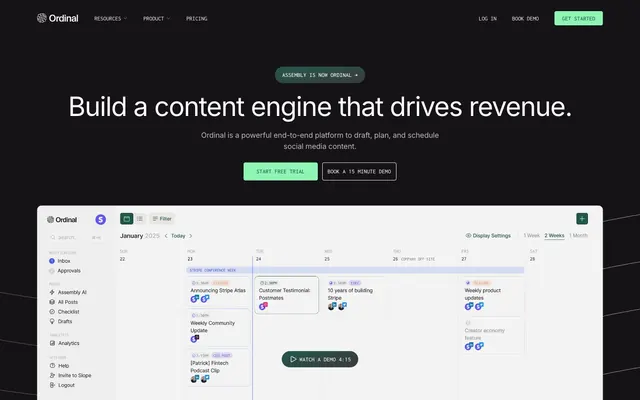
Preview image. Unlock full-res
Midnight Command Center – A focused, dark interface illuminated by a singular, bright green operational light.
Color palette
Primary action background, prominent accents, interactive elements, and focused states. This vivid green is the brand's primary color, indicating activity and interactive points
Muted accents and hover states, often appearing as text color against a light background or subtle borders. Provides a complementary, darker hue to Jade Glow; Subtle background gradients for atmospheric touches, transitioning from a muted green to a dark gray
Primary background for pages, footers, and filled buttons against light text. Creates a deep, expansive canvas
Subtle background for card surfaces, providing a faint lighter layer over Deep Night
Muted text for secondary information, subheadings, and soft borders. A gentle contrast against dark backgrounds
Primary text color, link text, and strong borders on dark backgrounds. Ensures legibility and highlights key information; Transparent to green gradient, used for subtle background highlights or decorative elements
Subtle borders and text in specific contexts, providing a slightly warmer off-white tone than Moonbeam White
Tertiary text and borders, for less critical information or ghost states
Typography
- Weights
- 400, 500
- Sizes
- 13px, 17px, 27px, 40px, 53px, 60px
- Line height
- 1, 1.2, 1.5
- Letter spacing
- -0.0300em, -0.0100em
- Fallback
- system-ui
Primary typeface for all UI elements, headlines, body text, and links. Its clean, modern lines support the system's focus on clarity and efficiency, with moderate tracking at larger sizes (-0.0300em for 60px and -0.0100em for 40px and 53px) to prevent headlines from feeling too loose.
- Weights
- 400, 500
- Sizes
- 13px, 17px
- Line height
- 1, 1.5
- Letter spacing
- -0.0100em, 0.0100em
- Fallback
- monospace
Used for smaller, functional UI text like badges, navigation, and supplementary information. Its slightly wider, geometric nature provides a subtle contrast to Inter, adding a 'coding-like' or 'system' feel without being overly technical.
Spacing & shape
Components
Solid Jade Glow (#8ef5b5) background with Deep Night (#151316) text. Features fully rounded, pill-shaped corners (1440px radius) and generous padding (11.73-16.67px horizontal, 8.4-13.33px vertical) for a prominent, inviting target. Text is often Inconsolata-Eyebrow for a distinct functional feel.
Transparent background with a Moonbeam White (#ffffff) border or text and Jade Glow (#8ef5b5) border. Uses pill-shaped corners (1440px) and similar padding to the primary button, offering a clear but less emphatic interactive element.
Transparent background with Moonbeam White (#ffffff) or Forest Whisper (#24574d) text. No visible border or radius, relies on text color for distinction. Used for minimal, understated calls to action or navigation items.
Transparent background with soft, asymmetric rounded corners (18.08px on top-left). No shadow. Often used for showcasing product features or screenshots with Moonbeam White text and generous internal padding (53.33px top, 34.66px left).
Transparent background with Moonbeam White (#ffffff) text. No border or radius. Used for short, contextual labels such as 'Scheduling' or feature tags. Text usually Inconsolata-Eyebrow for a technical feel.
Moonbeam White (#ffffff) text on a transparent background, transitioning to Forest Whisper (#24574d) on hover/active. Minimal padding and no explicit border or radius, relying on proximity and typography for interactive signaling.
Guidelines
- Use Deep Night (#151316) for all primary page and large section backgrounds to maintain the dark theme.
- Highlight interactive elements and calls to action exclusively with Jade Glow (#8ef5b5) for maximum visual impact and brand recognition.
- Employ Moonbeam White (#ffffff) for all primary body text and main headings to ensure readability against dark backgrounds.
- Apply Inter font in weights 400 or 500 for general text and headlines, varying size and letter-spacing according to the type scale.
- Utilize the `buttons` radius of 1440px for all action buttons to create a consistent, soft, pill-like appearance.
- Maintain comfortable density with an `elementGap` of 8px and `sectionGap` of 27px for most content blocks.
- Use Inconsolata-Eyebrow for all badge text and subtle functional labels to distinguish them from primary content.
- Avoid using multiple chromatic colors; Jade Glow (#8ef5b5) is the singular accent color.
- Do not introduce complex shadow systems; the design relies on subtle background shifts and borders for layering.
- Never use generic square buttons; all interactive buttons should leverage the pill-shaped 1440px border radius.
- Do not deviate from the Inter and Inconsolata-Eyebrow font families; maintain typographic consistency.
- Avoid extreme tight or loose letter-spacing; adhere to the defined letter-spacing values in the type scale for proportional text.
- Do not use dark gray or black text on Deep Night backgrounds as this does not meet AAA contrast requirements.
- Avoid using card backgrounds for transparent-by-default cards such as feature cards.
About this system
ShowHide
Ordinal uses a deep-space productivity aesthetic: dark canvas, minimalist UI elements, and a single vibrant green highlight that punctuates critical information and calls to action. The design maintains order through a comfortable density, clear typographic hierarchy, and subtle surface variations rather than heavy shadows or complex gradients. The overall atmosphere feels calm and focused, with interaction points clearly highlighted by the brand's signature accent green. Components are light, using ghost states and crisp borders against the dark background.
The page typically follows a max-width contained layout at 1440px, centered on the screen. The hero section is full-bleed with a dark background, featuring a centered headline and central call-to-action buttons. Subsequent sections alternate between dark and slightly lighter dark bands, creating a subtle visual rhythm. Content is generally arranged in two-column layouts, often with text on one side and a product screenshot or relevant visual on the other, or in three-column grids for feature lists. Navigation is a sticky top bar, minimal and un-obtrusive. The overall density is comfortable, with ample breathing room between sections.
The visual language for imagery is primarily functional product screenshots, often contained within subtle dark surface cards or on a plain background. There are no full-bleed lifestyle images. Iconography is minimalist and outlined, using the brand's primary green for interactive states or as decorative elements. Logos of partners are monochrome white or light gray against the dark background. The imagery serves to explain functionality and build credibility rather than creating a decorative atmosphere, often text-dominant with visuals supplementing the content.
Reminiscent of Linear, Supabase, Notion (dark mode), Vercel.
# Ordinal — Style Reference
> Midnight Command Center – A focused, dark interface illuminated by a singular, bright green operational light.

**Theme:** dark

**Site:** https://www.meetassembly.com

Ordinal uses a deep-space productivity aesthetic: dark canvas, minimalist UI elements, and a single vibrant green highlight that punctuates critical information and calls to action. The design maintains order through a comfortable density, clear typographic hierarchy, and subtle surface variations rather than heavy shadows or complex gradients. The overall atmosphere feels calm and focused, with interaction points clearly highlighted by the brand's signature accent green. Components are light, using ghost states and crisp borders against the dark background.

## Tokens — Colors

| Name | Value | Token | Role |
|------|------|------|------|
| Jade Glow | `#8ef5b5` | `--color-jade-glow` | Primary action background, prominent accents, interactive elements, and focused states. This vivid green is the brand's primary color, indicating activity and interactive points |
| Forest Whisper | `#24574d` | `--color-forest-whisper` | Muted accents and hover states, often appearing as text color against a light background or subtle borders. Provides a complementary, darker hue to Jade Glow; Subtle background gradients for atmospheric touches, transitioning from a muted green to a dark gray |
| Deep Night | `#151316` | `--color-deep-night` | Primary background for pages, footers, and filled buttons against light text. Creates a deep, expansive canvas |
| Cloudburst Gray | `#444245` | `--color-cloudburst-gray` | Subtle background for card surfaces, providing a faint lighter layer over Deep Night |
| Fog | `#8e8e8e` | `--color-fog` | Muted text for secondary information, subheadings, and soft borders. A gentle contrast against dark backgrounds |
| Moonbeam White | `#ffffff` | `--color-moonbeam-white` | Primary text color, link text, and strong borders on dark backgrounds. Ensures legibility and highlights key information; Transparent to green gradient, used for subtle background highlights or decorative elements |
| Lunar Dust | `#f4f2ee` | `--color-lunar-dust` | Subtle borders and text in specific contexts, providing a slightly warmer off-white tone than Moonbeam White |
| Ghostly Gray | `#b9b9b9` | `--color-ghostly-gray` | Tertiary text and borders, for less critical information or ghost states |

## Tokens — Typography

### Inter
- **Substitute:** system-ui
- **Weights:** 400, 500
- **Sizes:** 13px, 17px, 27px, 40px, 53px, 60px
- **Line height:** 1, 1.2, 1.5
- **Letter spacing:** -0.0300em, -0.0100em
- **Role:** Primary typeface for all UI elements, headlines, body text, and links. Its clean, modern lines support the system's focus on clarity and efficiency, with moderate tracking at larger sizes (-0.0300em for 60px and -0.0100em for 40px and 53px) to prevent headlines from feeling too loose.

### Inconsolata-Eyebrow
- **Substitute:** monospace
- **Weights:** 400, 500
- **Sizes:** 13px, 17px
- **Line height:** 1, 1.5
- **Letter spacing:** -0.0100em, 0.0100em
- **Role:** Used for smaller, functional UI text like badges, navigation, and supplementary information. Its slightly wider, geometric nature provides a subtle contrast to Inter, adding a 'coding-like' or 'system' feel without being overly technical.

## Tokens — Type Scale

Perfect Fourth (1.333) from 17px base.

| Role | Size | Line height | Letter spacing |
|------|------|------|------|
| caption | 13px | 1.5 | 0.13px |
| body | 17px | 1.5 | -0.17px |
| subheading | 27px | 1.5 | -0.81px |
| heading | 40px | 1.2 | -0.96px |
| heading-lg | 53px | 1.2 | -1.59px |
| display | 60px | 1 | -1.8px |

## Tokens — Spacing

- **Max width:** 1440px
- **Section gap:** 27px
- **Card padding:** 27px
- **Element gap:** 8px

## Tokens — Radius

- **Default:** 4.96px
- **Buttons:** 1440px
- **Cards:** 18.08px 0px 0px

## Layout

The page typically follows a max-width contained layout at 1440px, centered on the screen. The hero section is full-bleed with a dark background, featuring a centered headline and central call-to-action buttons. Subsequent sections alternate between dark and slightly lighter dark bands, creating a subtle visual rhythm. Content is generally arranged in two-column layouts, often with text on one side and a product screenshot or relevant visual on the other, or in three-column grids for feature lists. Navigation is a sticky top bar, minimal and un-obtrusive. The overall density is comfortable, with ample breathing room between sections.

## Imagery

The visual language for imagery is primarily functional product screenshots, often contained within subtle dark surface cards or on a plain background. There are no full-bleed lifestyle images. Iconography is minimalist and outlined, using the brand's primary green for interactive states or as decorative elements. Logos of partners are monochrome white or light gray against the dark background. The imagery serves to explain functionality and build credibility rather than creating a decorative atmosphere, often text-dominant with visuals supplementing the content.

## Components

### Primary Action Button
*Filled Call to Action Button*

Solid Jade Glow (#8ef5b5) background with Deep Night (#151316) text. Features fully rounded, pill-shaped corners (1440px radius) and generous padding (11.73-16.67px horizontal, 8.4-13.33px vertical) for a prominent, inviting target. Text is often Inconsolata-Eyebrow for a distinct functional feel.

### Secondary Ghost Button
*Outlined or Ghost Button*

Transparent background with a Moonbeam White (#ffffff) border or text and Jade Glow (#8ef5b5) border. Uses pill-shaped corners (1440px) and similar padding to the primary button, offering a clear but less emphatic interactive element.

### Text Link Button
*Minimal Interactive Link*

Transparent background with Moonbeam White (#ffffff) or Forest Whisper (#24574d) text. No visible border or radius, relies on text color for distinction. Used for minimal, understated calls to action or navigation items.

### Dark Surface Card
*Product content container*

Transparent background with soft, asymmetric rounded corners (18.08px on top-left). No shadow. Often used for showcasing product features or screenshots with Moonbeam White text and generous internal padding (53.33px top, 34.66px left).

### Informational Badge
*Small, functional label*

Transparent background with Moonbeam White (#ffffff) text. No border or radius. Used for short, contextual labels such as 'Scheduling' or feature tags. Text usually Inconsolata-Eyebrow for a technical feel.

### Navigation Link
*Header Navigation Item*

Moonbeam White (#ffffff) text on a transparent background, transitioning to Forest Whisper (#24574d) on hover/active. Minimal padding and no explicit border or radius, relying on proximity and typography for interactive signaling.

## Guidelines

### Do

- Use Deep Night (#151316) for all primary page and large section backgrounds to maintain the dark theme.
- Highlight interactive elements and calls to action exclusively with Jade Glow (#8ef5b5) for maximum visual impact and brand recognition.
- Employ Moonbeam White (#ffffff) for all primary body text and main headings to ensure readability against dark backgrounds.
- Apply Inter font in weights 400 or 500 for general text and headlines, varying size and letter-spacing according to the type scale.
- Utilize the `buttons` radius of 1440px for all action buttons to create a consistent, soft, pill-like appearance.
- Maintain comfortable density with an `elementGap` of 8px and `sectionGap` of 27px for most content blocks.
- Use Inconsolata-Eyebrow for all badge text and subtle functional labels to distinguish them from primary content.

### Don't

- Avoid using multiple chromatic colors; Jade Glow (#8ef5b5) is the singular accent color.
- Do not introduce complex shadow systems; the design relies on subtle background shifts and borders for layering.
- Never use generic square buttons; all interactive buttons should leverage the pill-shaped 1440px border radius.
- Do not deviate from the Inter and Inconsolata-Eyebrow font families; maintain typographic consistency.
- Avoid extreme tight or loose letter-spacing; adhere to the defined letter-spacing values in the type scale for proportional text.
- Do not use dark gray or black text on Deep Night backgrounds as this does not meet AAA contrast requirements.
- Avoid using card backgrounds for transparent-by-default cards such as feature cards.

## Agent Prompt Guide

Quick Color Reference:
text: #ffffff
background: #151316
border: #ffffff
accent: #8ef5b5
primary action: #8ef5b5 (filled action)

Example Component Prompts:
1. Create a Primary Action Button: #8ef5b5 background, #222222 text, 9999px radius, compact pill padding. Use this filled treatment for the main CTA.
2. Create a Hero Headline: 'Build a content engine that drives revenue.' - Inter font, weight 500, size 60px, Moonbeam White (#ffffff) color, -0.0300em letter-spacing, and 1.0 line height.
3. Create a Dark Surface Card: Cloudburst Gray (#444245) background, 18.08px 0px 0px radius, 53.33px top padding, 34.66px left padding. Card title: Inter font, weight 500, size 27, Moonbeam White (#ffffff), -0.0100em letter spacing, 1.5 line height. Card description: Inter font, weight 400, size 17, Fog (#8e8e8e), 1.5 line height.
More like this









Keep what you find
A free account saves references to boards and can send you a weekly email of picks based on what you save.
To see every result, go Pro.