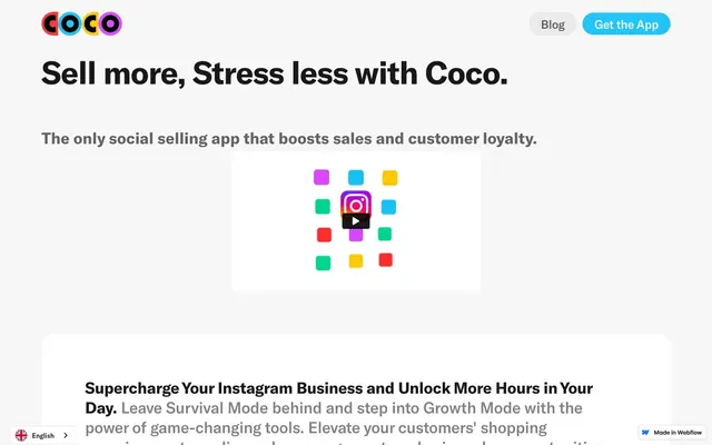
Preview image. Unlock full-res
Playful, energetic cards
Color palette
Primary action buttons, prominent informational cards, decorative accents — a vivid, inviting blue that feels approachable and active
Illustrative card backgrounds, accent sections — provides a punchy, playful contrast
Illustrative card backgrounds, accent sections — a bright, optimistic green for variety and emphasis
Page backgrounds, primary card surfaces, prominent text (on dark backgrounds)
Body text, secondary headings, border elements — a desaturated, readable text color
Primary headings, strong emphasis text, icon fills
Muted text, subtle borders, placeholder content
Tertiary text, subtle icons, decorative elements
Subtle button backgrounds, divider lines, disabled states — allows elements to recede
Typography
- Weights
- 500, 700
- Sizes
- 12px, 13px, 14px, 24px, 32px, 64px
- Line height
- 1, 1.13, 1.17, 1.25, 1.33, 1.43, 1.54
- Letter spacing
- -0.0200em at 64px, -0.0100em at 24px and 32px, normal otherwise
- Fallback
- Inter
All text elements, from headings to body text, maintaining a consistent, modern, and slightly condensed feel across the interface.
Spacing & shape
Components
Filled button with a Sky Blue (#23c4f7) background and Canvas White (#ffffff) text. Features fully rounded corners for a soft, friendly appearance. Padding: 8px vertical, 24px horizontal. Font: GT America, weight 500.
Outlined button with a transparent background, Ink Black (#000000) border, and Ghost Gray (#ebebeb) text. Features fully rounded corners. Padding: 8px vertical, 24px horizontal. Font: GT America, weight 500.
Basic card with Canvas White (#ffffff) background and 24px border-radius. No shadow. Inner padding of 40px on all sides.
Card with Sky Blue (#23c4f7) background and 24px border-radius. No shadow. Inner padding of 48px on all sides.
Card with Vivid Orchid (#da4dfd) background and 24px border-radius. No shadow. Inner padding of 48px on all sides (vertical) and 0px (horizontal).
Card with Fresh Mint (#00d797) background and 24px border-radius. No shadow. Inner padding of 48px on all sides.
Guidelines
- Prioritize Sky Blue (#23c4f7) for primary calls to action, maintaining its vividness against neutral backgrounds.
- Use 24px border-radius consistently for all card-like containers to reinforce the soft, approachable aesthetic.
- Employ GT America 700 (bold) for all main headings (32px, 64px) using Ink Black (#000000) or Canvas White (#ffffff) for strong contrast.
- Apply -0.0200em letter-spacing to display text (64px) and -0.0100em to subheading (24px) and heading (32px) text to ensure a compact, controlled typographic rhythm.
- Maintain generous 40px or 48px internal padding for cards to provide ample breathing room for content.
- Incorporate Vivid Orchid (#da4dfd) and Fresh Mint (#00d797) as accent backgrounds for cards to create visual variety and playful energy, ensuring text contrast remains legible.
- Do not introduce new border-radius values; stick to 24px for cards, 100px for buttons, 32px for images, and 3px for links.
- Avoid using multiple font families; all text should be GT America or its substitute.
- Do not add drop shadows to cards; the design relies on bold background colors and flat surfaces for visual hierarchy.
- Do not use dark backgrounds for entire sections, except when explicitly required for accent or specific content blocks; the theme is predominantly light.
- Avoid small, subtle text for calls to action; ensure action text uses GT America 500 and high contrast colors like Canvas White (#ffffff) on Sky Blue (#23c4f7).
About this system
ShowHide
Coco employs a vibrant, playful aesthetic with a strong emphasis on card-based layouts and bold accent colors. The design system layers bright, saturated hues onto a clean, spacious light background, creating an energetic and approachable feel. Typography is assertive and compact, reinforcing a sense of efficiency, while generously rounded corners on components soften the overall impression.
The page model is content-constrained, with sections centered and significant horizontal margins, but the exact `pageMaxWidth` value is not provided. The hero section features a prominent, full-width section with a dark header (branding + navigation) and a large, centered headline followed by subtext, and a central app-like illustration. Subsequent sections alternate between white and colored card backgrounds (Sky Blue, Vivid Orchid, Fresh Mint), typically presenting information in two-column text + image or illustration layouts. Vertical spacing between sections is generous and consistent, creating a spacious feel. Navigation is a simple top bar with branding on the left and primary actions (buttons) on the right.
The site uses a mix of abstract, geometric illustrations with vibrant, saturated colors (Vivid Orchid, Fresh Mint, Sky Blue) and product screenshots featuring app interfaces. Illustrations are flat, bold, and organic, often combining large colored shapes. Photography is minimal, focusing on app or social media screenshots. Icons are solid, simple, and monochrome, usually in Ink Black. Imagery serves primarily as decorative atmosphere and explanatory content, occupying significant visual space in card-like containers without overflowing.
Reminiscent of Canva, Mailchimp, Babbel.
# Coco — Style Reference
> Playful, energetic cards

**Theme:** light

**Site:** https://www.getcoco.com

Coco employs a vibrant, playful aesthetic with a strong emphasis on card-based layouts and bold accent colors. The design system layers bright, saturated hues onto a clean, spacious light background, creating an energetic and approachable feel. Typography is assertive and compact, reinforcing a sense of efficiency, while generously rounded corners on components soften the overall impression.

## Tokens — Colors

| Name | Value | Token | Role |
|------|------|------|------|
| Sky Blue | `#23c4f7` | `--color-sky-blue` | Primary action buttons, prominent informational cards, decorative accents — a vivid, inviting blue that feels approachable and active |
| Vivid Orchid | `#da4dfd` | `--color-vivid-orchid` | Illustrative card backgrounds, accent sections — provides a punchy, playful contrast |
| Fresh Mint | `#00d797` | `--color-fresh-mint` | Illustrative card backgrounds, accent sections — a bright, optimistic green for variety and emphasis |
| Canvas White | `#ffffff` | `--color-canvas-white` | Page backgrounds, primary card surfaces, prominent text (on dark backgrounds) |
| Slate Gray | `#636363` | `--color-slate-gray` | Body text, secondary headings, border elements — a desaturated, readable text color |
| Ink Black | `#000000` | `--color-ink-black` | Primary headings, strong emphasis text, icon fills |
| Medium Gray | `#808080` | `--color-medium-gray` | Muted text, subtle borders, placeholder content |
| Light Ash | `#aaadb0` | `--color-light-ash` | Tertiary text, subtle icons, decorative elements |
| Ghost Gray | `#ebebeb` | `--color-ghost-gray` | Subtle button backgrounds, divider lines, disabled states — allows elements to recede |

## Tokens — Typography

### GT America
- **Substitute:** Inter
- **Weights:** 500, 700
- **Sizes:** 12px, 13px, 14px, 24px, 32px, 64px
- **Line height:** 1, 1.13, 1.17, 1.25, 1.33, 1.43, 1.54
- **Letter spacing:** -0.0200em at 64px, -0.0100em at 24px and 32px, normal otherwise
- **Role:** All text elements, from headings to body text, maintaining a consistent, modern, and slightly condensed feel across the interface.

## Tokens — Type Scale

Perfect Fifth (1.5) from 14px base.

| Role | Size | Line height | Letter spacing |
|------|------|------|------|
| caption | 12px | 1.54 | — |
| body | 14px | 1.33 | — |
| subheading | 24px | 1.25 | -0.24px |
| heading | 32px | 1.17 | -0.32px |
| display | 64px | 1 | -1.28px |

## Tokens — Spacing

- **Section gap:** 48px
- **Card padding:** 40px
- **Element gap:** 8px

## Tokens — Radius

- **Buttons:** 100px
- **Cards:** 24px
- **Images:** 32px
- **links:** 3px

## Layout

The page model is content-constrained, with sections centered and significant horizontal margins, but the exact `pageMaxWidth` value is not provided. The hero section features a prominent, full-width section with a dark header (branding + navigation) and a large, centered headline followed by subtext, and a central app-like illustration. Subsequent sections alternate between white and colored card backgrounds (Sky Blue, Vivid Orchid, Fresh Mint), typically presenting information in two-column text + image or illustration layouts. Vertical spacing between sections is generous and consistent, creating a spacious feel. Navigation is a simple top bar with branding on the left and primary actions (buttons) on the right.

## Imagery

The site uses a mix of abstract, geometric illustrations with vibrant, saturated colors (Vivid Orchid, Fresh Mint, Sky Blue) and product screenshots featuring app interfaces. Illustrations are flat, bold, and organic, often combining large colored shapes. Photography is minimal, focusing on app or social media screenshots. Icons are solid, simple, and monochrome, usually in Ink Black. Imagery serves primarily as decorative atmosphere and explanatory content, occupying significant visual space in card-like containers without overflowing.

## Components

### Primary Action Button
*Call to action*

Filled button with a Sky Blue (#23c4f7) background and Canvas White (#ffffff) text. Features fully rounded corners for a soft, friendly appearance. Padding: 8px vertical, 24px horizontal. Font: GT America, weight 500.

### Secondary Ghost Button
*Supporting action*

Outlined button with a transparent background, Ink Black (#000000) border, and Ghost Gray (#ebebeb) text. Features fully rounded corners. Padding: 8px vertical, 24px horizontal. Font: GT America, weight 500.

### Informational Card
*Content container*

Basic card with Canvas White (#ffffff) background and 24px border-radius. No shadow. Inner padding of 40px on all sides.

### Sky Blue Feature Card
*Prominent feature display*

Card with Sky Blue (#23c4f7) background and 24px border-radius. No shadow. Inner padding of 48px on all sides.

### Orchid Feature Card
*Alternate feature display*

Card with Vivid Orchid (#da4dfd) background and 24px border-radius. No shadow. Inner padding of 48px on all sides (vertical) and 0px (horizontal).

### Mint Feature Card
*Alternate feature display*

Card with Fresh Mint (#00d797) background and 24px border-radius. No shadow. Inner padding of 48px on all sides.

## Guidelines

### Do

- Prioritize Sky Blue (#23c4f7) for primary calls to action, maintaining its vividness against neutral backgrounds.
- Use 24px border-radius consistently for all card-like containers to reinforce the soft, approachable aesthetic.
- Employ GT America 700 (bold) for all main headings (32px, 64px) using Ink Black (#000000) or Canvas White (#ffffff) for strong contrast.
- Apply -0.0200em letter-spacing to display text (64px) and -0.0100em to subheading (24px) and heading (32px) text to ensure a compact, controlled typographic rhythm.
- Maintain generous 40px or 48px internal padding for cards to provide ample breathing room for content.
- Incorporate Vivid Orchid (#da4dfd) and Fresh Mint (#00d797) as accent backgrounds for cards to create visual variety and playful energy, ensuring text contrast remains legible.

### Don't

- Do not introduce new border-radius values; stick to 24px for cards, 100px for buttons, 32px for images, and 3px for links.
- Avoid using multiple font families; all text should be GT America or its substitute.
- Do not add drop shadows to cards; the design relies on bold background colors and flat surfaces for visual hierarchy.
- Do not use dark backgrounds for entire sections, except when explicitly required for accent or specific content blocks; the theme is predominantly light.
- Avoid small, subtle text for calls to action; ensure action text uses GT America 500 and high contrast colors like Canvas White (#ffffff) on Sky Blue (#23c4f7).

## Agent Prompt Guide

Quick Color Reference:
text: #000000
background: #ffffff
border: #636363
accent: #da4dfd
primary action: #23c4f7 (filled action)

Example Component Prompts:
1. Create a Primary Action Button: #23c4f7 background, #000000 text, 9999px radius, compact pill padding. Use this filled treatment for the main CTA.
2. Create an Informational Card: Canvas White (#ffffff) background. 24px radius. 40px padding. Inside, a heading (Ink Black, GT America 700, 32px, lh 1.17, ls -0.32px) and body text (Slate Gray, GT America 500, 14px, lh 1.33).
More like this









Keep what you find
A free account saves references to boards and can send you a weekly email of picks based on what you save.
To see every result, go Pro.