Preview image. Unlock full-res
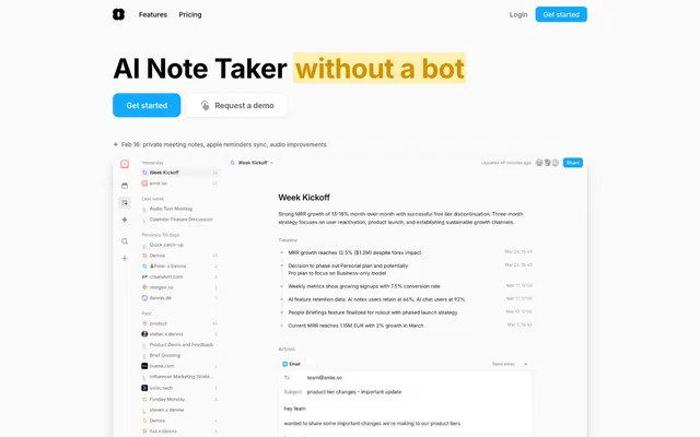
Sunlit productivity dashboard — a workspace where everything is white, flat, and purposeful, with one electric-blue switch that turns things on.
Color palette
CTA buttons ('Get started', 'Start free trial'), active nav highlight, brand accent — the sole chromatic action color on an otherwise monochrome page
Highlight backgrounds behind key phrases ('in just 7 days'), decorative gradient start — sky tint without saturation
Brand token from CSS custom properties; decorative accent for soft highlights
Observed in icon fill, icon color, other fill.
'Shareable Pages' feature label, tag borders for feature category chips
Text highlight background behind 'without a bot' in hero headline — single warm note in a cool palette
Page background, card surfaces, button fills for secondary actions
Alternate card background, subtle section differentiator
All UI borders — inputs, cards, dividers, icon rings — at 1px solid
Tag backgrounds ('Within 47 seconds:' highlight pill), section background bands
Secondary body text, nav labels, subtext
Placeholder text, icon strokes, de-emphasized UI labels
Primary headings, body text, icon fills
Dark bordered UI elements, elevated stroke contexts
Typography
- Weights
- 400, 500, 550, 600, 700
- Sizes
- 12px, 13px, 14px, 16px, 20px, 40px, 56px
- Line height
- 1, body: 1.50–1.75)
- Letter spacing
- -1.40px at 56px (-0.025em), -0.48px at 40px (-0.012em), normal at 16px and below
- Fallback
- Inter (Google Fonts)
Single typeface for all contexts — headlines to captions. Weight 700 at 56px for hero display, 600 at 40px for section headings, 400–500 for body and UI. The -0.025em tracking at large sizes (≈-1.4px at 56px, ≈-0.48px at 40px) compresses headlines into tight confident blocks. No decorative or serif counterpart — mono-typographic system.
- Weights
- 400
- Sizes
- 16px
- Line height
- 1.75
Inter var — detected in extracted data but not described by AI
Spacing & shape
Elevation
Components
Background #11a8ff, white text (#ffffff), 12px radius, 12px top/bottom padding, 28px left/right padding. Font Inter weight 600, 14px. No border. On dark sections, same treatment. The only filled chromatic button in the system.
Background #ffffff, text #5c5c5c, 12px radius, 12px/28px padding, 1px border #cdcdcd via shadow: rgba(0,0,0,0.06) 0px 0px 0px 1px. Inter weight 500, 14px. Sits beside primary CTA to create a binary choice.
Transparent background, text #000000 or #5c5c5c, no border radius (0px), 20px padding all sides. Inter weight 400–500, 14px. Appears in nav bar and inline contexts.
Transparent background, black text, 8px radius, 6px/10px padding. 1px border via #cdcdcd. Inter weight 500, 13px. Used inside the product screenshot cards.
Background #ffffff, 12px radius, no explicit padding (content determines), shadow: rgba(0,0,0,0.06) 0px 0px 0px 1px, rgba(0,0,0,0.06) 0px 1px 1px -0.5px, rgba(0,0,0,0.06) 0px 3px 3px -1.5px. The hairline shadow perimeter acts as a 1px border.
Background #fafafa, 12px radius, same 3-layer shadow as white card variant. Padding 0 — inner content uses its own spacing.
Background #ebebeb, 16px radius, 8px/16px padding, no shadow. Inter weight 600, 14–16px, text #000000. Used to isolate a key statistic or phrase visually.
9999px radius (full pill), background transparent or tinted per category, 1px border in category accent color (#01ca45 for Meeting Notes, #a050ff for Shareable Pages). Inter weight 500, 13px.
Background #fbefaf (amber), applied as backgroundColor to a span within the heading. No border, no radius. Creates a single warm contrast moment in an otherwise cool monochrome headline.
Background #ffffff with backdrop-filter blur(16px) when scrolled. Height ~60px, max-width 1200px centered. Logo left, nav links center (Inter 14px weight 500, color #000000), 'Login' as text link, 'Get started' as sky-blue filled button (12px radius, #11a8ff) right-aligned. Border-bottom 1px #cdcdcd.
Background #ffffff, radius 12px 12px 0px 0px (top-rounded, bottom flush), no shadow on outer container. Contains a full-bleed UI screenshot. Width spans most of content column. Topped with a grayscale(1) filter-treated inner UI, then full-color on hover/active.
Logos rendered at grayscale(1), horizontally scrolling via 'scrollX' animation (70s linear). No card container — logos sit directly on white page background. Inter caption 12px #5c5c5c for label text.
Guidelines
- Use #11a8ff exclusively for filled CTA buttons — no other UI element gets a chromatic fill color
- Apply letter-spacing -1.40px at 56px and -0.48px at 40px for all display and section headings using Inter
- Render card borders via 3-layer shadow stack (rgba(0,0,0,0.06) 0px 0px 0px 1px ...) rather than explicit border-color properties
- Use 9999px radius for all tag/pill/chip components and category labels; use 12px for cards and primary buttons
- Highlight key statistics or phrases inline with #fbefaf background at the span level — apply only once per hero to preserve impact
- Maintain grayscale(1) filter on partner/social proof logos and product screenshots in secondary contexts
- Keep category accent colors (#01ca45, #a050ff) to border-only usage on tags — never fill a UI surface with them
- Never add a second chromatic action color — #11a8ff is the only CTA fill; competing colors collapse the hierarchy
- Do not use weight below 400 for body text or above 700 for any text — the weight range 400–700 is the entire system
- Avoid explicit border declarations for cards — the shadow-as-border technique (0.06 opacity ring) is what keeps surfaces integrated, not separated
- Never use #a0a0a0 or #5c5c5c for headings — these are strictly secondary body and label colors
- Do not center-align body paragraphs — left-aligned text with 16px subheading baseline is the consistent content pattern
- Avoid gradients in UI components — the sky gradient (#cfeeff → #41baff) is decorative-only behind highlighted phrases, not a button or card treatment
- Do not apply backdrop-filter blur outside the navigation bar — it appears only on the sticky nav at scroll
About this system
ShowHide
Amie feels like a well-lit productivity workspace — bright white surfaces, almost clinical in their restraint, punctuated by a single electric sky-blue (#11a8ff) that fires only when action is required. The page is overwhelmingly neutral — 98% achromatic — making every chromatic moment (the amber highlight on 'without a bot', the green calendar icon, the violet tag) feel intentional rather than decorative. Inter at tight negative letter-spacing (-0.025em at display sizes) condenses headlines into confident blocks without weight extremes — weight 700 at 56px reads assertive but not aggressive. Cards use hairline 1px borders via layered near-invisible shadows rather than visible strokes, giving product UI previews the appearance of floating slightly off the page. The ghost 'Request a demo' button beside the filled CTA creates a paired choice architecture that recurs throughout the page.
Max-width ~1200px centered on a white full-bleed canvas. Navigation is a minimal top bar with logo + 3 links + 2 button actions. Hero section is split: left-aligned headline block with two CTAs stacked beside a large product screenshot card that extends below the fold. Below hero: logo strip (full-bleed scrolling), then a large centered headline section with tight paragraph text and a single CTA. Feature sections use alternating or stacked card grids — 2-3 column — with cards at equal height. No visible dividers between sections; spacing alone creates rhythm (estimated 80px section gaps). The page is long (~14000px) with many stacked feature blocks. Dense content areas use 8px element gaps; section transitions use 80px. Sticky nav collapses at scroll via backdrop blur.
Visuals are dominated by product UI screenshots — the app's own interface rendered at realistic scale inside rounded-top cards. No lifestyle photography, no people, no abstract 3D renders. Screenshots are full-color and detailed, showing the actual sidebar+content layout of the product. Outside screenshots, the page is pure text and UI components. The one decorative graphic element is a handwritten-style annotation ('These companies have 10+ Amie users') suggesting authenticity. Icons are filled and outlined variants in a single stroke weight, monochromatic except for the category-colored variants (Mint #01ca45, Violet #a050ff). Overall: text-dominant, image-sparse — the product screenshot IS the hero visual, not a supporting element.
Reminiscent of Notion, Linear, Superhuman, Cron (Notion Calendar), Craft.
# Amie — Style Reference
> Sunlit productivity dashboard — a workspace where everything is white, flat, and purposeful, with one electric-blue switch that turns things on.

**Theme:** light

**Site:** https://amie.so

Amie feels like a well-lit productivity workspace — bright white surfaces, almost clinical in their restraint, punctuated by a single electric sky-blue (#11a8ff) that fires only when action is required. The page is overwhelmingly neutral — 98% achromatic — making every chromatic moment (the amber highlight on 'without a bot', the green calendar icon, the violet tag) feel intentional rather than decorative. Inter at tight negative letter-spacing (-0.025em at display sizes) condenses headlines into confident blocks without weight extremes — weight 700 at 56px reads assertive but not aggressive. Cards use hairline 1px borders via layered near-invisible shadows rather than visible strokes, giving product UI previews the appearance of floating slightly off the page. The ghost 'Request a demo' button beside the filled CTA creates a paired choice architecture that recurs throughout the page.

## Tokens — Colors

| Name | Value | Token | Role |
|------|------|------|------|
| Sky Action | `#11a8ff` | `--color-sky-action` | CTA buttons ('Get started', 'Start free trial'), active nav highlight, brand accent — the sole chromatic action color on an otherwise monochrome page |
| Sky Pale | `#cfeeff` | `--color-sky-pale` | Highlight backgrounds behind key phrases ('in just 7 days'), decorative gradient start — sky tint without saturation |
| Amie Pink | `#f6a6a6` | `--color-amie-pink` | Brand token from CSS custom properties; decorative accent for soft highlights |
| Mint Active | `#01ca45` | `--color-mint-active` | Observed in icon fill, icon color, other fill. |
| Violet Tag | `#a050ff` | `--color-violet-tag` | 'Shareable Pages' feature label, tag borders for feature category chips |
| Amber Highlight | `#fbefaf` | `--color-amber-highlight` | Text highlight background behind 'without a bot' in hero headline — single warm note in a cool palette |
| Pure Canvas | `#ffffff` | `--color-pure-canvas` | Page background, card surfaces, button fills for secondary actions |
| Fog Surface | `#fafafa` | `--color-fog-surface` | Alternate card background, subtle section differentiator |
| Ash Border | `#cdcdcd` | `--color-ash-border` | All UI borders — inputs, cards, dividers, icon rings — at 1px solid |
| Stone Divider | `#ebebeb` | `--color-stone-divider` | Tag backgrounds ('Within 47 seconds:' highlight pill), section background bands |
| Graphite Body | `#5c5c5c` | `--color-graphite-body` | Secondary body text, nav labels, subtext |
| Silver Muted | `#a0a0a0` | `--color-silver-muted` | Placeholder text, icon strokes, de-emphasized UI labels |
| Ink Primary | `#000000` | `--color-ink-primary` | Primary headings, body text, icon fills |
| Charcoal Dark | `#2e2e2e` | `--color-charcoal-dark` | Dark bordered UI elements, elevated stroke contexts |

## Tokens — Typography

### Inter
- **Substitute:** Inter (Google Fonts)
- **Weights:** 400, 500, 550, 600, 700
- **Sizes:** 12px, 13px, 14px, 16px, 20px, 40px, 56px
- **Line height:** 1, body: 1.50–1.75)
- **Letter spacing:** -1.40px at 56px (-0.025em), -0.48px at 40px (-0.012em), normal at 16px and below
- **Role:** Single typeface for all contexts — headlines to captions. Weight 700 at 56px for hero display, 600 at 40px for section headings, 400–500 for body and UI. The -0.025em tracking at large sizes (≈-1.4px at 56px, ≈-0.48px at 40px) compresses headlines into tight confident blocks. No decorative or serif counterpart — mono-typographic system.

### Inter var
- **Weights:** 400
- **Sizes:** 16px
- **Line height:** 1.75
- **Role:** Inter var — detected in extracted data but not described by AI

## Tokens — Type Scale

Perfect Fifth (1.5) from 14px base.

| Role | Size | Line height | Letter spacing |
|------|------|------|------|
| caption | 12px | 1.5 | — |
| body | 14px | 1.75 | — |
| heading-sm | 20px | 1.4 | — |
| heading | 40px | 1.14 | -0.48px |
| display | 56px | 1 | -1.4px |

## Tokens — Spacing

- **Max width:** 1200px
- **Section gap:** 80px
- **Card padding:** 16px
- **Element gap:** 8px

## Tokens — Radius

- **Buttons:** 12px
- **Inputs:** 8px
- **Cards:** 12px
- **badges:** 4px
- **chips:** 9999px
- **modals:** 16px
- **tags:** 9999px

## Tokens — Elevation

- **Feature Card:** `rgba(0,0,0,0.06) 0px 0px 0px 1px, rgba(0,0,0,0.06) 0px 1px 1px -0.5px, rgba(0,0,0,0.06) 0px 3px 3px -1.5px`
- **Input Field (inset):** `rgba(0,0,0,0.05) 0px 0px 0px 1px inset`
- **Dropdown / Popover:** `rgba(0,0,0,0.1) 0px 1px 3px 0px, rgba(0,0,0,0.1) 0px 1px 2px -1px`

## Layout

Max-width ~1200px centered on a white full-bleed canvas. Navigation is a minimal top bar with logo + 3 links + 2 button actions. Hero section is split: left-aligned headline block with two CTAs stacked beside a large product screenshot card that extends below the fold. Below hero: logo strip (full-bleed scrolling), then a large centered headline section with tight paragraph text and a single CTA. Feature sections use alternating or stacked card grids — 2-3 column — with cards at equal height. No visible dividers between sections; spacing alone creates rhythm (estimated 80px section gaps). The page is long (~14000px) with many stacked feature blocks. Dense content areas use 8px element gaps; section transitions use 80px. Sticky nav collapses at scroll via backdrop blur.

## Imagery

Visuals are dominated by product UI screenshots — the app's own interface rendered at realistic scale inside rounded-top cards. No lifestyle photography, no people, no abstract 3D renders. Screenshots are full-color and detailed, showing the actual sidebar+content layout of the product. Outside screenshots, the page is pure text and UI components. The one decorative graphic element is a handwritten-style annotation ('These companies have 10+ Amie users') suggesting authenticity. Icons are filled and outlined variants in a single stroke weight, monochromatic except for the category-colored variants (Mint #01ca45, Violet #a050ff). Overall: text-dominant, image-sparse — the product screenshot IS the hero visual, not a supporting element.

## Components

### CTA Button Group

### Meeting Summary Card

### Stat Highlight Block

### Primary CTA Button
*Main conversion actions — 'Get started', 'Start free trial'*

Background #11a8ff, white text (#ffffff), 12px radius, 12px top/bottom padding, 28px left/right padding. Font Inter weight 600, 14px. No border. On dark sections, same treatment. The only filled chromatic button in the system.

### Ghost Secondary Button
*'Request a demo' and secondary actions paired beside primary CTA*

Background #ffffff, text #5c5c5c, 12px radius, 12px/28px padding, 1px border #cdcdcd via shadow: rgba(0,0,0,0.06) 0px 0px 0px 1px. Inter weight 500, 14px. Sits beside primary CTA to create a binary choice.

### Text / Nav Ghost Button
*Navigation links and low-priority actions like 'Features', 'Pricing', 'Login'*

Transparent background, text #000000 or #5c5c5c, no border radius (0px), 20px padding all sides. Inter weight 400–500, 14px. Appears in nav bar and inline contexts.

### Small Outline Button
*Compact in-UI actions within product preview areas*

Transparent background, black text, 8px radius, 6px/10px padding. 1px border via #cdcdcd. Inter weight 500, 13px. Used inside the product screenshot cards.

### Feature Card (White)
*Primary content cards showcasing product features*

Background #ffffff, 12px radius, no explicit padding (content determines), shadow: rgba(0,0,0,0.06) 0px 0px 0px 1px, rgba(0,0,0,0.06) 0px 1px 1px -0.5px, rgba(0,0,0,0.06) 0px 3px 3px -1.5px. The hairline shadow perimeter acts as a 1px border.

### Feature Card (Off-White)
*Secondary feature cards with subtle background differentiation*

Background #fafafa, 12px radius, same 3-layer shadow as white card variant. Padding 0 — inner content uses its own spacing.

### Highlight Chip
*Inline text emphasis tags like 'Within 47 seconds:' label*

Background #ebebeb, 16px radius, 8px/16px padding, no shadow. Inter weight 600, 14–16px, text #000000. Used to isolate a key statistic or phrase visually.

### Category Tag (Pill)
*Feature category labels — 'Meeting Notes', 'Shareable Pages'*

9999px radius (full pill), background transparent or tinted per category, 1px border in category accent color (#01ca45 for Meeting Notes, #a050ff for Shareable Pages). Inter weight 500, 13px.

### Inline Text Highlight
*Hero headline word-level emphasis like 'without a bot'*

Background #fbefaf (amber), applied as backgroundColor to a span within the heading. No border, no radius. Creates a single warm contrast moment in an otherwise cool monochrome headline.

### Navigation Bar
*Top-fixed site navigation*

Background #ffffff with backdrop-filter blur(16px) when scrolled. Height ~60px, max-width 1200px centered. Logo left, nav links center (Inter 14px weight 500, color #000000), 'Login' as text link, 'Get started' as sky-blue filled button (12px radius, #11a8ff) right-aligned. Border-bottom 1px #cdcdcd.

### Product Preview Card
*Large screenshot/demo card in hero section*

Background #ffffff, radius 12px 12px 0px 0px (top-rounded, bottom flush), no shadow on outer container. Contains a full-bleed UI screenshot. Width spans most of content column. Topped with a grayscale(1) filter-treated inner UI, then full-color on hover/active.

### Social Proof Logo Strip
*'Trusted by teams at' company logos*

Logos rendered at grayscale(1), horizontally scrolling via 'scrollX' animation (70s linear). No card container — logos sit directly on white page background. Inter caption 12px #5c5c5c for label text.

## Guidelines

### Do

- Use #11a8ff exclusively for filled CTA buttons — no other UI element gets a chromatic fill color
- Apply letter-spacing -1.40px at 56px and -0.48px at 40px for all display and section headings using Inter
- Render card borders via 3-layer shadow stack (rgba(0,0,0,0.06) 0px 0px 0px 1px ...) rather than explicit border-color properties
- Use 9999px radius for all tag/pill/chip components and category labels; use 12px for cards and primary buttons
- Highlight key statistics or phrases inline with #fbefaf background at the span level — apply only once per hero to preserve impact
- Maintain grayscale(1) filter on partner/social proof logos and product screenshots in secondary contexts
- Keep category accent colors (#01ca45, #a050ff) to border-only usage on tags — never fill a UI surface with them

### Don't

- Never add a second chromatic action color — #11a8ff is the only CTA fill; competing colors collapse the hierarchy
- Do not use weight below 400 for body text or above 700 for any text — the weight range 400–700 is the entire system
- Avoid explicit border declarations for cards — the shadow-as-border technique (0.06 opacity ring) is what keeps surfaces integrated, not separated
- Never use #a0a0a0 or #5c5c5c for headings — these are strictly secondary body and label colors
- Do not center-align body paragraphs — left-aligned text with 16px subheading baseline is the consistent content pattern
- Avoid gradients in UI components — the sky gradient (#cfeeff → #41baff) is decorative-only behind highlighted phrases, not a button or card treatment
- Do not apply backdrop-filter blur outside the navigation bar — it appears only on the sticky nav at scroll

## Agent Prompt Guide

**Quick Color Reference**
- text (primary): #000000
- text (secondary): #5c5c5c
- background: #ffffff
- border: #cdcdcd (1px solid)
- accent / highlight band: #ebebeb
- primary action: #11a8ff (filled action)

**Example Component Prompts**

1. **Hero Section**: White (#ffffff) background. Left-aligned headline at 56px Inter weight 700, #000000, letter-spacing -1.40px, line-height 1.00. Wrap one phrase (e.g. 'without a bot') in an inline span with background #fbefaf, no radius. Below headline: paired buttons — filled (#11a8ff background, #ffffff text, 12px radius, 12px/28px padding, Inter 600 14px) and ghost (#ffffff background, #5c5c5c text, 1px border #cdcdcd, same radius and padding). Right side: product screenshot inside a white card with radius 12px 12px 0px 0px and 3-layer shadow rgba(0,0,0,0.06).

2. **Feature Card Grid**: 3-column grid, 8px gap. Each card: background #ffffff, 12px radius, shadow rgba(0,0,0,0.06) 0px 0px 0px 1px, rgba(0,0,0,0.06) 0px 1px 1px -0.5px, rgba(0,0,0,0.06) 0px 3px 3px -1.5px. Card heading Inter 20px weight 600 #000000. Body text Inter 14px weight 400 #5c5c5c, line-height 1.75.

3. **Navigation Bar**: White background, backdrop-filter blur(16px), 1px bottom border #cdcdcd. Logo (16px square icon) left. Center: 'Features' and 'Pricing' as transparent buttons, Inter 14px weight 500, #000000, 0px radius, 20px padding. Right: 'Login' text link #000000, then 'Get started' button #11a8ff fill, #ffffff text, 12px radius, 12px/28px padding.

4. **Category Tag Pill**: Full pill radius 9999px, transparent background, 1px border in category color (#01ca45 for Meeting Notes, #a050ff for Shareable Pages). Text in matching color, Inter 13px weight 500, 6px/12px padding.

5. **Section Stat Highlight**: Centered heading at 40px Inter weight 700 #000000 letter-spacing -0.48px. Wrap leading stat phrase in a span with background #ebebeb, 16px radius, 8px/16px padding. Rest of headline plain black. Single 'Get started' button (#11a8ff, 12px radius) below at 24px margin-top.

## Gradient System

Two gradients, both sky-blue family, used decoratively only:
1. **Sky Wash**: linear-gradient(to right top, #cfeeff, #41baff) — used as background tint behind highlighted phrases or feature sections. Never on buttons or cards.
2. **Blue Depth**: linear-gradient(to right top, #11a8ff, #41baff) — denser sky gradient for branded decorative blocks. Both share the same directional angle (top-right). Do not introduce gradients in other hue families.
More like this








Keep what you find
A free account saves references to boards and can send you a weekly email of picks based on what you save.
To see every result, go Pro.