Preview image. Unlock full-res
Monochrome starkness; an uncompromising canvas of text and light.
Color palette
Hairline borders, dividers, input outlines, and card edges on light surfaces. Do not promote it to the primary CTA color
Primary text color, background for inverse sections, and the dominant cursor character. It provides unflinching contrast against Canvas White
Typography
- Weights
- 400
- Sizes
- 14px, 16px, 40px, 64px
- Line height
- 1, 1.25
- Letter spacing
- 0.0400em
- Fallback
- Arial
The sole typeface, used for all textual content from headings to body text. Its neutral, legible character perfectly supports the site's spartan aesthetic, with varying sizes defining hierarchy through scale alone.
Spacing & shape
Components
Rendered as white text on a transparent background, with a subtle 1px white border on hover/focus. Uses Helvetica LT, weight 400, no explicit padding, and 0px border-radius, contributing to an understated interaction style.
Large text using Helvetica LT, weight 400, in Pitch Black. Sizes include 40px and 64px, with line heights tuned for compact displays. No additional styling, relying purely on size and weight for impact.
Helvetica LT, weight 400, in Pitch Black on Canvas White. Rendered at 14px or 16px, with a line height of 1.25. Maintains high legibility within the monochrome design.
Guidelines
- Prioritize Canvas White (#ffffff) as the dominant background color for most sections, establishing a high-contrast foundation.
- Use Pitch Black (#000000) for all text and as the background for inverted sections (e.g., hero section).
- Implement Helvetica LT, weight 400, for all typographic needs, varying only the font size to create hierarchy.
- Apply a consistent letter-spacing of 0.0400em to all Helvetica LT text to maintain its defined character.
- Maintain a default border-radius of 0px for all elements, reinforcing the sharp, unadorned aesthetic.
- Utilize 72px as the standard vertical spacing between major page sections.
- Define interactive elements such as links and buttons with a transparent background, white text, and a 1px white border on interaction states to preserve the minimalist presentation.
- Avoid the introduction of any chromatic colors; the palette is strictly monochrome.
- Do not use any shadows or gradients for elevation or decorative purposes.
- Refrain from using border-radius values other than 0px.
- Do not introduce additional font families or weights beyond Helvetica LT 400.
- Avoid using decorative imagery or complex graphic elements; visual focus should remain on typography and direct contrast.
- Do not add any padding to interactive link or button elements for a minimal, integrated appearance.
About this system
ShowHide
Consumedinkey's design system emanates a stark, minimalist severity, prioritizing content with an absolute monochrome palette. Typography, the primary visual element, is rendered in high-contrast against expansive, unblemished surfaces. The visual language is ascetic, focusing on direct communication and an almost complete absence of decorative components or background textures.
The page adheres to a full-bleed layout, horizontally extending content to the viewport edges without a dedicated `pageMaxWidth`. Sections are delineated by shifts in background color (either Canvas White or Pitch Black) and a generous vertical `sectionGap` of 72px. The hero section often features oversized, centered typography. Content arrangement is primarily composed of large, single-column text blocks or simple two-column layouts, usually text-dominant. The navigation consists of discreet, non-intrusive `Ghost Link Buttons` positioned at the top corners of the page, blending into the background until hovered.
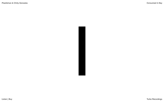
This site features a complete absence of conventional imagery. Instead, it relies on typography and the stark contrast of its monochrome palette to convey information and mood. The presence of a prominent black vertical bar (like a text cursor) in the hero section acts as a minimalist, abstract visual anchor. Icons are not present on the site, reinforcing its text-dominant, utilitarian approach. Density is extremely low, with ample negative space.
Reminiscent of A24 FILMS, Massimo Vignelli's website, The Paragraphs (a design agency).
# Consumedinkey — Style Reference
> Monochrome starkness; an uncompromising canvas of text and light.

**Theme:** light

**Site:** https://www.consumedinkey.com

Consumedinkey's design system emanates a stark, minimalist severity, prioritizing content with an absolute monochrome palette. Typography, the primary visual element, is rendered in high-contrast against expansive, unblemished surfaces. The visual language is ascetic, focusing on direct communication and an almost complete absence of decorative components or background textures.

## Tokens — Colors

| Name | Value | Token | Role |
|------|------|------|------|
| Canvas White | `#ffffff` | `--color-canvas-white` | Hairline borders, dividers, input outlines, and card edges on light surfaces. Do not promote it to the primary CTA color |
| Pitch Black | `#000000` | `--color-pitch-black` | Primary text color, background for inverse sections, and the dominant cursor character. It provides unflinching contrast against Canvas White |

## Tokens — Typography

### Helvetica LT
- **Substitute:** Arial
- **Weights:** 400
- **Sizes:** 14px, 16px, 40px, 64px
- **Line height:** 1, 1.25
- **Letter spacing:** 0.0400em
- **Role:** The sole typeface, used for all textual content from headings to body text. Its neutral, legible character perfectly supports the site's spartan aesthetic, with varying sizes defining hierarchy through scale alone.

## Tokens — Type Scale

| Role | Size | Line height | Letter spacing |
|------|------|------|------|
| caption | 14px | 1.25 | 0.56px |
| body | 16px | 1.25 | 0.64px |
| heading | 40px | 1 | 1.6px |
| display | 64px | 1 | 2.56px |

## Tokens — Spacing

- **Section gap:** 72px
- **Card padding:** 16px
- **Element gap:** 16px

## Tokens — Radius

- **Default:** 0px

## Layout

The page adheres to a full-bleed layout, horizontally extending content to the viewport edges without a dedicated `pageMaxWidth`. Sections are delineated by shifts in background color (either Canvas White or Pitch Black) and a generous vertical `sectionGap` of 72px. The hero section often features oversized, centered typography. Content arrangement is primarily composed of large, single-column text blocks or simple two-column layouts, usually text-dominant. The navigation consists of discreet, non-intrusive `Ghost Link Buttons` positioned at the top corners of the page, blending into the background until hovered.

## Imagery

This site features a complete absence of conventional imagery. Instead, it relies on typography and the stark contrast of its monochrome palette to convey information and mood. The presence of a prominent black vertical bar (like a text cursor) in the hero section acts as a minimalist, abstract visual anchor. Icons are not present on the site, reinforcing its text-dominant, utilitarian approach. Density is extremely low, with ample negative space.

## Components

### Ghost Link Button
*Interactive navigation and calls-to-action.*

Rendered as white text on a transparent background, with a subtle 1px white border on hover/focus. Uses Helvetica LT, weight 400, no explicit padding, and 0px border-radius, contributing to an understated interaction style.

### Primary Headline
*Section titles and prominent textual emphasis.*

Large text using Helvetica LT, weight 400, in Pitch Black. Sizes include 40px and 64px, with line heights tuned for compact displays. No additional styling, relying purely on size and weight for impact.

### Body Text
*General content and explanatory paragraphs.*

Helvetica LT, weight 400, in Pitch Black on Canvas White. Rendered at 14px or 16px, with a line height of 1.25. Maintains high legibility within the monochrome design.

## Guidelines

### Do

- Prioritize Canvas White (#ffffff) as the dominant background color for most sections, establishing a high-contrast foundation.
- Use Pitch Black (#000000) for all text and as the background for inverted sections (e.g., hero section).
- Implement Helvetica LT, weight 400, for all typographic needs, varying only the font size to create hierarchy.
- Apply a consistent letter-spacing of 0.0400em to all Helvetica LT text to maintain its defined character.
- Maintain a default border-radius of 0px for all elements, reinforcing the sharp, unadorned aesthetic.
- Utilize 72px as the standard vertical spacing between major page sections.
- Define interactive elements such as links and buttons with a transparent background, white text, and a 1px white border on interaction states to preserve the minimalist presentation.

### Don't

- Avoid the introduction of any chromatic colors; the palette is strictly monochrome.
- Do not use any shadows or gradients for elevation or decorative purposes.
- Refrain from using border-radius values other than 0px.
- Do not introduce additional font families or weights beyond Helvetica LT 400.
- Avoid using decorative imagery or complex graphic elements; visual focus should remain on typography and direct contrast.
- Do not add any padding to interactive link or button elements for a minimal, integrated appearance.

## Agent Prompt Guide

Quick Color Reference:
text: #000000
background: #ffffff
border: #ffffff
accent: no distinct accent color
primary action: no distinct CTA color

Example Component Prompts:
1. Create a full-bleed hero section: background #000000. Display text 'Consumed In Key' at 64px Helvetica LT weight 400, #ffffff, letter-spacing 2.56px, centered horizontally and vertically.
2. Create a body text section: background #ffffff. Body text 'Turbo Recordings presents its grandest achievement yet...' at 16px Helvetica LT weight 400, #000000, letter-spacing 0.64px. Set padding to 16px.
3. Create a navigation element for the top right: a Ghost Link Button, text 'Listen | Buy' at 14px Helvetica LT weight 400, #ffffff, letter-spacing 0.56px. Provide a 1px #ffffff border on hover. No padding.
More like this






Keep what you find
A free account saves references to boards and can send you a weekly email of picks based on what you save.
To see every result, go Pro.