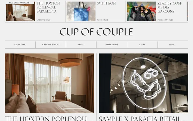
Preview image. Unlock full-res
Monochrome Editorial Canvas
Color palette
Dark borders and separators for elevated surfaces and inverted UI. Do not promote it to the primary CTA color
Neutral form states, badge text, and quiet UI feedback where color should stay understated. Do not promote it to the primary CTA color
Page background, card surfaces, and general content backdrops
Very thin structural borders in navigation elements
Typography
- Weights
- 400
- Sizes
- 10px, 16px
- Line height
- 1, 1.05, 1.2
- Fallback
- Franklin Gothic Book
Primary body text, navigation links, and smaller information captions. Its clean sans-serif form provides legibility against the more ornamental display fonts.
- Weights
- 400
- Sizes
- 17px, 28px
- Line height
- 1, 1.2
- Fallback
- Garamond
Supporting text, larger body paragraphs, and article titles. The classic serif adds a touch of traditional elegance.
- Weights
- 400
- Sizes
- 25px, 32px, 40px, 48px
- Line height
- 1.2
- Fallback
- Perpetua Titling MT
Primary section headings and prominent informational labels. Its refined, all-caps serif style evokes a luxury magazine masthead.
- Weights
- 400
- Sizes
- 72px
- Line height
- 1.2
- Fallback
- UnifrakturMaguntia
Exclusive for the brand's main title, 'Cup of Couple', serving as a distinct visual logo-type. This highly stylized font is a unique brand identifier.
Spacing & shape
Components
Text in Ink (#303030), no background, no border by default. Features a `1px` solid Ink (#303030) bottom border on interaction, but padding is `0px`.
Background is Canvas White (#f0f0f0), with `12px` vertical and `10px` horizontal padding. Features a `1px` solid Ash Gray (#808080) border around its perimeter. Radius is `0px`.
Transparent background, Ink (#303030) text. Features a `1px` solid Ash Gray (#808080) bottom border. Radius is `0px`.
Uses PerpetuaTitlingMT at `25px` height, Ink (#303030), normal letter spacing, with `20px` top padding and `60px` right padding.
Guidelines
- Prioritize ITCFranklinGothicStdBook and Garamond for readability in body copy and detailed information.
- Use PerpetuaTitlingMT for all primary headings and titles to establish a refined editorial tone.
- Apply Canvas White (#f0f0f0) as the dominant background color for all surfaces and sections.
- Utilize 0px border-radius for all interface elements including buttons, cards, and inputs, maintaining a sharp, angular aesthetic.
- Delimit content and sections using a `1px` solid border in Ash Gray (#808080) or Ink (#303030), avoiding heavy visual dividers.
- Maintain generous `36px` vertical spacing between major page sections to ensure airiness and reduce visual clutter.
- Employ the DisplaceKC font exclusively for the main brand logo 'Cup of Couple' — it should not be used for any other text.
- Do not introduce any chromatic colors for interactive elements; all accents should be within the achromatic palette.
- Avoid using drop shadows or any form of elevation; the design system mandates a flat, two-dimensional aesthetic.
- Do not use highly decorative UI elements or complex gradients, as the system relies on simplicity and typography.
- Do not deviate from the specified font families; their distinct characteristics are critical to brand identity.
- Never use rounded corners on any UI elements; the system's aesthetic is defined by sharp, precise edges.
- Avoid dense information blocks; instead, use ample padding and single-column layouts for featured content.
About this system
ShowHide
Cup of Couple presents a sophisticated and minimalist editorial aesthetic, mimicking a high-fashion magazine layout with a stark, achromatic palette. Typography reigns supreme, utilizing distinct serif and sans-serif fonts to establish clear visual hierarchy and a refined, curated feel. The design relies on generous white space and subtle hairline borders to delineate content, maintaining an airy lightness without heavy visual anchors. Surfaces are flat and un-elevated, emphasizing content over decorative UI elements.
The page structure is primarily max-width contained, but hero sections extend full-bleed for visual impact. The hero often features a large image with a centered, stylized brand title. Content sections typically follow a vertical rhythm of alternating two-column layouts (image-left/text-right or vice versa) or card grids, maintaining consistent vertical spacing. Navigation is a persistent top bar featuring ghosted text links and a minimal search input, with the brand name 'Cup of Couple' serving as the central identifier.
The imagery leans heavily on high-quality, aspirational photography with a slightly desaturated, film-like quality. Photos are presented within contained, rectangular frames with raw edges, often featuring close-ups of lifestyle scenes, product details, or evocative interior shots. Imagery serves both decorative atmosphere and explanatory content, showcasing product or experience in a sophisticated, unadorned manner. The density is moderate, with images forming large, impactful blocks balanced by significant whitespace.
Reminiscent of AIGA Journal, The Gentlewoman, Vogue online, Archiweb.
# Cup of Couple — Style Reference
> Monochrome Editorial Canvas

**Theme:** light

**Site:** https://www.cupofcouple.com

Cup of Couple presents a sophisticated and minimalist editorial aesthetic, mimicking a high-fashion magazine layout with a stark, achromatic palette. Typography reigns supreme, utilizing distinct serif and sans-serif fonts to establish clear visual hierarchy and a refined, curated feel. The design relies on generous white space and subtle hairline borders to delineate content, maintaining an airy lightness without heavy visual anchors. Surfaces are flat and un-elevated, emphasizing content over decorative UI elements.

## Tokens — Colors

| Name | Value | Token | Role |
|------|------|------|------|
| Ink | `#303030` | `--color-ink` | Dark borders and separators for elevated surfaces and inverted UI. Do not promote it to the primary CTA color |
| Ash Gray | `#808080` | `--color-ash-gray` | Neutral form states, badge text, and quiet UI feedback where color should stay understated. Do not promote it to the primary CTA color |
| Canvas White | `#f0f0f0` | `--color-canvas-white` | Page background, card surfaces, and general content backdrops |
| Subtle Gray | `#767676` | `--color-subtle-gray` | Very thin structural borders in navigation elements |

## Tokens — Typography

### ITCFranklinGothicStdBook
- **Substitute:** Franklin Gothic Book
- **Weights:** 400
- **Sizes:** 10px, 16px
- **Line height:** 1, 1.05, 1.2
- **Role:** Primary body text, navigation links, and smaller information captions. Its clean sans-serif form provides legibility against the more ornamental display fonts.

### Garamond
- **Substitute:** Garamond
- **Weights:** 400
- **Sizes:** 17px, 28px
- **Line height:** 1, 1.2
- **Role:** Supporting text, larger body paragraphs, and article titles. The classic serif adds a touch of traditional elegance.

### PerpetuaTitlingMT
- **Substitute:** Perpetua Titling MT
- **Weights:** 400
- **Sizes:** 25px, 32px, 40px, 48px
- **Line height:** 1.2
- **Role:** Primary section headings and prominent informational labels. Its refined, all-caps serif style evokes a luxury magazine masthead.

### DisplaceKC
- **Substitute:** UnifrakturMaguntia
- **Weights:** 400
- **Sizes:** 72px
- **Line height:** 1.2
- **Role:** Exclusive for the brand's main title, 'Cup of Couple', serving as a distinct visual logo-type. This highly stylized font is a unique brand identifier.

## Tokens — Type Scale

Perfect Fifth (1.5) from 10px base.

| Role | Size | Line height | Letter spacing |
|------|------|------|------|
| caption | 10px | 1 | — |
| heading-sm | 25px | 1.2 | — |
| heading | 32px | 1.2 | — |
| heading-lg | 40px | 1.2 | — |
| display | 48px | 1.2 | — |

## Tokens — Spacing

- **Section gap:** 36px
- **Card padding:** 12px
- **Element gap:** 12px

## Tokens — Radius

- **Buttons:** 0px
- **Inputs:** 0px
- **Cards:** 0px

## Layout

The page structure is primarily max-width contained, but hero sections extend full-bleed for visual impact. The hero often features a large image with a centered, stylized brand title. Content sections typically follow a vertical rhythm of alternating two-column layouts (image-left/text-right or vice versa) or card grids, maintaining consistent vertical spacing. Navigation is a persistent top bar featuring ghosted text links and a minimal search input, with the brand name 'Cup of Couple' serving as the central identifier.

## Imagery

The imagery leans heavily on high-quality, aspirational photography with a slightly desaturated, film-like quality. Photos are presented within contained, rectangular frames with raw edges, often featuring close-ups of lifestyle scenes, product details, or evocative interior shots. Imagery serves both decorative atmosphere and explanatory content, showcasing product or experience in a sophisticated, unadorned manner. The density is moderate, with images forming large, impactful blocks balanced by significant whitespace.

## Components

### Ghost Navigation Button
*Navigation and interactive links with a subtle underline effect on hover/active.*

Text in Ink (#303030), no background, no border by default. Features a `1px` solid Ink (#303030) bottom border on interaction, but padding is `0px`.

### Content Grid Card
*Container for visual diary and project entries.*

Background is Canvas White (#f0f0f0), with `12px` vertical and `10px` horizontal padding. Features a `1px` solid Ash Gray (#808080) border around its perimeter. Radius is `0px`.

### Minimal Search Input
*Search field with a discreet bottom border.*

Transparent background, Ink (#303030) text. Features a `1px` solid Ash Gray (#808080) bottom border. Radius is `0px`.

### Featured Project Header
*Header for prominent content sections.*

Uses PerpetuaTitlingMT at `25px` height, Ink (#303030), normal letter spacing, with `20px` top padding and `60px` right padding.

## Guidelines

### Do

- Prioritize ITCFranklinGothicStdBook and Garamond for readability in body copy and detailed information.
- Use PerpetuaTitlingMT for all primary headings and titles to establish a refined editorial tone.
- Apply Canvas White (#f0f0f0) as the dominant background color for all surfaces and sections.
- Utilize 0px border-radius for all interface elements including buttons, cards, and inputs, maintaining a sharp, angular aesthetic.
- Delimit content and sections using a `1px` solid border in Ash Gray (#808080) or Ink (#303030), avoiding heavy visual dividers.
- Maintain generous `36px` vertical spacing between major page sections to ensure airiness and reduce visual clutter.
- Employ the DisplaceKC font exclusively for the main brand logo 'Cup of Couple' — it should not be used for any other text.

### Don't

- Do not introduce any chromatic colors for interactive elements; all accents should be within the achromatic palette.
- Avoid using drop shadows or any form of elevation; the design system mandates a flat, two-dimensional aesthetic.
- Do not use highly decorative UI elements or complex gradients, as the system relies on simplicity and typography.
- Do not deviate from the specified font families; their distinct characteristics are critical to brand identity.
- Never use rounded corners on any UI elements; the system's aesthetic is defined by sharp, precise edges.
- Avoid dense information blocks; instead, use ample padding and single-column layouts for featured content.

## Agent Prompt Guide

Quick Color Reference:
text: #303030
background: #f0f0f0
border: #808080
accent: no distinct accent color
primary action: no distinct CTA color

Example Component Prompts:
1. Create a `Ghost Navigation Button`: 'Workshops' text using ITCFranklinGothicStdBook weight 400, size 16px, line height 1.0, color Ink (#303030), with no background or border. On hover, apply a `1px` solid Ink (#303030) bottom border.
2. Create a `Content Grid Card`: `400px` wide, `300px` tall. Background Canvas White (#f0f0f0). `12px` top/bottom padding, `10px` left/right padding. Border `1px` solid Ash Gray (#808080). Inside, add a placeholder image and a caption using ITCFranklinGothicStdBook weight 400, size 10px, line height 1.0, color Ink (#303030).
3. Create a `Minimal Search Input`: A transparent input field for 'Search...', text in Garamond weight 400, size 17px, line height 1.0, color Ink (#303030). Apply a `1px` solid Ash Gray (#808080) bottom border.
4. Design a `Featured Project Header`: Text 'FEATURED PROJECTS' using PerpetuaTitlingMT weight 400, size 25px, line height 1.2, color Ink (#303030). Add `20px` top padding and `60px` right padding.
More like this






Keep what you find
A free account saves references to boards and can send you a weekly email of picks based on what you save.
To see every result, go Pro.