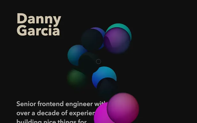
Preview image. Unlock full-res
Midnight gradient canvas
Color palette
Links, interactive elements, outlined action borders — a warm accent against the dark neutrals
Decorative background gradients for sections and cards — creating visual depth and soft light sources
Abstract object accents and background blur effects, adding vivid but muted color
Abstract object accents and background blur effects, adding vivid but muted color
Page background, primary canvas
Card surfaces, subtle elevation above the canvas
Primary text, headings, general content
Typography
- Weights
- 400, 600, 700
- Sizes
- 16px, 22px, 24px, 32px, 48px, 104px
- Line height
- 0.8, 1.4, 1.5
- Letter spacing
- normal
- Fallback
- system-ui, sans-serif
Primary typeface for all content. Its presence across all sizes and weights emphasizes a cohesive and solid textual voice. Larger headlines often use lower line height to appear as a dense block, while body text uses a generous line height for readability.
Spacing & shape
Components
Background color rgba(29, 35, 21, 0.5) with backdrop filters saturate(1.8) blur(60px), and often an underlying gradient like linear-gradient(90deg, #30263f 0%, #30263f 100%). Uses asymmetric top-left/top-right border-radius 96px for visual distinction, or no radius. Padding: 48px top, 0px sides, 96px bottom. No box-shadow.
Text color Warm Parchment (#d1c5ad) at normal weight. Underlined by default, with cursor hover revealing interaction.
Avenir Next, weight 400 or 600, color Ash Gray (#c8c8c8), size 24px or 32px. Set with 48px top and 24px bottom margins.
Avenir Next, weight 700, color Ash Gray (#c8c8c8), size 104px, line-height 0.8. Creates a dense visual block of text.
Avenir Next, weight 400, color Ash Gray (#c8c8c8), size 22px, line-height 1.5. Uses 24px top and bottom margins for separation.
Guidelines
- Prioritize Ebon Night (#10120d) for page backgrounds and Deep Forest (#161912) for subtly elevated card surfaces.
- Use Ash Gray (#c8c8c8) for all primary static text, ensuring high contrast and readability on dark backgrounds.
- Apply Warm Parchment (#d1c5ad) exclusively for interactive links and explicit action borders, using an outlined style.
- Utilize Avenir Next for all typography, adjusting weights (400, 600, 700) and sizes (16-104px) to establish hierarchy.
- Maintain generous section and card spacing, with 48px for `cardPadding` and `sectionGap`, and 24px for `elementGap`.
- Incorporate the gradient backdrops and blurred orb accents to add diffuse color and depth, especially behind cards and hero content.
- Apply asymmetric border-radius (e.g., 0px 0px 96px 96px) to cards where visual distinction is desired, otherwise use 0px.
- Avoid using harsh, solid colors for backgrounds; lean into soft, dark neutrals and gradients for visual depth.
- Do not introduce sharp shadows or overly defined borders, as the system relies on gradients and slight color shifts for depth.
- Refrain from using Warm Parchment (#d1c5ad) as a solid background fill for buttons; it's reserved for outlined actions and links.
- Do not deviate from the Avenir Next typeface; maintain its distinct character and range of weights.
- Avoid tight spacing; maintain the spacious and breathable layout with minimum 24px between elements and 48px for larger sections.
- Do not use highly saturated, non-gradient colors for large blocks; vivid hues are for subtle accents and blurred effects.
- Do not use generic, symmetrical radii on cards, except for explicit no-radius cases; embrace the distinctive larger asymmetric radii for character.
About this system
ShowHide
Danny Garcia's portfolio uses a dark, atmospheric canvas with subtle surface variations and vibrant, ethereal gradients. Typography is confident and substantial on dark backdrops, using a limited color palette featuring a warm gray for primary text and a distinct golden-beige for interactive elements. The aesthetic combines a sense of digital craftsmanship with a touch of modern artistry, allowing gradients to provide visual interest and surface hierarchy rather than heavy shadows or borders.
The page primarily uses a full-bleed layout, allowing background gradients and blurred orb effects to extend across the width. Content sections maintain consistent vertical spacing of 48px, with alternating text-left/text-right arrangements and centered stacks for headings and short descriptions. There's a strong emphasis on spaciousness, with ample negative space around content blocks. Navigation is minimal, likely integrated into the overall flow or accessed via implicit interactive elements, rather than a fixed header bar. The hero section features a prominent, centered headline over abstract, full-bleed gradient graphics.
This site features abstract, vibrant 3D orbs and diffused gradient effects that provide visual interest and depth against the dark background. The orbs are multi-colored (e.g., from #2a5482 to #f74577, or #40e4f7 to #db1885) and appear as blurred, textural elements that break the monotony of the dark canvas without being distracting. These graphics serve a decorative and atmospheric role, adding a sense of modern artistry and dynamism. Imagery is medium density, often supporting textual content rather than dominating it, with a focus on color and abstract form.
Reminiscent of Figma, Linear, Arc Browser, Stripe.
# Danny Garcia — Style Reference
> Midnight gradient canvas

**Theme:** dark

**Site:** https://danny-garcia.com

Danny Garcia's portfolio uses a dark, atmospheric canvas with subtle surface variations and vibrant, ethereal gradients. Typography is confident and substantial on dark backdrops, using a limited color palette featuring a warm gray for primary text and a distinct golden-beige for interactive elements. The aesthetic combines a sense of digital craftsmanship with a touch of modern artistry, allowing gradients to provide visual interest and surface hierarchy rather than heavy shadows or borders.

## Tokens — Colors

| Name | Value | Token | Role |
|------|------|------|------|
| Warm Parchment | `#d1c5ad` | `--color-warm-parchment` | Links, interactive elements, outlined action borders — a warm accent against the dark neutrals |
| Twilight Gradient | `#30263f` | `--color-twilight-gradient` | Decorative background gradients for sections and cards — creating visual depth and soft light sources |
| Chromatic Orb Gradient 1 | `#2a5482` | `--color-chromatic-orb-gradient-1` | Abstract object accents and background blur effects, adding vivid but muted color |
| Chromatic Orb Gradient 2 | `#40e4f7` | `--color-chromatic-orb-gradient-2` | Abstract object accents and background blur effects, adding vivid but muted color |
| Ebon Night | `#10120d` | `--color-ebon-night` | Page background, primary canvas |
| Deep Forest | `#161912` | `--color-deep-forest` | Card surfaces, subtle elevation above the canvas |
| Ash Gray | `#c8c8c8` | `--color-ash-gray` | Primary text, headings, general content |

## Tokens — Typography

### Avenir Next
- **Substitute:** system-ui, sans-serif
- **Weights:** 400, 600, 700
- **Sizes:** 16px, 22px, 24px, 32px, 48px, 104px
- **Line height:** 0.8, 1.4, 1.5
- **Letter spacing:** normal
- **Role:** Primary typeface for all content. Its presence across all sizes and weights emphasizes a cohesive and solid textual voice. Larger headlines often use lower line height to appear as a dense block, while body text uses a generous line height for readability.

## Tokens — Type Scale

| Role | Size | Line height | Letter spacing |
|------|------|------|------|
| body-sm | 16px | 1.5 | — |
| body | 22px | 1.5 | — |
| subheading | 24px | 1.4 | — |
| heading | 32px | 1.4 | — |
| heading-lg | 48px | 0.8 | — |
| display | 104px | 0.8 | — |

## Tokens — Spacing

- **Section gap:** 48px
- **Card padding:** 48px
- **Element gap:** 24px

## Tokens — Radius

- **Cards:** 96px 96px 96px 96px

## Layout

The page primarily uses a full-bleed layout, allowing background gradients and blurred orb effects to extend across the width. Content sections maintain consistent vertical spacing of 48px, with alternating text-left/text-right arrangements and centered stacks for headings and short descriptions. There's a strong emphasis on spaciousness, with ample negative space around content blocks. Navigation is minimal, likely integrated into the overall flow or accessed via implicit interactive elements, rather than a fixed header bar. The hero section features a prominent, centered headline over abstract, full-bleed gradient graphics.

## Imagery

This site features abstract, vibrant 3D orbs and diffused gradient effects that provide visual interest and depth against the dark background. The orbs are multi-colored (e.g., from #2a5482 to #f74577, or #40e4f7 to #db1885) and appear as blurred, textural elements that break the monotony of the dark canvas without being distracting. These graphics serve a decorative and atmospheric role, adding a sense of modern artistry and dynamism. Imagery is medium density, often supporting textual content rather than dominating it, with a focus on color and abstract form.

## Components

### Card with Gradient Backdrop
*Content container with an ethereal gradient background.*

Background color rgba(29, 35, 21, 0.5) with backdrop filters saturate(1.8) blur(60px), and often an underlying gradient like linear-gradient(90deg, #30263f 0%, #30263f 100%). Uses asymmetric top-left/top-right border-radius 96px for visual distinction, or no radius. Padding: 48px top, 0px sides, 96px bottom. No box-shadow.

### Text Link
*Interactive text elements.*

Text color Warm Parchment (#d1c5ad) at normal weight. Underlined by default, with cursor hover revealing interaction.

### Section Heading
*Title for content sections.*

Avenir Next, weight 400 or 600, color Ash Gray (#c8c8c8), size 24px or 32px. Set with 48px top and 24px bottom margins.

### Main Hero Headline
*Prominent display text for the hero section.*

Avenir Next, weight 700, color Ash Gray (#c8c8c8), size 104px, line-height 0.8. Creates a dense visual block of text.

### Primary Body Text
*Main narrative content.*

Avenir Next, weight 400, color Ash Gray (#c8c8c8), size 22px, line-height 1.5. Uses 24px top and bottom margins for separation.

## Guidelines

### Do

- Prioritize Ebon Night (#10120d) for page backgrounds and Deep Forest (#161912) for subtly elevated card surfaces.
- Use Ash Gray (#c8c8c8) for all primary static text, ensuring high contrast and readability on dark backgrounds.
- Apply Warm Parchment (#d1c5ad) exclusively for interactive links and explicit action borders, using an outlined style.
- Utilize Avenir Next for all typography, adjusting weights (400, 600, 700) and sizes (16-104px) to establish hierarchy.
- Maintain generous section and card spacing, with 48px for `cardPadding` and `sectionGap`, and 24px for `elementGap`.
- Incorporate the gradient backdrops and blurred orb accents to add diffuse color and depth, especially behind cards and hero content.
- Apply asymmetric border-radius (e.g., 0px 0px 96px 96px) to cards where visual distinction is desired, otherwise use 0px.

### Don't

- Avoid using harsh, solid colors for backgrounds; lean into soft, dark neutrals and gradients for visual depth.
- Do not introduce sharp shadows or overly defined borders, as the system relies on gradients and slight color shifts for depth.
- Refrain from using Warm Parchment (#d1c5ad) as a solid background fill for buttons; it's reserved for outlined actions and links.
- Do not deviate from the Avenir Next typeface; maintain its distinct character and range of weights.
- Avoid tight spacing; maintain the spacious and breathable layout with minimum 24px between elements and 48px for larger sections.
- Do not use highly saturated, non-gradient colors for large blocks; vivid hues are for subtle accents and blurred effects.
- Do not use generic, symmetrical radii on cards, except for explicit no-radius cases; embrace the distinctive larger asymmetric radii for character.

## Agent Prompt Guide

Quick Color Reference:
text: #c8c8c8
background: #10120d
border: no distinct border color
accent: #d1c5ad
primary action: no distinct CTA color

Example Component Prompts:
1. Create a page section: Deep Forest (#161912) background, with a header 'My Projects' in Ash Gray (#c8c8c8), Avenir Next weight 600, size 32px. Below the header, include a paragraph of body text in Ash Gray (#c8c8c8), Avenir Next weight 400, size 22px, line-height 1.5, elementGap 24px.
2. Design a link: 'Read More' in Warm Parchment (#d1c5ad), Avenir Next weight 400, size 16px. Ensure it has an underline and appears outlined if used as an action.
3. Implement a card: Background color rgba(29, 35, 21, 0.5), no box-shadow, with a bottom-right border-radius of 96px, and 48px top padding. Content inside should use Ash Gray (#c8c8c8) text and Warm Parchment (#d1c5ad) links.
More like this








Keep what you find
A free account saves references to boards and can send you a weekly email of picks based on what you save.
To see every result, go Pro.