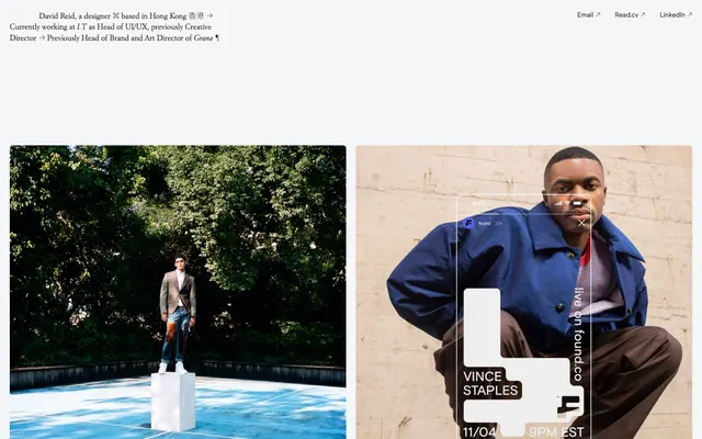
Preview image. Unlock full-res
Photographic gallery on parchment
Color palette
Page backgrounds, large content areas
Dark borders and separators for elevated surfaces and inverted UI
Secondary text, descriptive captions, and subtle separators or helper text where lower prominence is desired
Typography
- Weights
- 400
- Sizes
- 14px
- Line height
- 1.43
- Letter spacing
- normal
- Fallback
- Arial, sans-serif
General interface text, links, and minor labels. Its neutrality underpins the site's understated aesthetic.
- Weights
- 100
- Sizes
- 14px, 16px
- Line height
- 1.38, 1.43
- Letter spacing
- normal
- Fallback
- system-ui
Used for light, almost whispered text, particularly in descriptive blocks, creating a refined contrast to the default weight and emphasizing hierarchy without bolding.
- Weights
- 400
- Sizes
- 16px
- Line height
- 1.25, 1.38
- Letter spacing
- normal
- Fallback
- Garamond, serif
Decorative usage for specific textual elements, adding a classic, editorial touch.
- Weights
- 100
- Sizes
- 16px
- Line height
- 1.38
- Letter spacing
- normal
- Fallback
- Noto Sans, sans-serif
Likely used for East Asian characters, maintaining visual consistency with the light weight of the system-ui font.
Spacing & shape
Components
Images are contained within 6px rounded corners. Overlaid or adjacent descriptive text typically uses Muted Ash (#999999) on a Canvas White background. There's no explicit padding token for cards, implying a direct image-to-edge relationship within its container.
These are primarily text-based links (#222222) with a detected border that appears to be dynamic, possibly indicating an active or hover state. The border is a fine line of Lead Text (#222222). There is no background fill, making them lightweight and unobtrusive.
Uses Muted Ash (#999999) for body text, often with horizontal spacing of `20px` or `30px` for alignment. It maintains a comfortable line height, paired with `system-ui` weight 100 or `Modern Era` weight 400.
Appears in Lead Text (#222222), possibly in a larger size for `Modern Era` or `Italian Garamond` to create visual emphasis, typically followed by a `200px` vertical gap separating it from the content below.
Guidelines
- Prioritize a monochromatic palette of Canvas White (#ffffff), Lead Text (#222222), and Muted Ash (#999999) to maintain a restrained aesthetic.
- Use `Modern Era` weight 400 for primary text and links, and `system-ui` weight 100 or `Noto Sans TC` weight 100 for secondary, lighter text.
- Apply a consistent `6px` border-radius to all images to softly contain visual elements.
- Implement `20px` as the standard `elementGap` for horizontal and vertical spacing between distinct UI elements, and `200px` for `sectionGap`.
- Design interactive elements as 'ghost' components, relying on Lead Text (#222222) for borders and text, rather than filled backgrounds.
- Maintain a comfortable density with `10px` and `20px` margins for internal text blocks and `80px` for vertical content separation.
- Avoid introducing additional chromatic colors beyond the established monochromatic scheme.
- Do not use heavy shadows or gradients, as the design uses minimal elevation and a flat aesthetic.
- Refrain from using strong, bold typography for headlines; lean on `system-ui` weight 100 or `Italian Garamond` weight 400 for subtle impact.
- Do not deviate from the `6px` image border-radius; all images must conform to this softening treatment.
- Avoid dense, information-packed sections; ensure generous `elementGap` and `sectionGap` for comfortable reading.
- Do not use conventional filled buttons; all calls to action should be ghost links with subtle borders or simple text.
About this system
ShowHide
David Reid's site presents a stark, minimalist portfolio style. A monochromatic palette with deep charcoal text on an off-white canvas foregrounds content, reflecting a deliberate restraint. Visual hierarchy is established through a spacious, comfortable layout and a subtle interplay of fine lines and a single distinct radius. The design avoids illustrative elements, focusing instead on stark typography and photographic compositions, creating an atmosphere of quiet authority and directness.
The page maintains a full-bleed layout for large visual sections, allowing photography to dominate the viewport, but content frequently snaps to a max-width within those sections. The hero consists of simple descriptive text followed by a large photographic grid. Content arrangement appears as two-column grids for project showcases, often alternating large imagery with explanatory text sections. Vertical rhythm is established by section gaps up to 200px, which creates significant breathing room between major content blocks. Navigation is minimal, limited to discreet text links in the header.
The site primarily uses high-quality photography and product screenshots. Photography is typically full-bleed or large-format, often featuring single subjects in clear, well-lit environments. Product screenshots are typically clean, showcasing digital interfaces with a focus on functionality. Images consistently use a 6px border-radius for a subtle softening effect across all visual media. Imagery serves to showcase work and provide content rather than being purely decorative, with a high density relative to text in project sections.
Reminiscent of Stripe, Figma, Linear, Pitch.
# David Reid — Style Reference
> Photographic gallery on parchment

**Theme:** light

**Site:** https://www.davejreid.com

David Reid's site presents a stark, minimalist portfolio style. A monochromatic palette with deep charcoal text on an off-white canvas foregrounds content, reflecting a deliberate restraint. Visual hierarchy is established through a spacious, comfortable layout and a subtle interplay of fine lines and a single distinct radius. The design avoids illustrative elements, focusing instead on stark typography and photographic compositions, creating an atmosphere of quiet authority and directness.

## Tokens — Colors

| Name | Value | Token | Role |
|------|------|------|------|
| Canvas White | `#ffffff` | `--color-canvas-white` | Page backgrounds, large content areas |
| Lead Text | `#222222` | `--color-lead-text` | Dark borders and separators for elevated surfaces and inverted UI |
| Muted Ash | `#999999` | `--color-muted-ash` | Secondary text, descriptive captions, and subtle separators or helper text where lower prominence is desired |

## Tokens — Typography

### Modern Era
- **Substitute:** Arial, sans-serif
- **Weights:** 400
- **Sizes:** 14px
- **Line height:** 1.43
- **Letter spacing:** normal
- **Role:** General interface text, links, and minor labels. Its neutrality underpins the site's understated aesthetic.

### system-ui
- **Substitute:** system-ui
- **Weights:** 100
- **Sizes:** 14px, 16px
- **Line height:** 1.38, 1.43
- **Letter spacing:** normal
- **Role:** Used for light, almost whispered text, particularly in descriptive blocks, creating a refined contrast to the default weight and emphasizing hierarchy without bolding.

### Italian Garamond
- **Substitute:** Garamond, serif
- **Weights:** 400
- **Sizes:** 16px
- **Line height:** 1.25, 1.38
- **Letter spacing:** normal
- **Role:** Decorative usage for specific textual elements, adding a classic, editorial touch.

### Noto Sans TC
- **Substitute:** Noto Sans, sans-serif
- **Weights:** 100
- **Sizes:** 16px
- **Line height:** 1.38
- **Letter spacing:** normal
- **Role:** Likely used for East Asian characters, maintaining visual consistency with the light weight of the system-ui font.

## Tokens — Spacing

- **Section gap:** 200px
- **Element gap:** 20px

## Tokens — Radius

- **Images:** 6px

## Layout

The page maintains a full-bleed layout for large visual sections, allowing photography to dominate the viewport, but content frequently snaps to a max-width within those sections. The hero consists of simple descriptive text followed by a large photographic grid. Content arrangement appears as two-column grids for project showcases, often alternating large imagery with explanatory text sections. Vertical rhythm is established by section gaps up to 200px, which creates significant breathing room between major content blocks. Navigation is minimal, limited to discreet text links in the header.

## Imagery

The site primarily uses high-quality photography and product screenshots. Photography is typically full-bleed or large-format, often featuring single subjects in clear, well-lit environments. Product screenshots are typically clean, showcasing digital interfaces with a focus on functionality. Images consistently use a 6px border-radius for a subtle softening effect across all visual media. Imagery serves to showcase work and provide content rather than being purely decorative, with a high density relative to text in project sections.

## Components

### Image Card with Caption
*Displays photographic work with associated descriptive text.*

Images are contained within 6px rounded corners. Overlaid or adjacent descriptive text typically uses Muted Ash (#999999) on a Canvas White background. There's no explicit padding token for cards, implying a direct image-to-edge relationship within its container.

### Ghost Link Button
*Navigational elements and external links.*

These are primarily text-based links (#222222) with a detected border that appears to be dynamic, possibly indicating an active or hover state. The border is a fine line of Lead Text (#222222). There is no background fill, making them lightweight and unobtrusive.

### Secondary Text Section
*Provides context and description for projects or personal information.*

Uses Muted Ash (#999999) for body text, often with horizontal spacing of `20px` or `30px` for alignment. It maintains a comfortable line height, paired with `system-ui` weight 100 or `Modern Era` weight 400.

### Project Headline
*Section titles for different projects or categories.*

Appears in Lead Text (#222222), possibly in a larger size for `Modern Era` or `Italian Garamond` to create visual emphasis, typically followed by a `200px` vertical gap separating it from the content below.

## Guidelines

### Do

- Prioritize a monochromatic palette of Canvas White (#ffffff), Lead Text (#222222), and Muted Ash (#999999) to maintain a restrained aesthetic.
- Use `Modern Era` weight 400 for primary text and links, and `system-ui` weight 100 or `Noto Sans TC` weight 100 for secondary, lighter text.
- Apply a consistent `6px` border-radius to all images to softly contain visual elements.
- Implement `20px` as the standard `elementGap` for horizontal and vertical spacing between distinct UI elements, and `200px` for `sectionGap`.
- Design interactive elements as 'ghost' components, relying on Lead Text (#222222) for borders and text, rather than filled backgrounds.
- Maintain a comfortable density with `10px` and `20px` margins for internal text blocks and `80px` for vertical content separation.

### Don't

- Avoid introducing additional chromatic colors beyond the established monochromatic scheme.
- Do not use heavy shadows or gradients, as the design uses minimal elevation and a flat aesthetic.
- Refrain from using strong, bold typography for headlines; lean on `system-ui` weight 100 or `Italian Garamond` weight 400 for subtle impact.
- Do not deviate from the `6px` image border-radius; all images must conform to this softening treatment.
- Avoid dense, information-packed sections; ensure generous `elementGap` and `sectionGap` for comfortable reading.
- Do not use conventional filled buttons; all calls to action should be ghost links with subtle borders or simple text.

## Agent Prompt Guide

Quick Color Reference:
- text: #222222
- background: #ffffff
- border: #222222
- accent: no distinct accent color
- primary action: no distinct CTA color

Example Component Prompts:
- Create a top navigation bar: Canvas White background. Links in Lead Text (#222222) using `Modern Era` weight 400 at 14px, `letterSpacing` normal. Right-aligned ghost link buttons for 'Email', 'Read.cv', 'LinkedIn' with a Lead Text (#222222) border on hover or active states.
- Create a project image card: an image with a 6px radius. Below the image, body text in Muted Ash (#999999) using `system-ui` weight 100 at 14px, lineHeight 1.43, with an `elementGap` of `10px` from the image.
- Create a hero section introductory text: Main title in Lead Text (#222222) using `Modern Era` weight 400, followed by descriptive text in Muted Ash (#999999) using `system-ui` weight 100 at 14px, lineHeight 1.43. Ensure a `sectionGap` of 200px after this block.
More like this









Keep what you find
A free account saves references to boards and can send you a weekly email of picks based on what you save.
To see every result, go Pro.