Preview image. Unlock full-res
Sky-bound clarity
Color palette
Page background, hero section background — its gradient brings depth and a sense of open space
Primary action color for filled buttons and interactive accents — a vivid hue that stands out as active
Deep blue used for button and card shadows, tying elevation effects back to the brand's blue palette instead of generic gray; Inset shadow for active button states, providing a depressed effect
Brand icon accent, creating a small, bright visual pop
Primary surface for cards, input fields, and some button backgrounds — providing a clean, bright contrast to the blue
Secondary surface for cards and subtle background accents, offering a slightly muted alternative to Cloud White
Primary text color for headings and body content, offering high contrast against light surfaces
Muted text for secondary information, icons, and helper text
Hairline borders, dividers, and ghost button outlines – providing subtle separation
Subtle border color for ghost buttons and some card outlines against lighter backgrounds
Tertiary text color for fine print and less prominent content
Typography
- Weights
- 400, 500
- Sizes
- 12px, 14px, 15px, 16px, 17px, 18px, 20px, 60px
- Line height
- 1, 1.11, 1.2, 1.4, 1.43, 1.45, 1.5, 1.56, 1.6
- Letter spacing
- -0.0090em
- Fallback
- Inter
Body text, navigation, and most UI elements. A clean, modern sans-serif that balances readability with a slightly condensed feel at smaller sizes, providing a practical counterpoint to Gambarino's expressive nature.
- Weights
- 400, 500
- Sizes
- 16px, 18px, 20px, 36px, 40px, 48px, 60px
- Line height
- 1, 1.11, 1.2, 1.4, 1.5, 1.56
- Letter spacing
- -0.0100em
- Fallback
- Georgia
Headlines and emphasis text. Its classic, confident serif forms give authority and distinction, particularly at larger sizes. Not a generic sans-serif, giving it a distinctive voice.
- Weights
- 400
- Sizes
- 16px, 19px
- Line height
- 1.3, 1.5
- Letter spacing
- 0.0500em
- Fallback
- Monospace
Specialized for 'Open Source' badge and potentially code snippets. A distinct, wide-tracked typeface that creates a bold, technical aesthetic for specific highlights.
- Weights
- 500
- Sizes
- 16px
- Line height
- 1.5
- Letter spacing
- -0.009
Inter — detected in extracted data but not described by AI
Spacing & shape
Elevation
Components
Background: Deep Space Blue (#009afc). Text: Cloud White (#ffffff). Radius: 9999px (pill shape). Padding: 12px vertical, 48px horizontal. Shadow: rgba(0, 0, 0, 0.1) 0px 10px 15px -3px, rgba(0, 0, 0, 0.1) 0px 4px 6px -4px for soft elevation.
Background: transparent. Text: Graphite Text (#000000). Border: Light Steel Border (#e5e7eb) 1px solid. Radius: 9999px (pill shape). Padding minimal/content-driven.
Background: Cloud White (#ffffff). Text: Graphite Text (#000000). Placeholder text: Slate Text (#5b6882). Border: none. Radius: 16.2px. Inset shadow: Ocean Shadow (#006dc8) 0px -4.8px 0px 0px for a subtle depth effect.
Background: Cloud White (#ffffff). Radius: 12px. Padding: 16px. Shadow: rgba(0, 0, 0, 0.05) 0px 1px 2px 0px for a subtle lift.
Background: Fog Gray (#f3f4f6). Radius: 16px. No shadow, keeping it visually grounded.
Text: Cloud White (#ffffff). No background, minimal padding. Subtle underline on hover. Font: Switzer, 16px, weight 500.
Text: Slate Text (#5b6882). Underlined on hover. Font: Switzer or Gambarino based on context, default is 16px, weight 400.
Guidelines
- Use Sky Canvas (#a8d5ff) with its default linear gradient for primary backgrounds to establish an expansive feel.
- Employ Cloud White (#ffffff) for all interactive cards and input surfaces to create bright, readable content blocks.
- Apply a 9999px border-radius to all buttons for a friendly, pill-shaped aesthetic.
- Set primary action buttons with Deep Space Blue (#009afc) background and Cloud White (#ffffff) text to guide user interaction.
- Maintain a clear visual hierarchy by using Gambarino for headlines (sizes 20px-60px) and Switzer for body text (sizes 12px-18px).
- Use a subtle shadow rgba(0, 0, 0, 0.05) 0px 1px 2px 0px for cards to provide minimal depth without visual heaviness.
- Leverage Faint Blue Border (#cfe9fd) for ghost button borders or secondary outlines to soften interactive elements.
- Avoid sharp corners; all UI elements should have a radius of at least 8px, with interactive elements preferring 16.2px or 9999px.
- Do not introduce strong, dark backgrounds other than the hero gradient; maintain a predominantly light aesthetic for content sections.
- Refrain from using generic gray shadows for interactive elements; instead, use Ocean Shadow (#006dc8) for blue-tinted elevation.
- Do not apply excessive letter-spacing to body text; maintain the subtle negative tracking specified in Switzer and Gambarino for dense readability.
- Avoid using multiple vivid accent colors; Deep Space Blue (#009afc) should be the primary chromatic accent for user interaction.
- Do not deviate from the specified font families; Switzer and Gambarino are key to the brand's typographic identity.
- Do not use transparent backgrounds for text-heavy content cards; always provide a solid Cloud White or Fog Gray background for readability.
About this system
ShowHide
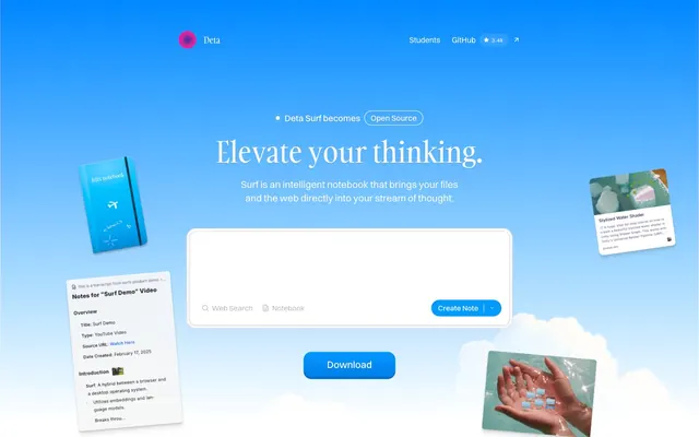
Deta Surf uses a refreshing, sky-inspired aesthetic, where a vivid blue gradient forms the primary background, evoking expanse and clarity. UI elements are typically white, rounded cards, often with subtle shadows that provide a soft lift from the blue canvas. Typography blends elegant, traditional serifs for headlines with clean, modern sans-serifs for body text, creating a contrast that feels both authoritative and accessible. Interactive elements feature a bright, vivid blue, acting as functional punctuation against the otherwise serene palette.
The page uses a full-bleed layout for the hero section, featuring a prominent blue gradient background and centered, large typography. Subsequent sections appear to use a max-width content container, centered on the page. Content arrangement often alternates between text-dominant blocks and visual elements, creating a balanced rhythm. A visual grid is subtly suggested by the placement of multiple floating card-like elements in the hero. Vertical spacing is comfortable, with clear separation between sections. The navigation is a minimal top bar with brand logo and utilitarian links (Students, GitHub).
Imagery primarily consists of conceptual 3D renders (e.g., notebook, floating elements) and stylized, high-key photography of hands interacting with small, digital-like objects. The renders are often slightly tilted or floating to convey lightness and innovation. Photos are clean and bright, frequently using water or reflective surfaces, featuring product elements rather than lifestyle scenes. Icons are simple, outlined or filled, with a consistent stroke weight and occasionally feature the Deta Pink Glow accent. Visuals are used decoratively to enhance the 'elevate your thinking' metaphor.
Reminiscent of Linear, Notion, Dropbox, Raycast.
# Deta Surf — Style Reference
> Sky-bound clarity

**Theme:** light

**Site:** https://deta.surf

Deta Surf uses a refreshing, sky-inspired aesthetic, where a vivid blue gradient forms the primary background, evoking expanse and clarity. UI elements are typically white, rounded cards, often with subtle shadows that provide a soft lift from the blue canvas. Typography blends elegant, traditional serifs for headlines with clean, modern sans-serifs for body text, creating a contrast that feels both authoritative and accessible. Interactive elements feature a bright, vivid blue, acting as functional punctuation against the otherwise serene palette.

## Tokens — Colors

| Name | Value | Token | Role |
|------|------|------|------|
| Sky Canvas | `#a8d5ff` | `--color-sky-canvas` | Page background, hero section background — its gradient brings depth and a sense of open space |
| Deep Space Blue | `#009afc` | `--color-deep-space-blue` | Primary action color for filled buttons and interactive accents — a vivid hue that stands out as active |
| Ocean Shadow | `#006dc8` | `--color-ocean-shadow` | Deep blue used for button and card shadows, tying elevation effects back to the brand's blue palette instead of generic gray; Inset shadow for active button states, providing a depressed effect |
| Deta Pink Glow | `#ed008d` | `--color-deta-pink-glow` | Brand icon accent, creating a small, bright visual pop |
| Cloud White | `#ffffff` | `--color-cloud-white` | Primary surface for cards, input fields, and some button backgrounds — providing a clean, bright contrast to the blue |
| Fog Gray | `#f3f4f6` | `--color-fog-gray` | Secondary surface for cards and subtle background accents, offering a slightly muted alternative to Cloud White |
| Graphite Text | `#000000` | `--color-graphite-text` | Primary text color for headings and body content, offering high contrast against light surfaces |
| Slate Text | `#5b6882` | `--color-slate-text` | Muted text for secondary information, icons, and helper text |
| Light Steel Border | `#e5e7eb` | `--color-light-steel-border` | Hairline borders, dividers, and ghost button outlines – providing subtle separation |
| Faint Blue Border | `#cfe9fd` | `--color-faint-blue-border` | Subtle border color for ghost buttons and some card outlines against lighter backgrounds |
| Ash Gray | `#808080` | `--color-ash-gray` | Tertiary text color for fine print and less prominent content |

## Tokens — Typography

### Switzer
- **Substitute:** Inter
- **Weights:** 400, 500
- **Sizes:** 12px, 14px, 15px, 16px, 17px, 18px, 20px, 60px
- **Line height:** 1, 1.11, 1.2, 1.4, 1.43, 1.45, 1.5, 1.56, 1.6
- **Letter spacing:** -0.0090em
- **Role:** Body text, navigation, and most UI elements. A clean, modern sans-serif that balances readability with a slightly condensed feel at smaller sizes, providing a practical counterpoint to Gambarino's expressive nature.

### Gambarino
- **Substitute:** Georgia
- **Weights:** 400, 500
- **Sizes:** 16px, 18px, 20px, 36px, 40px, 48px, 60px
- **Line height:** 1, 1.11, 1.2, 1.4, 1.5, 1.56
- **Letter spacing:** -0.0100em
- **Role:** Headlines and emphasis text. Its classic, confident serif forms give authority and distinction, particularly at larger sizes. Not a generic sans-serif, giving it a distinctive voice.

### Tanker
- **Substitute:** Monospace
- **Weights:** 400
- **Sizes:** 16px, 19px
- **Line height:** 1.3, 1.5
- **Letter spacing:** 0.0500em
- **Role:** Specialized for 'Open Source' badge and potentially code snippets. A distinct, wide-tracked typeface that creates a bold, technical aesthetic for specific highlights.

### Inter
- **Weights:** 500
- **Sizes:** 16px
- **Line height:** 1.5
- **Letter spacing:** -0.009
- **Role:** Inter — detected in extracted data but not described by AI

## Tokens — Type Scale

Augmented Fourth (1.414) from 16px base.

| Role | Size | Line height | Letter spacing |
|------|------|------|------|
| caption | 12px | 1.5 | -0.108px |
| body-sm | 14px | 1.43 | -0.126px |
| body | 16px | 1.5 | -0.144px |
| subheading | 20px | 1.4 | -0.2px |
| heading | 48px | 1.11 | -0.48px |
| display | 60px | 1 | -0.6px |

## Tokens — Spacing

- **Section gap:** 32px
- **Card padding:** 16px
- **Element gap:** 16px

## Tokens — Radius

- **General:** 8px
- **Buttons:** 9999px
- **Cards:** 12px
- **inputField:** 16.2px

## Tokens — Elevation

- **Standard Card:** `rgba(0, 0, 0, 0.05) 0px 1px 2px 0px`
- **Primary Filled Button:** `rgba(0, 0, 0, 0.1) 0px 10px 15px -3px, rgba(0, 0, 0, 0.1) 0px 4px 6px -4px`
- **Input Field:** `rgb(0, 109, 200) 0px -4.8px 0px 0px inset, rgba(0, 0, 0, 0.1) 0px 2.4px 4.8px 0px`

## Layout

The page uses a full-bleed layout for the hero section, featuring a prominent blue gradient background and centered, large typography. Subsequent sections appear to use a max-width content container, centered on the page. Content arrangement often alternates between text-dominant blocks and visual elements, creating a balanced rhythm. A visual grid is subtly suggested by the placement of multiple floating card-like elements in the hero. Vertical spacing is comfortable, with clear separation between sections. The navigation is a minimal top bar with brand logo and utilitarian links (Students, GitHub).

## Imagery

Imagery primarily consists of conceptual 3D renders (e.g., notebook, floating elements) and stylized, high-key photography of hands interacting with small, digital-like objects. The renders are often slightly tilted or floating to convey lightness and innovation. Photos are clean and bright, frequently using water or reflective surfaces, featuring product elements rather than lifestyle scenes. Icons are simple, outlined or filled, with a consistent stroke weight and occasionally feature the Deta Pink Glow accent. Visuals are used decoratively to enhance the 'elevate your thinking' metaphor.

## Components

### Primary Filled Button
*Main call-to-action*

Background: Deep Space Blue (#009afc). Text: Cloud White (#ffffff). Radius: 9999px (pill shape). Padding: 12px vertical, 48px horizontal. Shadow: rgba(0, 0, 0, 0.1) 0px 10px 15px -3px, rgba(0, 0, 0, 0.1) 0px 4px 6px -4px for soft elevation.

### Ghost Open Source Button
*Secondary action or status indicator*

Background: transparent. Text: Graphite Text (#000000). Border: Light Steel Border (#e5e7eb) 1px solid. Radius: 9999px (pill shape). Padding minimal/content-driven.

### Search/Notebook Input
*Interactive input field*

Background: Cloud White (#ffffff). Text: Graphite Text (#000000). Placeholder text: Slate Text (#5b6882). Border: none. Radius: 16.2px. Inset shadow: Ocean Shadow (#006dc8) 0px -4.8px 0px 0px for a subtle depth effect.

### Standard Card
*Content container*

Background: Cloud White (#ffffff). Radius: 12px. Padding: 16px. Shadow: rgba(0, 0, 0, 0.05) 0px 1px 2px 0px for a subtle lift.

### Muted Card Background
*Secondary content container*

Background: Fog Gray (#f3f4f6). Radius: 16px. No shadow, keeping it visually grounded.

### Header Navigation Link
*Global navigation item*

Text: Cloud White (#ffffff). No background, minimal padding. Subtle underline on hover. Font: Switzer, 16px, weight 500.

### Text Link in Body
*Interactive text element*

Text: Slate Text (#5b6882). Underlined on hover. Font: Switzer or Gambarino based on context, default is 16px, weight 400.

## Guidelines

### Do

- Use Sky Canvas (#a8d5ff) with its default linear gradient for primary backgrounds to establish an expansive feel.
- Employ Cloud White (#ffffff) for all interactive cards and input surfaces to create bright, readable content blocks.
- Apply a 9999px border-radius to all buttons for a friendly, pill-shaped aesthetic.
- Set primary action buttons with Deep Space Blue (#009afc) background and Cloud White (#ffffff) text to guide user interaction.
- Maintain a clear visual hierarchy by using Gambarino for headlines (sizes 20px-60px) and Switzer for body text (sizes 12px-18px).
- Use a subtle shadow rgba(0, 0, 0, 0.05) 0px 1px 2px 0px for cards to provide minimal depth without visual heaviness.
- Leverage Faint Blue Border (#cfe9fd) for ghost button borders or secondary outlines to soften interactive elements.

### Don't

- Avoid sharp corners; all UI elements should have a radius of at least 8px, with interactive elements preferring 16.2px or 9999px.
- Do not introduce strong, dark backgrounds other than the hero gradient; maintain a predominantly light aesthetic for content sections.
- Refrain from using generic gray shadows for interactive elements; instead, use Ocean Shadow (#006dc8) for blue-tinted elevation.
- Do not apply excessive letter-spacing to body text; maintain the subtle negative tracking specified in Switzer and Gambarino for dense readability.
- Avoid using multiple vivid accent colors; Deep Space Blue (#009afc) should be the primary chromatic accent for user interaction.
- Do not deviate from the specified font families; Switzer and Gambarino are key to the brand's typographic identity.
- Do not use transparent backgrounds for text-heavy content cards; always provide a solid Cloud White or Fog Gray background for readability.

## Agent Prompt Guide

Quick Color Reference:
text: #000000
background: #a8d5ff
border: #e5e7eb
accent: #ed008d
primary action: #009afc (filled action)

Example Component Prompts:
Create a hero section with a gradient background using linear-gradient(rgb(74, 158, 255) 0%, rgb(123, 184, 255) 50%, rgb(168, 213, 255) 100%). Headline: 'Elevate your thinking.' (Gambarino, 60px, Graphit Text #000000, letter-spacing -0.6px). Subtitle: 'Surf is an intelligent notebook...' (Switzer, 20px, Slate Text #5b6882, letter-spacing -0.18px).

Create a Primary Action Button: #009afc background, #000000 text, 9999px radius, compact pill padding. Use this filled treatment for the main CTA.

Create a Standard Card: background Cloud White #ffffff, radius 12px, padding 16px. Shadow: rgba(0, 0, 0, 0.05) 0px 1px 2px 0px. Text: 'Notes for "Surf Demo" Video' (Switzer, 18px, Graphite Text #000000).

Implement an interactive Search Input: Cloud White #ffffff background, radius 16.2px, inset shadow rgb(0, 109, 200) 0px -4.8px 0px 0px, placeholder text Slate Text (#5b6882) 'Web Search' (Switzer, 16px).
More like this









Keep what you find
A free account saves references to boards and can send you a weekly email of picks based on what you save.
To see every result, go Pro.