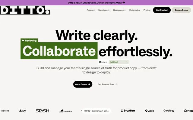
Preview image. Unlock full-res
Architectural blueprint on white marble
Color palette
Accent for highlighted content, badges, and occasional backgrounds
Striking accents, outlines, and decorative elements to draw attention
Accent for links, outlines, and decorative elements
Decorative highlights and abstract graphic accents
Decorative outlines and highlights
Decorative outlines and highlights
Violet wash for highlight backgrounds, decorative bands, and soft emphasis behind content. Do not promote it to the primary CTA color
Primary text, deep backgrounds for contrast, primary filled buttons, strong borders for UI elements
Dominant page background, card surfaces, ghost button text
Muted text, secondary navigation, subtle button borders and iconography
Subtle dividers, borders, and light interaction states
Text on dark backgrounds, badges, and internal accents
Success states, badges, and outlined elements for positive reinforcement
Typography
- Weights
- 300, 400, 700
- Sizes
- 13px, 16px, 18px, 25px, 26px, 35px, 72px, 108px
- Line height
- 0.89, 1, 1.05, 1.1, 1.2, 1.43
- Letter spacing
- -0.0400em at 108px, -0.0200em at 72px, -0.0140em at 35px, -0.0120em at 26px, -0.0110em at 25px, -0.0100em at 18px, 0.0080em at 16px, 0.0100em at 13px
- Fallback
- Inter
Primary typeface for most UI elements including body text, links, buttons, and smaller headings. The light weights (300, 400) maintain an airy, modern feel, while the generous letter-spacing for smaller text ensures readability.
- Weights
- 400, 700
- Sizes
- 16px, 18px, 24px, 36px, 40px, 43px, 86px
- Line height
- 0.88, 1, 1.05, 2.63
- Letter spacing
- -0.0230em at 86px, -0.0220em at 43px, -0.0100em at 36px, 0.0200em at 16px
- Fallback
- Inter
Reserved for large, impactful headlines, where its extended proportions demand attention. Its tight letter-spacing at larger sizes contributes to a bold, confident statement, often appearing as fragmented highlights.
- Weights
- 900
- Sizes
- 35px
- Line height
- 1.2
- Letter spacing
- -0.0100em
- Fallback
- Inter Condensed
Used sparingly for very specific, emphasized text such as badges or callouts. Its heavy weight and condensed form provide strong visual punch and contrast against the lighter primary typeface.
Spacing & shape
Components
Solid Midnight Ink (#000000) background with Pure White (#ffffff) text. Features a full pill shape with 1000px border-radius, 15px vertical and horizontal padding, using ABC Social Regular at 16px.
Transparent background with Graphite (#6a6559) text and a matching 1px border. Pill-shaped with 100px border-radius, 8px vertical and 10px horizontal padding, using ABC Social Regular at 16px.
Transparent background with Graphite (#6a6559) text and a matching 1px border. Full pill shape with 1000px border-radius, 15px vertical and horizontal padding, using ABC Social Regular at 16px.
Harvest Gold (#ffdd33) background with Midnight Ink (#000000) text. No border-radius or padding observed directly as a consistent component style, appearing as an inline visual highlight.
Fresh Green (#3e6b15) background with Pure White (#ffffff) text. No border-radius, 6px vertical and 10px horizontal padding, using ABC Social Regular.
Harvest Gold (#ffdd33) background with a 1000px border-radius, appearing as a large circular shape with no discernible padding, creating a cut-out or background effect rather than a contained card.
Pure White (#ffffff) background with Midnight Ink (#000000) text. Border is 1px Midnight Ink (#000000). Features a generous 28px border-radius, 0px vertical and 20px horizontal padding.
Guidelines
- Use Midnight Ink (#000000) for all primary text and important headings to ensure high legibility against the light canvas.
- Apply Canvas White (#f7f5f3) as the default background for all page sections and elevated surfaces.
- Utilize 1000px border-radius for all primary buttons and large decorative elements to create a soft, pill-shaped aesthetic.
- Employ Harvest Gold (#ffdd33) and Power Red (#ff6137) strategically and sparingly for emphasis, such as badges, outlined boxes, or text highlights, never as primary UI colors.
- Maintain a clear visual hierarchy using ABC Social for body text (16-18px), ABC Social Extended for major headlines (43-86px), and ABC Social Condensed for specific emphasized text like badges.
- Structure content with a consistent 20px element gap and 60px section gap for a comfortable, organized layout.
- Use ABC Social weights 300 and 400 for most text, reserving 700 for strong emphasis within body copy or bold components.
- Avoid using multiple accent colors in close proximity; stick to one or two per view to maintain visual clarity.
- Do not introduce heavy shadows or gradients on surfaces; components should remain flat and minimal.
- Never use the accent colors for full background sections, as they are intended for highlights, not foundational colors.
- Avoid using default system fonts. Always use ABC Social variants or their specified substitutes.
- Do not deviate from the established border radii; maintain 1000px for pills, 100px for secondary buttons, and 28px for inputs.
- Resist adding additional padding or margins that break the 4px grid and established spacing tokens.
- Do not use dark backgrounds for large content areas; the system is designed for a light theme with dark text.
About this system
ShowHide
Ditto uses an 'architectural blueprint on white marble' visual language, combining a refined, nearly monochromatic canvas with precise geometric typography and a vibrant, playful accent color for highlights and interactive elements. Surfaces are clean and untextured, serving as a bright foundation for highly legible black text. Strategic splashes of saturated color are used for emphasis, badges, or outlined elements, creating an energetic yet organized feel. Components are lightweight and often feature large border-radii, giving a soft, approachable edge to the otherwise crisp design.
The page primarily uses a max-width contained layout, with content segments often centered or adopting clean two-column text-left/image-right (or vice-versa) arrangements. The hero section establishes a clear centered headline over a subtle background. Sections alternate between a base Canvas White and occasional Harvest Gold backgrounds for emphasis, creating a clear visual rhythm. Vertical spacing between sections is generous, contributing to a comfortable density. Navigation is a sticky top bar with clearly defined links and primary/secondary call-to-action buttons.
This site prominently features highly stylized, abstract graphic elements and product screenshots. The graphics are often playful and dimensional, using the accent color palette to create visual interest rather than realistic representations. Overlapping, torn-paper, or distressed effects are common for accent shapes, giving a handcrafted feel. Product screenshots are clean, high-fidelity, and typically contained within a well-defined UI, focusing on clarity over extensive context. Icons are simple, outlined, and monochromatic, used for navigation or feature delineation, prioritizing function without visual distraction.
Reminiscent of Figma, Linear, Notion, Webflow.
# Ditto — Style Reference
> Architectural blueprint on white marble

**Theme:** light

**Site:** https://www.dittowords.com

Ditto uses an 'architectural blueprint on white marble' visual language, combining a refined, nearly monochromatic canvas with precise geometric typography and a vibrant, playful accent color for highlights and interactive elements. Surfaces are clean and untextured, serving as a bright foundation for highly legible black text. Strategic splashes of saturated color are used for emphasis, badges, or outlined elements, creating an energetic yet organized feel. Components are lightweight and often feature large border-radii, giving a soft, approachable edge to the otherwise crisp design.

## Tokens — Colors

| Name | Value | Token | Role |
|------|------|------|------|
| Harvest Gold | `#ffdd33` | `--color-harvest-gold` | Accent for highlighted content, badges, and occasional backgrounds |
| Power Red | `#ff6137` | `--color-power-red` | Striking accents, outlines, and decorative elements to draw attention |
| Royal Blue | `#0097e6` | `--color-royal-blue` | Accent for links, outlines, and decorative elements |
| Rich Violet | `#b26dc2` | `--color-rich-violet` | Decorative highlights and abstract graphic accents |
| Mustard Seed | `#bbb809` | `--color-mustard-seed` | Decorative outlines and highlights |
| Blush Pink | `#f5c4cc` | `--color-blush-pink` | Decorative outlines and highlights |
| Electric Blue | `#1345eb` | `--color-electric-blue` | Violet wash for highlight backgrounds, decorative bands, and soft emphasis behind content. Do not promote it to the primary CTA color |
| Midnight Ink | `#000000` | `--color-midnight-ink` | Primary text, deep backgrounds for contrast, primary filled buttons, strong borders for UI elements |
| Canvas White | `#f7f5f3` | `--color-canvas-white` | Dominant page background, card surfaces, ghost button text |
| Graphite | `#6a6559` | `--color-graphite` | Muted text, secondary navigation, subtle button borders and iconography |
| Warm Gray | `#e2e2e2` | `--color-warm-gray` | Subtle dividers, borders, and light interaction states |
| Pure White | `#ffffff` | `--color-pure-white` | Text on dark backgrounds, badges, and internal accents |
| Fresh Green | `#3e6b15` | `--color-fresh-green` | Success states, badges, and outlined elements for positive reinforcement |

## Tokens — Typography

### ABC Social
- **Substitute:** Inter
- **Weights:** 300, 400, 700
- **Sizes:** 13px, 16px, 18px, 25px, 26px, 35px, 72px, 108px
- **Line height:** 0.89, 1, 1.05, 1.1, 1.2, 1.43
- **Letter spacing:** -0.0400em at 108px, -0.0200em at 72px, -0.0140em at 35px, -0.0120em at 26px, -0.0110em at 25px, -0.0100em at 18px, 0.0080em at 16px, 0.0100em at 13px
- **Role:** Primary typeface for most UI elements including body text, links, buttons, and smaller headings. The light weights (300, 400) maintain an airy, modern feel, while the generous letter-spacing for smaller text ensures readability.

### ABC Social Extended
- **Substitute:** Inter
- **Weights:** 400, 700
- **Sizes:** 16px, 18px, 24px, 36px, 40px, 43px, 86px
- **Line height:** 0.88, 1, 1.05, 2.63
- **Letter spacing:** -0.0230em at 86px, -0.0220em at 43px, -0.0100em at 36px, 0.0200em at 16px
- **Role:** Reserved for large, impactful headlines, where its extended proportions demand attention. Its tight letter-spacing at larger sizes contributes to a bold, confident statement, often appearing as fragmented highlights.

### ABC Social Condensed
- **Substitute:** Inter Condensed
- **Weights:** 900
- **Sizes:** 35px
- **Line height:** 1.2
- **Letter spacing:** -0.0100em
- **Role:** Used sparingly for very specific, emphasized text such as badges or callouts. Its heavy weight and condensed form provide strong visual punch and contrast against the lighter primary typeface.

## Tokens — Type Scale

Perfect Fourth (1.333) from 18px base.

| Role | Size | Line height | Letter spacing |
|------|------|------|------|
| caption | 13px | 1.43 | 0.01em |
| body-sm | 16px | 1.43 | 0.008em |
| body | 18px | 1.43 | -0.01em |
| subheading | 25px | 1.2 | -0.011em |
| heading | 35px | 1.2 | -0.014em |
| heading-lg | 43px | 1.05 | -0.022em |
| display-sm | 72px | 1 | -0.02em |
| display | 86px | 0.88 | -0.023em |
| display-lg | 108px | 0.89 | -0.04em |

## Tokens — Spacing

- **Section gap:** 60px
- **Card padding:** 20px
- **Element gap:** 20px

## Tokens — Radius

- **Buttons:** 100px
- **Inputs:** 28px
- **Cards:** 1000px
- **Images:** 12px

## Layout

The page primarily uses a max-width contained layout, with content segments often centered or adopting clean two-column text-left/image-right (or vice-versa) arrangements. The hero section establishes a clear centered headline over a subtle background. Sections alternate between a base Canvas White and occasional Harvest Gold backgrounds for emphasis, creating a clear visual rhythm. Vertical spacing between sections is generous, contributing to a comfortable density. Navigation is a sticky top bar with clearly defined links and primary/secondary call-to-action buttons.

## Imagery

This site prominently features highly stylized, abstract graphic elements and product screenshots. The graphics are often playful and dimensional, using the accent color palette to create visual interest rather than realistic representations. Overlapping, torn-paper, or distressed effects are common for accent shapes, giving a handcrafted feel. Product screenshots are clean, high-fidelity, and typically contained within a well-defined UI, focusing on clarity over extensive context. Icons are simple, outlined, and monochromatic, used for navigation or feature delineation, prioritizing function without visual distraction.

## Components

### Primary Filled Button
*Main call to action button.*

Solid Midnight Ink (#000000) background with Pure White (#ffffff) text. Features a full pill shape with 1000px border-radius, 15px vertical and horizontal padding, using ABC Social Regular at 16px.

### Ghost Outline Button
*Secondary call to action, less prominent than primary.*

Transparent background with Graphite (#6a6559) text and a matching 1px border. Pill-shaped with 100px border-radius, 8px vertical and 10px horizontal padding, using ABC Social Regular at 16px.

### Ghost Border Button (Pill)
*Tertiary action or navigational elements requiring minimal visual weight.*

Transparent background with Graphite (#6a6559) text and a matching 1px border. Full pill shape with 1000px border-radius, 15px vertical and horizontal padding, using ABC Social Regular at 16px.

### Badge with Background
*Highlighting status or keyword.*

Harvest Gold (#ffdd33) background with Midnight Ink (#000000) text. No border-radius or padding observed directly as a consistent component style, appearing as an inline visual highlight.

### Success Status Badge
*Indicating a positive status.*

Fresh Green (#3e6b15) background with Pure White (#ffffff) text. No border-radius, 6px vertical and 10px horizontal padding, using ABC Social Regular.

### Circular Card Highlight
*Decorative element or visual accent.*

Harvest Gold (#ffdd33) background with a 1000px border-radius, appearing as a large circular shape with no discernible padding, creating a cut-out or background effect rather than a contained card.

### Text Input Field
*User input for forms.*

Pure White (#ffffff) background with Midnight Ink (#000000) text. Border is 1px Midnight Ink (#000000). Features a generous 28px border-radius, 0px vertical and 20px horizontal padding.

## Guidelines

### Do

- Use Midnight Ink (#000000) for all primary text and important headings to ensure high legibility against the light canvas.
- Apply Canvas White (#f7f5f3) as the default background for all page sections and elevated surfaces.
- Utilize 1000px border-radius for all primary buttons and large decorative elements to create a soft, pill-shaped aesthetic.
- Employ Harvest Gold (#ffdd33) and Power Red (#ff6137) strategically and sparingly for emphasis, such as badges, outlined boxes, or text highlights, never as primary UI colors.
- Maintain a clear visual hierarchy using ABC Social for body text (16-18px), ABC Social Extended for major headlines (43-86px), and ABC Social Condensed for specific emphasized text like badges.
- Structure content with a consistent 20px element gap and 60px section gap for a comfortable, organized layout.
- Use ABC Social weights 300 and 400 for most text, reserving 700 for strong emphasis within body copy or bold components.

### Don't

- Avoid using multiple accent colors in close proximity; stick to one or two per view to maintain visual clarity.
- Do not introduce heavy shadows or gradients on surfaces; components should remain flat and minimal.
- Never use the accent colors for full background sections, as they are intended for highlights, not foundational colors.
- Avoid using default system fonts. Always use ABC Social variants or their specified substitutes.
- Do not deviate from the established border radii; maintain 1000px for pills, 100px for secondary buttons, and 28px for inputs.
- Resist adding additional padding or margins that break the 4px grid and established spacing tokens.
- Do not use dark backgrounds for large content areas; the system is designed for a light theme with dark text.

## Agent Prompt Guide

Quick Color Reference:
text: #000000
background: #f7f5f3
border: #6a6559
accent: #ffdd33
primary action: #000000 (filled action)

Example Component Prompts:
1. Create a Primary Action Button: #000000 background, #f7f5f3 text, 9999px radius, compact pill padding. Use this filled treatment for the main CTA.
2. Create a ghost outline button for secondary action: Transparent background, Graphite (#6a6559) text, 1px Graphite (#6a6559) border, 100px border-radius, 8px vertical and 10px horizontal padding, ABC Social regular 16px text.
3. Create a success badge: Fresh Green (#3e6b15) background, Pure White (#ffffff) text, no border-radius, 6px vertical and 10px horizontal padding, ABC Social regular 16px text.
4. Create a text input field: Pure White (#ffffff) background, Midnight Ink (#000000) text, 1px Midnight Ink (#000000) border, 28px border-radius, 0px vertical and 20px horizontal padding, ABC Social regular 16px placeholder text.
More like this








Keep what you find
A free account saves references to boards and can send you a weekly email of picks based on what you save.
To see every result, go Pro.