Preview image. Unlock full-res
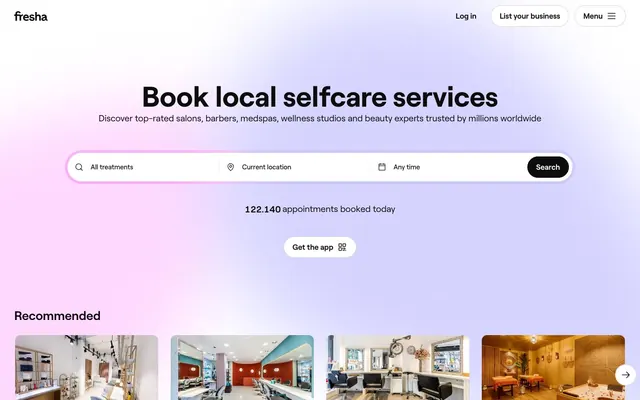
Luminous radial gradient
Color palette
Outlined action buttons, active link states, small functional icons — signals interactivity and importance with a distinct, vivid hue
Yellow decorative accent for icons, marks, and small graphic details. Do not promote it to the primary CTA color
Hero background gradient start — an inviting, soft, and vibrant backdrop to the primary service offering
Dark borders and separators for elevated surfaces and inverted UI. Do not promote it to the primary CTA color
Hairline borders, dividers, input outlines, and card edges on light surfaces. Do not promote it to the primary CTA color
Secondary card backgrounds, subtle section dividers — provides a gentle visual separation from the main canvas
Muted body text, secondary descriptions, helper text — balances readability with less emphasis than primary text
Divider lines, subtle input borders, inactive elements — provides a delicate structural definition
Hairline borders, dividers, input outlines, and card edges on light surfaces. Do not promote it to the primary CTA color
Typography
- Weights
- 400, 500, 600, 700
- Sizes
- 15px, 16px, 17px, 20px, 24px, 28px, 40px, 64px, 96px
- Line height
- 1, 1.06, 1.1, 1.15, 1.17, 1.2, 1.29, 1.33, 1.4, 1.41
- Letter spacing
- normal
- Fallback
- Inter
All textual content — its geometric clarity provides a modern, functional voice across headings, body text, and interactive elements. The variety of weights supports a clear typographic hierarchy.
Spacing & shape
Components
Text in Midnight Ink (#0d0d0d) at 16px RoobertPRO weight 400. Hover/active states use Violet Impulse (#6950f3) text color or a bottom border of E5E5E5.
Full-width field with text set at 16px RoobertPRO weight 400 in Midnight Ink (#0d0d0d). Uses a 999px border-radius, a thin 1px border of Silver Mist (#d3d3d3) and 2px of horizontal padding.
Filled background in Midnight Ink (#0d0d0d) with Canvas White (#ffffff) text at 16px RoobertPRO weight 400. Has a 999px border-radius and 12px vertical padding.
Transparent background with Midnight Ink (#0d0d0d) text at 16px RoobertPRO weight 400. Uses a 999px border-radius and minimal padding (0px).
Transparent background, Violet Impulse (#6950f3) text and 1px border. Uses 999px border-radius and 12px vertical padding where visible.
Transparent background with 12px border-radius. Contains an image with an 8px border-radius. Titles are in Midnight Ink (#0d0d0d) and descriptions in Muted Stone (#767676).
Cloud Gray (#f2f2f2) background with 8px border-radius. Features generous 32px padding on all sides. Text is in Midnight Ink (#0d0d0d) for headings and Muted Stone (#767676) for body content.
Guidelines
- Use Midnight Ink (#0d0d0d) for all primary text and main headings to ensure strong contrast and readability.
- Apply Canvas White (#ffffff) as the default page background and for filled interactive elements.
- Reserve Violet Impulse (#6950f3) for outlined call-to-action buttons and active link states.
- Utilize Cloud Gray (#f2f2f2) for secondary content cards and subtle background variations in sections.
- Implement a 999px border-radius for all primary buttons, search inputs, and navigational elements to maintain a uniformly rounded aesthetic.
- Ensure all textual content uses the RoobertPRO font family in appropriate weights for hierarchy.
- Maintain a clear elementGap of 8px between discrete UI elements for consistent visual rhythm.
- Avoid using Sunset Gold (#ffc00a) as an interaction color; it is reserved for decorative accents and ratings.
- Do not introduce sharp corners; all significant UI containers and interactive elements should use 8px, 12px, or 999px border-radii.
- Do not use dark backgrounds for main content sections; the system is designed around a light theme with bright surfaces.
- Avoid excessive shadow usage; rely on distinct background colors and minimal borders for element separation.
- Do not use decorative gradients on functional UI components; stick to solid colors for clarity.
- Refrain from altering the letter-spacing of RoobertPRO text; maintain 'normal' tracking for all content.
- Do not use more than two levels of text color in a single component to avoid visual clutter; primarily use Midnight Ink (#0d0d0d) and Muted Stone (#767676).
About this system
ShowHide
Fresha uses an expansive, bright self-care marketplace aesthetic with a clear information hierarchy. A luminous radial gradient forms a soft, inviting backdrop, contrasting with sharp black typography and vivid accent colors. Interactive elements are clearly defined by rounded borders and specific color usage, while a subtle surface elevation emphasizes key content. The layout maintains a spacious feel with compact, grouped content, creating an efficient and user-friendly experience.
The page uses a maximum-width contained layout, with a prominent full-width hero section that features a radial gradient background and a centered headline. Content sections below the hero alternate between full-width blocks (like the 'Download the app' section) and multi-column grids for recommended services. Vertical spacing between logical sections is consistently 24px. The main navigation is a sticky top bar, providing persistent access. Content is generally grouped into compact, repeating cards, creating an information-dense yet scannable layout.
The site predominantly uses high-quality product photography (salons, spas, services) within contained, rectangular frames with either 8px or 12px rounded corners. These images serve as explanatory content and are crucial for showcasing services. Small, functional icons are outlined and monochromatic, primarily in Midnight Ink (#0d0d0d), serving as visual cues. Product screenshots are realistic and shown within device mockups. The overall imagery is content-heavy, directly illustrating the services offered, rather than relying on abstract graphics or lifestyle photography.
Reminiscent of Mindbody, ClassPass, Booking.com.
# Fresha — Style Reference
> Luminous radial gradient

**Theme:** light

**Site:** https://www.fresha.com

Fresha uses an expansive, bright self-care marketplace aesthetic with a clear information hierarchy. A luminous radial gradient forms a soft, inviting backdrop, contrasting with sharp black typography and vivid accent colors. Interactive elements are clearly defined by rounded borders and specific color usage, while a subtle surface elevation emphasizes key content. The layout maintains a spacious feel with compact, grouped content, creating an efficient and user-friendly experience.

## Tokens — Colors

| Name | Value | Token | Role |
|------|------|------|------|
| Violet Impulse | `#6950f3` | `--color-violet-impulse` | Outlined action buttons, active link states, small functional icons — signals interactivity and importance with a distinct, vivid hue |
| Sunset Gold | `#ffc00a` | `--color-sunset-gold` | Yellow decorative accent for icons, marks, and small graphic details. Do not promote it to the primary CTA color |
| Self-Care Glow | `#ef6997` | `--color-self-care-glow` | Hero background gradient start — an inviting, soft, and vibrant backdrop to the primary service offering |
| Midnight Ink | `#0d0d0d` | `--color-midnight-ink` | Dark borders and separators for elevated surfaces and inverted UI. Do not promote it to the primary CTA color |
| Canvas White | `#ffffff` | `--color-canvas-white` | Hairline borders, dividers, input outlines, and card edges on light surfaces. Do not promote it to the primary CTA color |
| Cloud Gray | `#f2f2f2` | `--color-cloud-gray` | Secondary card backgrounds, subtle section dividers — provides a gentle visual separation from the main canvas |
| Muted Stone | `#767676` | `--color-muted-stone` | Muted body text, secondary descriptions, helper text — balances readability with less emphasis than primary text |
| Silver Mist | `#d3d3d3` | `--color-silver-mist` | Divider lines, subtle input borders, inactive elements — provides a delicate structural definition |
| Mercury Stroke | `#e5e5e5` | `--color-mercury-stroke` | Hairline borders, dividers, input outlines, and card edges on light surfaces. Do not promote it to the primary CTA color |

## Tokens — Typography

### RoobertPRO
- **Substitute:** Inter
- **Weights:** 400, 500, 600, 700
- **Sizes:** 15px, 16px, 17px, 20px, 24px, 28px, 40px, 64px, 96px
- **Line height:** 1, 1.06, 1.1, 1.15, 1.17, 1.2, 1.29, 1.33, 1.4, 1.41
- **Letter spacing:** normal
- **Role:** All textual content — its geometric clarity provides a modern, functional voice across headings, body text, and interactive elements. The variety of weights supports a clear typographic hierarchy.

## Tokens — Type Scale

Major Third (1.25) from 15px base.

| Role | Size | Line height | Letter spacing |
|------|------|------|------|
| caption | 15px | 1.41 | — |
| subheading | 20px | 1.29 | — |
| heading | 24px | 1.25 | — |
| heading-lg | 28px | 1.17 | — |
| display | 40px | 1.15 | — |

## Tokens — Spacing

- **Section gap:** 24px
- **Card padding:** 32px
- **Element gap:** 8px

## Tokens — Radius

- **Default:** 8px
- **Buttons:** 999px
- **Inputs:** 999px
- **Cards:** 8px
- **largeCards:** 12px
- **smallElements:** 4px
- **tags:** 999px

## Layout

The page uses a maximum-width contained layout, with a prominent full-width hero section that features a radial gradient background and a centered headline. Content sections below the hero alternate between full-width blocks (like the 'Download the app' section) and multi-column grids for recommended services. Vertical spacing between logical sections is consistently 24px. The main navigation is a sticky top bar, providing persistent access. Content is generally grouped into compact, repeating cards, creating an information-dense yet scannable layout.

## Imagery

The site predominantly uses high-quality product photography (salons, spas, services) within contained, rectangular frames with either 8px or 12px rounded corners. These images serve as explanatory content and are crucial for showcasing services. Small, functional icons are outlined and monochromatic, primarily in Midnight Ink (#0d0d0d), serving as visual cues. Product screenshots are realistic and shown within device mockups. The overall imagery is content-heavy, directly illustrating the services offered, rather than relying on abstract graphics or lifestyle photography.

## Components

### Navigation Link
*Main navigation and utility links in header/footer.*

Text in Midnight Ink (#0d0d0d) at 16px RoobertPRO weight 400. Hover/active states use Violet Impulse (#6950f3) text color or a bottom border of E5E5E5.

### Primary Search Input
*Main search bar for services and locations.*

Full-width field with text set at 16px RoobertPRO weight 400 in Midnight Ink (#0d0d0d). Uses a 999px border-radius, a thin 1px border of Silver Mist (#d3d3d3) and 2px of horizontal padding.

### Search Button
*Dedicated action button for initiating a search.*

Filled background in Midnight Ink (#0d0d0d) with Canvas White (#ffffff) text at 16px RoobertPRO weight 400. Has a 999px border-radius and 12px vertical padding.

### Ghost Header Button
*Secondary action button in the header, e.g., 'Log in' or 'Menu'.*

Transparent background with Midnight Ink (#0d0d0d) text at 16px RoobertPRO weight 400. Uses a 999px border-radius and minimal padding (0px).

### Outlined Call to Action Button
*Prominent, interactive buttons that suggest a primary action, like 'Get the app'.*

Transparent background, Violet Impulse (#6950f3) text and 1px border. Uses 999px border-radius and 12px vertical padding where visible.

### Product Thumbnail Card
*Display individual service providers with imagery and condensed info.*

Transparent background with 12px border-radius. Contains an image with an 8px border-radius. Titles are in Midnight Ink (#0d0d0d) and descriptions in Muted Stone (#767676).

### Information Card
*Standalone informational blocks or larger content groupings.*

Cloud Gray (#f2f2f2) background with 8px border-radius. Features generous 32px padding on all sides. Text is in Midnight Ink (#0d0d0d) for headings and Muted Stone (#767676) for body content.

## Guidelines

### Do

- Use Midnight Ink (#0d0d0d) for all primary text and main headings to ensure strong contrast and readability.
- Apply Canvas White (#ffffff) as the default page background and for filled interactive elements.
- Reserve Violet Impulse (#6950f3) for outlined call-to-action buttons and active link states.
- Utilize Cloud Gray (#f2f2f2) for secondary content cards and subtle background variations in sections.
- Implement a 999px border-radius for all primary buttons, search inputs, and navigational elements to maintain a uniformly rounded aesthetic.
- Ensure all textual content uses the RoobertPRO font family in appropriate weights for hierarchy.
- Maintain a clear elementGap of 8px between discrete UI elements for consistent visual rhythm.

### Don't

- Avoid using Sunset Gold (#ffc00a) as an interaction color; it is reserved for decorative accents and ratings.
- Do not introduce sharp corners; all significant UI containers and interactive elements should use 8px, 12px, or 999px border-radii.
- Do not use dark backgrounds for main content sections; the system is designed around a light theme with bright surfaces.
- Avoid excessive shadow usage; rely on distinct background colors and minimal borders for element separation.
- Do not use decorative gradients on functional UI components; stick to solid colors for clarity.
- Refrain from altering the letter-spacing of RoobertPRO text; maintain 'normal' tracking for all content.
- Do not use more than two levels of text color in a single component to avoid visual clutter; primarily use Midnight Ink (#0d0d0d) and Muted Stone (#767676).

## Agent Prompt Guide

Quick Color Reference:
text: #0d0d0d
background: #ffffff
border: #d3d3d3
accent: #ffc00a
primary action: #6950f3 (outlined action border)

Example Component Prompts:
1. Create a 'List your business' button: ghost style, 999px border-radius, Midnight Ink (#0d0d0d) text at 16px RoobertPRO weight 400, no background fill, no border.
2. Design a 'Get the app' outlined button: Violet Impulse (#6950f3) border and text color, 999px border-radius, 12px vertical padding, RoobertPRO text size 16px, weight 400.
3. Implement a 'Recommended Service Card': transparent background, 12px border-radius. Include an image with 8px border-radius. Headline in Midnight Ink (#0d0d0d), body text in Muted Stone (#767676) both at 16px RoobertPRO weight 400. Add Sunset Gold (#ffc00a) for a star rating icon.
4. Create an Outlined Primary Action: Transparent background, #6950f3 border and text, 9999px radius, compact pill padding. Use it for the main CTA instead of a filled button.
More like this








Keep what you find
A free account saves references to boards and can send you a weekly email of picks based on what you save.
To see every result, go Pro.