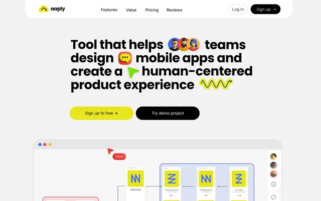
Preview image. Unlock full-res
Vibrant whiteboard sketch. Bright digital ink on a muted gray canvas, with playful, organic shapes.
Color palette
Iconography, accent graphics, interactive text links — adds a warm, inviting accent to UI elements.
Used for distinctive UI elements, notably a tooltip-like component — provides a striking, high-visibility contrast.
Interactive elements, graphical accents — offers a cool, vibrant contrast to the warm yellows and reds.
Secondary brand accents, often used in product mockups to depict internal UI elements, providing warmth.
Highly saturated accent for distinct small UI elements, emphasizes a fun, energetic feel.
Page backgrounds, section separators, modal backdrops.
Card backgrounds, elevated container surfaces.
Primary text, headline text, iconography, interactive button backgrounds — establishes strong grounding and contrast.
Dividers, subtle borders, input field outlines.
Disabled button text, secondary borders, subtle shadows.
Typography
- Weights
- 400, 500, 700
- Sizes
- 14px, 27px, 34px, 52px, 57px
- Line height
- 1, 1.05, 1.33, 1.35, 1.56, 1.57
- Letter spacing
- -1.026, -0.988, -0.646, -0.513
- Fallback
- system-ui
The primary display font for headlines and prominent textual elements. Its playful yet robust character defines the brand's voice, especially with its tight negative letter-spacing at larger sizes.
- Weights
- 300, 400, 500, 700
- Sizes
- 15px, 16px, 18px, 27px, 31px
- Line height
- 1.4, 1.44, 1.53, 1.55, 1.56
- Letter spacing
- -0.682, -0.756
- Fallback
- sans-serif
The workhorse sans-serif for body text, subheadings, and UI labels. Its legibility at smaller sizes and various weights provides versatility and a modern feel, complementing the Poppins display font.
- Weights
- 400
- Sizes
- 16px
- Line height
- 1.2
- Fallback
- serif
A decorative serif font used sparingly, likely for specific styled elements within illustrations or small, distinct text blocks, standing out against the dominant sans-serifs.
Spacing & shape
Elevation
Components
Rounded button with Lemon Zest (#e6e51e) background, Onyx Ink (#000000) text, and a 30px border-radius. Features a right-pointing arrow icon and 16px vertical, 24px horizontal padding.
Ghost button with Onyx Ink (#000000) stroke and text, transparent background, and a 30px border-radius. Used for secondary actions, providing a subtle interactive cue.
Black text, Inter font, 16px size. Hover state is implied by underline or color change based on convention.
Outline button with a 30px border-radius, Onyx Ink (#000000) text, and a Fog (#e6e6e6) border, set against Canvas (#ffffff) header background.
Filled button with an Onyx Ink (#000000) background, Canvas (#ffffff) text, and a 30px border-radius.
A small, rounded rectangle with a Bubblegum Red (#f34646) background, white text, and a 50px border-radius, used for micro-interactions or labels.
Guidelines
- Prioritize Onyx Ink (#000000) for all body text and headlines to maintain high contrast on Whiteboard Background (#f2f2f2) and Canvas (#ffffff).
- Use Lemon Zest (#e6e51e) exclusively for primary calls-to-action, distinguishing them as the highest priority interaction.
- Apply Poppins for all major headings (52px, 57px) with tight negative letter-spacing for brand distinction.
- Maintain a 30px border-radius for all primary buttons and card elements to reinforce branding.
- Utilize a mix of playful radii (30px, 36px, 40px, 50px) for non-standard elements or decorative components to add visual interest.
- Employ the rgba(0, 0, 0, 0.2) 0px 10px 10px -5px shadow sparingly, primarily for elevated cards or modals.
- Avoid using any desaturated or low-contrast colors for interactive elements; stick to the vivid brand palette for engagement.
- Do not use generic gray text for headlines or body copy; maintain the strong presence of Onyx Ink (#000000).
- Do not introduce new serif fonts beyond the decorative Times; maintain a clean sans-serif primary text hierarchy.
- Avoid blocky, sharp-cornered elements; lean into the rounded aesthetic with a variety of radii.
- Do not use subtle shadows for most UI elements; the design emphasizes flat surfaces with distinct color accents.
- Do not vary line-height significantly from specified values on Inter and Poppins, as this can disrupt the intended typographic rhythm.
About this system
ShowHide
Aaply's design feels like an energetic, vibrant whiteboard brainstorming session. The stark contrast between a near-achromatic gray background and bold, highly saturated colors creates a dynamic, youthful energy. Playful, varied border radii across elements disrupt uniformity, while the strategic use of black, not dark gray, for headlines and body text grounds the otherwise light interface with a strong visual presence. This system intentionally uses a high key, vibrant color palette for interaction over subtle cues.
The page primarily uses a max-width centered layout (implied 1200px based on component width) with generous sectionGap (64px) for comfortable density. The hero section features a centered headline over the Whiteboard Background (#f2f2f2) without a full-bleed visual. Content sections largely follow a stacked, centered pattern, or a basic two-column arrangement (text and image/illustration). The rhythm is consistent: light gray background with content blocks, followed by another light gray, creating a sense of spaciousness. Navigation is a fixed top bar with a left-aligned logo and right-aligned main navigation and action buttons.
The visual language focuses heavily on stylized product mockups and illustrations. Product screenshots are contained within rounded frames, often featuring the brand's Lemon Zest (#e6e51e) yellow for UI elements. Illustrations are flat, geometric, and often whimsical, using the full vibrant accent palette (Bubblegum Red, Electric Violet, Playful Burst Orange). Icons are typically filled and black on light backgrounds, or white on vibrant colored elements. Imagery is not purely decorative; it serves to explain features and visualize the product's UX flow, often overlapping with the UI. The density is moderate, balancing descriptive text with illustrative examples.
Reminiscent of Figma, Notion, Miro, Webflow, Canva.
# Aaply — Style Reference
> Vibrant whiteboard sketch. Bright digital ink on a muted gray canvas, with playful, organic shapes.

**Theme:** light

**Site:** https://aaply.app

Aaply's design feels like an energetic, vibrant whiteboard brainstorming session. The stark contrast between a near-achromatic gray background and bold, highly saturated colors creates a dynamic, youthful energy. Playful, varied border radii across elements disrupt uniformity, while the strategic use of black, not dark gray, for headlines and body text grounds the otherwise light interface with a strong visual presence. This system intentionally uses a high key, vibrant color palette for interaction over subtle cues.

## Tokens — Colors

| Name | Value | Token | Role |
|------|------|------|------|
| Playful Burst Orange | `#ff8562` | `--color-playful-burst-orange` | Iconography, accent graphics, interactive text links — adds a warm, inviting accent to UI elements. |
| Bubblegum Red | `#f34646` | `--color-bubblegum-red` | Used for distinctive UI elements, notably a tooltip-like component — provides a striking, high-visibility contrast. |
| Electric Violet | `#466cf3` | `--color-electric-violet` | Interactive elements, graphical accents — offers a cool, vibrant contrast to the warm yellows and reds. |
| Sunshine Yellow | `#f5bd50` | `--color-sunshine-yellow` | Secondary brand accents, often used in product mockups to depict internal UI elements, providing warmth. |
| Neon Yellow | `#fff705` | `--color-neon-yellow` | Highly saturated accent for distinct small UI elements, emphasizes a fun, energetic feel. |
| Whiteboard Background | `#f2f2f2` | `--color-whiteboard-background` | Page backgrounds, section separators, modal backdrops. |
| Canvas | `#ffffff` | `--color-canvas` | Card backgrounds, elevated container surfaces. |
| Onyx Ink | `#000000` | `--color-onyx-ink` | Primary text, headline text, iconography, interactive button backgrounds — establishes strong grounding and contrast. |
| Fog | `#e6e6e6` | `--color-fog` | Dividers, subtle borders, input field outlines. |
| Pebble | `#cccccc` | `--color-pebble` | Disabled button text, secondary borders, subtle shadows. |

## Tokens — Typography

### Poppins
- **Substitute:** system-ui
- **Weights:** 400, 500, 700
- **Sizes:** 14px, 27px, 34px, 52px, 57px
- **Line height:** 1, 1.05, 1.33, 1.35, 1.56, 1.57
- **Letter spacing:** -1.026, -0.988, -0.646, -0.513
- **Role:** The primary display font for headlines and prominent textual elements. Its playful yet robust character defines the brand's voice, especially with its tight negative letter-spacing at larger sizes.

### Inter
- **Substitute:** sans-serif
- **Weights:** 300, 400, 500, 700
- **Sizes:** 15px, 16px, 18px, 27px, 31px
- **Line height:** 1.4, 1.44, 1.53, 1.55, 1.56
- **Letter spacing:** -0.682, -0.756
- **Role:** The workhorse sans-serif for body text, subheadings, and UI labels. Its legibility at smaller sizes and various weights provides versatility and a modern feel, complementing the Poppins display font.

### Times
- **Substitute:** serif
- **Weights:** 400
- **Sizes:** 16px
- **Line height:** 1.2
- **Role:** A decorative serif font used sparingly, likely for specific styled elements within illustrations or small, distinct text blocks, standing out against the dominant sans-serifs.

## Tokens — Type Scale

Major Third (1.25) from 14px base.

| Role | Size | Line height | Letter spacing |
|------|------|------|------|
| body-sm | 14px | 1.57 | — |
| body-lg | 16px | 1.44 | — |
| subheading | 18px | 1.55 | — |
| heading | 27px | 1.33 | -0.513px |
| heading-lg | 31px | 1.56 | -0.682px |
| display | 52px | 1.05 | -0.988px |
| display-lg | 57px | 1.05 | -1.026px |

## Tokens — Spacing

- **Max width:** 1200px
- **Section gap:** 64px
- **Element gap:** 16px

## Tokens — Radius

- **Default:** 16px
- **Buttons:** 30px
- **Cards:** 30px
- **extraLarge:** 40px
- **large:** 36px
- **pill:** 3000px

## Tokens — Elevation

- **Product Diagram Card:** `rgba(0, 0, 0, 0.2) 0px 10px 10px -5px`

## Layout

The page primarily uses a max-width centered layout (implied 1200px based on component width) with generous sectionGap (64px) for comfortable density. The hero section features a centered headline over the Whiteboard Background (#f2f2f2) without a full-bleed visual. Content sections largely follow a stacked, centered pattern, or a basic two-column arrangement (text and image/illustration). The rhythm is consistent: light gray background with content blocks, followed by another light gray, creating a sense of spaciousness. Navigation is a fixed top bar with a left-aligned logo and right-aligned main navigation and action buttons.

## Imagery

The visual language focuses heavily on stylized product mockups and illustrations. Product screenshots are contained within rounded frames, often featuring the brand's Lemon Zest (#e6e51e) yellow for UI elements. Illustrations are flat, geometric, and often whimsical, using the full vibrant accent palette (Bubblegum Red, Electric Violet, Playful Burst Orange). Icons are typically filled and black on light backgrounds, or white on vibrant colored elements. Imagery is not purely decorative; it serves to explain features and visualize the product's UX flow, often overlapping with the UI. The density is moderate, balancing descriptive text with illustrative examples.

## Components

### CTA Button Group

### Tooltip / Badge Components

### Feature / Stat Cards

### Primary Call-to-Action Button
*Interactive element*

Rounded button with Lemon Zest (#e6e51e) background, Onyx Ink (#000000) text, and a 30px border-radius. Features a right-pointing arrow icon and 16px vertical, 24px horizontal padding.

### Secondary Outline Button
*Interactive element*

Ghost button with Onyx Ink (#000000) stroke and text, transparent background, and a 30px border-radius. Used for secondary actions, providing a subtle interactive cue.

### Navigation Link
*Interactive element*

Black text, Inter font, 16px size. Hover state is implied by underline or color change based on convention.

### Header Login Button
*Interactive element*

Outline button with a 30px border-radius, Onyx Ink (#000000) text, and a Fog (#e6e6e6) border, set against Canvas (#ffffff) header background.

### Header Sign Up Button
*Interactive element*

Filled button with an Onyx Ink (#000000) background, Canvas (#ffffff) text, and a 30px border-radius.

### Tooltip Bubblegum Red
*Informational / contextual*

A small, rounded rectangle with a Bubblegum Red (#f34646) background, white text, and a 50px border-radius, used for micro-interactions or labels.

## Guidelines

### Do

- Prioritize Onyx Ink (#000000) for all body text and headlines to maintain high contrast on Whiteboard Background (#f2f2f2) and Canvas (#ffffff).
- Use Lemon Zest (#e6e51e) exclusively for primary calls-to-action, distinguishing them as the highest priority interaction.
- Apply Poppins for all major headings (52px, 57px) with tight negative letter-spacing for brand distinction.
- Maintain a 30px border-radius for all primary buttons and card elements to reinforce branding.
- Utilize a mix of playful radii (30px, 36px, 40px, 50px) for non-standard elements or decorative components to add visual interest.
- Employ the rgba(0, 0, 0, 0.2) 0px 10px 10px -5px shadow sparingly, primarily for elevated cards or modals.

### Don't

- Avoid using any desaturated or low-contrast colors for interactive elements; stick to the vivid brand palette for engagement.
- Do not use generic gray text for headlines or body copy; maintain the strong presence of Onyx Ink (#000000).
- Do not introduce new serif fonts beyond the decorative Times; maintain a clean sans-serif primary text hierarchy.
- Avoid blocky, sharp-cornered elements; lean into the rounded aesthetic with a variety of radii.
- Do not use subtle shadows for most UI elements; the design emphasizes flat surfaces with distinct color accents.
- Do not vary line-height significantly from specified values on Inter and Poppins, as this can disrupt the intended typographic rhythm.

## Agent Prompt Guide

### Quick Color Reference
- Text: #000000 (Onyx Ink)
- Background: #f2f2f2 (Whiteboard Background)
- Primary CTA: #e6e51 (Lemon Zest)
- Card Surface: #ffffff (Canvas)
- Accent Red: #f34646 (Bubblegum Red)

### 3-5 Example Component Prompts
1. **Create a hero section:** Whiteboard Background (#f2f2f2). Headline text 'Tool that helps teams design mobile apps...' in Poppins 57px, weight 700, Onyx Ink (#000000), letter-spacing -1.026px. Primary CTA button with Lemon Zest (#e6e51e) background, Onyx Ink (#000000) text (Inter 16px), 30px radius, 16px vertical padding, 24px horizontal padding. Secondary outline button with Onyx Ink (#000000) text (Inter 16px), 30px radius, 1px Onyx Ink border, 16px vertical padding, 24px horizontal padding.
2. **Generate a product feature card:** Canvas (#ffffff) background, 30px border-radius, box-shadow rgba(0, 0, 0, 0.2) 0px 10px 10px -5px. Title in Poppins 27px, weight 700, Onyx Ink (#000000), letter-spacing -0.513px. Body text in Inter 16px, weight 400, Onyx Ink (#000000).
3. **Design a navigation bar:** Canvas (#ffffff) background. Logo on left. Navigation links (Features, Value, Pricing, Reviews) in Inter 16px, weight 400, Onyx Ink (#000000). 'Log in' button as an outline type (Onyx Ink border, text), 'Sign up' button filled with Onyx Ink (#000000) background and Canvas (#ffffff) text. Both buttons have 30px radius. All elements are within a 1200px max-width container.
More like this







Keep what you find
A free account saves references to boards and can send you a weekly email of picks based on what you save.
To see every result, go Pro.