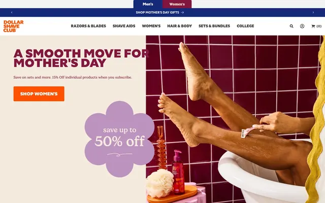
Preview image. Unlock full-res
Bold utility, clear guidance
Color palette
Primary background, prominent text, card elements
Accent for navigation states and specific content blocks
Primary call-to-action buttons, interactive highlights
Darker background variations, subtle interactive states
Primary text, button text, crisp borders, page elements
Secondary text, dark internal borders, neutral button elements
Background for information cards, subtle surface contrasts
Subtle background accents or section dividers
Subtle borders, background accents for imagery
Divider lines, badge borders
Input borders, placeholder text
Heavy borders, strong outlines, occasional text
Typography
- Weights
- 400, 600, 700, 800, 900
- Sizes
- 12px, 14px, 15px, 16px, 18px, 20px, 24px, 32px, 40px, 52px
- Line height
- 0.8, 1, 1.19, 1.2, 1.25, 1.29, 1.3, 1.33, 1.36, 1.5, 1.57, 1.8, 1.86
- Letter spacing
- -0.0060em at 52px, 0.0120em at 40px, 0.0150em at 32px, 0.0250em at 24px, 0.0310em at 20px, 0.0330em at 18px, 0.0380em at 16px, 0.0400em at 15px, 0.0430em at 14px, 0.0440em at 12px
- Fallback
- Montserrat, Open Sans
Primary brand typeface for all headings, body text, buttons, and UI elements. Its strong, condensed character is key to the brand's direct and confident voice.
- Weights
- 400, 700, 800
- Sizes
- 12px, 14px, 16px
- Line height
- 1.2, 1.4, 1.5, 1.8
- Letter spacing
- 0.0250em at 16px, 0.0710em at 12px
- Fallback
- Roboto, Lato
Secondary typeface for navigation, input fields, and some body text, providing a complementary, slightly wider feel; particularly for all-caps navigation items to ensure legibility.
- Weights
- 400
- Sizes
- 16px
- Line height
- 1.5
GTStandard-M — detected in extracted data but not described by AI
- Weights
- 300
- Sizes
- 18px
- Line height
- 1
Font Awesome 5 Pro — detected in extracted data but not described by AI
Spacing & shape
Components
Filled with Action Orange (#fe5000), white text (#ffffff), 5px border-radius, 10px vertical and 20px horizontal padding. A more prominent variant uses 15px vertical and 80px horizontal padding and 4px radius.
Transparent background, Slate Gray (#404040) text and border, no border-radius (0px), 0px padding. Used for subtle interactions like 'Add' or within navigation.
Deep Space Blue (#0a153c) background, white text (#ffffff), 4px border-radius, 2px vertical and 7px horizontal padding. Used for the segmented 'Men's' / 'Women's' navigation.
Powder Blue (#dbebf5) background, 0px border-radius, 25px padding on all sides, no shadow. Content within uses Midnight Blue (#142978) for primary text.
Transparent background, 0px border-radius, 0px padding, no shadow. Adaptable for various content blocks like product listings.
Transparent background, Slate Gray (#404040) text, no border-radius, 0px padding, a light subtle border in #404040 with 8% opacity. Used for search inputs.
White background (#ffffff), Slate Gray (#404040) text, 4px border-radius, 10px vertical and 40px horizontal padding. Prominently used for search.
White background (#ffffff), Slate Gray (#404040) text, 4px border-radius, 10px padding, 4px right margin. Often used with icon for count.
Transparent background, Platinum Gray (#e3e3e3) border, 4px border-radius. Padding and text color typically inherited from context.
Guidelines
- Use Midnight Blue (#142978) as the primary background for content sections to maintain visual depth and brand consistency.
- Apply Action Orange (#fe5000) exclusively for primary calls-to-action and critical interactive elements.
- Prioritize DSC Specter for all headings and body text, varying weights (400-900) to establish clear typographic hierarchy.
- Ensure all buttons use a border-radius of either 5px or 4px for a consistent, subtle softness.
- Maintain a clear elementGap of 10px between inline interactive elements and form fields.
- Utilize Mahogany Red (#82163f) sparingly, primarily for navigation highlights or specific brand messages.
- Leverage Powder Blue (#dbebf5) for card backgrounds to visually differentiate information blocks without adding visual weight.
- Do not use generic gray tones for button backgrounds; all functional buttons should adopt Action Orange (#fe5000) or Deep Space Blue (#0a153c) for variant actions.
- Avoid excessive use of shadows; most components should remain flat to emphasize the bold color palette.
- Do not introduce new font families; adhere strictly to DSC Specter and Gelica for all text.
- Refrain from using Crisp White (#ffffff) as a primary background for large sections unless it's a dedicated hero or a very light content spot contrasting a dark dominant mode.
- Do not deviate from the established spacing scale; maintain 10px for element gaps and 25px for card padding to keep a comfortable density.
- Never use achromatic blacks or dark grays for primary text on dark backgrounds; always use Crisp White (#ffffff) for readability.
- Avoid outlining primary action buttons; the design system strongly favors filled Action Orange (#fe5000) for emphasis.
About this system
ShowHide
Dollar Shave Club presents a bold, product-focused aesthetic built on a deep blue foundation. Vibrant brand colors like orange and maroon punctuate the interface, guiding attention to key actions and brand messaging, while a tightly defined typographic system ensures strong hierarchy. Components are direct and confident, featuring slight corner rounding and minimal elevation, allowing the strong color palette and product imagery to drive the visual experience.
The page primarily uses a full-bleed layout for background colors, creating distinct horizontal sections. Content within these sections is often centered within an implied max-width container, especially for headings and feature blocks. The hero section is a split layout: a commanding headline and call-to-action on the left, set against a predominantly white or light background, paired with a dynamic lifestyle image on the right which can be deeply saturated with brand colors. Subsequent sections alternate between Midnight Blue and brighter card backgrounds, often utilizing a 4-column grid for product features or a 3-column grid for 'How It Works' style content. Navigation is a sticky top bar with clearly segmented 'Men's' and 'Women's' options, reinforced by a secondary navigation for product categories.
This site features a mix of product photography and stylized lifestyle imagery. Product shots are typically tight crops, often on solid backgrounds (Powder Blue or white), showcasing the items clearly rather than in use. Lifestyle images, when present, tend to be candid and dynamic, with warm lighting and a slightly desaturated color treatment, aiming for authenticity. Illustrations are abstract and organic, using brand colors like Action Orange and a pastel purple for decorative flair. Icons are outlined, with a moderate stroke weight, and primarily use Action Orange or Crisp White, contrasting against the dark backgrounds. Imagery density is moderate, used to break up text sections and highlight product benefits.
Reminiscent of Harry's, Manscaped, Away (luggage), Native (deodorant).
# Dollar Shave Club — Style Reference
> Bold utility, clear guidance

**Theme:** dark

**Site:** https://www.dollarshaveclub.com

Dollar Shave Club presents a bold, product-focused aesthetic built on a deep blue foundation. Vibrant brand colors like orange and maroon punctuate the interface, guiding attention to key actions and brand messaging, while a tightly defined typographic system ensures strong hierarchy. Components are direct and confident, featuring slight corner rounding and minimal elevation, allowing the strong color palette and product imagery to drive the visual experience.

## Tokens — Colors

| Name | Value | Token | Role |
|------|------|------|------|
| Midnight Blue | `#142978` | `--color-midnight-blue` | Primary background, prominent text, card elements |
| Mahogany Red | `#82163f` | `--color-mahogany-red` | Accent for navigation states and specific content blocks |
| Action Orange | `#fe5000` | `--color-action-orange` | Primary call-to-action buttons, interactive highlights |
| Deep Space Blue | `#0a153c` | `--color-deep-space-blue` | Darker background variations, subtle interactive states |
| Crisp White | `#ffffff` | `--color-crisp-white` | Primary text, button text, crisp borders, page elements |
| Slate Gray | `#404040` | `--color-slate-gray` | Secondary text, dark internal borders, neutral button elements |
| Powder Blue | `#dbebf5` | `--color-powder-blue` | Background for information cards, subtle surface contrasts |
| Warm Cream | `#f5ecdf` | `--color-warm-cream` | Subtle background accents or section dividers |
| Light Gray | `#eeeeee` | `--color-light-gray` | Subtle borders, background accents for imagery |
| Platinum Gray | `#e3e3e3` | `--color-platinum-gray` | Divider lines, badge borders |
| Ash Gray | `#949596` | `--color-ash-gray` | Input borders, placeholder text |
| Ink Black | `#000000` | `--color-ink-black` | Heavy borders, strong outlines, occasional text |

## Tokens — Typography

### DSC Specter
- **Substitute:** Montserrat, Open Sans
- **Weights:** 400, 600, 700, 800, 900
- **Sizes:** 12px, 14px, 15px, 16px, 18px, 20px, 24px, 32px, 40px, 52px
- **Line height:** 0.8, 1, 1.19, 1.2, 1.25, 1.29, 1.3, 1.33, 1.36, 1.5, 1.57, 1.8, 1.86
- **Letter spacing:** -0.0060em at 52px, 0.0120em at 40px, 0.0150em at 32px, 0.0250em at 24px, 0.0310em at 20px, 0.0330em at 18px, 0.0380em at 16px, 0.0400em at 15px, 0.0430em at 14px, 0.0440em at 12px
- **Role:** Primary brand typeface for all headings, body text, buttons, and UI elements. Its strong, condensed character is key to the brand's direct and confident voice.

### Gelica
- **Substitute:** Roboto, Lato
- **Weights:** 400, 700, 800
- **Sizes:** 12px, 14px, 16px
- **Line height:** 1.2, 1.4, 1.5, 1.8
- **Letter spacing:** 0.0250em at 16px, 0.0710em at 12px
- **Role:** Secondary typeface for navigation, input fields, and some body text, providing a complementary, slightly wider feel; particularly for all-caps navigation items to ensure legibility.

### GTStandard-M
- **Weights:** 400
- **Sizes:** 16px
- **Line height:** 1.5
- **Role:** GTStandard-M — detected in extracted data but not described by AI

### Font Awesome 5 Pro
- **Weights:** 300
- **Sizes:** 18px
- **Line height:** 1
- **Role:** Font Awesome 5 Pro — detected in extracted data but not described by AI

## Tokens — Type Scale

Major Third (1.25) from 14px base.

| Role | Size | Line height | Letter spacing |
|------|------|------|------|
| caption | 12px | 1.5 | 0.528px |
| body | 14px | 1.57 | 0.602px |
| body-lg | 16px | 1.5 | 0.608px |
| subheading | 18px | 1.29 | 0.594px |
| heading | 24px | 1.25 | 0.6px |
| heading-lg | 32px | 1.2 | 0.48px |
| display | 52px | 0.8 | -0.312px |

## Tokens — Spacing

- **Section gap:** 30px
- **Card padding:** 25px
- **Element gap:** 10px

## Tokens — Radius

- **Default:** 4px
- **Buttons:** 5px 10px
- **Cards:** 4px

## Layout

The page primarily uses a full-bleed layout for background colors, creating distinct horizontal sections. Content within these sections is often centered within an implied max-width container, especially for headings and feature blocks. The hero section is a split layout: a commanding headline and call-to-action on the left, set against a predominantly white or light background, paired with a dynamic lifestyle image on the right which can be deeply saturated with brand colors. Subsequent sections alternate between Midnight Blue and brighter card backgrounds, often utilizing a 4-column grid for product features or a 3-column grid for 'How It Works' style content. Navigation is a sticky top bar with clearly segmented 'Men's' and 'Women's' options, reinforced by a secondary navigation for product categories.

## Imagery

This site features a mix of product photography and stylized lifestyle imagery. Product shots are typically tight crops, often on solid backgrounds (Powder Blue or white), showcasing the items clearly rather than in use. Lifestyle images, when present, tend to be candid and dynamic, with warm lighting and a slightly desaturated color treatment, aiming for authenticity. Illustrations are abstract and organic, using brand colors like Action Orange and a pastel purple for decorative flair. Icons are outlined, with a moderate stroke weight, and primarily use Action Orange or Crisp White, contrasting against the dark backgrounds. Imagery density is moderate, used to break up text sections and highlight product benefits.

## Components

### Primary Action Button
*Main call-to-action*

Filled with Action Orange (#fe5000), white text (#ffffff), 5px border-radius, 10px vertical and 20px horizontal padding. A more prominent variant uses 15px vertical and 80px horizontal padding and 4px radius.

### Ghost Button
*Secondary action that needs less emphasis*

Transparent background, Slate Gray (#404040) text and border, no border-radius (0px), 0px padding. Used for subtle interactions like 'Add' or within navigation.

### Navigation Button
*Top-level navigation items*

Deep Space Blue (#0a153c) background, white text (#ffffff), 4px border-radius, 2px vertical and 7px horizontal padding. Used for the segmented 'Men's' / 'Women's' navigation.

### Information Card (Powder Blue)
*Presenting product features or bundles*

Powder Blue (#dbebf5) background, 0px border-radius, 25px padding on all sides, no shadow. Content within uses Midnight Blue (#142978) for primary text.

### Plain Card (Transparent)
*Flexible content container without visual emphasis*

Transparent background, 0px border-radius, 0px padding, no shadow. Adaptable for various content blocks like product listings.

### Text Input (Transparent)
*Form fields without a distinct background*

Transparent background, Slate Gray (#404040) text, no border-radius, 0px padding, a light subtle border in #404040 with 8% opacity. Used for search inputs.

### Text Input (White Background)
*Standard form input fields*

White background (#ffffff), Slate Gray (#404040) text, 4px border-radius, 10px vertical and 40px horizontal padding. Prominently used for search.

### Badge (White)
*Small informational tags*

White background (#ffffff), Slate Gray (#404040) text, 4px border-radius, 10px padding, 4px right margin. Often used with icon for count.

### Badge (Platinum Border)
*Indicating quantity or status*

Transparent background, Platinum Gray (#e3e3e3) border, 4px border-radius. Padding and text color typically inherited from context.

## Guidelines

### Do

- Use Midnight Blue (#142978) as the primary background for content sections to maintain visual depth and brand consistency.
- Apply Action Orange (#fe5000) exclusively for primary calls-to-action and critical interactive elements.
- Prioritize DSC Specter for all headings and body text, varying weights (400-900) to establish clear typographic hierarchy.
- Ensure all buttons use a border-radius of either 5px or 4px for a consistent, subtle softness.
- Maintain a clear elementGap of 10px between inline interactive elements and form fields.
- Utilize Mahogany Red (#82163f) sparingly, primarily for navigation highlights or specific brand messages.
- Leverage Powder Blue (#dbebf5) for card backgrounds to visually differentiate information blocks without adding visual weight.

### Don't

- Do not use generic gray tones for button backgrounds; all functional buttons should adopt Action Orange (#fe5000) or Deep Space Blue (#0a153c) for variant actions.
- Avoid excessive use of shadows; most components should remain flat to emphasize the bold color palette.
- Do not introduce new font families; adhere strictly to DSC Specter and Gelica for all text.
- Refrain from using Crisp White (#ffffff) as a primary background for large sections unless it's a dedicated hero or a very light content spot contrasting a dark dominant mode.
- Do not deviate from the established spacing scale; maintain 10px for element gaps and 25px for card padding to keep a comfortable density.
- Never use achromatic blacks or dark grays for primary text on dark backgrounds; always use Crisp White (#ffffff) for readability.
- Avoid outlining primary action buttons; the design system strongly favors filled Action Orange (#fe5000) for emphasis.

## Agent Prompt Guide

Quick Color Reference:
text: #ffffff
background: #142978
border: #404040
accent: #82163f
primary action: #fe5000 (filled action)

Example Component Prompts:
1. Create a Primary Action Button: #fe5000 background, #404040 text, 9999px radius, compact pill padding. Use this filled treatment for the main CTA.
3. Create a navigation link: background transparent. Text 'Razors & Blades' using DSC Specter weight 600, size 16px, #ffffff. On hover, use Mahogany Red (#82163f) for the background with 4px radius and 13px right margin.
More like this








Keep what you find
A free account saves references to boards and can send you a weekly email of picks based on what you save.
To see every result, go Pro.