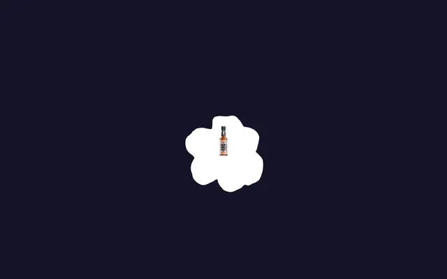
Preview image. Unlock full-res
zine-punk poster
Color palette
Decorative borders, large heading text, secondary backgrounds, outlined button strokes. This off-white serves as the primary contrasting color
Page background, primary canvas
Body text, secondary text, illustration fill. Provides a darker contrast against Buttermilk Cream
Decorative graphic fills, supporting elements. Provides the sharpest contrast against Buttermilk Cream
Typography
- Weights
- 400
- Sizes
- 14px
- Line height
- 1.43
- Fallback
- Arial, Helvetica, sans-serif
Detail text, legal links, small print. Its system-font clarity provides grounding amidst custom display fonts.
- Weights
- 400, 700
- Sizes
- 50px, 187px, 245px, 576px
- Line height
- 0.82, 0.85, 0.94, 1
- Letter spacing
- -0.038em at 576px, -0.029em at 245px, -0.012em at 187px
- Fallback
- Impact, sans-serif
Dominant display headlines. Its condensed, bold nature and tight tracking create a powerful, blocky visual presence that feels like a newspaper headline or poster.
- Weights
- 400
- Sizes
- 29px, 36px, 58px
- Line height
- 1, 1.2
- Letter spacing
- normal
- Fallback
- Inter, sans-serif
Mid-sized headings, sub-headings, and prominent calls to action. Offers a more approachable, rounded alternative to Obviously while maintaining a strong personality.
Spacing & shape
Components
Black uppercase text 'BUY NOW' on a Buttermilk Cream background, framed by a thick 3.5px Pure Black border. The repeating nature is a key visual motif.
Deep Graphite text at 14px Arial, 400 weight, with 1.43 line height, contrasting against the Midnight Indigo background. Often accompanied by 14px top margin.
A repeating pattern of 'WTF IS GUYANA' text in Buttermilk Cream, often with star motifs, acting as a thick decorative border element around content sections. The text is 14px Arial, 400 weight.
Massive 'Obviously' font in Buttermilk Cream, using 576px at weight 400, with a tight letter-spacing of -0.038em. Dominates the viewport.
Vulf Sans in Buttermilk Cream at 58px weight 400 with normal letter spacing. Often has a 24px top margin.
A container with a 72px border radius, giving it a strongly rounded circular to pill-shaped appearance.
Guidelines
- Use Midnight Indigo (#151329) as the primary page background.
- Utilize Buttermilk Cream (#feeee2) for all prominent display text and decorative borders to maximize contrast.
- Apply 'Obviously' font with tight letter-spacing (-0.038em for largest sizes) to all major headlines for a dense, impactful look.
- Frame significant content blocks with 3.5px solid borders in Pure Black (#000000) or Buttermilk Cream (#feeee2).
- Employ a generous 72px border radius for any enclosed elements, creating distinct circular or pill shapes.
- Maintain a clear visual hierarchy by limiting text colors primarily to Deep Graphite (#333333) and Buttermilk Cream (#feeee2).
- Use 29px as a recurring horizontal padding or margin for content sections and large elements.
- Avoid subtle gradients or soft shadows; the design relies on stark contrast and flat color.
- Do not introduce new saturated accent colors; stick to the Midnight Indigo, Buttermilk Cream, and Deep Graphite palette.
- Refrain from using more than two font families; confine typography to Arial, Obviously, and Vulf Sans.
- Do not use letter spacing greater than 'normal'; condensed and tightly tracked text is a core characteristic.
- Avoid standard square or minimally rounded corners; all significant contained elements should leverage the 72px radius.
- Do not clutter layouts with too much small text; prioritize impactful headlines and concise paragraphs.
About this system
ShowHide
Peppasauce employs a bold, playful 'zine-punk poster' aesthetic with a heavy emphasis on custom typography and high contrast. The visual system is built around a deep indigo canvas and a creamy off-white accent, creating a punchy, almost monochromatic feel broken only by the product imagery. Layouts are dense and text-heavy, framed by decorative borders and repeating textual motifs. The design avoids subtle gradients or shadows, opting for stark outlines and flat color surfaces.
The page primarily uses a full-bleed layout on a Midnight Indigo canvas, with content constrained by generous horizontal padding rather than a fixed max-width container, giving a sense of immersive space. The hero section features a commanding, large-scale headline (Sometimes overlaid on map-like graphics) and repeating text borders. Sections have a continuous vertical flow, punctuated by repeating textual and bordered motifs like a retro newspaper layout. Content is typically arranged in centered stacks or simple text blocks, occasionally framed by decorative borders with text running along the edges. Density is high, with elements often butting up against each other or overlapping slightly to create a collage effect. Navigation is minimal, relying on repeating visual cues and perhaps a very small, unobtrusive footer.
The site uses a mix of tightly cropped, brightly lit product photography against simple backgrounds (often white) and abstract, collage-like graphics. Illustrations feature organic, blob-like shapes in flat Buttermilk Cream or Pure Black, often serving as background elements or frames. Icons, when present, are simple, monochromatic, and tend to be filled rather than outlined, matching the bold, high-contrast aesthetic. Imagery is primarily decorative and atmospheric, emphasizing brand personality rather than detailed product features, with a high density of visual elements creating a busy, 'zine' feel.
Reminiscent of Fenty Beauty, Supreme, Liquid Death, Actual Source.
# Peppasauce — Style Reference
> zine-punk poster

**Theme:** dark

**Site:** https://www.peppasauce.love

Peppasauce employs a bold, playful 'zine-punk poster' aesthetic with a heavy emphasis on custom typography and high contrast. The visual system is built around a deep indigo canvas and a creamy off-white accent, creating a punchy, almost monochromatic feel broken only by the product imagery. Layouts are dense and text-heavy, framed by decorative borders and repeating textual motifs. The design avoids subtle gradients or shadows, opting for stark outlines and flat color surfaces.

## Tokens — Colors

| Name | Value | Token | Role |
|------|------|------|------|
| Buttermilk Cream | `#feeee2` | `--color-buttermilk-cream` | Decorative borders, large heading text, secondary backgrounds, outlined button strokes. This off-white serves as the primary contrasting color |
| Midnight Indigo | `#151329` | `--color-midnight-indigo` | Page background, primary canvas |
| Deep Graphite | `#333333` | `--color-deep-graphite` | Body text, secondary text, illustration fill. Provides a darker contrast against Buttermilk Cream |
| Pure Black | `#000000` | `--color-pure-black` | Decorative graphic fills, supporting elements. Provides the sharpest contrast against Buttermilk Cream |

## Tokens — Typography

### Arial
- **Substitute:** Arial, Helvetica, sans-serif
- **Weights:** 400
- **Sizes:** 14px
- **Line height:** 1.43
- **Role:** Detail text, legal links, small print. Its system-font clarity provides grounding amidst custom display fonts.

### Obviously
- **Substitute:** Impact, sans-serif
- **Weights:** 400, 700
- **Sizes:** 50px, 187px, 245px, 576px
- **Line height:** 0.82, 0.85, 0.94, 1
- **Letter spacing:** -0.038em at 576px, -0.029em at 245px, -0.012em at 187px
- **Role:** Dominant display headlines. Its condensed, bold nature and tight tracking create a powerful, blocky visual presence that feels like a newspaper headline or poster.

### Vulf Sans
- **Substitute:** Inter, sans-serif
- **Weights:** 400
- **Sizes:** 29px, 36px, 58px
- **Line height:** 1, 1.2
- **Letter spacing:** normal
- **Role:** Mid-sized headings, sub-headings, and prominent calls to action. Offers a more approachable, rounded alternative to Obviously while maintaining a strong personality.

## Tokens — Type Scale

| Role | Size | Line height | Letter spacing |
|------|------|------|------|
| body | 14px | 1.43 | — |
| heading-sm | 29px | 1 | — |
| heading | 36px | 1.2 | — |
| heading-lg | 50px | 0.82 | — |
| display | 576px | 0.85 | -0.038em |

## Tokens — Spacing

- **Section gap:** 29px
- **Card padding:** 43px
- **Element gap:** 14px

## Tokens — Radius

- **elements:** 72px

## Layout

The page primarily uses a full-bleed layout on a Midnight Indigo canvas, with content constrained by generous horizontal padding rather than a fixed max-width container, giving a sense of immersive space. The hero section features a commanding, large-scale headline (Sometimes overlaid on map-like graphics) and repeating text borders. Sections have a continuous vertical flow, punctuated by repeating textual and bordered motifs like a retro newspaper layout. Content is typically arranged in centered stacks or simple text blocks, occasionally framed by decorative borders with text running along the edges. Density is high, with elements often butting up against each other or overlapping slightly to create a collage effect. Navigation is minimal, relying on repeating visual cues and perhaps a very small, unobtrusive footer.

## Imagery

The site uses a mix of tightly cropped, brightly lit product photography against simple backgrounds (often white) and abstract, collage-like graphics. Illustrations feature organic, blob-like shapes in flat Buttermilk Cream or Pure Black, often serving as background elements or frames. Icons, when present, are simple, monochromatic, and tend to be filled rather than outlined, matching the bold, high-contrast aesthetic. Imagery is primarily decorative and atmospheric, emphasizing brand personality rather than detailed product features, with a high density of visual elements creating a busy, 'zine' feel.

## Components

### Call-to-Action Link
*Primary interactive element for immediate actions.*

Black uppercase text 'BUY NOW' on a Buttermilk Cream background, framed by a thick 3.5px Pure Black border. The repeating nature is a key visual motif.

### Descriptive Text Block
*Informational paragraphs.*

Deep Graphite text at 14px Arial, 400 weight, with 1.43 line height, contrasting against the Midnight Indigo background. Often accompanied by 14px top margin.

### Decorative Border (Horizontal)
*Visual separation and branding.*

A repeating pattern of 'WTF IS GUYANA' text in Buttermilk Cream, often with star motifs, acting as a thick decorative border element around content sections. The text is 14px Arial, 400 weight.

### Hero Headline
*Main page title or section headline.*

Massive 'Obviously' font in Buttermilk Cream, using 576px at weight 400, with a tight letter-spacing of -0.038em. Dominates the viewport.

### Section Heading
*Secondary headings for content sections.*

Vulf Sans in Buttermilk Cream at 58px weight 400 with normal letter spacing. Often has a 24px top margin.

### Circular Element
*Decorative frame for imagery or icons.*

A container with a 72px border radius, giving it a strongly rounded circular to pill-shaped appearance.

## Guidelines

### Do

- Use Midnight Indigo (#151329) as the primary page background.
- Utilize Buttermilk Cream (#feeee2) for all prominent display text and decorative borders to maximize contrast.
- Apply 'Obviously' font with tight letter-spacing (-0.038em for largest sizes) to all major headlines for a dense, impactful look.
- Frame significant content blocks with 3.5px solid borders in Pure Black (#000000) or Buttermilk Cream (#feeee2).
- Employ a generous 72px border radius for any enclosed elements, creating distinct circular or pill shapes.
- Maintain a clear visual hierarchy by limiting text colors primarily to Deep Graphite (#333333) and Buttermilk Cream (#feeee2).
- Use 29px as a recurring horizontal padding or margin for content sections and large elements.

### Don't

- Avoid subtle gradients or soft shadows; the design relies on stark contrast and flat color.
- Do not introduce new saturated accent colors; stick to the Midnight Indigo, Buttermilk Cream, and Deep Graphite palette.
- Refrain from using more than two font families; confine typography to Arial, Obviously, and Vulf Sans.
- Do not use letter spacing greater than 'normal'; condensed and tightly tracked text is a core characteristic.
- Avoid standard square or minimally rounded corners; all significant contained elements should leverage the 72px radius.
- Do not clutter layouts with too much small text; prioritize impactful headlines and concise paragraphs.

## Agent Prompt Guide

Quick Color Reference:
text: #333333
background: #151329
border: #feeee2
accent: #feeee2
primary action: no distinct CTA color

Example Component Prompts:
No distinct primary action color was observed; use the extracted neutral button treatments instead of inventing a filled CTA color.
2. Create a Section Heading: Vulf Sans 58px weight 400 text 'A TASTE OF GUYANA' in #feeee2, positioned with a 24px top margin.
3. Create a decorative border element: Repeating Arial 14px weight 400 text 'WTF IS GUYANA' in #feeee2, with star motifs, acting as a horizontal border. The border element itself has a 3.5px solid #feeee2 stroke.
4. Create a main body text block: Arial 14px weight 400 text in #333333, with 1.43 line height, placed on a #151329 background, with 14px top and bottom margins.
More like this








Keep what you find
A free account saves references to boards and can send you a weekly email of picks based on what you save.
To see every result, go Pro.