Preview image. Unlock full-res
Midnight Command Center
Color palette
Violet outline accent for tags, dividers, and focused UI edges
Primary page background, base surface for many components, establishing the dark theme
Dark borders and separators for elevated surfaces and inverted UI. Do not promote it to the primary CTA color
Subtle background for UI sections and elevated surfaces, slightly lighter than Pitch Black to create depth
Background for secondary buttons and interactive elements, providing a soft lift from the surrounding dark surfaces
Soft borders around images and subtle dividers, providing minimal visual separation
Dark borders and separators for elevated surfaces and inverted UI. Do not promote it to the primary CTA color
Muted text for secondary information, ghost button text, and subtle icons, receding slightly into the background
Medium-contrast borders, control outlines, and structural separators. Do not promote it to the primary CTA color
Primary text, prominent icons, and filled button backgrounds, providing maximum contrast on dark surfaces
Typography
- Weights
- 400, 500, 600
- Sizes
- 14px, 16px, 20px, 24px, 40px, 56px, 64px
- Line height
- 1.13, 1.14, 1.2, 1.29, 1.33, 1.4, 1.5, 1.57
- Letter spacing
- -0.036, -0.031, -0.025, -0.021, -0.012
- Fallback
- System UI
Primary typeface for all UI text, headings, and body copy. Its range of weights and optical adjustments for larger sizes (negative letter-spacing) contribute to the system's precise and authoritative feel.
- Weights
- 400
- Sizes
- 12px, 14px
- Line height
- 1, 1.4
- Letter spacing
- 0.083, 0.071
- Fallback
- Fira Code
Monospaced typeface used for small, functional text such as labels, metadata, or code snippets, providing clear distinction and technical precision.
Spacing & shape
Components
Transparent background, Polar White text (rgba(255, 255, 255, 0.64)), no border, 0px radius, 0px padding. Designed for minimal visual weight.
Dark Frost (rgb(30,30,30)) background, Polar White (rgb(255,255,255)) text, 8px border-radius, 10px vertical padding, 11px horizontal padding.
Polar White (rgb(255,255,255)) background, Midnight Charcoal (rgb(10,10,10)) text, 8px border-radius, 10px vertical padding, 16px horizontal padding.
Transparent background, Polar White (rgb(255,255,255)) text, with a subtle Polar White (rgba(255, 255, 255, 0.24)) 1px border. 8px border-radius, 10px vertical padding, 16px horizontal padding.
Pitch Black (rgb(0,0,0)) background, 66px border-radius, no shadow or padding.
Off-Black (rgb(20,20,20)) background, 8px border-radius, no shadow or padding. Subtly elevated from the primary page background.
Guidelines
- Prioritize Dark Frost (#1e1e1e) or Pitch Black (#000000) for interactive elements, reserving Polar White (#ffffff) for primary action roles and key information.
- Apply negative letter-spacing from the Inter font definition to all headings and large display text for a tight, authoritative feel.
- Use Data Blue (#6798ff) exclusively for functional accents, interactive states, and data points, avoiding decorative use.
- Maintain an 8px base unit for all spacing, particularly elementGap and cardPadding, ensuring a consistent density.
- Render all primary button and card elements with an 8px border-radius to maintain a consistent soft containment.
- Utilize JetBrains Mono font for any labels, tokens, or data fields that require a fixed-width, technical appearance.
- Implement the subtle 1px border with Light Gray (#454545) or Polar White (rgba(255, 255, 255, 0.24)) for ghost/outlined elements.
- Avoid using highly saturated, non-semantic colors beyond Data Blue (#6798ff); maintain a grayscale palette for most UI elements.
- Do not deviate from the specified negative letter-spacing values for Inter headings; incorrect tracking will compromise the brand's typographic signature.
- Do not introduce strong shadows or excessive elevation; the system relies on subtle background shifts and borders for depth.
- Avoid using Polar White (#ffffff) as a general background color; it is reserved for foreground elements on dark surfaces.
- Do not use default browser link colors (e.g. #0000ee); ensure all interactive text adheres to the defined color palette, typically Data Blue or Silver Dust.
- Do not apply large, decorative imagery; maintain tight crops or abstract graphics that integrate seamlessly with the dark UI.
- Avoid irregular border radii; adhere strictly to 8px for most components and 66px for specific circular features.
About this system
ShowHide
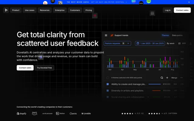
Dovetail employs a dark-mode command center aesthetic centered on crisp functionality. A deep charcoal canvas serves as the backdrop for subtly elevated, monochromatic interface elements. Typography is compact and precise, utilizing negative letter-spacing for large text to convey authority. A singular vivid blue acts as a functional accent, highlighting interactive states and critical data points within an otherwise cool-toned grayscale palette, creating a focused, efficient user experience.
The page primarily uses a max-width contained layout, though the hero section is full-bleed with a dark background and a central headline. Content often alternates between centered stacked blocks and two-column layouts featuring text on one side and a product visual or data interface on the other. Vertical rhythm is maintained by consistent 32px section gaps. Navigation is a sticky top bar with ghost buttons, transitioning to a primary filled button for key actions. A card grid is used for feature display, maintaining a consistent 8px radius on all card elements.
This system features a blend of product screenshots, abstract geometric graphics, and minimal iconography. Product screenshots are typically tightly cropped, showcasing the UI on dark surfaces, often within larger graphical containers. Abstract graphics, particularly 3D wireframe grids, serve as atmospheric backgrounds rather than content. Icons are generally filled, monochromatic (often white or a subtle gray), with a consistent medium stroke weight, acting as functional rather than decorative elements. Image density is moderate, with visuals often complementing large text blocks without overwhelming them.
Reminiscent of Vercel, Linear, Superhuman, Raycast.
# Dovetail — Style Reference
> Midnight Command Center

**Theme:** dark

**Site:** https://dovetail.com

Dovetail employs a dark-mode command center aesthetic centered on crisp functionality. A deep charcoal canvas serves as the backdrop for subtly elevated, monochromatic interface elements. Typography is compact and precise, utilizing negative letter-spacing for large text to convey authority. A singular vivid blue acts as a functional accent, highlighting interactive states and critical data points within an otherwise cool-toned grayscale palette, creating a focused, efficient user experience.

## Tokens — Colors

| Name | Value | Token | Role |
|------|------|------|------|
| Data Blue | `#6798ff` | `--color-data-blue` | Violet outline accent for tags, dividers, and focused UI edges |
| Midnight Charcoal | `#0a0a0a` | `--color-midnight-charcoal` | Primary page background, base surface for many components, establishing the dark theme |
| Pitch Black | `#000000` | `--color-pitch-black` | Dark borders and separators for elevated surfaces and inverted UI. Do not promote it to the primary CTA color |
| Off-Black | `#141414` | `--color-off-black` | Subtle background for UI sections and elevated surfaces, slightly lighter than Pitch Black to create depth |
| Dark Frost | `#1e1e1e` | `--color-dark-frost` | Background for secondary buttons and interactive elements, providing a soft lift from the surrounding dark surfaces |
| Medium Gray | `#313131` | `--color-medium-gray` | Soft borders around images and subtle dividers, providing minimal visual separation |
| Light Gray | `#454545` | `--color-light-gray` | Dark borders and separators for elevated surfaces and inverted UI. Do not promote it to the primary CTA color |
| Dim Gray | `#7c7c7c` | `--color-dim-gray` | Muted text for secondary information, ghost button text, and subtle icons, receding slightly into the background |
| Silver Dust | `#a7a7a7` | `--color-silver-dust` | Medium-contrast borders, control outlines, and structural separators. Do not promote it to the primary CTA color |
| Polar White | `#ffffff` | `--color-polar-white` | Primary text, prominent icons, and filled button backgrounds, providing maximum contrast on dark surfaces |

## Tokens — Typography

### Inter
- **Substitute:** System UI
- **Weights:** 400, 500, 600
- **Sizes:** 14px, 16px, 20px, 24px, 40px, 56px, 64px
- **Line height:** 1.13, 1.14, 1.2, 1.29, 1.33, 1.4, 1.5, 1.57
- **Letter spacing:** -0.036, -0.031, -0.025, -0.021, -0.012
- **Role:** Primary typeface for all UI text, headings, and body copy. Its range of weights and optical adjustments for larger sizes (negative letter-spacing) contribute to the system's precise and authoritative feel.

### JetBrains Mono
- **Substitute:** Fira Code
- **Weights:** 400
- **Sizes:** 12px, 14px
- **Line height:** 1, 1.4
- **Letter spacing:** 0.083, 0.071
- **Role:** Monospaced typeface used for small, functional text such as labels, metadata, or code snippets, providing clear distinction and technical precision.

## Tokens — Type Scale

Perfect Fourth (1.333) from 16px base.

| Role | Size | Line height | Letter spacing |
|------|------|------|------|
| caption | 14px | 1.4 | 0.083em |
| body | 16px | 1.5 | -0.012em |
| subheading | 20px | 1.4 | -0.021em |
| heading | 24px | 1.33 | -0.025em |
| heading-lg | 40px | 1.29 | -0.031em |
| display | 56px | 1.14 | -0.036em |

## Tokens — Spacing

- **Section gap:** 32px
- **Card padding:** 16px
- **Element gap:** 8px

## Tokens — Radius

- **Buttons:** 8px
- **Cards:** 8px
- **Images:** 8px
- **circularElements:** 66px

## Layout

The page primarily uses a max-width contained layout, though the hero section is full-bleed with a dark background and a central headline. Content often alternates between centered stacked blocks and two-column layouts featuring text on one side and a product visual or data interface on the other. Vertical rhythm is maintained by consistent 32px section gaps. Navigation is a sticky top bar with ghost buttons, transitioning to a primary filled button for key actions. A card grid is used for feature display, maintaining a consistent 8px radius on all card elements.

## Imagery

This system features a blend of product screenshots, abstract geometric graphics, and minimal iconography. Product screenshots are typically tightly cropped, showcasing the UI on dark surfaces, often within larger graphical containers. Abstract graphics, particularly 3D wireframe grids, serve as atmospheric backgrounds rather than content. Icons are generally filled, monochromatic (often white or a subtle gray), with a consistent medium stroke weight, acting as functional rather than decorative elements. Image density is moderate, with visuals often complementing large text blocks without overwhelming them.

## Components

### Ghost Navigation Button
*Main navigation and secondary actions in headers/footers.*

Transparent background, Polar White text (rgba(255, 255, 255, 0.64)), no border, 0px radius, 0px padding. Designed for minimal visual weight.

### Filled Secondary Button
*Standard secondary call-to-action or functional button within dark UIs.*

Dark Frost (rgb(30,30,30)) background, Polar White (rgb(255,255,255)) text, 8px border-radius, 10px vertical padding, 11px horizontal padding.

### Filled Primary Button
*Key call-to-action button, often guiding user flow.*

Polar White (rgb(255,255,255)) background, Midnight Charcoal (rgb(10,10,10)) text, 8px border-radius, 10px vertical padding, 16px horizontal padding.

### Outlined Tertiary Button
*Less prominent interactive elements, often in data displays or advanced controls.*

Transparent background, Polar White (rgb(255,255,255)) text, with a subtle Polar White (rgba(255, 255, 255, 0.24)) 1px border. 8px border-radius, 10px vertical padding, 16px horizontal padding.

### Circular Card Background
*Used as a distinctive visual element or container, possibly for testimonials or key metrics.*

Pitch Black (rgb(0,0,0)) background, 66px border-radius, no shadow or padding.

### Data Overlay Card
*Containers for displaying data visualizations or complex UI elements.*

Off-Black (rgb(20,20,20)) background, 8px border-radius, no shadow or padding. Subtly elevated from the primary page background.

## Guidelines

### Do

- Prioritize Dark Frost (#1e1e1e) or Pitch Black (#000000) for interactive elements, reserving Polar White (#ffffff) for primary action roles and key information.
- Apply negative letter-spacing from the Inter font definition to all headings and large display text for a tight, authoritative feel.
- Use Data Blue (#6798ff) exclusively for functional accents, interactive states, and data points, avoiding decorative use.
- Maintain an 8px base unit for all spacing, particularly elementGap and cardPadding, ensuring a consistent density.
- Render all primary button and card elements with an 8px border-radius to maintain a consistent soft containment.
- Utilize JetBrains Mono font for any labels, tokens, or data fields that require a fixed-width, technical appearance.
- Implement the subtle 1px border with Light Gray (#454545) or Polar White (rgba(255, 255, 255, 0.24)) for ghost/outlined elements.

### Don't

- Avoid using highly saturated, non-semantic colors beyond Data Blue (#6798ff); maintain a grayscale palette for most UI elements.
- Do not deviate from the specified negative letter-spacing values for Inter headings; incorrect tracking will compromise the brand's typographic signature.
- Do not introduce strong shadows or excessive elevation; the system relies on subtle background shifts and borders for depth.
- Avoid using Polar White (#ffffff) as a general background color; it is reserved for foreground elements on dark surfaces.
- Do not use default browser link colors (e.g. #0000ee); ensure all interactive text adheres to the defined color palette, typically Data Blue or Silver Dust.
- Do not apply large, decorative imagery; maintain tight crops or abstract graphics that integrate seamlessly with the dark UI.
- Avoid irregular border radii; adhere strictly to 8px for most components and 66px for specific circular features.

## Agent Prompt Guide

### Quick Color Reference
text: #ffffff
background: #0a0a0a
border: #454545
accent: #6798ff
primary action: #1e1e1e (filled action)

### 3-5 Example Component Prompts
1. Create a Primary Action Button: #1e1e1e background, #ffffff text, 9999px radius, compact pill padding. Use this filled treatment for the main CTA.
2. Create a feature card: Off-Black (#141414) background, 8px border-radius, no shadow. Heading at 20px Inter weight 500, Polar White (#ffffff). Body text at 16px Inter weight 400, Silver Dust (#a7a7a7). Include an icon in Data Blue (#6798ff).
3. Create an outlined button for data filtering: Transparent background, Polar White (#ffffff) text, 1px border in rgba(255, 255, 255, 0.24), 8px border-radius, 10px vertical padding, 16px horizontal padding.
4. Design a small label in JetBrains Mono: 12px JetBrains Mono weight 400, Data Blue (#6798ff), letter-spacing 0.071em. Background Dark Frost (#1e1e1e) with 4px radius and 4px padding.
More like this









Keep what you find
A free account saves references to boards and can send you a weekly email of picks based on what you save.
To see every result, go Pro.