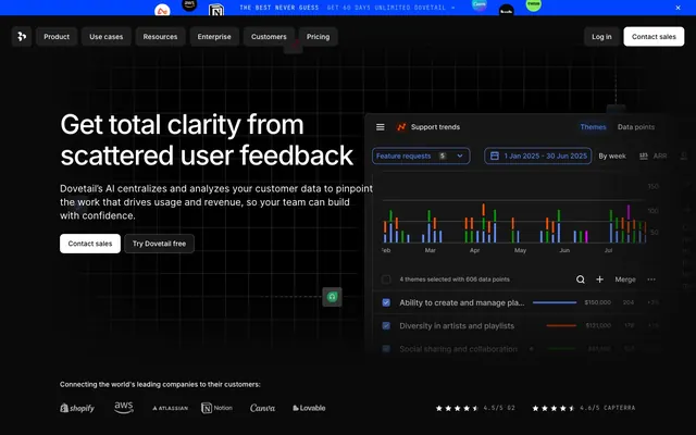
Preview image. Unlock full-res
Midnight command center
Color palette
Violet outline accent for tags, dividers, and focused UI edges. Do not promote it to the primary CTA color
Primary page background, core surface — a rich, near-black that sets the deep-space tone
Secondary surface, button backgrounds, interactive elements — offers slight elevation from the Deep Night background
Tertiary surface, card background — provides another level of depth, slightly lighter than Deep Night
Subtle borders, image frames, grid lines — a barely-there separation for content
Dark borders and separators for elevated surfaces and inverted UI. Do not promote it to the primary CTA color
Primary text, prominent icons, button text — ensures high contrast against dark backgrounds
Secondary text, muted links, subtle details — provides readability without competing with Pure White
Tertiary text, subtle descriptions, disabled states — fades into the background
Typography
- Weights
- 400, 500, 600
- Sizes
- 14px, 16px, 20px, 24px, 40px, 56px, 64px
- Line height
- 1.13, 1.14, 1.2, 1.29, 1.33, 1.4, 1.5, 1.57
- Letter spacing
- -0.0360em at 64px, -0.0310em at 56px, -0.0250em at 40px, -0.0210em at 24px, -0.0120em at 20px
- Fallback
- system-ui
Primary typeface for all UI text, headings, and body content. Its clean, geometric forms provide clarity and modern appeal against the dark theme.
- Weights
- 400
- Sizes
- 12px, 14px
- Line height
- 1, 1.4
- Letter spacing
- 0.0830em at 12px, 0.0710em at 14px
- Fallback
- monospace
Monospaced typeface used for small labels, code snippets, and data points, providing distinctiveness and precision.
Spacing & shape
Components
Transparent background, Pure White text, no border, 0px border-radius, no padding. Inter typeface.
Graphite (#1e1e1e) background, Pure White text, 8px border-radius, 10px vertical and 11px horizontal padding. Inter typeface.
Pure White (#ffffff) background, Deep Night (#0a0a0a) text, 8px border-radius, 10px vertical and 16px horizontal padding. Inter typeface. Offers strong contrast.
Subtle White (rgba(255, 255, 255, 0.08)) background, Pure White text, Subtle White (rgba(255, 255, 255, 0.24)) border, 8px border-radius, 10px vertical and 16px horizontal padding. Inter typeface.
Deep Night (#000000 converted from rgba) background, 66px border-radius, no shadow, 0px padding. Used for large, distinctive content blocks.
Abyssal Plane (#141414 converted from rgba) background, 8px border-radius, no shadow, 0px padding. Provides a consistent container for information.
Guidelines
- Prioritize Absolute White (#ffffff) for primary text on dark backgrounds and Skybound Violet (#6798ff) for critical interactive states to ensure immediate attention.
- Utilize Graphite (#1e1e1e) for interactive surface elements and Abyssal Plane (#141414) for static card backgrounds, creating a distinct visual layering.
- Apply Inter font family for all main content and headings, adjusting weights from 400 to 600 to control hierarchy, with letter-spacing decreasing for larger sizes.
- Employ JetBrains Mono at 12px or 14px with positive letter-spacing (0.0710em or 0.0830em) for labels, data, or code elements to provide a precise, technical feel.
- Maintain an 8px border-radius for all standard interactive components and cards, ensuring a consistent softened-edge aesthetic.
- Use Ash (#454545) or Ghost (#313131) sparingly for hairline borders and subtle dividers, allowing elements to breathe without harsh separation.
- Ensure generous sectionGap of 32px between major content blocks to prevent visual crowding on the dark canvas.
- Avoid introducing additional chromatic colors; Skybound Violet (#6798ff) is the singular accent for focus and interaction.
- Do not use dark backgrounds that are too light or saturated, as this dilutes the deep-space theme and affects readability of white text.
- Refrain from using strong shadows or complex elevation; the visual hierarchy is primarily achieved through background color shifts and precise borders.
- Do not deviate from the specified letter-spacing for Inter at different sizes; the precise tracking is crucial for the typography's authoritative feel.
- Avoid arbitrary border-radius values; adhere strictly to 8px for standard components, 4px for tags, and 66px for distinct spotlight cards.
- Do not overload interface elements with borders; rely on background color changes for surface distinction, reserving borders for subtle cues.
- Avoid using decorative imagery or photography that introduces light tones or busy compositions, as this would conflict with the dark, focused UI.
About this system
ShowHide
Dovetail uses a sophisticated, deep-space interface strategy: a dominant dark canvas creates depth, accented by bright, functional typography and subtle gray surfaces. Visual hierarchy is established through precise alignment, judicious use of white text, and a single, vivid blue violet. Interactive elements are clearly delineated with contrasting backgrounds and precise spacing, maintaining a sense of order against the immersive dark theme.
Reminiscent of Linear, Vercel, Raycast, Notion (dark mode).
# Dovetail — Style Reference
> Midnight command center

**Theme:** dark

**Site:** https://dovetailapp.com

Dovetail uses a sophisticated, deep-space interface strategy: a dominant dark canvas creates depth, accented by bright, functional typography and subtle gray surfaces. Visual hierarchy is established through precise alignment, judicious use of white text, and a single, vivid blue violet. Interactive elements are clearly delineated with contrasting backgrounds and precise spacing, maintaining a sense of order against the immersive dark theme.

## Tokens — Colors

| Name | Value | Token | Role |
|------|------|------|------|
| Skybound Violet | `#6798ff` | `--color-skybound-violet` | Violet outline accent for tags, dividers, and focused UI edges. Do not promote it to the primary CTA color |
| Deep Night | `#0a0a0a` | `--color-deep-night` | Primary page background, core surface — a rich, near-black that sets the deep-space tone |
| Graphite | `#1e1e1e` | `--color-graphite` | Secondary surface, button backgrounds, interactive elements — offers slight elevation from the Deep Night background |
| Abyssal Plane | `#141414` | `--color-abyssal-plane` | Tertiary surface, card background — provides another level of depth, slightly lighter than Deep Night |
| Ghost | `#313131` | `--color-ghost` | Subtle borders, image frames, grid lines — a barely-there separation for content |
| Ash | `#454545` | `--color-ash` | Dark borders and separators for elevated surfaces and inverted UI. Do not promote it to the primary CTA color |
| Pure White | `#ffffff` | `--color-pure-white` | Primary text, prominent icons, button text — ensures high contrast against dark backgrounds |
| Silver Pine | `#a7a7a7` | `--color-silver-pine` | Secondary text, muted links, subtle details — provides readability without competing with Pure White |
| Stone Dust | `#7c7c7c` | `--color-stone-dust` | Tertiary text, subtle descriptions, disabled states — fades into the background |

## Tokens — Typography

### Inter
- **Substitute:** system-ui
- **Weights:** 400, 500, 600
- **Sizes:** 14px, 16px, 20px, 24px, 40px, 56px, 64px
- **Line height:** 1.13, 1.14, 1.2, 1.29, 1.33, 1.4, 1.5, 1.57
- **Letter spacing:** -0.0360em at 64px, -0.0310em at 56px, -0.0250em at 40px, -0.0210em at 24px, -0.0120em at 20px
- **Role:** Primary typeface for all UI text, headings, and body content. Its clean, geometric forms provide clarity and modern appeal against the dark theme.

### JetBrains Mono
- **Substitute:** monospace
- **Weights:** 400
- **Sizes:** 12px, 14px
- **Line height:** 1, 1.4
- **Letter spacing:** 0.0830em at 12px, 0.0710em at 14px
- **Role:** Monospaced typeface used for small labels, code snippets, and data points, providing distinctiveness and precision.

## Tokens — Type Scale

Major Third (1.25) from 16px base.

| Role | Size | Line height | Letter spacing |
|------|------|------|------|
| caption | 12px | 1.4 | 0.996px |
| body-sm | 14px | 1.5 | 0.7px |
| body | 16px | 1.5 | — |
| subheading | 20px | 1.4 | -0.24px |
| heading | 24px | 1.33 | -0.5px |
| heading-lg | 40px | 1.2 | -1px |
| display-sm | 56px | 1.14 | -1.74px |
| display | 64px | 1.13 | -2.3px |

## Tokens — Spacing

- **Section gap:** 32px
- **Card padding:** 16px
- **Element gap:** 8px

## Tokens — Radius

- **Buttons:** 8px
- **Cards:** 8px
- **prominent-card:** 66px
- **tags:** 4px

## Components

### Ghost Navigation Button
*Primary navigation and subtle actions in headers*

Transparent background, Pure White text, no border, 0px border-radius, no padding. Inter typeface.

### Subtle Nav Button
*Secondary navigation items, subtly interactive elements*

Graphite (#1e1e1e) background, Pure White text, 8px border-radius, 10px vertical and 11px horizontal padding. Inter typeface.

### Standard Button
*General purpose call-to-action buttons*

Pure White (#ffffff) background, Deep Night (#0a0a0a) text, 8px border-radius, 10px vertical and 16px horizontal padding. Inter typeface. Offers strong contrast.

### Outlined Elevated Button
*Secondary call-to-action, ghost buttons with higher prominence*

Subtle White (rgba(255, 255, 255, 0.08)) background, Pure White text, Subtle White (rgba(255, 255, 255, 0.24)) border, 8px border-radius, 10px vertical and 16px horizontal padding. Inter typeface.

### Prominent Spotlight Card
*Highlighted content panels, visual breaks with strong presence*

Deep Night (#000000 converted from rgba) background, 66px border-radius, no shadow, 0px padding. Used for large, distinctive content blocks.

### Default Card
*Standard content containers*

Abyssal Plane (#141414 converted from rgba) background, 8px border-radius, no shadow, 0px padding. Provides a consistent container for information.

## Guidelines

### Do

- Prioritize Absolute White (#ffffff) for primary text on dark backgrounds and Skybound Violet (#6798ff) for critical interactive states to ensure immediate attention.
- Utilize Graphite (#1e1e1e) for interactive surface elements and Abyssal Plane (#141414) for static card backgrounds, creating a distinct visual layering.
- Apply Inter font family for all main content and headings, adjusting weights from 400 to 600 to control hierarchy, with letter-spacing decreasing for larger sizes.
- Employ JetBrains Mono at 12px or 14px with positive letter-spacing (0.0710em or 0.0830em) for labels, data, or code elements to provide a precise, technical feel.
- Maintain an 8px border-radius for all standard interactive components and cards, ensuring a consistent softened-edge aesthetic.
- Use Ash (#454545) or Ghost (#313131) sparingly for hairline borders and subtle dividers, allowing elements to breathe without harsh separation.
- Ensure generous sectionGap of 32px between major content blocks to prevent visual crowding on the dark canvas.

### Don't

- Avoid introducing additional chromatic colors; Skybound Violet (#6798ff) is the singular accent for focus and interaction.
- Do not use dark backgrounds that are too light or saturated, as this dilutes the deep-space theme and affects readability of white text.
- Refrain from using strong shadows or complex elevation; the visual hierarchy is primarily achieved through background color shifts and precise borders.
- Do not deviate from the specified letter-spacing for Inter at different sizes; the precise tracking is crucial for the typography's authoritative feel.
- Avoid arbitrary border-radius values; adhere strictly to 8px for standard components, 4px for tags, and 66px for distinct spotlight cards.
- Do not overload interface elements with borders; rely on background color changes for surface distinction, reserving borders for subtle cues.
- Avoid using decorative imagery or photography that introduces light tones or busy compositions, as this would conflict with the dark, focused UI.

## Agent Prompt Guide

Quick Color Reference:
text: #ffffff
background: #0a0a0a
border: #313131
accent: #6798ff
primary action: #1e1e1e (filled action)

Example Component Prompts:
1. Create a Primary Action Button: #1e1e1e background, #ffffff text, 9999px radius, compact pill padding. Use this filled treatment for the main CTA.
2. Design a feature card: Abyssal Plane background. Display a metric '2.3x' in Pure White, Inter weight 600, 40px, letter-spacing -1.0px. Below, a descriptive subtext 'Return on investment' in Silver Pine, Inter weight 400, 16px. Ensure card has 8px radius and 16px internal padding.
3. Create a navigation button group inside a dark nav bar: Use Ghost Navigation Button for 'Product', 'Use cases', 'Resources', 'Enterprise', 'Customers', 'Pricing' in Pure White. For the 'Contact sales' button, use a Standard Button variant with Pure White background and Deep Night text, 8px radius, 10px vertical / 16px horizontal padding. For 'Log In', use a Subtle Nav Button variant with Graphite background.
More like this








Keep what you find
A free account saves references to boards and can send you a weekly email of picks based on what you save.
To see every result, go Pro.