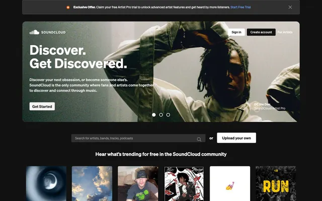
Preview image. Unlock full-res
Dark stage, glowing spotlights. A deep, consistent dark background sets the scene, with strategic, vivid accents drawing attention to key interactive elements like a spotlight.
Color palette
Primary interactive links, selected navigation items, key visual indicators — signals interactivity and focus, drawing the eye in a primarily dark interface.
Promotional or decorative banners, providing a soft, warm gradient transition.
Subtle background for specific content blocks, offering a cooler, calming gradient.
Accent for call-to-action buttons in specific promotional contexts, drawing immediate attention with high contrast against dark.
Page backgrounds, major section backgrounds, card backgrounds, all primary UI surfaces.
Input backgrounds, secondary background surfaces for elevated elements.
Primary text, headline text, core iconography, button text on dark backgrounds.
Secondary text, descriptive elements, navigation links, inactive states, placeholder text.
Decorative borders around subtle elements, button outlines on dark backgrounds.
Light button backgrounds, subtle surface variations against dark primary backgrounds.
Typography
- Weights
- 100, 400, 600, 700
- Sizes
- 12px, 14px, 17px, 18px, 22px, 28px, 36px, 60px
- Line height
- 1, 1.2, 1.27, 1.29, 1.33, 1.41, 1.43, 1.71
- Fallback
- system-ui, sans-serif
All text elements, unifies the visual language from headlines to body text. Its modern, understated character supports the content-driven approach.
Spacing & shape
Components
Background: Pitch Black (#121212), Text: Ghost White (#ffffff). Border: Ghost White (#ffffff). Radius: 4px. Padding: 6px vertical, 12px horizontal. Used for primary actions against light backgrounds.
Background: Ghost White (#ffffff), Text: Pitch Black (#121212). Border: Pitch Black (#121212). Radius: 4px. Padding: 6px vertical, 12px horizontal. Used for secondary actions against a dark background.
Background: Faded White (#f2f2f2), Text: Pitch Black (#121212). Border: Pitch Black (#121212). Radius: 4px. Padding: 6px vertical, 12px horizontal. Used for less prominent actions, providing a softer contrast than the Secondary button.
Background: transparent, Text: Storm Gray (#999999). Border: Storm Gray (#999999). Radius: 0px. Padding: 0px. Used for subtle actions like navigation links or inline actions.
Background: Ash Gray (#303030), Text: Ghost White (#ffffff). Placeholder: Storm Gray (#999999). Border: transparent. Radius: 3px. Padding: 8px vertical, 16px left, 40px right. Features an inset shadow rgba(18, 18, 18, 0.1) 0px 0px 0px 1px.
Text: Storm Gray (#999999) inactive, Skybound Blue (#699fff) active. No background or border. Default typography: Söhne, 17px, 400 weight.
Text: Ghost White (#ffffff), Söhne, 60px, 700 weight, 1.0 line height. Central focus of the hero section, commanding visual attention.
Guidelines
- Use Pitch Black (#121212) as the default background for all primary content sections.
- Apply a 4px `radius.default` to all interactive elements except ghost buttons and input fields to maintain a consistent subtle softening.
- Employ Söhne 60px / 1.0 line height / 700 weight for all main page headlines against dark backgrounds.
- Highlight interactive links and active states with Skybound Blue (#699fff) to maintain a clear visual hierarchy.
- Utilize 8px for `elementGap` to ensure consistent spacing between distinct inline elements and input fields.
- Ensure all text against Pitch Black backgrounds uses Ghost White (#ffffff) for optimal contrast and readability.
- Contain all main content within a `pageMaxWidth` of 1240px, centered on the screen.
- Avoid using highly saturated background colors that compete with primary content or album art.
- Do not deviate from Söhne as the sole typeface; stick to its specified weights and sizes.
- Never use hard-edged elements where a 3px input radius or 4px button radius is expected.
- Refrain from using shadows for elevation; rely on background color variations (e.g., Ash Gray on Pitch Black) to indicate depth.
- Do not add additional padding to Album Art Cards; they should appear flush with their grid container.
- Avoid generic black (#000000) for text on light button backgrounds; use Pitch Black (#121212) for brand consistency.
About this system
ShowHide
This design system creates an immersive, contemporary feel with a dark foundation that amplifies content. A rich interplay of stark black and soft gray neutrals forms a sophisticated backdrop, punctuated by a signature vibrant blue for interactive elements. The controlled color palette, combined with a crisp, minimal typographic hierarchy, allows content, especially diverse album art, to become the primary visual driver. Rounded corners on buttons and inputs offer a touch of user-friendliness against the otherwise strong, dark aesthetic.
The site employs a max-width 1240px centered layout for content sections, set against a full-bleed dark background. The hero section is a full-width, dark-themed banner with a strong, centered headline and a large, evocative artist image that dominates the visual space. Subsequent sections maintain consistent vertical spacing, featuring prominent content grids for album art (typically 5-column or 4-column) and a clear division between content blocks. The navigation is a fixed top bar on a dark background, and content often appears in full-width rows with internal grid structures. There's a notable shift to a contained, light background section for illustrating app features, providing visual contrast and separation for product-focused content.
The visual language for imagery is content-centric, relying heavily on diverse, high-fidelity album art and artist photography. Images are presented in square or near-square formats, often in grids, without borders or masks, allowing the art to speak for itself. Photography, particularly in the hero section, tends towards darker, more artistic compositions that blend seamlessly with the dark UI. There are also product screenshots of mobile devices, depicted as clean, contained elements on a white background, contrasting the main dark theme to highlight app features. Icons are minimal, line-based, and achromatic, primarily Ghost White against dark backgrounds, serving purely functional roles.
Reminiscent of Spotify, Netflix, Apple Music.
# SoundCloud — Style Reference
> Dark stage, glowing spotlights. A deep, consistent dark background sets the scene, with strategic, vivid accents drawing attention to key interactive elements like a spotlight.

**Theme:** dark

**Site:** https://soundcloud.com

This design system creates an immersive, contemporary feel with a dark foundation that amplifies content. A rich interplay of stark black and soft gray neutrals forms a sophisticated backdrop, punctuated by a signature vibrant blue for interactive elements. The controlled color palette, combined with a crisp, minimal typographic hierarchy, allows content, especially diverse album art, to become the primary visual driver. Rounded corners on buttons and inputs offer a touch of user-friendliness against the otherwise strong, dark aesthetic.

## Tokens — Colors

| Name | Value | Token | Role |
|------|------|------|------|
| Skybound Blue | `#699fff` | `--color-skybound-blue` | Primary interactive links, selected navigation items, key visual indicators — signals interactivity and focus, drawing the eye in a primarily dark interface. |
| Melodic Blush Gradient | `#8e8485` | `--color-melodic-blush-gradient` | Promotional or decorative banners, providing a soft, warm gradient transition. |
| Ocean Serenity Gradient | `#70929c` | `--color-ocean-serenity-gradient` | Subtle background for specific content blocks, offering a cooler, calming gradient. |
| Sunset Ember | `#ff5500` | `--color-sunset-ember` | Accent for call-to-action buttons in specific promotional contexts, drawing immediate attention with high contrast against dark. |
| Pitch Black | `#121212` | `--color-pitch-black` | Page backgrounds, major section backgrounds, card backgrounds, all primary UI surfaces. |
| Ash Gray | `#303030` | `--color-ash-gray` | Input backgrounds, secondary background surfaces for elevated elements. |
| Ghost White | `#ffffff` | `--color-ghost-white` | Primary text, headline text, core iconography, button text on dark backgrounds. |
| Storm Gray | `#999999` | `--color-storm-gray` | Secondary text, descriptive elements, navigation links, inactive states, placeholder text. |
| Cloud Gray | `#999999` | `--color-cloud-gray` | Decorative borders around subtle elements, button outlines on dark backgrounds. |
| Faded White | `#f2f2f2` | `--color-faded-white` | Light button backgrounds, subtle surface variations against dark primary backgrounds. |

## Tokens — Typography

### Söhne
- **Substitute:** system-ui, sans-serif
- **Weights:** 100, 400, 600, 700
- **Sizes:** 12px, 14px, 17px, 18px, 22px, 28px, 36px, 60px
- **Line height:** 1, 1.2, 1.27, 1.29, 1.33, 1.41, 1.43, 1.71
- **Role:** All text elements, unifies the visual language from headlines to body text. Its modern, understated character supports the content-driven approach.

## Tokens — Type Scale

Perfect Fifth (1.5) from 14px base.

| Role | Size | Line height | Letter spacing |
|------|------|------|------|
| caption | 12px | 1.71 | — |
| body | 14px | 1.43 | — |
| heading | 22px | 1.27 | — |
| heading-lg | 36px | 1.2 | — |
| display | 60px | 1 | — |

## Tokens — Spacing

- **Max width:** 1240px
- **Section gap:** 96px
- **Card padding:** 12px
- **Element gap:** 8px

## Tokens — Radius

- **Default:** 4px
- **Inputs:** 3px
- **Images:** 16px
- **none:** 0px

## Layout

The site employs a max-width 1240px centered layout for content sections, set against a full-bleed dark background. The hero section is a full-width, dark-themed banner with a strong, centered headline and a large, evocative artist image that dominates the visual space. Subsequent sections maintain consistent vertical spacing, featuring prominent content grids for album art (typically 5-column or 4-column) and a clear division between content blocks. The navigation is a fixed top bar on a dark background, and content often appears in full-width rows with internal grid structures. There's a notable shift to a contained, light background section for illustrating app features, providing visual contrast and separation for product-focused content.

## Imagery

The visual language for imagery is content-centric, relying heavily on diverse, high-fidelity album art and artist photography. Images are presented in square or near-square formats, often in grids, without borders or masks, allowing the art to speak for itself. Photography, particularly in the hero section, tends towards darker, more artistic compositions that blend seamlessly with the dark UI. There are also product screenshots of mobile devices, depicted as clean, contained elements on a white background, contrasting the main dark theme to highlight app features. Icons are minimal, line-based, and achromatic, primarily Ghost White against dark backgrounds, serving purely functional roles.

## Components

### Exclusive Offer Alert Banner

### Search Bar with Upload CTA

### Trending Track Cards Grid

### Primary Dark Button
*Call to Action*

Background: Pitch Black (#121212), Text: Ghost White (#ffffff). Border: Ghost White (#ffffff). Radius: 4px. Padding: 6px vertical, 12px horizontal. Used for primary actions against light backgrounds.

### Secondary Light Button
*Secondary Action*

Background: Ghost White (#ffffff), Text: Pitch Black (#121212). Border: Pitch Black (#121212). Radius: 4px. Padding: 6px vertical, 12px horizontal. Used for secondary actions against a dark background.

### Tertiary Light Button
*Alternative Action*

Background: Faded White (#f2f2f2), Text: Pitch Black (#121212). Border: Pitch Black (#121212). Radius: 4px. Padding: 6px vertical, 12px horizontal. Used for less prominent actions, providing a softer contrast than the Secondary button.

### Ghost Button
*Minimal Action*

Background: transparent, Text: Storm Gray (#999999). Border: Storm Gray (#999999). Radius: 0px. Padding: 0px. Used for subtle actions like navigation links or inline actions.

### Search Input Field
*Content Search*

Background: Ash Gray (#303030), Text: Ghost White (#ffffff). Placeholder: Storm Gray (#999999). Border: transparent. Radius: 3px. Padding: 8px vertical, 16px left, 40px right. Features an inset shadow rgba(18, 18, 18, 0.1) 0px 0px 0px 1px.

### Primary Navigation Link
*Interactive Navigation*

Text: Storm Gray (#999999) inactive, Skybound Blue (#699fff) active. No background or border. Default typography: Söhne, 17px, 400 weight.

### Hero Headline
*Main Page Title*

Text: Ghost White (#ffffff), Söhne, 60px, 700 weight, 1.0 line height. Central focus of the hero section, commanding visual attention.

## Guidelines

### Do

- Use Pitch Black (#121212) as the default background for all primary content sections.
- Apply a 4px `radius.default` to all interactive elements except ghost buttons and input fields to maintain a consistent subtle softening.
- Employ Söhne 60px / 1.0 line height / 700 weight for all main page headlines against dark backgrounds.
- Highlight interactive links and active states with Skybound Blue (#699fff) to maintain a clear visual hierarchy.
- Utilize 8px for `elementGap` to ensure consistent spacing between distinct inline elements and input fields.
- Ensure all text against Pitch Black backgrounds uses Ghost White (#ffffff) for optimal contrast and readability.
- Contain all main content within a `pageMaxWidth` of 1240px, centered on the screen.

### Don't

- Avoid using highly saturated background colors that compete with primary content or album art.
- Do not deviate from Söhne as the sole typeface; stick to its specified weights and sizes.
- Never use hard-edged elements where a 3px input radius or 4px button radius is expected.
- Refrain from using shadows for elevation; rely on background color variations (e.g., Ash Gray on Pitch Black) to indicate depth.
- Do not add additional padding to Album Art Cards; they should appear flush with their grid container.
- Avoid generic black (#000000) for text on light button backgrounds; use Pitch Black (#121212) for brand consistency.

## Agent Prompt Guide

### Quick Color Reference
- Text (Primary): #ffffff
- Background (Primary): #121212
- CTA (Accent): #ff5500
- Link/Active: #699fff
- Border/Outline (Subtle): #999999
- Input Background: #303030

### 3-5 Example Component Prompts
1. Create a `Hero Headline` section: `Pitch Black` background, centered. Headline text 'Discover. Get Discovered.' using Söhne 60px, 700 weight, 1.0 line height, `Ghost White` color. Include a 'Get Started' button (Background: `Pitch Black` #121212, Text: `Ghost White` #ffffff, Border: `Ghost White` #ffffff, Radius: 4px, Padding: 6px vertical, 12px horizontal).

2. Design a `Search Input Field`: `Ash Gray` (#303030) background, `Ghost White` (#ffffff) text, radius 3px, padding 8px vertical, 16px left, 40px right. Placeholder text 'Search for artists, bands, tracks, podcasts' in `Storm Gray` (#999999). Add inset shadow rgba(18, 18, 18, 0.1) 0px 0px 0px 1px.

3. Generate a `Trending Playlists Section`: Background `Pitch Black` (#121212), containing a grid of `Album Art Cards` (no background, `Ghost White` (#ffffff) text overlays on imagery, 0px radius, 0px padding). Below the grid, add a `Secondary Light Button` labeled 'Explore trending playlists' (Background: `Ghost White` #ffffff, Text: `Pitch Black` #121212, Border: `Pitch Black` #121212, Radius: 4px, Padding: 6px vertical, 12px horizontal).

4. Implement a `Navigation Link` for 'Home': Söhne, 17px, 400 weight, `Skybound Blue` (#699fff) for active state, `Storm Gray` (#999999) for inactive state. No background, no border, 0px padding.
More like this






Keep what you find
A free account saves references to boards and can send you a weekly email of picks based on what you save.
To see every result, go Pro.