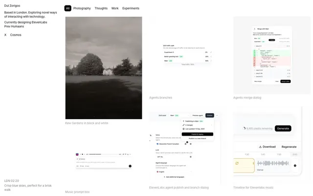
Preview image. Unlock full-res
Monochrome, text-first workbench.
Color palette
Supporting palette color for small decorative accents when the core palette needs contrast. Do not promote it to the primary CTA color
Page backgrounds, card surfaces, UI canvases
Primary text, prominent headings, strong link text. High contrast against light surfaces
Subtle borders, dividers, ghost button outlines. Provides soft definition between elements
Secondary text, muted headings, captions. A softer alternative to Tarmac for subordinate information
Muted helper text, tertiary information. Fades into the background for low-priority content
Text color on Midnight backgrounds
Spacing & shape
Components
Text in Tarmac (#252525) on a transparent background with no padding. Interacts subtly through hover/active states. Border is set to `0px`.
Text in Tarmac (#252525) on a transparent background, 8px padding applied horizontally (paddingRight/Left) and 0px vertically, with a border-radius of 8px. Border `1px` solid, Fog (#ebebeb).
Text in Ivory (#fbfbfb) on a Midnight (#000000) background, 8px padding horizontally, 0px vertically, with a border-radius of 8px. Used sparingly for strong accent.
Acts as a container for visual content. Implicit padding for internal elements, likely using the base element gap of 6px. No explicit border-radius on the card itself, but contained interactive elements (buttons/links) have a radius of 8px.
Text Tarmac (#252525) with no explicit decoration. Distinguished by minimal horizontal padding of 8px and a radius of 8px for interactive areas or hover states. Border `1px` solid, Fog (#ebebeb).
Guidelines
- Prioritize Tarmac (#252525) for all primary text and headings.
- Use Canvas (#ffffff) for all main backgrounds and surface elements.
- Define separation with Fog (#ebebeb) for subtle borders and dividers.
- Apply an 8px border-radius to all interactive elements like buttons and links.
- Use Midnight (#000000) and Ivory (#fbfbfb) exclusively for primary active button states.
- Maintain a conservative use of spacing, adhering to 6px for element gaps and 32px for section separation.
- Avoid using saturated or vivid colors; the palette is strictly achromatic with very limited exceptions.
- Do not introduce strong shadows or excessive elevation; the design relies on flat surfaces and subtle borders.
- Do not use multiple font families; all typography should adhere to the singular, strong typographic voice.
- Avoid large, decorative headings; headlines are typically concise and integrated into the content flow.
- Do not apply padding or margins that significantly deviate from the established 4px base unit or token values.
- Do not use `0px` border-radius for interactive elements unless it's a specific ghost button variant.
About this system
ShowHide
Dul Zorigoo's design system evokes an organized, understated workspace with strong typographic presence. It uses a near-monochromatic palette where all interface elements exist within a narrow range of grays, allowing content to take visual precedence. Interactions are subtle, marked by soft borders and minimal spatial shifts rather than vivid color, creating a quiet, focused user experience.
The page uses a maximum content width of 1137px, centrally aligned. The hero section is subtle, starting with text on the left and evolving into a grid of content. Content is arranged predominantly in a multi-column grid, often 2 or 3 columns, where visual elements (photos/screenshots) are paired with text labels below. Vertical rhythm is established through consistent 32px section gaps and smaller 6px element gaps. Navigation is sidebar-based, with current status highlighted by small borders, complemented by horizontal filter buttons above content areas.
This system primarily uses static photography and product UI screenshots. Photography ranges from evocative black & white landscapes to slightly desaturated color images, often cropped tightly or presented within contained frames. UI screenshots are functional and explanatory, blending seamlessly into the monochromatic design. Imagery serves a decorative and illustrative role, providing context and visual interest without overwhelming the clean interface. Icons, where present, are minimal, outlined, and monochromatic, typically in Tarmac (#252525).
Reminiscent of Linear, Figma, Are.na, Supabase.
# Dul Zorigoo — Style Reference
> Monochrome, text-first workbench.

**Theme:** light

**Site:** https://dzrgo.com

Dul Zorigoo's design system evokes an organized, understated workspace with strong typographic presence. It uses a near-monochromatic palette where all interface elements exist within a narrow range of grays, allowing content to take visual precedence. Interactions are subtle, marked by soft borders and minimal spatial shifts rather than vivid color, creating a quiet, focused user experience.

## Tokens — Colors

| Name | Value | Token | Role |
|------|------|------|------|
| Midnight | `#000000` | `--color-midnight` | Supporting palette color for small decorative accents when the core palette needs contrast. Do not promote it to the primary CTA color |
| Canvas | `#ffffff` | `--color-canvas` | Page backgrounds, card surfaces, UI canvases |
| Tarmac | `#252525` | `--color-tarmac` | Primary text, prominent headings, strong link text. High contrast against light surfaces |
| Fog | `#ebebeb` | `--color-fog` | Subtle borders, dividers, ghost button outlines. Provides soft definition between elements |
| Asphalt | `#a8a8a8` | `--color-asphalt` | Secondary text, muted headings, captions. A softer alternative to Tarmac for subordinate information |
| Pebble | `#8e8e8e` | `--color-pebble` | Muted helper text, tertiary information. Fades into the background for low-priority content |
| Ivory | `#fbfbfb` | `--color-ivory` | Text color on Midnight backgrounds |

## Tokens — Spacing

- **Max width:** 1137px
- **Section gap:** 32px
- **Card padding:** 8px
- **Element gap:** 6px

## Tokens — Radius

- **Buttons:** 8px
- **links:** 8px

## Layout

The page uses a maximum content width of 1137px, centrally aligned. The hero section is subtle, starting with text on the left and evolving into a grid of content. Content is arranged predominantly in a multi-column grid, often 2 or 3 columns, where visual elements (photos/screenshots) are paired with text labels below. Vertical rhythm is established through consistent 32px section gaps and smaller 6px element gaps. Navigation is sidebar-based, with current status highlighted by small borders, complemented by horizontal filter buttons above content areas.

## Imagery

This system primarily uses static photography and product UI screenshots. Photography ranges from evocative black & white landscapes to slightly desaturated color images, often cropped tightly or presented within contained frames. UI screenshots are functional and explanatory, blending seamlessly into the monochromatic design. Imagery serves a decorative and illustrative role, providing context and visual interest without overwhelming the clean interface. Icons, where present, are minimal, outlined, and monochromatic, typically in Tarmac (#252525).

## Components

### Ghost Filter Button
*Used for navigation and filtering categories*

Text in Tarmac (#252525) on a transparent background with no padding. Interacts subtly through hover/active states. Border is set to `0px`.

### Pill Filter Button
*Used for navigation and filtering categories*

Text in Tarmac (#252525) on a transparent background, 8px padding applied horizontally (paddingRight/Left) and 0px vertically, with a border-radius of 8px. Border `1px` solid, Fog (#ebebeb).

### Active Pill Button
*Indicates the currently selected filter or category.*

Text in Ivory (#fbfbfb) on a Midnight (#000000) background, 8px padding horizontally, 0px vertically, with a border-radius of 8px. Used sparingly for strong accent.

### Thumbnail Card
*Displays content previews, typically an image with a text label below.*

Acts as a container for visual content. Implicit padding for internal elements, likely using the base element gap of 6px. No explicit border-radius on the card itself, but contained interactive elements (buttons/links) have a radius of 8px.

### Subtle Link
*Standard inline links and navigation items within sidebars.*

Text Tarmac (#252525) with no explicit decoration. Distinguished by minimal horizontal padding of 8px and a radius of 8px for interactive areas or hover states. Border `1px` solid, Fog (#ebebeb).

## Guidelines

### Do

- Prioritize Tarmac (#252525) for all primary text and headings.
- Use Canvas (#ffffff) for all main backgrounds and surface elements.
- Define separation with Fog (#ebebeb) for subtle borders and dividers.
- Apply an 8px border-radius to all interactive elements like buttons and links.
- Use Midnight (#000000) and Ivory (#fbfbfb) exclusively for primary active button states.
- Maintain a conservative use of spacing, adhering to 6px for element gaps and 32px for section separation.

### Don't

- Avoid using saturated or vivid colors; the palette is strictly achromatic with very limited exceptions.
- Do not introduce strong shadows or excessive elevation; the design relies on flat surfaces and subtle borders.
- Do not use multiple font families; all typography should adhere to the singular, strong typographic voice.
- Avoid large, decorative headings; headlines are typically concise and integrated into the content flow.
- Do not apply padding or margins that significantly deviate from the established 4px base unit or token values.
- Do not use `0px` border-radius for interactive elements unless it's a specific ghost button variant.

## Agent Prompt Guide

Quick Color Reference:
text: #252525
background: #ffffff
border: #ebebeb
accent: #000000
primary action: no distinct CTA color

Example Component Prompts:
1. Create a filter button: Text 'All' in Tarmac (#252525), no background, no vertical padding, 8px horizontal padding, 8px border-radius, 1px solid Fog (#ebebeb) border.
2. Create an active filter button: Text 'Photography' in Ivory (#fbfbfb), Midnight (#000000) background, 0px vertical padding, 8px horizontal padding, 8px border-radius.
3. Create a content card with an image: A square canvas (#ffffff) card with a photo and a heading 'Kew Gardens' below it in Tarmac (#252525), using 6px element gap for internal spacing.
More like this










Keep what you find
A free account saves references to boards and can send you a weekly email of picks based on what you save.
To see every result, go Pro.