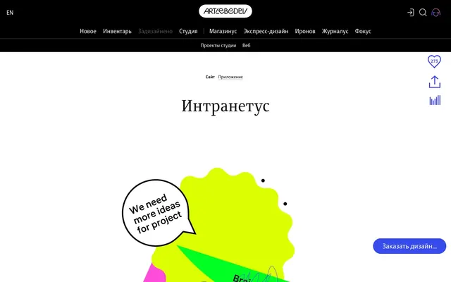
Preview image. Unlock full-res
Whiteboard doodle productivity
Color palette
Primary actionable elements like links, button backgrounds, and active state indicators
Subtle borders for interactive elements, providing a soft blue outline
Violet outline accent for tags, dividers, and focused UI edges. Do not promote it to the primary CTA color
Page backgrounds, card surfaces, UI containers
Primary text, strong borders, icons, and some background fills on specific elements like navigation
Secondary background surfaces for UI elements, providing subtle differentiation
Secondary text color and some borders, offering visual relief from pure black
Medium-contrast borders, control outlines, and structural separators. Do not promote it to the primary CTA color
Base tint for subtle shadows, suggesting depth without strong opacity
Typography
- Weights
- 400, 700
- Sizes
- 13px, 14px, 15px, 16px, 18px, 21px
- Line height
- 1, 1.2, 1.4, 1.5, 2.67
- Letter spacing
- 0.200em
- Fallback
- Inter
Body text, navigation, helper text, and various UI elements. Its widespread use makes it the primary workhorse font, maintaining legibility and a contemporary feel.
- Weights
- 400, 700
- Sizes
- 16px, 21px, 28px, 40px, 48px
- Line height
- 1.2, 1.3
- Letter spacing
- normal
- Fallback
- Merriweather
Headings and prominent display text. The serif face adds a touch of classic authority and visual distinction to section titles.
- Weights
- 400
- Sizes
- 18px, 25px
- Line height
- 1
- Letter spacing
- normal
- Fallback
- Arial
Used for specific brand elements and unique text styles, contributing to the brand's distinctive visual identity.
- Weights
- 400
- Sizes
- 16px, 18px
- Line height
- 1, 1.2
- Letter spacing
- normal
- Fallback
- Inter
Supplementary text, icons, and less prominent UI labels. Used to provide visual contrast and hierarchy without adding another full font family.
- Weights
- 500
- Sizes
- 64px
- Line height
- 1.2
- Letter spacing
- normal
- Fallback
- Montserrat
Large, impactful headings for hero sections, demanding attention with its significant size and medium weight.
Spacing & shape
Elevation
Components
Text in ALSArtemiusSans, often weight 400 or 700. Interactive elements with a border-bottom of 1px solid Action Blue (#0089ff) on hover or active state, and a color change to Action Blue. Default links are Ink Black (#000000).
Filled button with a background of Action Blue (#0089ff) and text color of Canvas (#ffffff). Border-radius of 25px for a pill-like shape. Padding: 10px-11px horizontal, 7px-8px vertical.
Transparent background with a border of 1px solid Action Blue (#0089ff) and text in Action Blue (#0089ff). Rounded corners apply at 25px radius. Often used for less prominent actions.
Transparent background with Ink Black (#000000) text and a border-radius of 12px. Padding can vary, but typically has generous vertical padding (e.g., 52px top).
Utilizes Canvas (#ffffff) as the background. Default card surfaces have no border, shadow, or padding, appearing as a clean, flat plane. Used to contain sections of content.
Guidelines
- Prioritize Canvas (#ffffff) and Ink Black (#000000) for most UI elements, reserving Action Blue (#0089ff) for interactive states and primary calls to action.
- Apply a 25px border-radius to all primary buttons for a consistent pill-shape.
- Use ALSArtemiusSans for body text, UI labels, and navigation, maintaining an overall functional aesthetic.
- Employ ALSArtemiusSerif for main headings (28px and larger) to add gravitas and visual interest.
- Maintain comfortable spacing with a base unit of 4px; target 10px for element gaps and 28px for section gaps.
- Utilize mild shadows like rgba(44, 48, 56, 0.5) 0px 30px 140px -50px for subtle elevation, primarily on interactive elements or images.
- Use the Muted Blue Wash (#b3dcff) for subtle interactive element borders that require a softer visual cue than solid Action Blue.
- Avoid using multiple chromatic colors in close proximity; the design relies on a single vivid blue for accent.
- Do not introduce strong, opaque shadows; leverage the subtle, diffuse shadows provided (rgba(44, 48, 56, 0.5) 0px 30px 140px -50px).
- Refrain from heavy background gradients or patterns; the system values clean, solid surfaces.
- Do not deviate significantly from the established typefaces; ALSArtemiusSans and ALSArtemiusSerif define the typographic voice.
- Avoid excessive use of borders; many elements are defined by negative space and clear backgrounds.
- Do not use dark backgrounds for main content areas; the system is firmly established as a light theme with bright Canvas (#ffffff) surfaces.
About this system
ShowHide
The Интранетус design system presents a clean, brightly lit interface centered around a vivid blue accent. This blue is used sparingly but impactfully to highlight interactive elements and convey primary actions. Typography is a mix of modern sans-serifs and a more traditional serif for headings, creating a subtle tension between straightforward utility and classic legibility. Component surfaces are generally crisp white, relying on ample negative space and minimal borders rather than heavy shadows for definition.
The page primarily uses a max-width contained layout, with content centered. The hero section often features a large, whimsical illustration above the fold, with a prominent headline (display-sized) centered. Section rhythm is consistent, with generous vertical spacing between content blocks and an overall airy feel. Content is typically arranged in either a single-column centered stack or alternating text-and-image patterns. No explicit grid usage for card layouts is prominent, but rather distinct content blocks. Navigation consists of a top bar that appears fixed, featuring text links and simple icons.
The visual language is characterized by abstract, colorful, and often whimsical illustrations resembling whiteboard doodles or children's drawings. These graphics feature organic, freeform shapes, saturated colors (neons like lime green, hot pink, vivid yellow), and playful scribbled elements. Imagery is primarily decorative rather than product-focused, serving to imbue the interface with a lighthearted, creative atmosphere. Icons are minimalist, often outlined in black, with a medium stroke weight. Density is low, with illustrations occupying ample white space, ensuring the UI remains text-dominant.
Reminiscent of Figma, Linear, Notion, Mailchimp, Miro.
# Интранетус — Style Reference
> Whiteboard doodle productivity

**Theme:** light

**Site:** https://intranetus.com

The Интранетус design system presents a clean, brightly lit interface centered around a vivid blue accent. This blue is used sparingly but impactfully to highlight interactive elements and convey primary actions. Typography is a mix of modern sans-serifs and a more traditional serif for headings, creating a subtle tension between straightforward utility and classic legibility. Component surfaces are generally crisp white, relying on ample negative space and minimal borders rather than heavy shadows for definition.

## Tokens — Colors

| Name | Value | Token | Role |
|------|------|------|------|
| Action Blue | `#0089ff` | `--color-action-blue` | Primary actionable elements like links, button backgrounds, and active state indicators |
| Muted Blue Wash | `#b3dcff` | `--color-muted-blue-wash` | Subtle borders for interactive elements, providing a soft blue outline |
| Vivid Violet | `#384bec` | `--color-vivid-violet` | Violet outline accent for tags, dividers, and focused UI edges. Do not promote it to the primary CTA color |
| Canvas | `#ffffff` | `--color-canvas` | Page backgrounds, card surfaces, UI containers |
| Ink Black | `#000000` | `--color-ink-black` | Primary text, strong borders, icons, and some background fills on specific elements like navigation |
| Deep Graphite | `#2c3038` | `--color-deep-graphite` | Secondary background surfaces for UI elements, providing subtle differentiation |
| Medium Gray | `#555555` | `--color-medium-gray` | Secondary text color and some borders, offering visual relief from pure black |
| Light Gray | `#b3b3b3` | `--color-light-gray` | Medium-contrast borders, control outlines, and structural separators. Do not promote it to the primary CTA color |
| Shadow Tint | `#96989c` | `--color-shadow-tint` | Base tint for subtle shadows, suggesting depth without strong opacity |

## Tokens — Typography

### ALSArtemiusSans
- **Substitute:** Inter
- **Weights:** 400, 700
- **Sizes:** 13px, 14px, 15px, 16px, 18px, 21px
- **Line height:** 1, 1.2, 1.4, 1.5, 2.67
- **Letter spacing:** 0.200em
- **Role:** Body text, navigation, helper text, and various UI elements. Its widespread use makes it the primary workhorse font, maintaining legibility and a contemporary feel.

### ALSArtemiusSerif
- **Substitute:** Merriweather
- **Weights:** 400, 700
- **Sizes:** 16px, 21px, 28px, 40px, 48px
- **Line height:** 1.2, 1.3
- **Letter spacing:** normal
- **Role:** Headings and prominent display text. The serif face adds a touch of classic authority and visual distinction to section titles.

### ALS-logo
- **Substitute:** Arial
- **Weights:** 400
- **Sizes:** 18px, 25px
- **Line height:** 1
- **Letter spacing:** normal
- **Role:** Used for specific brand elements and unique text styles, contributing to the brand's distinctive visual identity.

### Artemius Sans Neue
- **Substitute:** Inter
- **Weights:** 400
- **Sizes:** 16px, 18px
- **Line height:** 1, 1.2
- **Letter spacing:** normal
- **Role:** Supplementary text, icons, and less prominent UI labels. Used to provide visual contrast and hierarchy without adding another full font family.

### als_hauss
- **Substitute:** Montserrat
- **Weights:** 500
- **Sizes:** 64px
- **Line height:** 1.2
- **Letter spacing:** normal
- **Role:** Large, impactful headings for hero sections, demanding attention with its significant size and medium weight.

## Tokens — Type Scale

Perfect Fourth (1.333) from 16px base.

| Role | Size | Line height | Letter spacing |
|------|------|------|------|
| caption | 13px | 1.4 | 0.26px |
| body | 16px | 1.4 | 0.32px |
| subheading | 18px | 1.2 | 0.36px |
| heading-sm | 21px | 1.2 | 0.42px |
| heading | 28px | 1.2 | 0.56px |
| heading-lg | 40px | 1.2 | 0.8px |
| display | 64px | 1.2 | 1.28px |

## Tokens — Spacing

- **Section gap:** 28px
- **Card padding:** 0px
- **Element gap:** 10px

## Tokens — Radius

- **Default:** 4px
- **Buttons:** 25px
- **badges:** 12px
- **misc:** 20px

## Tokens — Elevation

- **Interactive Link/Button:** `rgba(44, 48, 56, 0.5) 0px 30px 140px -50px`
- **Image:** `rgba(44, 48, 56, 0.5) 0px 30px 80px -30px`

## Layout

The page primarily uses a max-width contained layout, with content centered. The hero section often features a large, whimsical illustration above the fold, with a prominent headline (display-sized) centered. Section rhythm is consistent, with generous vertical spacing between content blocks and an overall airy feel. Content is typically arranged in either a single-column centered stack or alternating text-and-image patterns. No explicit grid usage for card layouts is prominent, but rather distinct content blocks. Navigation consists of a top bar that appears fixed, featuring text links and simple icons.

## Imagery

The visual language is characterized by abstract, colorful, and often whimsical illustrations resembling whiteboard doodles or children's drawings. These graphics feature organic, freeform shapes, saturated colors (neons like lime green, hot pink, vivid yellow), and playful scribbled elements. Imagery is primarily decorative rather than product-focused, serving to imbue the interface with a lighthearted, creative atmosphere. Icons are minimalist, often outlined in black, with a medium stroke weight. Density is low, with illustrations occupying ample white space, ensuring the UI remains text-dominant.

## Components

### Navigation Link
*Primary navigation element*

Text in ALSArtemiusSans, often weight 400 or 700. Interactive elements with a border-bottom of 1px solid Action Blue (#0089ff) on hover or active state, and a color change to Action Blue. Default links are Ink Black (#000000).

### Primary Action Button
*Call to action button*

Filled button with a background of Action Blue (#0089ff) and text color of Canvas (#ffffff). Border-radius of 25px for a pill-like shape. Padding: 10px-11px horizontal, 7px-8px vertical.

### Ghost Action Button
*Secondary or tertiary action button*

Transparent background with a border of 1px solid Action Blue (#0089ff) and text in Action Blue (#0089ff). Rounded corners apply at 25px radius. Often used for less prominent actions.

### Info Badge
*Categorization or status indicator*

Transparent background with Ink Black (#000000) text and a border-radius of 12px. Padding can vary, but typically has generous vertical padding (e.g., 52px top).

### Card Surface
*Content container*

Utilizes Canvas (#ffffff) as the background. Default card surfaces have no border, shadow, or padding, appearing as a clean, flat plane. Used to contain sections of content.

## Guidelines

### Do

- Prioritize Canvas (#ffffff) and Ink Black (#000000) for most UI elements, reserving Action Blue (#0089ff) for interactive states and primary calls to action.
- Apply a 25px border-radius to all primary buttons for a consistent pill-shape.
- Use ALSArtemiusSans for body text, UI labels, and navigation, maintaining an overall functional aesthetic.
- Employ ALSArtemiusSerif for main headings (28px and larger) to add gravitas and visual interest.
- Maintain comfortable spacing with a base unit of 4px; target 10px for element gaps and 28px for section gaps.
- Utilize mild shadows like rgba(44, 48, 56, 0.5) 0px 30px 140px -50px for subtle elevation, primarily on interactive elements or images.
- Use the Muted Blue Wash (#b3dcff) for subtle interactive element borders that require a softer visual cue than solid Action Blue.

### Don't

- Avoid using multiple chromatic colors in close proximity; the design relies on a single vivid blue for accent.
- Do not introduce strong, opaque shadows; leverage the subtle, diffuse shadows provided (rgba(44, 48, 56, 0.5) 0px 30px 140px -50px).
- Refrain from heavy background gradients or patterns; the system values clean, solid surfaces.
- Do not deviate significantly from the established typefaces; ALSArtemiusSans and ALSArtemiusSerif define the typographic voice.
- Avoid excessive use of borders; many elements are defined by negative space and clear backgrounds.
- Do not use dark backgrounds for main content areas; the system is firmly established as a light theme with bright Canvas (#ffffff) surfaces.

## Agent Prompt Guide

Quick Color Reference:
text: #000000
background: #ffffff
border: #000000
accent: #0089ff
primary action: #0089ff (outlined action border)

Example Component Prompts:
1. Create an Outlined Primary Action: Transparent background, #0089ff border and text, 9999px radius, compact pill padding. Use it for the main CTA instead of a filled button.
2. Design a navigation link: text Ink Black (#000000), font ALSArtemiusSans weight 400, on hover, a 1px solid Action Blue (#0089ff) border-bottom and text Action Blue (#0089ff).
3. Generate a heading for a section: text Ink Black (#000000), font ALSArtemiusSerif weight 700, size 48px, line-height 1.2.
4. Produce an info badge: transparent background, text Ink Black (#000000), border-radius 12px, 52px top padding.
5. Create a simple content card: background Canvas (#ffffff), no border, no shadow, 0px padding.
More like this









Keep what you find
A free account saves references to boards and can send you a weekly email of picks based on what you save.
To see every result, go Pro.