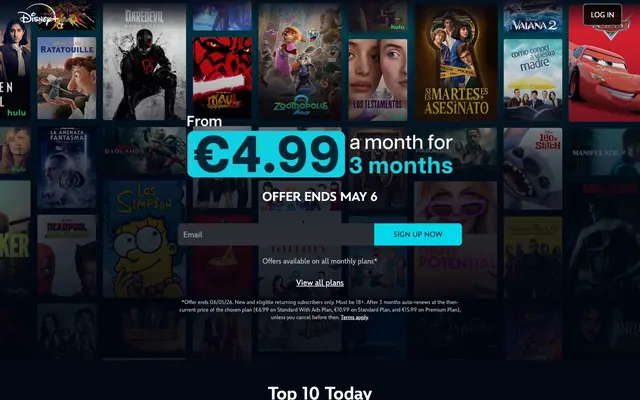
Preview image. Unlock full-res
Midnight Command Center: Dark, immersive interfaces punctuated by vivid interactive highlights.
Color palette
Primary call-to-action button backgrounds. A vibrant accent to guide user action
Secondary call-to-action details, selected active states, descriptive text emphasizing value
Primary page background, core content surface. Provides an immersive, dark canvas for media
Input field backgrounds, subtle borders, secondary surface elements. A slightly lighter dark gray for contrast
Text on very light backgrounds (e.g. within active buttons)
Neutral form states, badge text, and quiet UI feedback where color should stay understated. Do not promote it to the primary CTA color
Secondary text, unselected icons, helper text for content metadata
Primary text, headlines, navigation labels. High-contrast text on dark backgrounds
Footer background, elevated sections for visual separation
Placeholder text in input fields, less prominent body copy
Subtle background for UI elements that need mild distinction from Deep Midnight
Text color for primary buttons with vibrant backgrounds
Decorative borders on certain navigation elements
Navigation bar background. Provides a distinct and consistent top-level UI element
Typography
- Weights
- 400, 700
- Sizes
- 12px, 14px, 16px, 18px, 20px, 28px, 40px
- Line height
- 1.2, 1.38, 1.4, 1.5, 1.83
- Letter spacing
- 0.0250em
- Fallback
- system-ui, sans-serif
Primary typeface for all text content, from body copy to headlines. Its consistent tracking provides a unified and readable experience across different scales. Weight 400 is used for general content, while 700 emphasizes critical information.
Spacing & shape
Components
Transparent background, 'Off-White' text, 'Muted Silver' 1px border. No padding specified for common usage, implying content-based sizing.
Background 'Sky Blue', text 'Button Dark Text', 8px border-radius, 8px vertical padding, 16px horizontal padding.
Background 'Electric Teal', text 'Text Dark', 0px 8px 8px 0px border-radius (rounded right side), 8px vertical padding, 44px horizontal padding.
Transparent background, 12px border-radius, no box-shadow, no padding implies content fills the card directly.
Background 'rgb(0, 0, 0)' (black), 12px border-radius, no box-shadow, no padding.
Background 'Cool Graphite', placeholder text 'Ghost Gray', 8px 0px 0px 8px border-radius (rounded left side), 12px horizontal padding. No vertical padding explicitly defined, implying default browser or container sizing.
Transparent background, 'Off-White' text, 0px border-radius, no padding.
Guidelines
- Use 'Deep Midnight' (#040714) as the base background for most full-bleed sections to maintain immersion.
- Apply 'Sky Blue' (#33ddff) for primary interactive elements, ensuring high contrast against dark backgrounds.
- Maintain a comfortable density with an 'elementGap' of '8px' for most inline spacing between UI elements.
- Ensure all text, especially headlines, uses the Inspire typeface with a consistent '0.0250em' letter-spacing.
- Define card and button corners with '12px' and '8px' border-radius respectively, using the specified tokens.
- Prioritize high contrast for text: 'Off-White' (#fafafa) on 'Deep Midnight' (#040714) or 'Cool Graphite' (#282a36).
- Use 'Muted Silver' (#e5e7eb) for subtle UI borders, outlines, and dividers to articulate structure without distraction.
- Do not introduce light backgrounds for main content areas; maintain the dark theme for immersion.
- Avoid using highly saturated colors for large areas or decorative elements; reserve vibrancy for functional accents.
- Do not deviate from the established border radii; maintain '12px' for cards and '8px' for interactive controls.
- Do not add prominent shadows or elevation unless specifically called for by a component; the system relies on flat surfaces.
- Refrain from using generic sans-serif fonts; the Inspire typeface is critical for brand recognition.
- Do not use overly dense layouts; maintain a 'comfortable' spacing with '24px' section gaps.
- Avoid decorative gradients; the system uses solid colors for background and accents.
About this system
ShowHide
Disney+ maintains a 'midnight command center' aesthetic, designed for content consumption. It features a predominantly dark background with contrasting light typography to highlight content. Functional elements are often subtle until interaction, utilizing a vibrant blue for calls to action, drawing attention against the otherwise subdued palette. The visual system is defined by its strong reliance on dark surfaces, minimal borders, and a focus on content presentation.
The page primarily uses a max-width contained layout in its main content areas, set against a full-bleed dark background. The hero section often features content previews or a signup form centered over a blurred background of media. Section rhythm is driven by consistent vertical spacing of '24px' between content blocks. Content is arranged in flexible grids for media display and alternating text-left/visual-right patterns for feature descriptions. Navigation is a sticky top bar, minimally styled with 'Canvas Blue Black' background and 'Off-White' text.
This system primarily uses product-focused imagery, specifically movie posters and show thumbnails, which are presented as contained elements within a grid. These are generally full-color, cinematic stills or stylized artwork, with minimal alteration. The iconography is typically simple, often white or light gray outlines or fills, serving functional roles rather than decorative. Image density is high in content sections, where visuals are the primary draw, while informational sections remain text-dominant.
Reminiscent of Netflix, HBO Max, Apple TV+, Prime Video.
# Watch new Originals — Style Reference
> Midnight Command Center: Dark, immersive interfaces punctuated by vivid interactive highlights.

**Theme:** dark

**Site:** https://www.disneyplus.com

Disney+ maintains a 'midnight command center' aesthetic, designed for content consumption. It features a predominantly dark background with contrasting light typography to highlight content. Functional elements are often subtle until interaction, utilizing a vibrant blue for calls to action, drawing attention against the otherwise subdued palette. The visual system is defined by its strong reliance on dark surfaces, minimal borders, and a focus on content presentation.

## Tokens — Colors

| Name | Value | Token | Role |
|------|------|------|------|
| Sky Blue | `#33ddff` | `--color-sky-blue` | Primary call-to-action button backgrounds. A vibrant accent to guide user action |
| Electric Teal | `#02d6e8` | `--color-electric-teal` | Secondary call-to-action details, selected active states, descriptive text emphasizing value |
| Deep Midnight | `#040714` | `--color-deep-midnight` | Primary page background, core content surface. Provides an immersive, dark canvas for media |
| Cool Graphite | `#282a36` | `--color-cool-graphite` | Input field backgrounds, subtle borders, secondary surface elements. A slightly lighter dark gray for contrast |
| Text Dark | `#02172a` | `--color-text-dark` | Text on very light backgrounds (e.g. within active buttons) |
| Muted Silver | `#e5e7eb` | `--color-muted-silver` | Neutral form states, badge text, and quiet UI feedback where color should stay understated. Do not promote it to the primary CTA color |
| Light Gray | `#c0c0c0` | `--color-light-gray` | Secondary text, unselected icons, helper text for content metadata |
| Off-White | `#fafafa` | `--color-off-white` | Primary text, headlines, navigation labels. High-contrast text on dark backgrounds |
| Deep Space | `#0e0b14` | `--color-deep-space` | Footer background, elevated sections for visual separation |
| Ghost Gray | `#b7b8bd` | `--color-ghost-gray` | Placeholder text in input fields, less prominent body copy |
| Accent Gray | `#1e1f24` | `--color-accent-gray` | Subtle background for UI elements that need mild distinction from Deep Midnight |
| Button Dark Text | `#17171c` | `--color-button-dark-text` | Text color for primary buttons with vibrant backgrounds |
| Faint Border | `#6f717b` | `--color-faint-border` | Decorative borders on certain navigation elements |
| Canvas Blue Black | `#010104` | `--color-canvas-blue-black` | Navigation bar background. Provides a distinct and consistent top-level UI element |

## Tokens — Typography

### Inspire
- **Substitute:** system-ui, sans-serif
- **Weights:** 400, 700
- **Sizes:** 12px, 14px, 16px, 18px, 20px, 28px, 40px
- **Line height:** 1.2, 1.38, 1.4, 1.5, 1.83
- **Letter spacing:** 0.0250em
- **Role:** Primary typeface for all text content, from body copy to headlines. Its consistent tracking provides a unified and readable experience across different scales. Weight 400 is used for general content, while 700 emphasizes critical information.

## Tokens — Type Scale

Minor Third (1.2) from 16px base.

| Role | Size | Line height | Letter spacing |
|------|------|------|------|
| caption | 12px | 1.5 | 0.3px |
| body-sm | 14px | 1.4 | 0.35px |
| body | 16px | 1.38 | 0.4px |
| subheading | 18px | 1.38 | 0.45px |
| heading | 20px | 1.2 | 0.5px |
| heading-lg | 28px | 1.2 | 0.7px |
| display | 40px | 1.2 | 1px |

## Tokens — Spacing

- **Section gap:** 24px
- **Card padding:** 16px
- **Element gap:** 8px

## Tokens — Radius

- **Buttons:** 8px
- **Inputs:** 8px
- **Cards:** 12px

## Layout

The page primarily uses a max-width contained layout in its main content areas, set against a full-bleed dark background. The hero section often features content previews or a signup form centered over a blurred background of media. Section rhythm is driven by consistent vertical spacing of '24px' between content blocks. Content is arranged in flexible grids for media display and alternating text-left/visual-right patterns for feature descriptions. Navigation is a sticky top bar, minimally styled with 'Canvas Blue Black' background and 'Off-White' text.

## Imagery

This system primarily uses product-focused imagery, specifically movie posters and show thumbnails, which are presented as contained elements within a grid. These are generally full-color, cinematic stills or stylized artwork, with minimal alteration. The iconography is typically simple, often white or light gray outlines or fills, serving functional roles rather than decorative. Image density is high in content sections, where visuals are the primary draw, while informational sections remain text-dominant.

## Components

### Ghost Button
*Navigation, secondary actions, in-content links*

Transparent background, 'Off-White' text, 'Muted Silver' 1px border. No padding specified for common usage, implying content-based sizing.

### Primary Action Button
*Main calls to action, form submissions*

Background 'Sky Blue', text 'Button Dark Text', 8px border-radius, 8px vertical padding, 16px horizontal padding.

### Signup CTA Button
*Specific call to action, usually in hero or signup forms.*

Background 'Electric Teal', text 'Text Dark', 0px 8px 8px 0px border-radius (rounded right side), 8px vertical padding, 44px horizontal padding.

### Default Card
*Content presentation, media cards.*

Transparent background, 12px border-radius, no box-shadow, no padding implies content fills the card directly.

### Black Background Card
*Emphasized content cards, often for media previews.*

Background 'rgb(0, 0, 0)' (black), 12px border-radius, no box-shadow, no padding.

### Email Input Field
*User input for email addresses.*

Background 'Cool Graphite', placeholder text 'Ghost Gray', 8px 0px 0px 8px border-radius (rounded left side), 12px horizontal padding. No vertical padding explicitly defined, implying default browser or container sizing.

### Ghost Badge
*Content metadata, labels*

Transparent background, 'Off-White' text, 0px border-radius, no padding.

## Guidelines

### Do

- Use 'Deep Midnight' (#040714) as the base background for most full-bleed sections to maintain immersion.
- Apply 'Sky Blue' (#33ddff) for primary interactive elements, ensuring high contrast against dark backgrounds.
- Maintain a comfortable density with an 'elementGap' of '8px' for most inline spacing between UI elements.
- Ensure all text, especially headlines, uses the Inspire typeface with a consistent '0.0250em' letter-spacing.
- Define card and button corners with '12px' and '8px' border-radius respectively, using the specified tokens.
- Prioritize high contrast for text: 'Off-White' (#fafafa) on 'Deep Midnight' (#040714) or 'Cool Graphite' (#282a36).
- Use 'Muted Silver' (#e5e7eb) for subtle UI borders, outlines, and dividers to articulate structure without distraction.

### Don't

- Do not introduce light backgrounds for main content areas; maintain the dark theme for immersion.
- Avoid using highly saturated colors for large areas or decorative elements; reserve vibrancy for functional accents.
- Do not deviate from the established border radii; maintain '12px' for cards and '8px' for interactive controls.
- Do not add prominent shadows or elevation unless specifically called for by a component; the system relies on flat surfaces.
- Refrain from using generic sans-serif fonts; the Inspire typeface is critical for brand recognition.
- Do not use overly dense layouts; maintain a 'comfortable' spacing with '24px' section gaps.
- Avoid decorative gradients; the system uses solid colors for background and accents.

## Agent Prompt Guide

Quick Color Reference:
text: #fafafa
background: #040714
border: #e5e7eb
accent: #02d6e8
primary action: #33ddff (filled action)

Example Component Prompts:
Create a primary action button: background 'Sky Blue' (#33ddff), text 'Button Dark Text' (#17171c), 8px border-radius, 8px vertical padding, 16px horizontal padding, using Inspire weight 700 at 16px.
Create an email input field: background 'Cool Graphite' (#282a36), placeholder text 'Ghost Gray' (#b7b8bd), 8px 0px 0px 8px border-radius, 12px horizontal padding, using Inspire weight 400 at 16px.
Create a ghost button for navigation: transparent background, text 'Off-White' (#fafafa), 1px border 'Muted Silver' (#e5e7eb), no explicit padding (content-based), using Inspire weight 400 at 14px.
Create a content card: 'Deep Midnight' (#040714) background, 12px border-radius, no padding, 'Muted Silver' (#e5e7eb) 1px border.
More like this





Keep what you find
A free account saves references to boards and can send you a weekly email of picks based on what you save.
To see every result, go Pro.