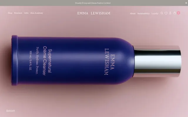
Preview image. Unlock full-res
Soft Pink Marble with Deep Orchid
Color palette
Interactive elements, outlined button borders, key typography highlights, active navigation indicators — a vivid and deep brand signatory color
Subtlety on lists and links, a lighter tint of the brand's signature purple
Accent for navigation elements, small badge backgrounds, provides a soft counterpoint to the deep plum
Primary surface background, card surfaces, ghost button text (when on dark backgrounds), light text
Page canvas background, subtle product display surfaces
Primary body text, dark outline button borders, navigation links on light backgrounds
Muted background for specific nav sections, subtle dividers
Typography
- Weights
- 300, 400, 700
- Sizes
- 11px, 13px, 14px, 16px, 20px, 30px
- Line height
- 1, 1.2, 1.25, 1.38, 1.4, 1.5, 1.63, 1.69, 1.82, 1.86
- Letter spacing
- normal
- Fallback
- Playfair Display
Primary typeface for headings and larger display text. Its classic serif evokes elegance and heritage.
- Weights
- 400
- Sizes
- 16px, 20px, 24px, 80px
- Line height
- 1.2, 1.25, 1.4, 1.63
- Letter spacing
- normal
- Fallback
- Inter
Used for body text, product descriptions, and other content-heavy areas. Its clean sans-serif ensures readability against varied backgrounds.
Spacing & shape
Components
Transparent background with a 1px solid '--deep-plum' border and '--deep-plum' text. No padding, uses surrounding element spacing. Radius is 3px.
Transparent background with a 1px solid '--charcoal-ink' border and '--charcoal-ink' text. No padding, uses surrounding element spacing. Radius is 0px.
Transparent background, no border or shadow. Generous horizontal padding of 50px and no vertical padding. Radius is 0px.
Transparent background. Features a 1px solid '--deep-plum' bottom border. Placeholder text is '--lavender-mist'. Internal left padding is 10px. Radius is 0px.
Background is '--warm-petal', text color is contrast-appropriate. Radius is 50px, creating a pill shape. No padding.
Guidelines
- Use Martina Plantijn for all headings and display text, employing its 300 or 400 weight for a refined, understated presence.
- Apply Deep Plum (#49369e) exclusively for primary interactive states, outlined button borders, and key brand highlights, maintaining its vivid impact.
- Ensure all primary button elements are rendered as ghost buttons with a 1px border using either Deep Plum (#49369e) or Charcoal Ink (#000000).
- Employ Powder Pink (#f2f1ef) as the standard page background, providing a consistent soft canvas for all content.
- Utilize 3px radius for all button elements, providing a subtle softness without appearing overly playful.
- Maintain a comfortable density with element spacing often at 5px, and section gaps at 30px to create visual harmony.
- For inputs, use a transparent background and a 1px solid bottom border of Deep Plum (#49369e).
- Do not use solid backgrounds for primary action buttons; all interactive buttons should be ghosted or outlined.
- Avoid using multiple vivid accent colors; restrict chromatic accents to Deep Plum (#49369e) and Warm Petal (#ec9bad).
- Do not apply strong elevation or shadows; the aesthetic is flat and tactile, relying on color and form for distinction.
- Do not override the classic 'normal' letter-spacing for Martina Plantijn or Regola Pro Book; maintain generous legibility.
- Avoid large, impactful heading weights; the brand language favors lighter weights for sophistication.
- Do not use default browser link colors (e.g., #0000EE); all links should be styled with Charcoal Ink (#000000) or Deep Plum (#49369e).
- Never use text colors that don't pass AAA contrast against their background unless they're clearly decorative and non-essential.
About this system
ShowHide
Emma Lewisham presents a refined and classic aesthetic, characterized by a dominant muted pink-beige background against which a deep, vivid violet serves as the primary brand accent. Typography, featuring a serif for headings and a sans-serif for body text, is used with classic letter-spacing for legibility. Elements are generally soft and rounded, avoiding harsh lines, giving UI components a gentle, tactile quality that complements the natural skincare brand.
The page layout is primarily full-bleed with content often centered within an implied max-width container. The hero section features a large, product-focused image overlapping the header, establishing a premium and direct visual introduction. Sections generally follow a consistent vertical rhythm. Content arrangement appears to favor centered stacks or simple two-column layouts, particularly for text-left/image-right compositions. Navigation is a prominent top bar, appearing sticky, with both utility and primary links. The overall density feels comfortable and uncrowded, allowing product imagery and typography to breathe.
This site predominantly uses clean product photography. Products are typically presented as tight crops, often against a plain background (like the Powder Pink page canvas) or a pure white. The treatment is direct and focused on the product itself, with a clear emphasis on quality and detail. There is minimal lifestyle context. Icons are simple, likely outlined, and in monochrome or brand accent colors, serving purely functional roles.
Reminiscent of Aēsop, Augustinus Bader, Drunk Elephant.
# Emmalewisham — Style Reference
> Soft Pink Marble with Deep Orchid

**Theme:** light

**Site:** https://emmalewisham.co.uk

Emma Lewisham presents a refined and classic aesthetic, characterized by a dominant muted pink-beige background against which a deep, vivid violet serves as the primary brand accent. Typography, featuring a serif for headings and a sans-serif for body text, is used with classic letter-spacing for legibility. Elements are generally soft and rounded, avoiding harsh lines, giving UI components a gentle, tactile quality that complements the natural skincare brand.

## Tokens — Colors

| Name | Value | Token | Role |
|------|------|------|------|
| Deep Plum | `#49369e` | `--color-deep-plum` | Interactive elements, outlined button borders, key typography highlights, active navigation indicators — a vivid and deep brand signatory color |
| Lavender Mist | `#a9a7db` | `--color-lavender-mist` | Subtlety on lists and links, a lighter tint of the brand's signature purple |
| Warm Petal | `#ec9bad` | `--color-warm-petal` | Accent for navigation elements, small badge backgrounds, provides a soft counterpoint to the deep plum |
| Vanilla Cream | `#ffffff` | `--color-vanilla-cream` | Primary surface background, card surfaces, ghost button text (when on dark backgrounds), light text |
| Powder Pink | `#f2f1ef` | `--color-powder-pink` | Page canvas background, subtle product display surfaces |
| Charcoal Ink | `#000000` | `--color-charcoal-ink` | Primary body text, dark outline button borders, navigation links on light backgrounds |
| Smoke Gray | `#a09c97` | `--color-smoke-gray` | Muted background for specific nav sections, subtle dividers |

## Tokens — Typography

### Martina Plantijn
- **Substitute:** Playfair Display
- **Weights:** 300, 400, 700
- **Sizes:** 11px, 13px, 14px, 16px, 20px, 30px
- **Line height:** 1, 1.2, 1.25, 1.38, 1.4, 1.5, 1.63, 1.69, 1.82, 1.86
- **Letter spacing:** normal
- **Role:** Primary typeface for headings and larger display text. Its classic serif evokes elegance and heritage.

### Regola Pro Book
- **Substitute:** Inter
- **Weights:** 400
- **Sizes:** 16px, 20px, 24px, 80px
- **Line height:** 1.2, 1.25, 1.4, 1.63
- **Letter spacing:** normal
- **Role:** Used for body text, product descriptions, and other content-heavy areas. Its clean sans-serif ensures readability against varied backgrounds.

## Tokens — Type Scale

Perfect Fifth (1.5) from 16px base.

| Role | Size | Line height | Letter spacing |
|------|------|------|------|
| caption | 11px | 1.5 | — |
| body | 16px | 1.86 | — |
| subheading | 20px | 1.25 | — |
| heading | 24px | 1.4 | — |
| heading-lg | 30px | 1.2 | — |
| display | 80px | 1.2 | — |

## Tokens — Spacing

- **Section gap:** 30px
- **Element gap:** 5px

## Tokens — Radius

- **Buttons:** 3px
- **Cards:** 0px
- **body:** 10px
- **navBadges:** 50px

## Layout

The page layout is primarily full-bleed with content often centered within an implied max-width container. The hero section features a large, product-focused image overlapping the header, establishing a premium and direct visual introduction. Sections generally follow a consistent vertical rhythm. Content arrangement appears to favor centered stacks or simple two-column layouts, particularly for text-left/image-right compositions. Navigation is a prominent top bar, appearing sticky, with both utility and primary links. The overall density feels comfortable and uncrowded, allowing product imagery and typography to breathe.

## Imagery

This site predominantly uses clean product photography. Products are typically presented as tight crops, often against a plain background (like the Powder Pink page canvas) or a pure white. The treatment is direct and focused on the product itself, with a clear emphasis on quality and detail. There is minimal lifestyle context. Icons are simple, likely outlined, and in monochrome or brand accent colors, serving purely functional roles.

## Components

### Ghost Button - Deep Plum
*Primary call to action for interactive elements.*

Transparent background with a 1px solid '--deep-plum' border and '--deep-plum' text. No padding, uses surrounding element spacing. Radius is 3px.

### Ghost Button - Charcoal Ink
*Secondary call to action.*

Transparent background with a 1px solid '--charcoal-ink' border and '--charcoal-ink' text. No padding, uses surrounding element spacing. Radius is 0px.

### Image Card
*Product display or informational cards.*

Transparent background, no border or shadow. Generous horizontal padding of 50px and no vertical padding. Radius is 0px.

### Text Input
*User input fields.*

Transparent background. Features a 1px solid '--deep-plum' bottom border. Placeholder text is '--lavender-mist'. Internal left padding is 10px. Radius is 0px.

### Navigation Badge - Warm Petal
*Small, functional numerical indicators in navigation.*

Background is '--warm-petal', text color is contrast-appropriate. Radius is 50px, creating a pill shape. No padding.

## Guidelines

### Do

- Use Martina Plantijn for all headings and display text, employing its 300 or 400 weight for a refined, understated presence.
- Apply Deep Plum (#49369e) exclusively for primary interactive states, outlined button borders, and key brand highlights, maintaining its vivid impact.
- Ensure all primary button elements are rendered as ghost buttons with a 1px border using either Deep Plum (#49369e) or Charcoal Ink (#000000).
- Employ Powder Pink (#f2f1ef) as the standard page background, providing a consistent soft canvas for all content.
- Utilize 3px radius for all button elements, providing a subtle softness without appearing overly playful.
- Maintain a comfortable density with element spacing often at 5px, and section gaps at 30px to create visual harmony.
- For inputs, use a transparent background and a 1px solid bottom border of Deep Plum (#49369e).

### Don't

- Do not use solid backgrounds for primary action buttons; all interactive buttons should be ghosted or outlined.
- Avoid using multiple vivid accent colors; restrict chromatic accents to Deep Plum (#49369e) and Warm Petal (#ec9bad).
- Do not apply strong elevation or shadows; the aesthetic is flat and tactile, relying on color and form for distinction.
- Do not override the classic 'normal' letter-spacing for Martina Plantijn or Regola Pro Book; maintain generous legibility.
- Avoid large, impactful heading weights; the brand language favors lighter weights for sophistication.
- Do not use default browser link colors (e.g., #0000EE); all links should be styled with Charcoal Ink (#000000) or Deep Plum (#49369e).
- Never use text colors that don't pass AAA contrast against their background unless they're clearly decorative and non-essential.

## Agent Prompt Guide

Quick Color Reference:
text: #000000
background: #f2f1ef
border: #49369e
accent: #ec9bad
primary action: #49369e (outlined action border)

Example Component Prompts:
1. Create a navigation link: Martina Plantijn weight 400 at 16px, text color #000000, no letter-spacing, transparent background.
2. Create an outlined button for product details: 1px solid #49369e border, text color #49369e, background transparent, 3px radius. Use Regola Pro Book weight 400 at 16px. No padding.
3. Create a hero section with a centered headline: Background color #f2f1ef. Headline 'Beauty with intelligence.' using Martina Plantijn weight 300 at 80px, text color #000000, line height 1.2.
4. Create a text input field: Transparent background, 1px solid bottom border of #49369e, text color #524eb7, 10px left padding. Label with Regola Pro Book weight 400 at 16px.
More like this








Keep what you find
A free account saves references to boards and can send you a weekly email of picks based on what you save.
To see every result, go Pro.