Preview image. Unlock full-res
High-contrast functional block
Color palette
Decorative highlights, impactful section backgrounds, and a key brand accent color
Primary page background — a cool, muted base that allows energetic accents to pop
Secondary surface background, providing subtle warmth for content sections
Foreground elements and text for maximum contrast on darker surfaces
Primary text, borders, and icons — the dominant dark color providing strong contrast
Button backgrounds and footer background — a slightly softer dark for layered elements
Hairline borders and subtle dividers
Typography
- Weights
- 400, 700
- Sizes
- 10px
- Line height
- 1.15
- Fallback
- Arial
System font for utility text, navigation items, and small labels, leveraging built-in readability for functional roles.
- Weights
- 400
- Sizes
- 16px
- Line height
- 1.5, 1.6
- Fallback
- Space Mono
Primary body and descriptive text, chosen for a technical, precise, and understated corporate voice.
- Weights
- 400
- Sizes
- 28px
- Line height
- 1.29, 1.36
- Fallback
- Work Sans
Distinctive headlines and section titles, providing a touch of stylized uniqueness while maintaining legibility.
Spacing & shape
Components
Solid Graphite (#282828) background with Pure White (#ffffff) text. Features a 25px border-radius, creating a pill-like shape. Padding is 13px vertically and dynamically 13-25px horizontally. Text uses Helvetica 10px weight 400.
Inline text in Helvetica 10px weight 400. In an active state, it may have a 1px solid Charcoal Black (#000000) border-bottom or hover interaction.
Appears as Maax Mono 16px text with an implicit hover effect, indicated by a visual arrow or border on interaction. Uses Charcoal Black (#000000) text.
Uses a white background (#ffffff) with black text (#000000). Text in Helvetica 10px weight 400.
Guidelines
- Always use Charcoal Black (#000000) for primary text on light backgrounds for maximum contrast.
- Apply 25px border-radius to all interactive buttons and prominent links.
- Use Maax Mono at 16px with 1.5 line height for all extended body copy.
- Employ Flame Orange (#ff5000) sparingly for high-impact section backgrounds or decorative accents to draw attention.
- Maintain a comfortable density with element gaps typically at 24px and card padding at 13px.
- Contrast bold, solid Graphite (#282828) buttons with Pure White (#ffffff) text.
- Leverage the cool Ocean Mist (#a5d3d4) or warm Warm Canvas (#f9f8ea) for distinct full-width section backgrounds.
- Do not introduce gradients or soft shadows; the design relies on flat, high-contrast elements.
- Avoid using more than two distinct font families on a single page, adhering to Helvetica, Maax Mono, and Sofia-Regular.
- Do not use subtle color variations for interactive states; rely on direct changes in background, border, or text color.
- Do not use descriptive words like 'click here' – always make the link target clear.
- Refrain from using thin fonts or light greys for critical information, as legibility is prioritized through high contrast.
- Do not mix border radii values; consistently apply 25px for interactive elements and none for block content.
- Avoid excessive imagery; the visual identity is driven by bold color blocks and typography.
About this system
ShowHide
Enter GmbH presents a bold, utilitarian aesthetic marked by high-contrast typography and a distinct lack of decorative elements. The visual system operates on contrasting surfaces of muted and vibrant hues, with a focus on clear, unembellished communication. Components are straightforward, featuring strong outlines and full-block backgrounds, reinforcing a sense of directness and functional clarity.
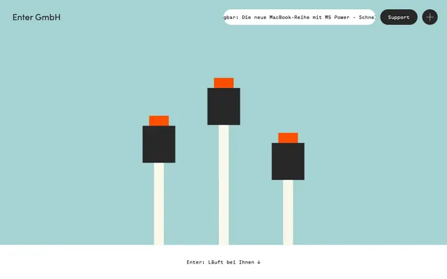
The page maintains a contained maximum width for text content, but sections frequently employ full-bleed background colors for visual impact. The hero section uses a full-bleed Ocean Mist background with abstract illustrations, centered body text, and a distinct link below. Section rhythm alternates between muted (Ocean Mist, Warm Canvas) and vibrant (Flame Orange) full-width color blocks. Content arrangement is primarily centered stacks of text, with some two-column text and link patterns. Navigation is a minimalist sticky top bar with a 'Support' button and a 'plus' icon acting as a menu toggle.
The visual language predominantly features abstract, geometric illustrations with a stark, blocky style. These are typically simple shapes in Charcoal Black, Flame Orange, and Pure White, serving as decorative atmosphere rather than content explanation. Imagery serves a bold, graphic purpose, providing visual anchors in an otherwise text-dominant layout. There is a minimal use of icons, which are outlined and in Charcoal Black.
Reminiscent of Basecamp, HEY.com, 37signals, Stripe (early versions).
# Enter GmbH — Style Reference
> High-contrast functional block

**Theme:** light

**Site:** https://enter-support.de

Enter GmbH presents a bold, utilitarian aesthetic marked by high-contrast typography and a distinct lack of decorative elements. The visual system operates on contrasting surfaces of muted and vibrant hues, with a focus on clear, unembellished communication. Components are straightforward, featuring strong outlines and full-block backgrounds, reinforcing a sense of directness and functional clarity.

## Tokens — Colors

| Name | Value | Token | Role |
|------|------|------|------|
| Flame Orange | `#ff5000` | `--color-flame-orange` | Decorative highlights, impactful section backgrounds, and a key brand accent color |
| Ocean Mist | `#a5d3d4` | `--color-ocean-mist` | Primary page background — a cool, muted base that allows energetic accents to pop |
| Warm Canvas | `#f9f8ea` | `--color-warm-canvas` | Secondary surface background, providing subtle warmth for content sections |
| Pure White | `#ffffff` | `--color-pure-white` | Foreground elements and text for maximum contrast on darker surfaces |
| Charcoal Black | `#000000` | `--color-charcoal-black` | Primary text, borders, and icons — the dominant dark color providing strong contrast |
| Graphite | `#282828` | `--color-graphite` | Button backgrounds and footer background — a slightly softer dark for layered elements |
| Muted Stone | `#6a6a6a` | `--color-muted-stone` | Hairline borders and subtle dividers |

## Tokens — Typography

### Helvetica
- **Substitute:** Arial
- **Weights:** 400, 700
- **Sizes:** 10px
- **Line height:** 1.15
- **Role:** System font for utility text, navigation items, and small labels, leveraging built-in readability for functional roles.

### Maax Mono
- **Substitute:** Space Mono
- **Weights:** 400
- **Sizes:** 16px
- **Line height:** 1.5, 1.6
- **Role:** Primary body and descriptive text, chosen for a technical, precise, and understated corporate voice.

### Sofia-Regular
- **Substitute:** Work Sans
- **Weights:** 400
- **Sizes:** 28px
- **Line height:** 1.29, 1.36
- **Role:** Distinctive headlines and section titles, providing a touch of stylized uniqueness while maintaining legibility.

## Tokens — Type Scale

| Role | Size | Line height | Letter spacing |
|------|------|------|------|
| caption | 10px | 1.15 | — |
| body | 16px | 1.5 | — |
| heading | 28px | 1.29 | — |

## Tokens — Spacing

- **Section gap:** 24px
- **Card padding:** 13px
- **Element gap:** 24px

## Tokens — Radius

- **Buttons:** 25px
- **links:** 25px

## Layout

The page maintains a contained maximum width for text content, but sections frequently employ full-bleed background colors for visual impact. The hero section uses a full-bleed Ocean Mist background with abstract illustrations, centered body text, and a distinct link below. Section rhythm alternates between muted (Ocean Mist, Warm Canvas) and vibrant (Flame Orange) full-width color blocks. Content arrangement is primarily centered stacks of text, with some two-column text and link patterns. Navigation is a minimalist sticky top bar with a 'Support' button and a 'plus' icon acting as a menu toggle.

## Imagery

The visual language predominantly features abstract, geometric illustrations with a stark, blocky style. These are typically simple shapes in Charcoal Black, Flame Orange, and Pure White, serving as decorative atmosphere rather than content explanation. Imagery serves a bold, graphic purpose, providing visual anchors in an otherwise text-dominant layout. There is a minimal use of icons, which are outlined and in Charcoal Black.

## Components

### Primary Action Button
*Interactive element for key user actions.*

Solid Graphite (#282828) background with Pure White (#ffffff) text. Features a 25px border-radius, creating a pill-like shape. Padding is 13px vertically and dynamically 13-25px horizontally. Text uses Helvetica 10px weight 400.

### Navigation Link
*Top-level navigation items.*

Inline text in Helvetica 10px weight 400. In an active state, it may have a 1px solid Charcoal Black (#000000) border-bottom or hover interaction.

### Decorative Text Link
*Subtle links within body content or lists.*

Appears as Maax Mono 16px text with an implicit hover effect, indicated by a visual arrow or border on interaction. Uses Charcoal Black (#000000) text.

### News Banner
*Informational banner at the top of the page.*

Uses a white background (#ffffff) with black text (#000000). Text in Helvetica 10px weight 400.

## Guidelines

### Do

- Always use Charcoal Black (#000000) for primary text on light backgrounds for maximum contrast.
- Apply 25px border-radius to all interactive buttons and prominent links.
- Use Maax Mono at 16px with 1.5 line height for all extended body copy.
- Employ Flame Orange (#ff5000) sparingly for high-impact section backgrounds or decorative accents to draw attention.
- Maintain a comfortable density with element gaps typically at 24px and card padding at 13px.
- Contrast bold, solid Graphite (#282828) buttons with Pure White (#ffffff) text.
- Leverage the cool Ocean Mist (#a5d3d4) or warm Warm Canvas (#f9f8ea) for distinct full-width section backgrounds.

### Don't

- Do not introduce gradients or soft shadows; the design relies on flat, high-contrast elements.
- Avoid using more than two distinct font families on a single page, adhering to Helvetica, Maax Mono, and Sofia-Regular.
- Do not use subtle color variations for interactive states; rely on direct changes in background, border, or text color.
- Do not use descriptive words like 'click here' – always make the link target clear.
- Refrain from using thin fonts or light greys for critical information, as legibility is prioritized through high contrast.
- Do not mix border radii values; consistently apply 25px for interactive elements and none for block content.
- Avoid excessive imagery; the visual identity is driven by bold color blocks and typography.

## Agent Prompt Guide

Quick Color Reference:
text: #000000
background: #a5d3d4
border: #000000
accent: #ff5000
primary action: #282828 (filled action)

Example Component Prompts:
1. Create a Primary Action Button: Graphite (#282828) background, Pure White (#ffffff) text, Helvetica 10px weight 400, 25px radius, 13px 13px padding.
2. Create a Headline: Sofia-Regular 28px weight 400, Charcoal Black (#000000) text.
3. Create a Body Text Block: Maax Mono 16px weight 400, Charcoal Black (#000000) text, 1.5 line height.
4. Design a Section Divider: Use a 1px solid Muted Stone (#6a6a6a) horizontal line.
5. Build a Footer Background: Solid Graphite (#282828) background with Pure White (#ffffff) text in Helvetica 10px weight 400.
More like this








Keep what you find
A free account saves references to boards and can send you a weekly email of picks based on what you save.
To see every result, go Pro.