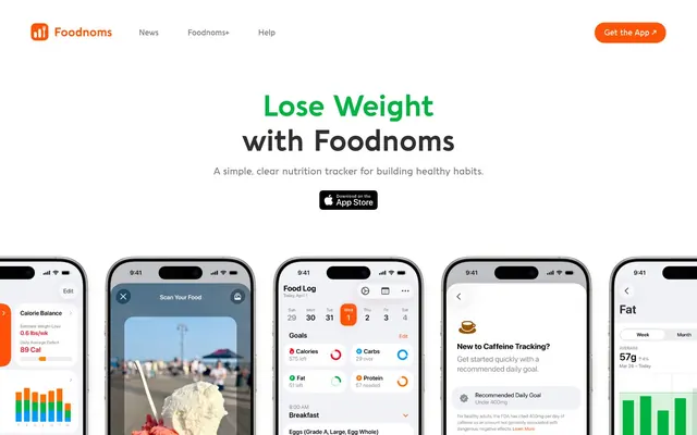
Preview image. Unlock full-res
Vibrant Data Clarity – like a meticulously organized information dashboard lit by colorful indicator lights.
Color palette
Primary call-to-action buttons, active navigation states, strong visual cues.
Secondary brand accent, used for specific data highlights or interactive elements within charts.
Alternative CTA background, hints at urgency or important interactions.
Distinctive data point, often used for highlighting or unique categories in graphs, providing strong differentiation.
Page backgrounds, card surfaces, primary text on dark accents.
Primary body text, darker UI elements, for strong contrast against White Canvas.
Headings, strong emphasis text, icons, ensures maximum legibility.
Subtle section dividers, light background for featured content blocks, provides slight visual separation from White Canvas.
Success states, positive metrics in data visualizations, provides a clear semantic indicator.
Informational indicators, general data visualization elements.
Typography
- Weights
- 700
- Sizes
- 18px, 22px, 30px, 60px
- Line height
- 1.2, 1.4
- Fallback
- Montserrat Bold, Lato Bold
Headlines and prominent display text, using a full set of stylistic alternates and ligatures to give a distinct, modern character.
- Weights
- 500
- Sizes
- 17px, 20px
- Line height
- 1.6, 1.8
- Fallback
- Montserrat Medium, Lato Medium
Long-form body text and primary links, ensuring readable paragraphs with a slightly generous line height.
- Weights
- 600
- Sizes
- 14px, 16px
- Line height
- 1.2, 1.4
- Fallback
- Montserrat SemiBold, Lato SemiBold
Subheadings, button text, and important inline labels, providing emphasis without the boldness of display text.
- Fallback
- sans-serif
System-level text like menu items, captions, and fine print, defaulting to an accessible and ubiquitous sans-serif.
- Fallback
- sans-serif
Bolded system text, minor navigation elements, and emphasized inline text.
Spacing & shape
Components
Filled button with Tangerine Accent background (#ff5406), White Canvas text (#ffffff), 26px border radius, 12px vertical padding, 20px horizontal padding. Prominently guides user interaction.
Ghost button with transparent background, Graphite Text (#2f2f2f) text at 64% opacity, 26px border radius, 12px vertical padding, 20px horizontal padding. Provides a less dominant interaction point.
Filled button with Warm Gray background (#f5f5f5), Tangerine Accent text (#ff5406) at 29% opacity, 26px border radius, 12px vertical padding, 20px horizontal padding. Offers a discrete interaction with brand color reinforcement.
Aquawax Pro Bold 60px, line-height 1.2, Raven Black. Center-aligned, immediately grabs attention.
Aquawax Pro Medium 20px, line-height 1.8, Graphite Text. Provides additional context below the main headline.
Apple App Store icon, presented as a clickable button to download the app. No explicit styling beyond the standard icon design.
Guidelines
- Always use the 26px border radius for all buttons, cards, and interactive containers.
- Prioritize Tangerine Accent (#ff5406) for primary call-to-action buttons to ensure immediate visibility.
- Maintain generous vertical spacing between sections (184-256px) for an airy, comfortable layout.
- Use Aquawax Pro Bold for all major headlines to leverage its distinctive character, with Raven Black (#000000) for maximum impact.
- Employ the full palette of vivid accent colors (Green, Sky Blue, Deep Purple) for information visualization within app-like interface elements to signify distinct categories or data points.
- Ensure all body text uses Aquawax Pro Medium weight 500 for optimal readability at default sizes.
- Avoid using Tangerine Accent (#ff5406) or Sunshine Orange (#ff6d00) for purely decorative purposes; reserve them for interactive elements or key data highlights.
- Do not introduce sharp corners or low radii; the 26px radius is a signature shape element.
- Never use generic system fonts for headlines or body text; always prefer Aquawax Pro with its specified weights and feature settings.
- Do not deviate from the established spacing scale (8px, 12px, 20px, 24px, 32px, 40px, 48px, 56px, 64px, 96px); maintain consistent density.
- Avoid overusing bold weighting (Aquawax Pro Bold 700) outside of headlines; use DemiBold (600) or Medium (500) for subheadings and body emphasis.
About this system
ShowHide
Foodnoms presents a vibrant, data-driven aesthetic, blending clean white spaces with a lively and diverse color palette. The immediate impression is one of approachable and precise digital tools, reinforced by the combination of a sharp, clear sans-serif with a more characterful, rounded custom typeface. The use of multiple vivid accent colors, particularly in charts and graphs within the simulated app screens, suggests a system designed for information visualization where clarity and differentiation are paramount, rather than a strictly minimalist or monochromatic approach.
The visual language is dominated by product screenshots, specifically in-app UI. These screenshots are presented as realistic phone mockups with slightly rounded edges, suggesting the app's functionality and interface are the primary visual content. The treatment is clean and contained, showcasing the UI clearly without distracting backgrounds (except for one instance of lifestyle photography visible behind an app interface). There are no abstract graphics or 3D renders, maintaining a focus on functional utility. Icons within the app are filled and minimal. The overall role of imagery is demonstrative: to showcase the product's features and user experience directly.
Reminiscent of Calm, Headspace, Fitbod, Linear (light mode).
# Foodnoms — Style Reference
> Vibrant Data Clarity – like a meticulously organized information dashboard lit by colorful indicator lights.

**Theme:** light

**Site:** https://foodnoms.com

Foodnoms presents a vibrant, data-driven aesthetic, blending clean white spaces with a lively and diverse color palette. The immediate impression is one of approachable and precise digital tools, reinforced by the combination of a sharp, clear sans-serif with a more characterful, rounded custom typeface. The use of multiple vivid accent colors, particularly in charts and graphs within the simulated app screens, suggests a system designed for information visualization where clarity and differentiation are paramount, rather than a strictly minimalist or monochromatic approach.

## Tokens — Colors

| Name | Value | Token | Role |
|------|------|------|------|
| Tangerine Accent | `#ff5406` | `--color-tangerine-accent` | Primary call-to-action buttons, active navigation states, strong visual cues. |
| Sunshine Orange | `#ff6d00` | `--color-sunshine-orange` | Secondary brand accent, used for specific data highlights or interactive elements within charts. |
| Crimson | `#ff3400` | `--color-crimson` | Alternative CTA background, hints at urgency or important interactions. |
| Deep Purple | `#5856de` | `--color-deep-purple` | Distinctive data point, often used for highlighting or unique categories in graphs, providing strong differentiation. |
| White Canvas | `#ffffff` | `--color-white-canvas` | Page backgrounds, card surfaces, primary text on dark accents. |
| Graphite Text | `#2f2f2f` | `--color-graphite-text` | Primary body text, darker UI elements, for strong contrast against White Canvas. |
| Raven Black | `#000000` | `--color-raven-black` | Headings, strong emphasis text, icons, ensures maximum legibility. |
| Warm Gray | `#f5f5f5` | `--color-warm-gray` | Subtle section dividers, light background for featured content blocks, provides slight visual separation from White Canvas. |
| Vivid Green | `#00b33f` | `--color-vivid-green` | Success states, positive metrics in data visualizations, provides a clear semantic indicator. |
| Sky Blue | `#00a9dd` | `--color-sky-blue` | Informational indicators, general data visualization elements. |

## Tokens — Typography

### Aquawax Pro
- **Substitute:** Montserrat Bold, Lato Bold
- **Weights:** 700
- **Sizes:** 18px, 22px, 30px, 60px
- **Line height:** 1.2, 1.4
- **Role:** Headlines and prominent display text, using a full set of stylistic alternates and ligatures to give a distinct, modern character.

### Aquawax Pro
- **Substitute:** Montserrat Medium, Lato Medium
- **Weights:** 500
- **Sizes:** 17px, 20px
- **Line height:** 1.6, 1.8
- **Role:** Long-form body text and primary links, ensuring readable paragraphs with a slightly generous line height.

### Aquawax Pro
- **Substitute:** Montserrat SemiBold, Lato SemiBold
- **Weights:** 600
- **Sizes:** 14px, 16px
- **Line height:** 1.2, 1.4
- **Role:** Subheadings, button text, and important inline labels, providing emphasis without the boldness of display text.

### system-ui
- **Substitute:** sans-serif
- **Role:** System-level text like menu items, captions, and fine print, defaulting to an accessible and ubiquitous sans-serif.

### system-ui
- **Substitute:** sans-serif
- **Role:** Bolded system text, minor navigation elements, and emphasized inline text.

## Tokens — Type Scale

Perfect Fifth (1.5) from 12px base.

| Role | Size | Line height | Letter spacing |
|------|------|------|------|
| caption | 12px | 1.2 | — |
| subheading | 18px | 1.2 | — |
| heading | 22px | 1.2 | — |
| heading-lg | 30px | 1.4 | — |
| display | 60px | 1.2 | — |

## Tokens — Spacing

- **Card padding:** 20px
- **Element gap:** 8px

## Tokens — Radius

- **Buttons:** 26px
- **Cards:** 26px
- **all:** 26px

## Imagery

The visual language is dominated by product screenshots, specifically in-app UI. These screenshots are presented as realistic phone mockups with slightly rounded edges, suggesting the app's functionality and interface are the primary visual content. The treatment is clean and contained, showcasing the UI clearly without distracting backgrounds (except for one instance of lifestyle photography visible behind an app interface). There are no abstract graphics or 3D renders, maintaining a focus on functional utility. Icons within the app are filled and minimal. The overall role of imagery is demonstrative: to showcase the product's features and user experience directly.

## Components

### Primary CTA Banner

### Feature Stats / Metric Cards

### Nutrition Goal Cards (Calories / Carbs / Fat / Protein)

### Primary Action Button
*Primary Calls to Action*

Filled button with Tangerine Accent background (#ff5406), White Canvas text (#ffffff), 26px border radius, 12px vertical padding, 20px horizontal padding. Prominently guides user interaction.

### Secondary Action Button
*Secondary Calls to Action*

Ghost button with transparent background, Graphite Text (#2f2f2f) text at 64% opacity, 26px border radius, 12px vertical padding, 20px horizontal padding. Provides a less dominant interaction point.

### Subtle Action Button
*Minor interactions or alternative options*

Filled button with Warm Gray background (#f5f5f5), Tangerine Accent text (#ff5406) at 29% opacity, 26px border radius, 12px vertical padding, 20px horizontal padding. Offers a discrete interaction with brand color reinforcement.

### Hero Headline
*Main page title*

Aquawax Pro Bold 60px, line-height 1.2, Raven Black. Center-aligned, immediately grabs attention.

### Hero Subhead
*Supporting text for hero headline*

Aquawax Pro Medium 20px, line-height 1.8, Graphite Text. Provides additional context below the main headline.

### Icon Button
*Download links for App Store*

Apple App Store icon, presented as a clickable button to download the app. No explicit styling beyond the standard icon design.

## Guidelines

### Do

- Always use the 26px border radius for all buttons, cards, and interactive containers.
- Prioritize Tangerine Accent (#ff5406) for primary call-to-action buttons to ensure immediate visibility.
- Maintain generous vertical spacing between sections (184-256px) for an airy, comfortable layout.
- Use Aquawax Pro Bold for all major headlines to leverage its distinctive character, with Raven Black (#000000) for maximum impact.
- Employ the full palette of vivid accent colors (Green, Sky Blue, Deep Purple) for information visualization within app-like interface elements to signify distinct categories or data points.
- Ensure all body text uses Aquawax Pro Medium weight 500 for optimal readability at default sizes.

### Don't

- Avoid using Tangerine Accent (#ff5406) or Sunshine Orange (#ff6d00) for purely decorative purposes; reserve them for interactive elements or key data highlights.
- Do not introduce sharp corners or low radii; the 26px radius is a signature shape element.
- Never use generic system fonts for headlines or body text; always prefer Aquawax Pro with its specified weights and feature settings.
- Do not deviate from the established spacing scale (8px, 12px, 20px, 24px, 32px, 40px, 48px, 56px, 64px, 96px); maintain consistent density.
- Avoid overusing bold weighting (Aquawax Pro Bold 700) outside of headlines; use DemiBold (600) or Medium (500) for subheadings and body emphasis.

## Agent Prompt Guide

### Quick Color Reference
- **Text:** #000000 (Raven Black)
- **Background:** #ffffff (White Canvas)
- **CTA:** #ff5406 (Tangerine Accent)
- **Subtle Background:** #f5f5f5 (Warm Gray)
- **Body Text:** #2f2f2f (Graphite Text)

### 3-5 Example Component Prompts
1. **Create a Hero Section:** White Canvas background. Headline 'Lose Weight with Foodnoms' using Aquawax Pro Bold 60px, Raven Black. Subtext 'A simple, clear nutrition tracker for building healthy habits.' using Aquawax Pro Medium 20px, Graphite Text. Beneath, a primary action button 'Get the App' with Tangerine Accent #ff5406 background, White Canvas #ffffff text, 26px border radius, 12px vertical padding, 20px horizontal padding.
2. **Generate a Testimonial Card:** Warm Gray #f5f5f5 background, 26px border radius. Body text 'Foodnoms changed my life!' using Aquawax Pro Medium 17px, Graphite Text #2f2f2f. Small caption 'Jane Doe, Happy User' using system sans-serif 12px, Raven Black #000000.
3. **Design a Navigation Menu Item:** Text 'News' using system sans-serif 12px, Raven Black #000000. For an active state, add a Tangerine Accent #ff5406 underline that's 2px thick.
4. **Create a Download Button:** Background is Tangerine Accent #ff5406. Text 'Download ↗' is Aquawax Pro DemiBold 16px, White Canvas #ffffff. Button has 26px border radius and 12px vertical padding, 20px horizontal padding.
5. **Render a Section Headline:** Text 'As Featured By' using Aquawax Pro Bold 30px, Raven Black #000000, centered on a White Canvas background.
More like this







Keep what you find
A free account saves references to boards and can send you a weekly email of picks based on what you save.
To see every result, go Pro.