Preview image. Unlock full-res
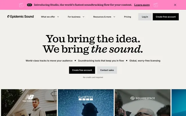
Crisp Paper, Bold Ink. Like a freshly printed document with critical information highlighted in vibrant markers.
Color palette
Promotional banners, card highlights, attention-grabbing links – a vivid, high-chroma pink to inject energy.
Interactive elements, links, occasional highlights – a vibrant blue that directs user attention.
Occasional highlights, secondary promotional elements – adds a bright, energetic touch.
Primary text, button backgrounds, navigation elements, key iconography – provides strong contrast against light surfaces.
Page backgrounds, card surfaces, inverted text for dark buttons.
Body background, sections, hero background – acts as a subtle off-white base.
Button backgrounds, subtle dividers – a very light gray for interactive elements.
Image backgrounds, card backgrounds, subtle UI element backgrounds – a cool, desaturated gray.
Typography
- Weights
- 400, 500, 600, 700
- Sizes
- 10px, 12px, 14px, 16px, 18px, 24px
- Line height
- 1, 1.15, 1.33, 1.5, 1.56, 1.6, 1.71
- Letter spacing
- 0.1000em
- Fallback
- system-ui, sans-serif
Body text, navigation items, buttons, captions, small labels – a highly readable, versatile workhorse font for all functional text. The consistent positive letter-spacing adds an open, informal feel.
- Weights
- 500
- Sizes
- 20px, 24px, 32px, 40px, 48px, 64px, 80px, 128px
- Line height
- 1, 1.06, 1.13, 1.2, 1.25
- Letter spacing
- -0.04, -0.03, -0.02
- Fallback
- Georgia, serif
Display and headline text – this custom font with its distinctive serifs provides a sophisticated, editorial counterpoint to Inter. The consistent negative letter-spacing for large sizes makes headlines feel tightly composed.
Spacing & shape
Components
Background: Midnight Ink (#000000), text: Cloud White (#ffffff). Padding: varies based on context (from 9.6px vertical, 24px horizontal to 0px). No border radius.
Background: Ash Gray (#efefef), text: Midnight Ink (#000000). Padding: varies (from 9.6px vertical, 24px horizontal to 0px). No border radius.
Transparent background, text: Midnight Ink (#000000). Padding: 0px. No border radius. Used for subtle actions like 'Contact sales'.
Background: rgba(207, 214, 229, 0.16) (Light Steel with transparency), text: Cloud White (#ffffff). Padding: 9.6px vertical, 24px horizontal. No border radius.
Transparent background (rgba(0,0,0,0)). Padding: 0px top/right/left, 40px bottom. No border or shadow. Used for showcasing brand examples.
Background: Rose Pop (#ff82c2). Padding: 16px top, 32px right, 16px bottom, 16px left. No border or shadow. Used for 'Studio' feature highlight.
Background: Light Steel (#cfd6e5). Padding: 0px. No border or shadow. Used to visually segment certain image-heavy sections.
Background: Midnight Ink (#000000), text: Cloud White (#ffffff). Padding: 2px vertical, 6px horizontal. Radius: 9999px (full pill shape).
Background: Paper Gray (#f1f0eb). No visible borders or shadows. Text: Midnight Ink (#000000). Padding seems to be around 16px vertical internally.
Guidelines
- Use Midnight Ink (#000000) for all primary body text and headings to ensure high contrast.
- Apply Rose Pop (#ff82c2) sparingly for promotional banners and key feature highlights to create visual pop.
- Employ the 'sebentaFont' at weight 500 for all headlines 20px and above, maintaining negative letter spacing values (-0.02em to -0.04em) to achieve a sophisticated, distinctive look.
- Utilize Paper Gray (#f1f0eb) as the default page and section background color, varying it subtly for content blocks where more visual separation is needed.
- Buttons and cards must always have a 0px border radius, reinforcing the crisp, boxy aesthetic of the UI.
- Ensure all text set in 'Inter' maintains a positive letter spacing of 0.1000em for an open, airy feel.
- Maintain a minimum vertical spacing of 40px between major content sections on the page.
- Do not use saturated brand colors for extensive text blocks; reserve them for accents and banners.
- Avoid using box shadows or gradients, as the system relies on flat colors and subtle background shifts for depth.
- Do not round corners on cards or buttons; maintain the explicit 0px border radius for a sharp, defined appearance.
- Do not substitute 'Inter' for 'sebentaFont' in headlines, as the custom font is crucial for brand identity.
- Avoid excessive use of the vivid accent colors simultaneously; typically, one strong accent color per section is sufficient to avoid visual clutter.
About this system
ShowHide
This design system presents a clean, approachable aesthetic with a strong emphasis on content, rather than heavy ornamentation. Subtle background color shifts create visual segmentation, preventing the flat UI from feeling stark. Type takes center stage, particularly the custom 'Sebenta Font' for headlines, which adds a distinct, sophisticated character, contrasting the straightforward 'Inter' for body copy. Playful, high-contrast accent colors are used sparingly to draw attention to key interactive elements and promotions, injecting vibrancy into an otherwise restrained palette.
The page maintains a centered max-width layout, with some sections breaking out to full-bleed for visual impact, such as the initial dark hero banner that contrasts with the main content area. The hero includes a prominent centered headline over a light background. Content alternates between stacked text blocks, two-column layouts (often text adjacent to an image or product screenshot), and 3-column card grids for features and examples. A consistent vertical rhythm is established, primarily through the 'sectionGap', creating distinct, comfortable breathing room between content blocks. Navigation is a sticky top bar with clearly defined 'Log in' and 'Create free account' buttons.
The visual language relies heavily on product-oriented photography and clean, unadorned UI. Photography is typically tightly cropped on a single subject or product, sometimes presented without much environmental context, or large landscape shots that evoke atmosphere. Images are often integrated directly into card backgrounds or full-width sections. There's a notable absence of illustrations or 3D renders. Icons are monochromatic, filled, and simplified, maintaining a functional, utilitarian role. The overall density is high with imagery, serving to showcase either the product in use or the 'sound' it represents, rather than just decorative elements.
Reminiscent of Figma, Linear, Canva, Stripe.
# Epidemicsound — Style Reference
> Crisp Paper, Bold Ink. Like a freshly printed document with critical information highlighted in vibrant markers.

**Theme:** light

**Site:** https://epidemicsound.com

This design system presents a clean, approachable aesthetic with a strong emphasis on content, rather than heavy ornamentation. Subtle background color shifts create visual segmentation, preventing the flat UI from feeling stark. Type takes center stage, particularly the custom 'Sebenta Font' for headlines, which adds a distinct, sophisticated character, contrasting the straightforward 'Inter' for body copy. Playful, high-contrast accent colors are used sparingly to draw attention to key interactive elements and promotions, injecting vibrancy into an otherwise restrained palette.

## Tokens — Colors

| Name | Value | Token | Role |
|------|------|------|------|
| Rose Pop | `#ff82c2` | `--color-rose-pop` | Promotional banners, card highlights, attention-grabbing links – a vivid, high-chroma pink to inject energy. |
| Electric Blue | `#20afff` | `--color-electric-blue` | Interactive elements, links, occasional highlights – a vibrant blue that directs user attention. |
| Lemon Zest | `#ffda40` | `--color-lemon-zest` | Occasional highlights, secondary promotional elements – adds a bright, energetic touch. |
| Midnight Ink | `#000000` | `--color-midnight-ink` | Primary text, button backgrounds, navigation elements, key iconography – provides strong contrast against light surfaces. |
| Cloud White | `#ffffff` | `--color-cloud-white` | Page backgrounds, card surfaces, inverted text for dark buttons. |
| Paper Gray | `#f1f0eb` | `--color-paper-gray` | Body background, sections, hero background – acts as a subtle off-white base. |
| Ash Gray | `#efefef` | `--color-ash-gray` | Button backgrounds, subtle dividers – a very light gray for interactive elements. |
| Light Steel | `#cfd6e5` | `--color-light-steel` | Image backgrounds, card backgrounds, subtle UI element backgrounds – a cool, desaturated gray. |

## Tokens — Typography

### Inter
- **Substitute:** system-ui, sans-serif
- **Weights:** 400, 500, 600, 700
- **Sizes:** 10px, 12px, 14px, 16px, 18px, 24px
- **Line height:** 1, 1.15, 1.33, 1.5, 1.56, 1.6, 1.71
- **Letter spacing:** 0.1000em
- **Role:** Body text, navigation items, buttons, captions, small labels – a highly readable, versatile workhorse font for all functional text. The consistent positive letter-spacing adds an open, informal feel.

### sebentaFont
- **Substitute:** Georgia, serif
- **Weights:** 500
- **Sizes:** 20px, 24px, 32px, 40px, 48px, 64px, 80px, 128px
- **Line height:** 1, 1.06, 1.13, 1.2, 1.25
- **Letter spacing:** -0.04, -0.03, -0.02
- **Role:** Display and headline text – this custom font with its distinctive serifs provides a sophisticated, editorial counterpoint to Inter. The consistent negative letter-spacing for large sizes makes headlines feel tightly composed.

## Tokens — Type Scale

| Role | Size | Line height | Letter spacing |
|------|------|------|------|
| caption | 10px | 1.5 | 0.1px |
| body | 14px | 1.71 | 0.1px |
| heading | 20px | 1.25 | -0.04em |
| heading-lg | 48px | 1.2 | -0.03em |
| display | 80px | 1.06 | -0.04em |

## Tokens — Spacing

- **Section gap:** 40px
- **Card padding:** 40px
- **Element gap:** 8px

## Tokens — Radius

- **Buttons:** 0px
- **Cards:** 0px
- **badges:** 9999px

## Layout

The page maintains a centered max-width layout, with some sections breaking out to full-bleed for visual impact, such as the initial dark hero banner that contrasts with the main content area. The hero includes a prominent centered headline over a light background. Content alternates between stacked text blocks, two-column layouts (often text adjacent to an image or product screenshot), and 3-column card grids for features and examples. A consistent vertical rhythm is established, primarily through the 'sectionGap', creating distinct, comfortable breathing room between content blocks. Navigation is a sticky top bar with clearly defined 'Log in' and 'Create free account' buttons.

## Imagery

The visual language relies heavily on product-oriented photography and clean, unadorned UI. Photography is typically tightly cropped on a single subject or product, sometimes presented without much environmental context, or large landscape shots that evoke atmosphere. Images are often integrated directly into card backgrounds or full-width sections. There's a notable absence of illustrations or 3D renders. Icons are monochromatic, filled, and simplified, maintaining a functional, utilitarian role. The overall density is high with imagery, serving to showcase either the product in use or the 'sound' it represents, rather than just decorative elements.

## Components

### CTA Button Group

### Promotional Highlight Card (Studio Feature)

### FAQ Accordion

### Primary Action Button (Dark)
*Call to action*

Background: Midnight Ink (#000000), text: Cloud White (#ffffff). Padding: varies based on context (from 9.6px vertical, 24px horizontal to 0px). No border radius.

### Secondary Action Button (Light)
*Secondary action or navigation*

Background: Ash Gray (#efefef), text: Midnight Ink (#000000). Padding: varies (from 9.6px vertical, 24px horizontal to 0px). No border radius.

### Ghost Button
*Tertiary action or navigational link*

Transparent background, text: Midnight Ink (#000000). Padding: 0px. No border radius. Used for subtle actions like 'Contact sales'.

### Promotional Banner Button
*CTA within promotional banners*

Background: rgba(207, 214, 229, 0.16) (Light Steel with transparency), text: Cloud White (#ffffff). Padding: 9.6px vertical, 24px horizontal. No border radius.

### Image Card (Transparent)
*Content container for images with overlaid text*

Transparent background (rgba(0,0,0,0)). Padding: 0px top/right/left, 40px bottom. No border or shadow. Used for showcasing brand examples.

### Promotional Highlight Card (Rose Pop)
*Highlighting key features or promotions*

Background: Rose Pop (#ff82c2). Padding: 16px top, 32px right, 16px bottom, 16px left. No border or shadow. Used for 'Studio' feature highlight.

### Image Background Card (Light Steel)
*Container for image-based content sections*

Background: Light Steel (#cfd6e5). Padding: 0px. No border or shadow. Used to visually segment certain image-heavy sections.

### New Feature Badge
*Signaling new content or features*

Background: Midnight Ink (#000000), text: Cloud White (#ffffff). Padding: 2px vertical, 6px horizontal. Radius: 9999px (full pill shape).

### Accordion Item
*Collapsible content sections, FAQs*

Background: Paper Gray (#f1f0eb). No visible borders or shadows. Text: Midnight Ink (#000000). Padding seems to be around 16px vertical internally.

## Guidelines

### Do

- Use Midnight Ink (#000000) for all primary body text and headings to ensure high contrast.
- Apply Rose Pop (#ff82c2) sparingly for promotional banners and key feature highlights to create visual pop.
- Employ the 'sebentaFont' at weight 500 for all headlines 20px and above, maintaining negative letter spacing values (-0.02em to -0.04em) to achieve a sophisticated, distinctive look.
- Utilize Paper Gray (#f1f0eb) as the default page and section background color, varying it subtly for content blocks where more visual separation is needed.
- Buttons and cards must always have a 0px border radius, reinforcing the crisp, boxy aesthetic of the UI.
- Ensure all text set in 'Inter' maintains a positive letter spacing of 0.1000em for an open, airy feel.
- Maintain a minimum vertical spacing of 40px between major content sections on the page.

### Don't

- Do not use saturated brand colors for extensive text blocks; reserve them for accents and banners.
- Avoid using box shadows or gradients, as the system relies on flat colors and subtle background shifts for depth.
- Do not round corners on cards or buttons; maintain the explicit 0px border radius for a sharp, defined appearance.
- Do not substitute 'Inter' for 'sebentaFont' in headlines, as the custom font is crucial for brand identity.
- Avoid excessive use of the vivid accent colors simultaneously; typically, one strong accent color per section is sufficient to avoid visual clutter.

## Agent Prompt Guide

### Quick Color Reference
- Text (primary): #000000
- Background (page): #f1f0eb
- CTA (primary button): #000000
- Border (none for buttons/cards)
- Accent (promotion): #ff82c2

### Example Component Prompts
1. Create a `Primary Action Button (Dark)` with the text "Create free account". It should use Midnight Ink for the background, Cloud White for the text, and have 9.6px vertical padding and 24px horizontal padding, with 0px radius.
2. Design a `Promotional Highlight Card (Rose Pop)`. Set the background to #ff82c2, padding to 16px top, 32px right, 16px bottom, 16px left, with 0px border radius. Inside, feature a headline in `sebentaFont`, weight 500, size 40px, line-height 1.13, letter-spacing -0.03em, and body text in `Inter` weight 400, size 14px, line-height 1.71, letter-spacing 0.1em.
3. Implement a `New Feature Badge` with the text "New". It needs a Midnight Ink (#000000) background, Cloud White (#ffffff) text, 2px vertical padding, 6px horizontal padding, and a 9999px border radius.
More like this








Keep what you find
A free account saves references to boards and can send you a weekly email of picks based on what you save.
To see every result, go Pro.