Preview image. Unlock full-res
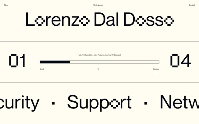
Pixelated Terminal on Cream Vellum. A minimalist, high-contrast digital aesthetic set against a soft, almost analog background.
Color palette
Likely interactive states or subtle highlight for dynamic components, not visible in screenshot but suggested by `--swiper-theme-color`.
Page backgrounds, large content blocks, interactive element backgrounds.
Primary text, interactive elements, accent borders, scroll indicators — establishes a bold, high-contrast, almost monospaced terminal aesthetic.
Secondary text, subtle borders, fills for certain graphic elements — offers a slightly softer shade of black for textural elements without losing brand cohesion.
Typography
- Weights
- 400
- Sizes
- 12px, 16px
- Line height
- 1
- Letter spacing
- normal
- Fallback
- Inter
Body copy (16px), navigation items (12px), and descriptive text. Its clean, geometric form provides modern legibility and contrasts with the pixel font without competing.
- Weights
- 400
- Sizes
- 135px
- Line height
- 1, 2.22
- Letter spacing
- normal
- Fallback
- Press Start 2P
Display headings and large numerical elements. This custom pixel font is the signature visual element, instantly conveying a retro-digital, command-line aesthetic.
Spacing & shape
Components
Text in Neue Montreal Regular 12px, #000000 on #fffcf0 background. No underline, no specific hover state visible but implied by interactive nature.
Large text in LDD Regular 135px, #000000, line height 1.00. Used for major display titles and numerical counters, demonstrating the core pixelated aesthetic.
A thin horizontal bar with a solid #000000 fill indicating progress against a #000000 border on a #fffcf0 background. The line is 2px high with 0px radius.
Text in Neue Montreal Regular 16px, #000310. Centered within its section, providing specific information to the user in a readable but understated manner.
Text in Neue Montreal Regular 12px, #000310, centered below the scroll bar to guide user interaction.
A thin (1-2px) solid black line (#000000) spanning the full width of the content area, visually segmenting content blocks. Uses the page's prominent border color to maintain stark definition.
Guidelines
- Use Cream Vellum (#fffcf0) as the primary background for all content sections.
- Apply Terminal Black (#000000) for all primary text elements and interactive component outlines.
- Employ the LDD font at 135px for all major page headings and numerical counters to maintain the distinctive pixel aesthetic.
- Maintain generous spacing around all elements, utilizing the 200px marginRight to ensure ample negative space and minimal information density.
- Use Neue Montreal Regular 16px, color Deep Graphite (#000310) for main body copy and descriptive text for maximal readability against the primary background.
- Avoid colored backgrounds or complex graphics; the design relies on stark contrast and minimalism.
- Do not introduce rounded corners; all elements should have hard, square edges unless it's a pixelated font.
- Do not use shadow effects; depth is created purely through stark outlines and negative space.
- Avoid using multiple weights or styles of the same font; the system is built on precision with specific type definitions.
- Do not deviate from the Cream Vellum and Terminal Black palette, except for the explicit Sky Blue Indicator for interactive states if necessary.
About this system
ShowHide
This design evokes a retro-digital, almost console-like interface, yet feels exceptionally sophisticated through its sparse application of elements and generous white space. The exclusive use of two distinct, highly characteristic typefaces—a modern sans-serif and a pixelated display font—creates a strong tension between contemporary clarity and nostalgic digital artifacts. The stark black-on-creamy-white palette anchors this aesthetic, making the pixelated elements feel intentional and premium.
The page uses a centered, max-width content model, with large sections clearly delineated by full-width black separator lines. The hero section features a large, centered pixelated headline. Content within sections is often centered, especially for introductory text. Navigation is a minimalist top bar with links aligned to the left and right. The overall rhythm is sparse and symmetrical, emphasizing clarity and strong visual breaks between content blocks. Scrolling features a unique horizontal progress bar, a distinct interactive element.
The site uses no photography or rich illustrations. Its visual language relies exclusively on typography, stark lines, and the distinctive pixelated LDD font to communicate. Icons, if present, would adhere to a simple, monochromatic, possibly pixelated style. The visual density is extremely low, with ample negative space. Visuals are not merely decorative but define the brand's core identity through textual and typographic presentation.
Reminiscent of Framer, Linear, Early Apple Websites (circa 1990s), Command Line Interfaces (CLI).
# ldd — Style Reference
> Pixelated Terminal on Cream Vellum. A minimalist, high-contrast digital aesthetic set against a soft, almost analog background.

**Theme:** light

**Site:** https://lorenzodaldosso.it

This design evokes a retro-digital, almost console-like interface, yet feels exceptionally sophisticated through its sparse application of elements and generous white space. The exclusive use of two distinct, highly characteristic typefaces—a modern sans-serif and a pixelated display font—creates a strong tension between contemporary clarity and nostalgic digital artifacts. The stark black-on-creamy-white palette anchors this aesthetic, making the pixelated elements feel intentional and premium.

## Tokens — Colors

| Name | Value | Token | Role |
|------|------|------|------|
| Sky Blue Indicator | `#007aff` | `--color-sky-blue-indicator` | Likely interactive states or subtle highlight for dynamic components, not visible in screenshot but suggested by `--swiper-theme-color`. |
| Cream Vellum | `#fffcf0` | `--color-cream-vellum` | Page backgrounds, large content blocks, interactive element backgrounds. |
| Terminal Black | `#000000` | `--color-terminal-black` | Primary text, interactive elements, accent borders, scroll indicators — establishes a bold, high-contrast, almost monospaced terminal aesthetic. |
| Deep Graphite | `#000310` | `--color-deep-graphite` | Secondary text, subtle borders, fills for certain graphic elements — offers a slightly softer shade of black for textural elements without losing brand cohesion. |

## Tokens — Typography

### Neue Montreal
- **Substitute:** Inter
- **Weights:** 400
- **Sizes:** 12px, 16px
- **Line height:** 1
- **Letter spacing:** normal
- **Role:** Body copy (16px), navigation items (12px), and descriptive text. Its clean, geometric form provides modern legibility and contrasts with the pixel font without competing.

### LDD
- **Substitute:** Press Start 2P
- **Weights:** 400
- **Sizes:** 135px
- **Line height:** 1, 2.22
- **Letter spacing:** normal
- **Role:** Display headings and large numerical elements. This custom pixel font is the signature visual element, instantly conveying a retro-digital, command-line aesthetic.

## Tokens — Type Scale

| Role | Size | Line height | Letter spacing |
|------|------|------|------|
| caption | 12px | 1 | — |
| body | 16px | 1 | — |
| display | 135px | 1 | — |

## Tokens — Spacing

- **Section gap:** 48px
- **Element gap:** 15-35px

## Tokens — Radius

- **all:** 0px

## Layout

The page uses a centered, max-width content model, with large sections clearly delineated by full-width black separator lines. The hero section features a large, centered pixelated headline. Content within sections is often centered, especially for introductory text. Navigation is a minimalist top bar with links aligned to the left and right. The overall rhythm is sparse and symmetrical, emphasizing clarity and strong visual breaks between content blocks. Scrolling features a unique horizontal progress bar, a distinct interactive element.

## Imagery

The site uses no photography or rich illustrations. Its visual language relies exclusively on typography, stark lines, and the distinctive pixelated LDD font to communicate. Icons, if present, would adhere to a simple, monochromatic, possibly pixelated style. The visual density is extremely low, with ample negative space. Visuals are not merely decorative but define the brand's core identity through textual and typographic presentation.

## Components

### Scroll Progress Bar with CTA

### Giant Pixel Counter Block

### Marquee Services Strip

### Header Navigation Item
*Navigation link*

Text in Neue Montreal Regular 12px, #000000 on #fffcf0 background. No underline, no specific hover state visible but implied by interactive nature.

### Giant Pixel Heading
*Headline*

Large text in LDD Regular 135px, #000000, line height 1.00. Used for major display titles and numerical counters, demonstrating the core pixelated aesthetic.

### Scroll Progress Bar
*UI indicator*

A thin horizontal bar with a solid #000000 fill indicating progress against a #000000 border on a #fffcf0 background. The line is 2px high with 0px radius.

### Mister Wolf Introduction
*Body Text*

Text in Neue Montreal Regular 16px, #000310. Centered within its section, providing specific information to the user in a readable but understated manner.

### Scroll CTA
*Instructional text*

Text in Neue Montreal Regular 12px, #000310, centered below the scroll bar to guide user interaction.

### Section Separator
*Visual divider*

A thin (1-2px) solid black line (#000000) spanning the full width of the content area, visually segmenting content blocks. Uses the page's prominent border color to maintain stark definition.

## Guidelines

### Do

- Use Cream Vellum (#fffcf0) as the primary background for all content sections.
- Apply Terminal Black (#000000) for all primary text elements and interactive component outlines.
- Employ the LDD font at 135px for all major page headings and numerical counters to maintain the distinctive pixel aesthetic.
- Maintain generous spacing around all elements, utilizing the 200px marginRight to ensure ample negative space and minimal information density.
- Use Neue Montreal Regular 16px, color Deep Graphite (#000310) for main body copy and descriptive text for maximal readability against the primary background.

### Don't

- Avoid colored backgrounds or complex graphics; the design relies on stark contrast and minimalism.
- Do not introduce rounded corners; all elements should have hard, square edges unless it's a pixelated font.
- Do not use shadow effects; depth is created purely through stark outlines and negative space.
- Avoid using multiple weights or styles of the same font; the system is built on precision with specific type definitions.
- Do not deviate from the Cream Vellum and Terminal Black palette, except for the explicit Sky Blue Indicator for interactive states if necessary.

## Agent Prompt Guide

### Quick Color Reference
- Text: #000000
- Background: #fffcf0
- Primary Accent (implied interactive): #007aff
- Secondary Text/Subtle Border: #000310

### 3-5 Example Component Prompts
1.  **Create a main header:** Centered, in LDD Regular, size 135px, color Terminal Black (#000000). Text content: 'LORENZO DAL DOSSO'.
2.  **Generate a navigation element:** Left-aligned, text 'Menu' in Neue Montreal Regular, 12px, color Terminal Black (#000000). Background Cream Vellum (#fffcf0).
3.  **Design a scroll progress bar:** A thin horizontal line, 2px height. The filled portion should be Terminal Black (#000000) on a background bar with a Terminal Black (#000000) border and Cream Vellum (#fffcf0) fill. Below it, centered text 'Scroll' in Neue Montreal Regular, 12px, color Deep Graphite (#000310).
4.  **Create an introductory text block:** Centered within the page, text 'Hello. I’m Mister Wolf. I solve Problems. Yes I’m an IT Specialist.' in Neue Montreal Regular, 16px, color Deep Graphite (#000310).
5.  **Add a prominent numerical counter:** Right-aligned, in LDD Regular, size 135px, color Terminal Black (#000000). Text content: '04'.
More like this









Keep what you find
A free account saves references to boards and can send you a weekly email of picks based on what you save.
To see every result, go Pro.