Preview image. Unlock full-res
Architectural blueprint on white marble. Light, precise, and structured, guiding builders through their thoughts.
Color palette
Primary interactive elements like CTA buttons, active links, important indicators – this is the site's only truly saturated brand color.
Page backgrounds, card surfaces, clean canvas for content creation.
Subtle background variation, UI elements that need mild distinction from primary surfaces.
Very faint background accents, borders for a barely-there separation.
Primary text, prominent headings, strong contrast against light backgrounds.
Secondary text, slightly softer than Charcoal Black for readability in body copy.
Subtle text, metadata, disabled states, providing hierarchy without fading into the background.
Component borders, dividers, subtle outlines for structure and separation.
Semantic positive feedback, confirmations, success messages.
Semantic positive background, for elements that need to convey 'success' or 'new'.
Typography
- Weights
- 400, 500, 600, 700
- Sizes
- 12px, 14px, 16px, 18px, 20px, 30px
- Line height
- 1, 1.33, 1.38, 1.43, 1.5, 1.56, 1.63
- Letter spacing
- 0.05, 0.05, 0.05, -0.025, -0.025, -0.025
- Fallback
- Inter
Primary brand typeface for all headings, body text, and UI elements. Its clean, technical aesthetic underpins the professional developer-focused identity. Specific feature settings 'ss01' likely provide alternative glyphs for a refined appearance.
- Weights
- 400, 900
- Sizes
- 14px, 16px, 18px, 20px
- Line height
- 1
- Fallback
- Font Awesome 6 Free
Used for decorative icons and some specific UI pictograms, providing a unique visual flavor for non-essential iconography.
- Weights
- 400, 900
- Sizes
- 12px, 14px, 18px
- Line height
- 1
- Fallback
- Font Awesome 6 Pro
Standard UI icon set for functional elements, ensuring consistent and clear visual communication across the interface.
- Weights
- 600
- Sizes
- 10px
- Line height
- 1.43
- Fallback
- IBM Plex Mono
Monospaced font for code snippets or technical data, ensuring alignment and distinction from regular text.
Spacing & shape
Elevation
Components
Background: Electric Indigo (#1d52de). Text: Cloud White (#f9fafb). Border radius: 10px. Padding: 6px vertical, 8px horizontal (smaller), or 0px vertical, 12px horizontal (larger), with a focus on text size.
Background: transparent. Text: Charcoal Black (#16191c). Border radius: 10px. Padding: 6px vertical, 8px horizontal.
Background: transparent. Text: Charcoal Black (#16191c). Border radius: 1.67772e+07px (effectively pill-shaped). No padding, as content determines size.
Background: transparent. Text: Charcoal Black (#16191c). Border radius: 8px. Zero padding, as interaction area is likely larger due to layout.
Background: Cloud White (#ffffff). Border: none. Shadow: none. Border radius: 10px. Padding: 10px on all sides. Used for small, contained content blocks like author profiles or mini-previews.
Background: transparent. Border: none. Shadow: none. Border radius: 1.67772e+07px (pill). No padding from component variants, but likely small internal text padding. Text: Electric Indigo (#1d52de).
Guidelines
- Use suisseIntl (Inter) color Charcoal Black (#16191c) for all primary body text at 16px, lineHeight 1.5, letterSpacing 0.05em.
- Apply Electric Indigo (#1d52de) only to primary interactive elements like 'Start your blog' buttons or active navigation links.
- Implement Card borders using Border Silver (#d1d4d9) at 1px for subtle visual separation, primarily for the 'What's New' style cards.
- Maintain a clear visual hierarchy, using Charcoal Black (#16191c) for main headings and Carbon Slate (#1c2024), Ash Mist (#7b8187) for subtext and metadata.
- Utilize Cloud White (#f9fafb) as the dominant background color for content areas, creating a clean, focused environment.
- Ensure input fields and interactive elements default to a 10px border-radius, aligning with the site's general component rounding.
- Apply a consistent layout max-width of 1176px for main content areas, with a section vertical gap of 48px to create breathing room.
- Do not introduce new saturated accent colors outside of Electric Indigo (#1d52de); maintain a largely achromatic palette.
- Avoid excessive use of shadows; the design relies on subtle borders and background color changes for separation, not pronounced drop shadows.
- Do not use highly rounded elements except for specific pill-shaped components like badges (radius 1.67772e+07px); most elements should use 10px or 14px radius.
- Do not use overly bold or decorative typography for headings; suisseIntl (Inter) at various weights should convey authority through clarity, not visual loudness.
- Avoid tight spacing between major sections; larger gaps like 48px are crucial for readability and information compartmentalization.
- Do not deviate from the specified suisseIntl letterSpacing values (-0.025em for larger text, 0.05em for smaller) as they are critical to the font's precise appearance.
About this system
ShowHide
Hashnode's design evokes a sense of organized clarity, like a refined environment where complex ideas are constructed. Predominantly bright, near-white surfaces create a spacious, focused canvas, punctuated by sharp, technical typography and a singular, vibrant blue accent. Precision is communicated through crisp sans-serif lines, defined component boundaries, and minimal, intentional softening at corners, creating a sense of professional purpose.
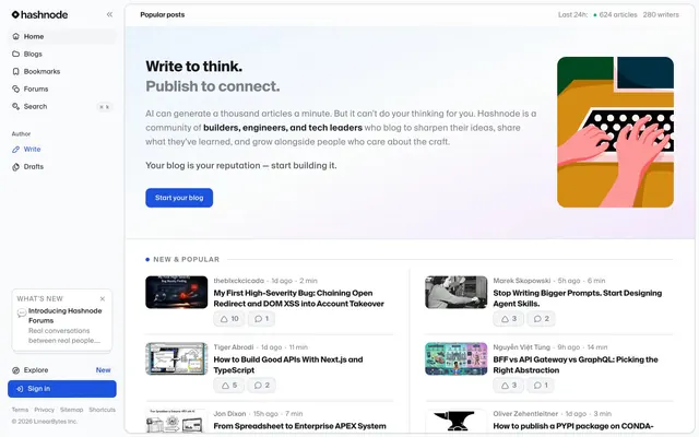
The page adheres to a max-width 1176px contained layout, centered on the screen, creating a focused content experience. The hero section features a split layout: prominent text on the left, a contained vector illustration on the right, resting on a subtly gradiented background. Content sections follow a consistent vertical rhythm with 48px gaps. Article listings use a grid layout where each item is a minimal card, emphasizing content over heavy visual decoration, laid out side-by-side. Navigation is handled by a sticky left sidebar containing primary links and a 'what's new' popout, alongside a conventional top bar for global actions and status.
The visual language for imagery is a mix of abstract, rounded vector illustrations and tightly cropped product screenshots or contextual photography. Illustrations are colorful but contained within defined shapes with soft, rounded corners (e.g., the hero illustration). Photography in article previews tends to be full-bleed within the card's image container, sometimes black and white or vibrant. Icons are primarily functional Font Awesome Pro, supplemented by more decorative Font Awesome Jelly for specific brand elements. Imagery serves a dual role: decorative atmosphere in hero sections and explanatory content/contextual previews within listings. Image density is moderate; sections are image-rich but not image-dominant.
Reminiscent of Vercel, Linear, Notion, Stripe.
# Hashnode — Style Reference
> Architectural blueprint on white marble. Light, precise, and structured, guiding builders through their thoughts.

**Theme:** light

**Site:** https://hashnode.com

Hashnode's design evokes a sense of organized clarity, like a refined environment where complex ideas are constructed. Predominantly bright, near-white surfaces create a spacious, focused canvas, punctuated by sharp, technical typography and a singular, vibrant blue accent. Precision is communicated through crisp sans-serif lines, defined component boundaries, and minimal, intentional softening at corners, creating a sense of professional purpose.

## Tokens — Colors

| Name | Value | Token | Role |
|------|------|------|------|
| Electric Indigo | `#1d52de` | `--color-electric-indigo` | Primary interactive elements like CTA buttons, active links, important indicators – this is the site's only truly saturated brand color. |
| Cloud White | `#f9fafb` | `--color-cloud-white` | Page backgrounds, card surfaces, clean canvas for content creation. |
| Storm Gray | `#f4f5f7` | `--color-storm-gray` | Subtle background variation, UI elements that need mild distinction from primary surfaces. |
| Stone Dust | `#e6e8eb` | `--color-stone-dust` | Very faint background accents, borders for a barely-there separation. |
| Charcoal Black | `#16191c` | `--color-charcoal-black` | Primary text, prominent headings, strong contrast against light backgrounds. |
| Carbon Slate | `#1c2024` | `--color-carbon-slate` | Secondary text, slightly softer than Charcoal Black for readability in body copy. |
| Ash Mist | `#7b8187` | `--color-ash-mist` | Subtle text, metadata, disabled states, providing hierarchy without fading into the background. |
| Border Silver | `#d1d4d9` | `--color-border-silver` | Component borders, dividers, subtle outlines for structure and separation. |
| Success Green | `#009966` | `--color-success-green` | Semantic positive feedback, confirmations, success messages. |
| Vivid Green | `#00bc7d` | `--color-vivid-green` | Semantic positive background, for elements that need to convey 'success' or 'new'. |

## Tokens — Typography

### suisseIntl
- **Substitute:** Inter
- **Weights:** 400, 500, 600, 700
- **Sizes:** 12px, 14px, 16px, 18px, 20px, 30px
- **Line height:** 1, 1.33, 1.38, 1.43, 1.5, 1.56, 1.63
- **Letter spacing:** 0.05, 0.05, 0.05, -0.025, -0.025, -0.025
- **Role:** Primary brand typeface for all headings, body text, and UI elements. Its clean, technical aesthetic underpins the professional developer-focused identity. Specific feature settings 'ss01' likely provide alternative glyphs for a refined appearance.

### Font Awesome 7 Jelly
- **Substitute:** Font Awesome 6 Free
- **Weights:** 400, 900
- **Sizes:** 14px, 16px, 18px, 20px
- **Line height:** 1
- **Role:** Used for decorative icons and some specific UI pictograms, providing a unique visual flavor for non-essential iconography.

### Font Awesome 7 Pro
- **Substitute:** Font Awesome 6 Pro
- **Weights:** 400, 900
- **Sizes:** 12px, 14px, 18px
- **Line height:** 1
- **Role:** Standard UI icon set for functional elements, ensuring consistent and clear visual communication across the interface.

### suisseMono
- **Substitute:** IBM Plex Mono
- **Weights:** 600
- **Sizes:** 10px
- **Line height:** 1.43
- **Role:** Monospaced font for code snippets or technical data, ensuring alignment and distinction from regular text.

## Tokens — Type Scale

Minor Third (1.2) from 16px base.

| Role | Size | Line height | Letter spacing |
|------|------|------|------|
| caption | 12px | 1.5 | 0.6px |
| body-sm | 14px | 1.43 | 0.7px |
| body | 16px | 1.38 | 0.8px |
| subheading | 18px | 1.33 | -0.45px |
| heading | 20px | 1.5 | -0.5px |
| display | 30px | 1 | -0.75px |

## Tokens — Spacing

- **Max width:** 1176px
- **Section gap:** 48px

## Tokens — Radius

- **Default:** 10px
- **Buttons:** 10px
- **Cards:** 10px-14px
- **tags:** 1.67772e+07px

## Tokens — Elevation

- **Hover/Interaction States:** `oklab(0 0 0 / 0.1) 0px 0px 0px 1px inset`

## Layout

The page adheres to a max-width 1176px contained layout, centered on the screen, creating a focused content experience. The hero section features a split layout: prominent text on the left, a contained vector illustration on the right, resting on a subtly gradiented background. Content sections follow a consistent vertical rhythm with 48px gaps. Article listings use a grid layout where each item is a minimal card, emphasizing content over heavy visual decoration, laid out side-by-side. Navigation is handled by a sticky left sidebar containing primary links and a 'what's new' popout, alongside a conventional top bar for global actions and status.

## Imagery

The visual language for imagery is a mix of abstract, rounded vector illustrations and tightly cropped product screenshots or contextual photography. Illustrations are colorful but contained within defined shapes with soft, rounded corners (e.g., the hero illustration). Photography in article previews tends to be full-bleed within the card's image container, sometimes black and white or vibrant. Icons are primarily functional Font Awesome Pro, supplemented by more decorative Font Awesome Jelly for specific brand elements. Imagery serves a dual role: decorative atmosphere in hero sections and explanatory content/contextual previews within listings. Image density is moderate; sections are image-rich but not image-dominant.

## Components

### Article Card — New & Popular

### What's New Notification Card

### Live Stats Bar + CTA Button Group

### Primary Button
*Main call to action*

Background: Electric Indigo (#1d52de). Text: Cloud White (#f9fafb). Border radius: 10px. Padding: 6px vertical, 8px horizontal (smaller), or 0px vertical, 12px horizontal (larger), with a focus on text size.

### Ghost Button
*Secondary action or link-like button*

Background: transparent. Text: Charcoal Black (#16191c). Border radius: 10px. Padding: 6px vertical, 8px horizontal.

### Badge Button
*Informational or count display*

Background: transparent. Text: Charcoal Black (#16191c). Border radius: 1.67772e+07px (effectively pill-shaped). No padding, as content determines size.

### Menu Item Button
*Sidebar navigation items*

Background: transparent. Text: Charcoal Black (#16191c). Border radius: 8px. Zero padding, as interaction area is likely larger due to layout.

### Thumbnail Card
*Small interactive cards or featured content*

Background: Cloud White (#ffffff). Border: none. Shadow: none. Border radius: 10px. Padding: 10px on all sides. Used for small, contained content blocks like author profiles or mini-previews.

### Interactive Chip
*Small, clickable element, often for categories or filters*

Background: transparent. Border: none. Shadow: none. Border radius: 1.67772e+07px (pill). No padding from component variants, but likely small internal text padding. Text: Electric Indigo (#1d52de).

## Guidelines

### Do

- Use suisseIntl (Inter) color Charcoal Black (#16191c) for all primary body text at 16px, lineHeight 1.5, letterSpacing 0.05em.
- Apply Electric Indigo (#1d52de) only to primary interactive elements like 'Start your blog' buttons or active navigation links.
- Implement Card borders using Border Silver (#d1d4d9) at 1px for subtle visual separation, primarily for the 'What's New' style cards.
- Maintain a clear visual hierarchy, using Charcoal Black (#16191c) for main headings and Carbon Slate (#1c2024), Ash Mist (#7b8187) for subtext and metadata.
- Utilize Cloud White (#f9fafb) as the dominant background color for content areas, creating a clean, focused environment.
- Ensure input fields and interactive elements default to a 10px border-radius, aligning with the site's general component rounding.
- Apply a consistent layout max-width of 1176px for main content areas, with a section vertical gap of 48px to create breathing room.

### Don't

- Do not introduce new saturated accent colors outside of Electric Indigo (#1d52de); maintain a largely achromatic palette.
- Avoid excessive use of shadows; the design relies on subtle borders and background color changes for separation, not pronounced drop shadows.
- Do not use highly rounded elements except for specific pill-shaped components like badges (radius 1.67772e+07px); most elements should use 10px or 14px radius.
- Do not use overly bold or decorative typography for headings; suisseIntl (Inter) at various weights should convey authority through clarity, not visual loudness.
- Avoid tight spacing between major sections; larger gaps like 48px are crucial for readability and information compartmentalization.
- Do not deviate from the specified suisseIntl letterSpacing values (-0.025em for larger text, 0.05em for smaller) as they are critical to the font's precise appearance.

## Agent Prompt Guide

### Quick Color Reference
- Text Primary: #16191c
- Background Primary: #f9fafb
- CTA Button: #1d52de
- Border Default: #d1d4d9
- Accent Active: #1d52de

### Example Component Prompts
1. **Create a Hero Section:** Background: linear-gradient(90deg, #f9fafb, #f4f5f7). Left side: Headline 'Write to think. Publish to connect.' Text size 30px, suisseIntl weight 700, color #16191c, letter-spacing -0.75px. Subtext 'AI can generate...' suisseIntl weight 400, color #1c2024, size 16px, lineHeight 1.5, letterSpacing 0.8. Button 'Start your blog' background #1d52de, text #f9fafb, radius 10px, padding 0px 12px.
2. **Generate an Article Card:** Background transparent, border none, radius 0px, padding 16px 0px. Title 'My First High-Severity Bug...' suisseIntl weight 600, color #16191c, size 18px, lineHeight 1.33, letterSpacing -0.45px. Metadata '1d ago • 2 min' suisseIntl weight 400, color #7b8187, size 14px, lineHeight 1.43. Pill-shaped action buttons (e.g., '10') with transparent background, #16191c text, radius 1.67772e+07px.
3. **Design a 'What's New' Promotional Card:** Background #ffffff, border none, radius 14px, padding 20px. Title 'Introducing Hashnode Forums' suisseIntl weight 600, color #16191c, size 16px, lineHeight 1.38. Body 'Real conversations between real people...' suisseIntl weight 400, color #1c2024, size 14px, lineHeight 1.43.
4. **Build a Navigation Link:** Text 'Home' suisseIntl weight 500, color #16191c, size 16px. Icon 'home' Font Awesome 7 Pro, size 16px, color #16191c. On 'active' state, change text and icon color to #1d52de, with a subtle background color #f4f5f7 and radius 10px.
More like this







Keep what you find
A free account saves references to boards and can send you a weekly email of picks based on what you save.
To see every result, go Pro.