Preview image. Unlock full-res
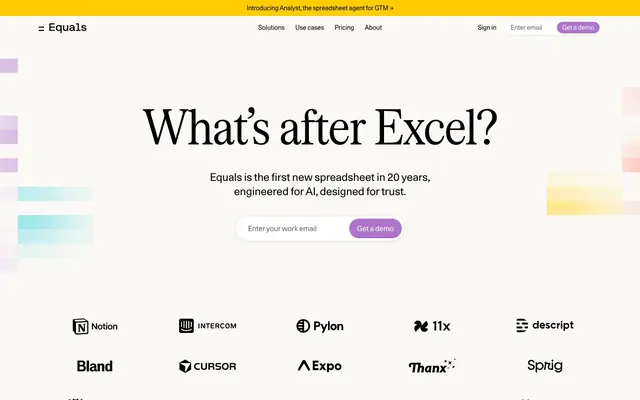
Broadsheet meets spreadsheet — editorial serif authority on warm cream, punctuated by floating pastel data cells.
Color palette
Announcement bar background only — saturated yellow on near-black text creates maximum urgency at minimal surface area, never used elsewhere so it retains its alarm-signal quality
Primary CTA buttons — warm violet against cream background reads as inviting rather than urgent, distinguishing CTAs from the aggressive red/orange typical of SaaS
Finance category accent swatch — one of three role-coded indicator blocks (RevOps red, Founders navy, Finance green) flanking solution rows
Background decorative color block in hero, part of the floating pastel spreadsheet-cell visual language
All headings, body text, borders, nav links, icons — full black with zero softening; the high contrast against cream is deliberately old-media, not SaaS-neutral
Page background, section backgrounds — the slight warm yellow tint separates this from clinical white and reinforces the paper/spreadsheet metaphor
Button text on orchid CTAs, nav hover states, input field backgrounds
Body copy, nav secondary text, descriptive subtexts under headings
Nav dropdown shadows, subtle divider lines
Typography
- Weights
- 400
- Sizes
- 40px, 48px, 110px
- Line height
- 1
- Letter spacing
- -2.2px at 110px, -0.48px at 48px, -0.4px at 40px
- Fallback
- Freight Display Condensed, or Playfair Display with condensed tracking
All display and section headings — single weight 400 across all sizes is the anti-convention choice; most SaaS headlines use 700-800, this regular-weight condensed serif whispers editorial authority. The 110px size is used only for hero display text.
- Weights
- 400
- Sizes
- 14px, 16px, 18px, 24px
- Line height
- 1
- Letter spacing
- -0.084px at 14px, -0.08px at 16px, -0.072px at 18px
- Fallback
- Inter, Aktiv Grotesk
Every non-heading element: nav links, body copy, buttons, footer, input placeholder, labels. The negative letter-spacing at all sizes tightens an already compact grotesque into something UI-precise — a signature move that makes UI chrome feel considered rather than default.
- Weights
- 400
- Sizes
- 13px
- Line height
- 1.54
- Letter spacing
- normal
- Fallback
- IBM Plex Mono
Fine-print body context — 13px utility text likely used for footnotes or micro-labels. Its presence alongside Unica77 suggests a tertiary voice for data footnotes or legal-adjacent content.
Spacing & shape
Components
Background #B074CE, white text, 60px border-radius (full pill), 4px 12px padding, Unica77 14px weight 400. The pill radius against the otherwise 0px-radius input it sits beside creates deliberate contrast. Used for 'Get a demo' globally.
Transparent background, #000000 text, 0px radius, 0px padding, Unica77 16px weight 400 with -0.08px letter-spacing. No underline at rest. Navigation links are completely unstyled except for hover state.
Full-width row separated by 1px #000000 horizontal rule top and bottom. Left: heading in Serrif Condensed 40px + body in Unica77 16px #646462. Right: a 24×12px solid color block (red for RevOps #FF3716, navy #00B for Founders, green #20A277 for Finance) functioning as a category icon. No card background — content sits directly on #FAF9F5.
White #FFFFFF background, 6px border-radius, box-shadow rgba(0,0,0,0.1) 0 0 0 0.5px + rgba(0,0,0,0.05) 0 2px 8px -2px + rgba(0,0,0,0.14) 0 2px 10px -4px. Interior items use Unica77 14px-16px. The layered three-value shadow creates thin-bezel framing without aggressive depth.
Monochrome customer logos displayed at uniform size in a horizontal or grid layout directly on #FAF9F5. No card, no border, no padding container — logos float on the page surface. Brand names (Notion, Intercom, Cursor, etc.) rendered in their own logotype styling but forced to black.
Rectangular blocks of flat color (glacier teal #2DCBDC, soft purple, warm yellow, pastel green) scattered in the hero background at varying sizes. No radius, no border, no shadow. They reference spreadsheet cell fills, creating an ambient visual field without interfering with foreground content.
Large opening quotation mark in Serrif Condensed, quote body in Serrif Condensed 40-48px, attribution in Unica77 16px #646462. Placed on #FAF9F5 with no container or border. The serif quote type against the sans-serif attribution creates deliberate register shift.
Guidelines
- Use Serrif Condensed weight 400 (never bold) for all headings — the editorial authority comes from scale (up to 110px) and letter-spacing (-2.2px at display), not weight
- Set the page background to #FAF9F5 (Warm Cream), never pure white — the warm tint is the canvas that makes black text feel typographic rather than digital
- Reserve #FFCC00 exclusively for the announcement bar and #B074CE exclusively for CTA buttons — their power comes from appearing once each, never reused as decorative color
- Use 60px border-radius on CTA buttons only; all other interactive elements (inputs, dropdowns, category pills) use 0px or 6px — the pill/sharp contrast is deliberate system tension
- Separate sections with 1px solid #000000 horizontal rules instead of increased vertical whitespace — this references spreadsheet grid lines and is the primary structural rhythm device
- Apply negative letter-spacing to Unica77 at all sizes: -0.084px at 14px, -0.08px at 16px — never use default tracking for UI text
- Display category/role color blocks as flat 24×12px solid rectangles (no radius, no border) — the raw flat swatch is the icon; never substitute icons or illustrations for these
- Never use #B074CE or #FFCC00 as background for content sections or cards — both colors are single-purpose signal colors, not palette options
- Never apply border-radius to inputs or horizontal dividers — the 0px sharp edge on form elements is the system's UI register; rounding them collapses the tension with pill CTAs
- Never use Serrif Condensed at weights other than 400 — do not attempt to bold or italicize headings, even for emphasis
- Never replace the floating color swatch decoratives with photography or illustrations — abstract flat rectangles are the hero visual language; anything representational breaks the spreadsheet metaphor
- Never use #646462 (Slate Body) for headings or CTAs — it is body-only, maintaining a strict two-tier contrast system: black for structure, slate for supporting copy
- Never stack multiple orchid (#B074CE) buttons in proximity — each page view should have a single dominant CTA moment, typically the email capture composite in the hero
- Never add drop shadows or elevation to section containers or cards — the only permitted shadow is on nav dropdown panels; sections live flat on the cream surface
About this system
ShowHide
Equals feels like a newspaper broadsheet that learned to breathe — authoritative serif headlines punching at 110px sit on a warm cream field (#FAF9F5), while playful pastel color swatches float loosely in the background like spreadsheet cells coming undone. The tension between Serrif Condensed's editorial weight and Unica77's tight UI precision creates a dual-register: serious data tool and approachable product. Yellow (#FFCC00) announces itself only on the top announcement bar, orchid purple (#B074CE) appears exclusively on CTA buttons — two accent colors that never compete because they never share the same zone. Thin horizontal rules divide sections instead of whitespace padding, referencing spreadsheet grid lines as a structural metaphor throughout the page.
Max-width centered layout (~1200px) on a full-bleed #FAF9F5 cream background. Hero is full-viewport-height centered stack: 110px display headline, 18px subtext, then the email+CTA composite unit. Floating color swatches appear left and right of the text column without containing structure — they bleed near the viewport edges. Below the hero, sections are separated exclusively by 1px black horizontal rules with no vertical gap between them, creating a dense spreadsheet-row rhythm. Solution rows use a two-column layout: text left, color swatch right. Customer logos appear in a 5-column grid row, then a second row, directly on the cream surface with no container. Navigation is a single sticky top bar with logo left, five nav links centered, sign-in + email input + CTA button right. Dropdown panels float below nav items with the layered shadow system.
No photography anywhere on the visible page. The hero's visual field is occupied entirely by flat-color rectangular swatches — glacier teal, soft lavender, pastel yellow, mint green — arranged loosely in the background at varying sizes, without radius or border, mimicking unfilled spreadsheet cells. These are purely decorative and never contain content. The logo section uses monochrome customer wordmarks forced to black, no badges or containers. Category indicators are 24×12px solid color blocks — raw data visualization primitives rather than designed icons. The visual language is resolutely non-photographic: a product confident enough that its typography IS the visual.
Reminiscent of Notion, Linear, Rows.com, Retool.
# Equals — Style Reference
> Broadsheet meets spreadsheet — editorial serif authority on warm cream, punctuated by floating pastel data cells.

**Theme:** light

**Site:** https://equals.com

Equals feels like a newspaper broadsheet that learned to breathe — authoritative serif headlines punching at 110px sit on a warm cream field (#FAF9F5), while playful pastel color swatches float loosely in the background like spreadsheet cells coming undone. The tension between Serrif Condensed's editorial weight and Unica77's tight UI precision creates a dual-register: serious data tool and approachable product. Yellow (#FFCC00) announces itself only on the top announcement bar, orchid purple (#B074CE) appears exclusively on CTA buttons — two accent colors that never compete because they never share the same zone. Thin horizontal rules divide sections instead of whitespace padding, referencing spreadsheet grid lines as a structural metaphor throughout the page.

## Tokens — Colors

| Name | Value | Token | Role |
|------|------|------|------|
| Analyst Yellow | `#FFCC00` | `--color-analyst-yellow` | Announcement bar background only — saturated yellow on near-black text creates maximum urgency at minimal surface area, never used elsewhere so it retains its alarm-signal quality |
| Orchid CTA | `#B074CE` | `--color-orchid-cta` | Primary CTA buttons — warm violet against cream background reads as inviting rather than urgent, distinguishing CTAs from the aggressive red/orange typical of SaaS |
| Brand Green | `#20A277` | `--color-brand-green` | Finance category accent swatch — one of three role-coded indicator blocks (RevOps red, Founders navy, Finance green) flanking solution rows |
| Glacier | `#2DCBDC` | `--color-glacier` | Background decorative color block in hero, part of the floating pastel spreadsheet-cell visual language |
| Midnight Ink | `#000000` | `--color-midnight-ink` | All headings, body text, borders, nav links, icons — full black with zero softening; the high contrast against cream is deliberately old-media, not SaaS-neutral |
| Warm Cream | `#FAF9F5` | `--color-warm-cream` | Page background, section backgrounds — the slight warm yellow tint separates this from clinical white and reinforces the paper/spreadsheet metaphor |
| Cloud White | `#FFFFFF` | `--color-cloud-white` | Button text on orchid CTAs, nav hover states, input field backgrounds |
| Slate Body | `#646462` | `--color-slate-body` | Body copy, nav secondary text, descriptive subtexts under headings |
| Fog Border | `#CDCCC9` | `--color-fog-border` | Nav dropdown shadows, subtle divider lines |

## Tokens — Typography

### Serrif Condensed
- **Substitute:** Freight Display Condensed, or Playfair Display with condensed tracking
- **Weights:** 400
- **Sizes:** 40px, 48px, 110px
- **Line height:** 1
- **Letter spacing:** -2.2px at 110px, -0.48px at 48px, -0.4px at 40px
- **Role:** All display and section headings — single weight 400 across all sizes is the anti-convention choice; most SaaS headlines use 700-800, this regular-weight condensed serif whispers editorial authority. The 110px size is used only for hero display text.

### Unica77
- **Substitute:** Inter, Aktiv Grotesk
- **Weights:** 400
- **Sizes:** 14px, 16px, 18px, 24px
- **Line height:** 1
- **Letter spacing:** -0.084px at 14px, -0.08px at 16px, -0.072px at 18px
- **Role:** Every non-heading element: nav links, body copy, buttons, footer, input placeholder, labels. The negative letter-spacing at all sizes tightens an already compact grotesque into something UI-precise — a signature move that makes UI chrome feel considered rather than default.

### Aeonik Fono
- **Substitute:** IBM Plex Mono
- **Weights:** 400
- **Sizes:** 13px
- **Line height:** 1.54
- **Letter spacing:** normal
- **Role:** Fine-print body context — 13px utility text likely used for footnotes or micro-labels. Its presence alongside Unica77 suggests a tertiary voice for data footnotes or legal-adjacent content.

## Tokens — Type Scale

Augmented Fourth (1.414) from 16px base.

| Role | Size | Line height | Letter spacing |
|------|------|------|------|
| caption | 13px | 1.54 | — |
| body | 16px | 1.5 | -0.08em |
| subheading | 18px | 1.33 | -0.072em |
| heading-sm | 24px | 1.29 | — |
| heading | 40px | 1.1 | -0.8px |
| heading-lg | 48px | 1.04 | -0.48px |
| display | 110px | 1 | -2.2px |

## Tokens — Spacing

- **Max width:** 1200px
- **Section gap:** 80-120px
- **Card padding:** 24px
- **Element gap:** 12-20px

## Tokens — Radius

- **Buttons:** 60px
- **Inputs:** 0px
- **dropdowns:** 6px
- **tags:** 50px

## Layout

Max-width centered layout (~1200px) on a full-bleed #FAF9F5 cream background. Hero is full-viewport-height centered stack: 110px display headline, 18px subtext, then the email+CTA composite unit. Floating color swatches appear left and right of the text column without containing structure — they bleed near the viewport edges. Below the hero, sections are separated exclusively by 1px black horizontal rules with no vertical gap between them, creating a dense spreadsheet-row rhythm. Solution rows use a two-column layout: text left, color swatch right. Customer logos appear in a 5-column grid row, then a second row, directly on the cream surface with no container. Navigation is a single sticky top bar with logo left, five nav links centered, sign-in + email input + CTA button right. Dropdown panels float below nav items with the layered shadow system.

## Imagery

No photography anywhere on the visible page. The hero's visual field is occupied entirely by flat-color rectangular swatches — glacier teal, soft lavender, pastel yellow, mint green — arranged loosely in the background at varying sizes, without radius or border, mimicking unfilled spreadsheet cells. These are purely decorative and never contain content. The logo section uses monochrome customer wordmarks forced to black, no badges or containers. Category indicators are 24×12px solid color blocks — raw data visualization primitives rather than designed icons. The visual language is resolutely non-photographic: a product confident enough that its typography IS the visual.

## Components

### Orchid CTA Email Capture

### Solution Rows

### Testimonial Pull Quote

### Orchid CTA Button
*Primary call-to-action*

Background #B074CE, white text, 60px border-radius (full pill), 4px 12px padding, Unica77 14px weight 400. The pill radius against the otherwise 0px-radius input it sits beside creates deliberate contrast. Used for 'Get a demo' globally.

### Ghost Nav Link
*Primary navigation items*

Transparent background, #000000 text, 0px radius, 0px padding, Unica77 16px weight 400 with -0.08px letter-spacing. No underline at rest. Navigation links are completely unstyled except for hover state.

### Solution Row
*Feature/use-case listing separated by horizontal rules*

Full-width row separated by 1px #000000 horizontal rule top and bottom. Left: heading in Serrif Condensed 40px + body in Unica77 16px #646462. Right: a 24×12px solid color block (red for RevOps #FF3716, navy #00B for Founders, green #20A277 for Finance) functioning as a category icon. No card background — content sits directly on #FAF9F5.

### Nav Dropdown Panel
*Mega-menu navigation dropdown*

White #FFFFFF background, 6px border-radius, box-shadow rgba(0,0,0,0.1) 0 0 0 0.5px + rgba(0,0,0,0.05) 0 2px 8px -2px + rgba(0,0,0,0.14) 0 2px 10px -4px. Interior items use Unica77 14px-16px. The layered three-value shadow creates thin-bezel framing without aggressive depth.

### Logo Tag
*Social proof / customer logo display*

Monochrome customer logos displayed at uniform size in a horizontal or grid layout directly on #FAF9F5. No card, no border, no padding container — logos float on the page surface. Brand names (Notion, Intercom, Cursor, etc.) rendered in their own logotype styling but forced to black.

### Floating Color Swatch
*Hero background decorative element*

Rectangular blocks of flat color (glacier teal #2DCBDC, soft purple, warm yellow, pastel green) scattered in the hero background at varying sizes. No radius, no border, no shadow. They reference spreadsheet cell fills, creating an ambient visual field without interfering with foreground content.

### Testimonial Pull Quote
*Social proof text block*

Large opening quotation mark in Serrif Condensed, quote body in Serrif Condensed 40-48px, attribution in Unica77 16px #646462. Placed on #FAF9F5 with no container or border. The serif quote type against the sans-serif attribution creates deliberate register shift.

## Guidelines

### Do

- Use Serrif Condensed weight 400 (never bold) for all headings — the editorial authority comes from scale (up to 110px) and letter-spacing (-2.2px at display), not weight
- Set the page background to #FAF9F5 (Warm Cream), never pure white — the warm tint is the canvas that makes black text feel typographic rather than digital
- Reserve #FFCC00 exclusively for the announcement bar and #B074CE exclusively for CTA buttons — their power comes from appearing once each, never reused as decorative color
- Use 60px border-radius on CTA buttons only; all other interactive elements (inputs, dropdowns, category pills) use 0px or 6px — the pill/sharp contrast is deliberate system tension
- Separate sections with 1px solid #000000 horizontal rules instead of increased vertical whitespace — this references spreadsheet grid lines and is the primary structural rhythm device
- Apply negative letter-spacing to Unica77 at all sizes: -0.084px at 14px, -0.08px at 16px — never use default tracking for UI text
- Display category/role color blocks as flat 24×12px solid rectangles (no radius, no border) — the raw flat swatch is the icon; never substitute icons or illustrations for these

### Don't

- Never use #B074CE or #FFCC00 as background for content sections or cards — both colors are single-purpose signal colors, not palette options
- Never apply border-radius to inputs or horizontal dividers — the 0px sharp edge on form elements is the system's UI register; rounding them collapses the tension with pill CTAs
- Never use Serrif Condensed at weights other than 400 — do not attempt to bold or italicize headings, even for emphasis
- Never replace the floating color swatch decoratives with photography or illustrations — abstract flat rectangles are the hero visual language; anything representational breaks the spreadsheet metaphor
- Never use #646462 (Slate Body) for headings or CTAs — it is body-only, maintaining a strict two-tier contrast system: black for structure, slate for supporting copy
- Never stack multiple orchid (#B074CE) buttons in proximity — each page view should have a single dominant CTA moment, typically the email capture composite in the hero
- Never add drop shadows or elevation to section containers or cards — the only permitted shadow is on nav dropdown panels; sections live flat on the cream surface

## Agent Prompt Guide

**Quick Color Reference**
- Text / headings: #000000
- Page background: #FAF9F5
- Body / secondary text: #646462
- CTA button background: #B074CE
- Announcement bar: #FFCC00
- Borders / rules: #000000
- Nav dropdown background: #FFFFFF

**Example Component Prompts**

1. **Hero Section:** Cream (#FAF9F5) full-bleed background with floating flat-color rectangles (no radius, no border) in teal #2DCBDC, lavender, pale yellow scattered in background. Centered stack: headline 'What's after Excel?' in Serrif Condensed 110px weight 400 #000000 letter-spacing -2.2px, line-height 1.0. Subtext 18px Unica77 weight 400 #646462 letter-spacing -0.072px below. Then email input (0px radius, #000000 1px border, 18px top/bottom 28px left padding, Unica77 16px placeholder #646462) with orchid CTA button (#B074CE, white text, 60px radius, 4px 12px padding) overlapping the right edge.

2. **Solution Row:** Full-width row on #FAF9F5, separated top and bottom by 1px solid #000000 horizontal rule. Left column: heading in Serrif Condensed 40px #000000 letter-spacing -0.8px, below it body text Unica77 16px #646462. Right column flush right: 24×12px flat color block (no radius, no border) — #FF3716 for RevOps, #00B for Founders, #20A277 for Finance.

3. **Nav Bar:** Sticky top bar on #FFFFFF, logo 'Equals' left in Unica77 bold. Center: five ghost links (Solutions, Use cases, Pricing, About) in Unica77 16px #000000 0px padding. Right: 'Sign in' ghost link + email input (compact, 0px radius) + 'Get a demo' pill button (#B074CE, 60px radius, white text, Unica77 14px).

4. **Announcement Bar:** Full-viewport-width strip, #FFCC00 background, 0px radius, 6px 20px padding. Text: Unica77 14px #000000 weight 400, content with trailing '→' arrow. Placed above the nav bar, always top of page.

5. **Customer Logo Row:** 5-column horizontal layout directly on #FAF9F5, no container, no border, no shadow. Monochrome customer wordmark logos forced to #000000. Equal spacing between logos (~20px column gap). No labels or captions.

## Spreadsheet Color Block System

The three use-case rows (RevOps, Founders, Finance) each carry a specific solid color block that functions as both a category identifier and a data-cell visual metaphor:
- RevOps: #FF3716 (Amber) — aggressive pipeline urgency
- Founders: #00B (Brand Blue) — institutional authority
- Finance: #20A277 (Brand Green) — financial health signaling
These blocks are 24px wide × 12px tall, zero border-radius, no border, no shadow. When building new solution rows for additional personas, select a new color from the brand token set (--brand-glacier, --brand-peach, --brand-aquamarine, --brand-sky, --brand-purple) and maintain the same rectangular proportion. Never use #FFCC00 or #B074CE for these blocks — those colors are reserved for announcement and CTA roles respectively.
More like this









Keep what you find
A free account saves references to boards and can send you a weekly email of picks based on what you save.
To see every result, go Pro.