Preview image. Unlock full-res
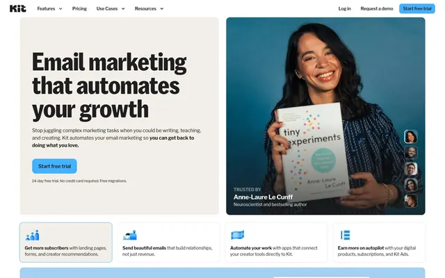
Warm creator notebook — parchment pages, highlighter-blue ink, heavy type on linen.
Color palette
Primary CTA buttons, active nav states, inline keyword highlights — vivid blue on parchment or near-black backgrounds acts as the single highlighter across an otherwise neutral palette, directing attention without competing with any other chromatic element
Hero and section background panels — muted blue used as an atmospheric backdrop, never for text or interaction
Section background panels — pastel pink used decoratively to vary section rhythm
Section background panels — muted orange for alternating content band backgrounds
Section background panels — muted green used as a decorative surface, never for semantic status
Icon fills and inline callout elements — warm yellow used sparingly for small graphic accents, not for text or backgrounds
Page background, hero section fill, card backgrounds — the defining warm-tinted base that makes the whole site feel like a printed editorial page rather than a screen
Card interiors, form inputs, modal surfaces, footer text on dark backgrounds
All borders, dividers, input outlines — omnipresent at freq=7844, it is the connective tissue border color across every component
Subdued body text, placeholder text, disabled states
Typography
- Weights
- 500
- Sizes
- 14px, 18px, 48px, 56px, 64px, 80px
- Line height
- 0.95, 1, 1.25
- Letter spacing
- -0.72px at 80px, -0.45px at 48px, 0.35px for caps labels (0.025em)
- Fallback
- Instrument Sans, Plus Jakarta Sans
Hero display headlines and large section statements only. Weight 500 is the only cut — this custom face is reserved for sizes 48px and above in practice, with 14px/18px appearing as UI labels in kit-branded contexts. At 80px with 0.95 line-height, lines stack with intentional bleed, creating visual mass. The -0.009em tracking at display sizes tightens the setting so letterforms feel cut from a single block.
- Weights
- 400, 600, 700
- Sizes
- 10px, 12px, 14px, 16px, 18px, 20px
- Line height
- 1.4, 1.25, 1
- Letter spacing
- -0.25px at 10px (-0.025em), -0.18px at 14px (-0.013em), -0.16px at 16px (-0.010em), -0.14px at 18px (-0.008em), 0.25px for 0.025em uppercase tags
- Fallback
- Libre Franklin is freely available on Google Fonts — use directly
Everything except display headlines — nav, body copy, buttons, links, captions, footer columns. Weight 700 for sub-headlines and emphasis within body text; 600 for button labels and nav items; 400 for running body text and secondary info. Negative tracking from -0.025em at small sizes to -0.008em at 20px gives all text a slightly condensed, editorial feel even at small scales. The 0.025em uppercase letter-spacing on small-caps labels creates a typewriter-tag contrast against the condensed body.
Spacing & shape
Components
Background #44b1ff, text #1e1e1, border-radius 12px, padding 16px all sides. Font: Libre Franklin 600 14-16px. No border. On parchment (#f2efe9) backgrounds this creates the single chromatic pop on an otherwise neutral surface. Appears 9× as the dominant button variant.
Background transparent, text #1e1e1, border-radius 0px, no padding (inline text-style). Libre Franklin 400-600 14px. Border inherited as #e3e3e3 only when grouped. Used for non-CTA nav links that need no chrome — they read as text until hovered.
Background oklab dark-tinted at ~8% opacity (#1e1e1 at 0.08), text #1e1e1, border-radius 8px, zero padding (tight fit). Creates a very-light pressed-surface appearance against parchment. Appears 4× as an in-content control variant.
Background transparent, text #1e1e1, border-radius 8px, padding 4px top/bottom × 8px left/right. Libre Franklin 400 14px. Minimal-chrome button for low-emphasis actions within content blocks.
Background #ffffff on parchment page, border 1px #e3e3e3, border-radius 12px, padding 24px. Contains a colored icon (Amber Flag #f2ba41 or Sky Marker #44b1ff), Libre Franklin 700 14-16px bold feature name inline with body weight 400 description. Light card on warm page base creates subtle lift without shadows.
Full-width bands using Dust Blue #a2d1f1, Blush Mist #e7c9f1, Peach Sand #ffd0ad, or Sage Foam #b9e9c5. No border, no radius (edge-to-edge). Text remains #1e1e1 throughout — contrast is always AAA (12:1+). Each band houses product screenshots or feature illustrations, never more than one pastel per consecutive section.
Background #f2efe9 (parchment), height ~56px, border-bottom 1px #e3e3e3. Left: Kit wordmark #1e1e1e. Center: ghost text nav items (Features, Pricing, Use Cases, Resources) Libre Franklin 600 14px. Right: 'Log in' ghost + 'Request a demo' ghost + 'Start free trial' #44b1ff pill button at border-radius 12px, padding 16px. Entire bar shares the parchment base — no white nav-on-white convention.
Background #1e1e1 (near-black), text #ffffff for links, column headers in Libre Franklin 600 10-12px uppercase with 0.025em letter-spacing. Links in Libre Franklin 400 14px #ffffff. 4-column grid with 32px column gap. 'NEW' badge appears as a small Sage Foam #b9e9c5 pill tag inline with select links. Parchment logo (#f2efe9 tinted) in bottom-left.
Circular avatar images 40-48px diameter, stacked vertically with 4px gap, border 2px #ffffff. Float against the photographic hero background. No label text — image-only stack creates ambient trust signal without disrupting the headline hierarchy.
Background Sage Foam #b9e9c5, text #1e1e1, border-radius 8px, padding 4px 8px. Libre Franklin 600 10px uppercase with 0.025em tracking. Appears inline after link text — not as a standalone badge but as a tight appended label.
Guidelines
- Use #f2efe9 (Parchment) as the default page background — never pure white (#ffffff) for full-page base
- Apply #44b1ff only to primary CTA buttons and keyword highlights; all other interactive text states use #1e1e1 on transparent
- Set all button border-radius to 12px for primary actions; use 8px for secondary/tertiary controls and form inputs
- Use KitSansFont weight 500 only at 48px and above; switch to Libre Franklin for all text at 20px and below
- Apply 1px #e3e3e3 border to all cards and inputs — no shadows; elevation reads through surface color contrast alone
- Use pastel section backgrounds (Dust Blue #a2d1f1, Blush Mist #e7c9f1, Peach Sand #ffd0ad, Sage Foam #b9e9c5) for alternating content bands; limit to one per section, never consecutive same-hue bands
- Set Libre Franklin at negative letter-spacing: -0.016em at 16px, -0.013em at 14px, -0.025em at 10-12px caps labels with +0.025em for uppercase tags
- Don't use #44b1ff as a section background or decorative fill — it exists only on interactive elements (buttons, inline highlights)
- Don't add box-shadows to cards or buttons — shadows break the flat editorial print aesthetic; use border 1px #e3e3e3 instead
- Don't use KitSansFont below 48px in display contexts; at smaller sizes it loses the structural weight that justifies its custom status
- Don't use Amber Flag (#f2ba41) for text, borders, or buttons — it is strictly an icon accent fill color
- Don't stack two consecutive pastel-background sections of the same hue — alternate with parchment (#f2efe9) or white (#ffffff) bands between
- Don't use border-radius above 16px — avoid pill/capsule shapes (9999px) entirely; the system sits between pill-free and boxy
- Don't apply the dark footer (#1e1e1e) surface to any mid-page section — it is reserved exclusively for the page-closing footer block
About this system
ShowHide
Kit reads like a warm editorial notebook — cream-tinted parchment (#f2efe9) as the page base, heavy black headlines punching out of it at weight 700, and a single sky-blue accent (#44b1ff) that appears on CTAs and interactive highlights against the near-black (#1e1e1e). The palette is intentionally muted and hand-curated: soft pastel blocks (dusty blue, blush pink, peach, sage green) appear as section backgrounds, never as text or interaction states, making the one vivid blue feel like a highlighter on a notebook page. KitSansFont at 80px/64px in the custom weight 500 dominates hero spaces with tight -0.009em tracking, while Libre Franklin handles everything else across the content hierarchy — a two-font system where custom display and workhorse utility stay in clearly assigned lanes. Radius tokens are tight and intentional: 12px on buttons and cards, 8px on secondary UI, creating a slightly-rounded-but-serious personality that avoids both sharp corporate rigidity and bubbly consumer softness.
Max-width ~1200px centered, sections are full-bleed to viewport width with content constrained inside. The above-the-fold hero splits 50/50: left half parchment (#f2efe9) with headline + CTA, right half full-height portrait photography — no gutter between them, creating an edge-to-edge split without a grid column gap. Below the hero: alternating pastel band sections (Dust Blue, Blush Mist, Peach Sand) each containing a centered product screenshot or feature illustration with text alongside. Feature grid: 4-column card row at comfortable 24px padding each. 'Thousands of' social proof section: centered headline with keyword highlighted in Sky Marker #44b1ff, followed by a horizontal creator photo strip. Footer: dark (#1e1e1e) full-bleed 4-column link grid. Navigation is sticky top bar at 56px, parchment-colored matching the hero. Section vertical rhythm is 80px gaps between major bands. No sidebar patterns — all layouts are horizontal-grid or centered-stack.
Kit uses portrait photography as the hero's dominant visual — waist-up shots of real creators (authors, coaches, bloggers) holding their books or products against solid-color studio backgrounds (teal, blue). The photography is warm, direct, high-key studio lit with no moody processing — subjects look at camera or slightly off, smiling, creating a peer-to-peer feeling rather than aspirational stock. Photos bleed to the card edge with a 12px radius container. Product UI screenshots appear as overlapping card overlays (dashboard metrics, sign-up pages) positioned partially over the photography, grounding the emotional imagery in functional reality. The second-screen hero section uses a darkened product screenshot as a full-panel background with a floating white card overlay — photography mixed with UI, not isolated. The testimonial strip uses tight circular avatar crops. Icon style: filled, minimal, two-tone (Sky Marker blue #44b1ff body + Amber Flag #f2ba41 accent detail), displayed at 24-32px in feature cards. Imagery density is balanced — one large photo per hero, then primarily text + UI screenshot driven below the fold.
Reminiscent of Mailchimp, Beehiiv, Substack, Ghost, Flodesk.
# Kit — Style Reference
> Warm creator notebook — parchment pages, highlighter-blue ink, heavy type on linen.

**Theme:** light

**Site:** https://kit.com

Kit reads like a warm editorial notebook — cream-tinted parchment (#f2efe9) as the page base, heavy black headlines punching out of it at weight 700, and a single sky-blue accent (#44b1ff) that appears on CTAs and interactive highlights against the near-black (#1e1e1e). The palette is intentionally muted and hand-curated: soft pastel blocks (dusty blue, blush pink, peach, sage green) appear as section backgrounds, never as text or interaction states, making the one vivid blue feel like a highlighter on a notebook page. KitSansFont at 80px/64px in the custom weight 500 dominates hero spaces with tight -0.009em tracking, while Libre Franklin handles everything else across the content hierarchy — a two-font system where custom display and workhorse utility stay in clearly assigned lanes. Radius tokens are tight and intentional: 12px on buttons and cards, 8px on secondary UI, creating a slightly-rounded-but-serious personality that avoids both sharp corporate rigidity and bubbly consumer softness.

## Tokens — Colors

| Name | Value | Token | Role |
|------|------|------|------|
| Sky Marker | `#44b1ff` | `--color-sky-marker` | Primary CTA buttons, active nav states, inline keyword highlights — vivid blue on parchment or near-black backgrounds acts as the single highlighter across an otherwise neutral palette, directing attention without competing with any other chromatic element |
| Dust Blue | `#a2d1f1` | `--color-dust-blue` | Hero and section background panels — muted blue used as an atmospheric backdrop, never for text or interaction |
| Blush Mist | `#e7c9f1` | `--color-blush-mist` | Section background panels — pastel pink used decoratively to vary section rhythm |
| Peach Sand | `#ffd0ad` | `--color-peach-sand` | Section background panels — muted orange for alternating content band backgrounds |
| Sage Foam | `#b9e9c5` | `--color-sage-foam` | Section background panels — muted green used as a decorative surface, never for semantic status |
| Amber Flag | `#f2ba41` | `--color-amber-flag` | Icon fills and inline callout elements — warm yellow used sparingly for small graphic accents, not for text or backgrounds |
| Parchment | `#f2efe9` | `--color-parchment` | Page background, hero section fill, card backgrounds — the defining warm-tinted base that makes the whole site feel like a printed editorial page rather than a screen |
| Chalk | `#ffffff` | `--color-chalk` | Card interiors, form inputs, modal surfaces, footer text on dark backgrounds |
| Fog | `#e3e3e3` | `--color-fog` | All borders, dividers, input outlines — omnipresent at freq=7844, it is the connective tissue border color across every component |
| Ash | `#d4d4d4` | `--color-ash` | Subdued body text, placeholder text, disabled states |

## Tokens — Typography

### KitSansFont
- **Substitute:** Instrument Sans, Plus Jakarta Sans
- **Weights:** 500
- **Sizes:** 14px, 18px, 48px, 56px, 64px, 80px
- **Line height:** 0.95, 1, 1.25
- **Letter spacing:** -0.72px at 80px, -0.45px at 48px, 0.35px for caps labels (0.025em)
- **Role:** Hero display headlines and large section statements only. Weight 500 is the only cut — this custom face is reserved for sizes 48px and above in practice, with 14px/18px appearing as UI labels in kit-branded contexts. At 80px with 0.95 line-height, lines stack with intentional bleed, creating visual mass. The -0.009em tracking at display sizes tightens the setting so letterforms feel cut from a single block.

### Libre Franklin
- **Substitute:** Libre Franklin is freely available on Google Fonts — use directly
- **Weights:** 400, 600, 700
- **Sizes:** 10px, 12px, 14px, 16px, 18px, 20px
- **Line height:** 1.4, 1.25, 1
- **Letter spacing:** -0.25px at 10px (-0.025em), -0.18px at 14px (-0.013em), -0.16px at 16px (-0.010em), -0.14px at 18px (-0.008em), 0.25px for 0.025em uppercase tags
- **Role:** Everything except display headlines — nav, body copy, buttons, links, captions, footer columns. Weight 700 for sub-headlines and emphasis within body text; 600 for button labels and nav items; 400 for running body text and secondary info. Negative tracking from -0.025em at small sizes to -0.008em at 20px gives all text a slightly condensed, editorial feel even at small scales. The 0.025em uppercase letter-spacing on small-caps labels creates a typewriter-tag contrast against the condensed body.

## Tokens — Type Scale

Augmented Fourth (1.414) from 16px base.

| Role | Size | Line height | Letter spacing |
|------|------|------|------|
| caption | 10px | 1.4 | -0.25px |
| body | 16px | 1.5 | -0.16px |
| subheading | 18px | 1.56 | -0.14px |
| heading-sm | 20px | 1.4 | -0.16px |
| heading | 48px | 1.25 | -0.43px |
| heading-lg | 56px | 1.25 | -0.5px |
| display | 80px | 0.95 | -0.72px |

## Tokens — Spacing

- **Max width:** 1200px
- **Section gap:** 80px
- **Card padding:** 24px
- **Element gap:** 16px

## Tokens — Radius

- **Buttons:** 12px
- **Inputs:** 8px
- **Cards:** 12px
- **modals:** 16px
- **navDropdowns:** 12px
- **tags:** 8px

## Layout

Max-width ~1200px centered, sections are full-bleed to viewport width with content constrained inside. The above-the-fold hero splits 50/50: left half parchment (#f2efe9) with headline + CTA, right half full-height portrait photography — no gutter between them, creating an edge-to-edge split without a grid column gap. Below the hero: alternating pastel band sections (Dust Blue, Blush Mist, Peach Sand) each containing a centered product screenshot or feature illustration with text alongside. Feature grid: 4-column card row at comfortable 24px padding each. 'Thousands of' social proof section: centered headline with keyword highlighted in Sky Marker #44b1ff, followed by a horizontal creator photo strip. Footer: dark (#1e1e1e) full-bleed 4-column link grid. Navigation is sticky top bar at 56px, parchment-colored matching the hero. Section vertical rhythm is 80px gaps between major bands. No sidebar patterns — all layouts are horizontal-grid or centered-stack.

## Imagery

Kit uses portrait photography as the hero's dominant visual — waist-up shots of real creators (authors, coaches, bloggers) holding their books or products against solid-color studio backgrounds (teal, blue). The photography is warm, direct, high-key studio lit with no moody processing — subjects look at camera or slightly off, smiling, creating a peer-to-peer feeling rather than aspirational stock. Photos bleed to the card edge with a 12px radius container. Product UI screenshots appear as overlapping card overlays (dashboard metrics, sign-up pages) positioned partially over the photography, grounding the emotional imagery in functional reality. The second-screen hero section uses a darkened product screenshot as a full-panel background with a floating white card overlay — photography mixed with UI, not isolated. The testimonial strip uses tight circular avatar crops. Icon style: filled, minimal, two-tone (Sky Marker blue #44b1ff body + Amber Flag #f2ba41 accent detail), displayed at 24-32px in feature cards. Imagery density is balanced — one large photo per hero, then primarily text + UI screenshot driven below the fold.

## Components

### Hero Feature Cards

### Subscriber Stats Dashboard Card

### Primary CTA Button Group with Trial Note

### Primary CTA Button
*Main call-to-action — 'Start free trial', sign-up triggers*

Background #44b1ff, text #1e1e1, border-radius 12px, padding 16px all sides. Font: Libre Franklin 600 14-16px. No border. On parchment (#f2efe9) backgrounds this creates the single chromatic pop on an otherwise neutral surface. Appears 9× as the dominant button variant.

### Ghost Navigation Button
*Secondary nav actions like 'Log in', 'Request a demo', dropdown triggers*

Background transparent, text #1e1e1, border-radius 0px, no padding (inline text-style). Libre Franklin 400-600 14px. Border inherited as #e3e3e3 only when grouped. Used for non-CTA nav links that need no chrome — they read as text until hovered.

### Subtle Tinted Button
*Tertiary or grouped option buttons within content*

Background oklab dark-tinted at ~8% opacity (#1e1e1 at 0.08), text #1e1e1, border-radius 8px, zero padding (tight fit). Creates a very-light pressed-surface appearance against parchment. Appears 4× as an in-content control variant.

### Text Action Button
*Inline content actions, pill-style small controls*

Background transparent, text #1e1e1, border-radius 8px, padding 4px top/bottom × 8px left/right. Libre Franklin 400 14px. Minimal-chrome button for low-emphasis actions within content blocks.

### Hero Feature Card
*Below-the-fold 4-column feature summary tiles*

Background #ffffff on parchment page, border 1px #e3e3e3, border-radius 12px, padding 24px. Contains a colored icon (Amber Flag #f2ba41 or Sky Marker #44b1ff), Libre Franklin 700 14-16px bold feature name inline with body weight 400 description. Light card on warm page base creates subtle lift without shadows.

### Pastel Section Background Band
*Full-bleed section backgrounds used to break page rhythm*

Full-width bands using Dust Blue #a2d1f1, Blush Mist #e7c9f1, Peach Sand #ffd0ad, or Sage Foam #b9e9c5. No border, no radius (edge-to-edge). Text remains #1e1e1 throughout — contrast is always AAA (12:1+). Each band houses product screenshots or feature illustrations, never more than one pastel per consecutive section.

### Navigation Bar
*Sticky top navigation across all pages*

Background #f2efe9 (parchment), height ~56px, border-bottom 1px #e3e3e3. Left: Kit wordmark #1e1e1e. Center: ghost text nav items (Features, Pricing, Use Cases, Resources) Libre Franklin 600 14px. Right: 'Log in' ghost + 'Request a demo' ghost + 'Start free trial' #44b1ff pill button at border-radius 12px, padding 16px. Entire bar shares the parchment base — no white nav-on-white convention.

### Footer Column Grid
*Site-wide footer link columns*

Background #1e1e1 (near-black), text #ffffff for links, column headers in Libre Franklin 600 10-12px uppercase with 0.025em letter-spacing. Links in Libre Franklin 400 14px #ffffff. 4-column grid with 32px column gap. 'NEW' badge appears as a small Sage Foam #b9e9c5 pill tag inline with select links. Parchment logo (#f2efe9 tinted) in bottom-left.

### Testimonial / Creator Photo Strip
*Social proof imagery along the hero's right edge*

Circular avatar images 40-48px diameter, stacked vertically with 4px gap, border 2px #ffffff. Float against the photographic hero background. No label text — image-only stack creates ambient trust signal without disrupting the headline hierarchy.

### NEW Badge
*Inline tag marking new features in nav and footer*

Background Sage Foam #b9e9c5, text #1e1e1, border-radius 8px, padding 4px 8px. Libre Franklin 600 10px uppercase with 0.025em tracking. Appears inline after link text — not as a standalone badge but as a tight appended label.

## Guidelines

### Do

- Use #f2efe9 (Parchment) as the default page background — never pure white (#ffffff) for full-page base
- Apply #44b1ff only to primary CTA buttons and keyword highlights; all other interactive text states use #1e1e1 on transparent
- Set all button border-radius to 12px for primary actions; use 8px for secondary/tertiary controls and form inputs
- Use KitSansFont weight 500 only at 48px and above; switch to Libre Franklin for all text at 20px and below
- Apply 1px #e3e3e3 border to all cards and inputs — no shadows; elevation reads through surface color contrast alone
- Use pastel section backgrounds (Dust Blue #a2d1f1, Blush Mist #e7c9f1, Peach Sand #ffd0ad, Sage Foam #b9e9c5) for alternating content bands; limit to one per section, never consecutive same-hue bands
- Set Libre Franklin at negative letter-spacing: -0.016em at 16px, -0.013em at 14px, -0.025em at 10-12px caps labels with +0.025em for uppercase tags

### Don't

- Don't use #44b1ff as a section background or decorative fill — it exists only on interactive elements (buttons, inline highlights)
- Don't add box-shadows to cards or buttons — shadows break the flat editorial print aesthetic; use border 1px #e3e3e3 instead
- Don't use KitSansFont below 48px in display contexts; at smaller sizes it loses the structural weight that justifies its custom status
- Don't use Amber Flag (#f2ba41) for text, borders, or buttons — it is strictly an icon accent fill color
- Don't stack two consecutive pastel-background sections of the same hue — alternate with parchment (#f2efe9) or white (#ffffff) bands between
- Don't use border-radius above 16px — avoid pill/capsule shapes (9999px) entirely; the system sits between pill-free and boxy
- Don't apply the dark footer (#1e1e1e) surface to any mid-page section — it is reserved exclusively for the page-closing footer block

## Agent Prompt Guide

**Quick Color Reference**
- Page background: #f2efe9 (Parchment)
- Primary text: #1e1e1 (Near Black)
- CTA / highlights: #44b1ff (Sky Marker)
- Borders / dividers: #e3e3e3 (Fog)
- Card surface: #ffffff (Chalk)
- Footer background: #1e1e1 (Near Black)

**Example Component Prompts**

1. Hero Section: Split layout, left 50% parchment background (#f2efe9). Headline at 64px KitSansFont weight 500, #1e1e1, letter-spacing -0.58px, line-height 1.00. Body copy 18px Libre Franklin weight 400, #1e1e1, letter-spacing -0.14px. CTA button: background #44b1ff, text #1e1e1, border-radius 12px, padding 16px all sides, Libre Franklin 600 16px. Right 50%: full-height portrait photo, border-radius 0 (edge-to-edge).

2. Feature Summary Card: Background #ffffff, border 1px #e3e3e3, border-radius 12px, padding 24px. Top: 28px icon in #44b1ff. Below: Libre Franklin 700 16px #1e1e1 feature name inline with Libre Franklin 400 16px #1e1e1 description. No shadow.

3. Pastel Content Section Band: Full-bleed background #a2d1f1 (or #ffd0ad / #b9e9c5 / #e7c9f1 for alternating bands). Internal max-width 1200px centered. Product screenshot contained in #ffffff card, border-radius 12px, border 1px #e3e3e3. Text beside it: 48px KitSansFont 500 #1e1e1 headline, 18px Libre Franklin 400 #1e1e1 body. 80px top/bottom section padding.

4. Footer Column: Background #1e1e1 full-bleed. 4-column grid, 32px column gap. Section headers: Libre Franklin 600 10px #ffffff uppercase, letter-spacing 0.025em. Links: Libre Franklin 400 14px #ffffff. NEW badge: background #b9e9c5, text #1e1e1, border-radius 8px, padding 4px 8px, Libre Franklin 600 10px uppercase.

5. Email Sign-Up Block: Input field background #ffffff, border 1px #e3e3e3, border-radius 8px, padding 12px 16px, placeholder Libre Franklin 400 16px #d4d4d4. Submit button full-width below: background #44b1ff, border-radius 8px, padding 14px, Libre Franklin 600 16px #1e1e1e. Stack with 8px gap. Privacy note: Libre Franklin 400 12px #d4d4d4 centered below button.

## Pastel Band System

Kit uses four muted pastel hues as interchangeable full-bleed section backgrounds: Dust Blue (#a2d1f1), Blush Mist (#e7c9f1), Peach Sand (#ffd0ad), Sage Foam (#b9e9c5). Rules: (1) Never place two pastel bands consecutively — always break with Parchment (#f2efe9) or White (#ffffff). (2) All four achieve AAA contrast with #1e1e1 text (12:1 minimum). (3) Never use these colors for borders, buttons, or text — surface-only. (4) The Sage Foam (#b9e9c5) shade doubles as the NEW badge fill, the only case where a pastel color appears on a UI component rather than a full section.
More like this









Keep what you find
A free account saves references to boards and can send you a weekly email of picks based on what you save.
To see every result, go Pro.