Preview image. Unlock full-res
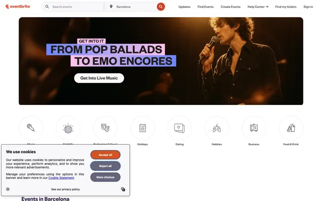
Event listing, vibrant and clear
Color palette
Primary accent for links, interactive elements, outlined buttons, information states
Illustrative accents and occasional card backgrounds — used sparingly for brand emphasis
Page backgrounds, card surfaces, ghost button backgrounds, default badge background
Subtle background for UI elements, hover states for neutral buttons and badges
Hairline borders, dividers, input outlines, and card edges on light surfaces. Do not promote it to the primary CTA color
Active state backgrounds and borders for neutral ghost buttons
Primary text, prominent headings, default icon color
Secondary text, muted navigation elements, low-emphasis button text, focus outlines
Tertiary text, subtle button borders on hover/active, decorative icon fills
High-contrast headings, text on darker backgrounds, primary button text for outlined/ghost buttons
Typography
- Weights
- 400, 600, 700
- Sizes
- 12px, 14px, 16px, 18px, 24px, 32px
- Line height
- 0.75, 1, 1.2, 1.25, 1.33, 1.43, 1.57, 1.71, 1.83, 2
- Letter spacing
- -0.01em at 32px, -0.009em at 24px, 0.01em at 12px
Headings, body text, and general interface text – provides a bold, condensed feel for titles, balancing with a clear, readable body.
- Weights
- 600
- Sizes
- 14px
- Line height
- 1.2, 1.43
- Letter spacing
- normal
Specific navigation and metadata elements – ensuring clear, compact labeling within tighter UI spaces.
Spacing & shape
Components
Background: transparent (rgba(0,0,0,0)). Text: Inkwell Purple (#39364f) or Oceanic Blue (#3659e3). Padding: 0px. Border: 0px. Radius: 0px.
Background: Canvas White (#ffffff). Text: Inkwell Purple (#39364f). Border: Lavender Ash (#dbdae3) 1px solid. Border Radius: 360px. Padding: 1px 6px.
Background: transparent (rgba(0,0,0,0)). Text: Shadow Graphite (#585163). Border: 0px. Radius: 0px. Padding: 0px.
Background: Canvas White (#ffffff). Border: none. Shadow: none. Radius: 16px. Padding: 0px.
Background: transparent (rgba(0,0,0,0)). Border: none. Shadow: none. Radius: 40px 40px 0px 0px. Padding: 0px.
Background: Canvas White (#ffffff). Border: none. Shadow: none. Radius: 4px. Padding: 0px.
Background: Canvas White (#ffffff). Text: Inkwell Purple (#39364f). Radius: 20px. Padding: 0px.
Background: transparent (rgba(0,0,0,0)). Text: Oceanic Blue (#3659e3). Border: Oceanic Blue (#3659e3) 1px solid at the bottom. Radius: 0px. Padding: 12px 0px 6px 0px.
Guidelines
- Use Canvas White (#ffffff) as the primary page background to create an expansive, light environment.
- Apply Oceanic Blue (#3659e3) exclusively for interactive elements like links, outlined buttons, and input borders to signal functionality.
- Ensure all cards use a radius of 16px, except for hero-style cards which use 40px 40px 0px 0px for a distinct top edge.
- Prioritize Neue Plak family for all text elements, using condensed weights and sizes above 18px for headlines and Neue Plak Text 600 for navigation.
- Maintain a comfortable density with 12px for `elementGap` and `cardPadding` within components to ensure readability.
- Implement Pill Buttons with a 360px radius for a fully rounded, distinct interactive shape.
- Use Lavender Ash (#dbdae3) for hairline borders on lists and cards to keep surfaces clean yet structured.
- Avoid using highly saturated colors for large background areas, keeping the interface neutral and accent-driven.
- Do not introduce strong box-shadows on cards or containers; flatness is preferred to maintain a lightweight feel.
- Do not deviate from the Neue Plak family for primary text; it sets the brand's typographic tone.
- Do not use generic square buttons; opt for rounded (360px) or ghost buttons as per the design system.
- Avoid arbitrary uses of Terracotta (#f05537); reserve it for specific illustrative branding rather than widespread UI elements.
- Do not vary from the established spacing units; maintain the 4px base for consistent rhythm and hierarchy.
- Do not clutter card content with excessive internal padding; content should define the card's boundaries, not excessive internal whitespace.
About this system
ShowHide
Eventbrite employs a lively discovery-platform aesthetic, featuring a bright, almost white canvas punctuated by a single vivid blue for interaction and branding. Typography is direct and legible, supporting a clear hierarchy without being overt. Components are lightweight with subtle borders and generous rounded corners, emphasizing content flow and event visibility over heavy chrome.
The site uses a full-bleed page model for its primary background, but content within sections is typically contained and centered within a comfortable max-width. The hero section often features a full-width background image with centered, condensed headline text. Sections follow a consistent vertical rhythm, primarily flowing seamlessly with minimal visual dividers. Content is arranged in flexible grid layouts, with multi-column event cards featuring images prominently. A dominant pattern is a 4-column card grid for event listings. The navigation is a sticky top bar, providing persistent access to search and key actions while scrolling.
The visual language for imagery is diverse, incorporating photography and custom illustrations. Photography is typically lifestyle or event-focused, sometimes with a slight creative crop but generally left unmasked. Product screenshots appear less frequently. Illustrations are organic, often flat but with some subtle dimension, featuring a muted color palette that occasionally includes branded accents like Terra Cotta. Icons are outlined, conveying functionality without heavy visual weight. Imagery serves both decorative atmosphere in hero sections and explanatory content in event listings, often appearing as contained image blocks within cards, dominating visual space in grid layouts.
Reminiscent of Dice.fm, Bandsintown, Resident Advisor.
# Eventbrite — Style Reference
> Event listing, vibrant and clear

**Theme:** light

**Site:** https://www.eventbrite.com

Eventbrite employs a lively discovery-platform aesthetic, featuring a bright, almost white canvas punctuated by a single vivid blue for interaction and branding. Typography is direct and legible, supporting a clear hierarchy without being overt. Components are lightweight with subtle borders and generous rounded corners, emphasizing content flow and event visibility over heavy chrome.

## Tokens — Colors

| Name | Value | Token | Role |
|------|------|------|------|
| Oceanic Blue | `#3659e3` | `--color-oceanic-blue` | Primary accent for links, interactive elements, outlined buttons, information states |
| Terra Cotta | `#f05537` | `--color-terra-cotta` | Illustrative accents and occasional card backgrounds — used sparingly for brand emphasis |
| Canvas White | `#ffffff` | `--color-canvas-white` | Page backgrounds, card surfaces, ghost button backgrounds, default badge background |
| Porcelain Mist | `#f8f7fa` | `--color-porcelain-mist` | Subtle background for UI elements, hover states for neutral buttons and badges |
| Lavender Ash | `#dbdae3` | `--color-lavender-ash` | Hairline borders, dividers, input outlines, and card edges on light surfaces. Do not promote it to the primary CTA color |
| Ghost Gray | `#eeedf2` | `--color-ghost-gray` | Active state backgrounds and borders for neutral ghost buttons |
| Inkwell Purple | `#39364f` | `--color-inkwell-purple` | Primary text, prominent headings, default icon color |
| Shadow Graphite | `#585163` | `--color-shadow-graphite` | Secondary text, muted navigation elements, low-emphasis button text, focus outlines |
| Slate Steel | `#6f7287` | `--color-slate-steel` | Tertiary text, subtle button borders on hover/active, decorative icon fills |
| Deep Plum | `#1e0a3c` | `--color-deep-plum` | High-contrast headings, text on darker backgrounds, primary button text for outlined/ghost buttons |

## Tokens — Typography

### Neue Plak
- **Weights:** 400, 600, 700
- **Sizes:** 12px, 14px, 16px, 18px, 24px, 32px
- **Line height:** 0.75, 1, 1.2, 1.25, 1.33, 1.43, 1.57, 1.71, 1.83, 2
- **Letter spacing:** -0.01em at 32px, -0.009em at 24px, 0.01em at 12px
- **Role:** Headings, body text, and general interface text – provides a bold, condensed feel for titles, balancing with a clear, readable body.

### Neue Plak Text
- **Weights:** 600
- **Sizes:** 14px
- **Line height:** 1.2, 1.43
- **Letter spacing:** normal
- **Role:** Specific navigation and metadata elements – ensuring clear, compact labeling within tighter UI spaces.

## Tokens — Type Scale

Minor Third (1.2) from 16px base.

| Role | Size | Line height | Letter spacing |
|------|------|------|------|
| caption | 12px | 1.43 | — |
| body-sm | 14px | 1.43 | — |
| body | 16px | 1.43 | — |
| body-lg | 18px | 1.43 | — |
| heading-sm | 24px | 1.3 | — |
| heading | 32px | 1.3 | — |

## Tokens — Spacing

- **Section gap:** 77px
- **Card padding:** 12px
- **Element gap:** 12px

## Tokens — Radius

- **Buttons:** 360px
- **Inputs:** 4px
- **Cards:** 16px
- **badges:** 20px
- **heroCard:** 40px 40px 0px 0px
- **navCategory:** 100px

## Layout

The site uses a full-bleed page model for its primary background, but content within sections is typically contained and centered within a comfortable max-width. The hero section often features a full-width background image with centered, condensed headline text. Sections follow a consistent vertical rhythm, primarily flowing seamlessly with minimal visual dividers. Content is arranged in flexible grid layouts, with multi-column event cards featuring images prominently. A dominant pattern is a 4-column card grid for event listings. The navigation is a sticky top bar, providing persistent access to search and key actions while scrolling.

## Imagery

The visual language for imagery is diverse, incorporating photography and custom illustrations. Photography is typically lifestyle or event-focused, sometimes with a slight creative crop but generally left unmasked. Product screenshots appear less frequently. Illustrations are organic, often flat but with some subtle dimension, featuring a muted color palette that occasionally includes branded accents like Terra Cotta. Icons are outlined, conveying functionality without heavy visual weight. Imagery serves both decorative atmosphere in hero sections and explanatory content in event listings, often appearing as contained image blocks within cards, dominating visual space in grid layouts.

## Components

### Ghost Button
*Outline style button for secondary actions or navigation.*

Background: transparent (rgba(0,0,0,0)). Text: Inkwell Purple (#39364f) or Oceanic Blue (#3659e3). Padding: 0px. Border: 0px. Radius: 0px.

### Pill Button
*Small, contained button for filters or tags.*

Background: Canvas White (#ffffff). Text: Inkwell Purple (#39364f). Border: Lavender Ash (#dbdae3) 1px solid. Border Radius: 360px. Padding: 1px 6px.

### Category Navigation Link
*Navigational link within category menus, often below a main image.*

Background: transparent (rgba(0,0,0,0)). Text: Shadow Graphite (#585163). Border: 0px. Radius: 0px. Padding: 0px.

### Standard Card
*Container for event listings and general content blocks.*

Background: Canvas White (#ffffff). Border: none. Shadow: none. Radius: 16px. Padding: 0px.

### Hero Card
*Prominent card used in hero sections, often with an integrated image.*

Background: transparent (rgba(0,0,0,0)). Border: none. Shadow: none. Radius: 40px 40px 0px 0px. Padding: 0px.

### Compact Card
*Smaller cards for dense content layouts or galleries.*

Background: Canvas White (#ffffff). Border: none. Shadow: none. Radius: 4px. Padding: 0px.

### Filter Badge
*Small, rounded labels for filtering or categorization.*

Background: Canvas White (#ffffff). Text: Inkwell Purple (#39364f). Radius: 20px. Padding: 0px.

### Navigation Search Input
*Input field for global search functionality in the header.*

Background: transparent (rgba(0,0,0,0)). Text: Oceanic Blue (#3659e3). Border: Oceanic Blue (#3659e3) 1px solid at the bottom. Radius: 0px. Padding: 12px 0px 6px 0px.

## Guidelines

### Do

- Use Canvas White (#ffffff) as the primary page background to create an expansive, light environment.
- Apply Oceanic Blue (#3659e3) exclusively for interactive elements like links, outlined buttons, and input borders to signal functionality.
- Ensure all cards use a radius of 16px, except for hero-style cards which use 40px 40px 0px 0px for a distinct top edge.
- Prioritize Neue Plak family for all text elements, using condensed weights and sizes above 18px for headlines and Neue Plak Text 600 for navigation.
- Maintain a comfortable density with 12px for `elementGap` and `cardPadding` within components to ensure readability.
- Implement Pill Buttons with a 360px radius for a fully rounded, distinct interactive shape.
- Use Lavender Ash (#dbdae3) for hairline borders on lists and cards to keep surfaces clean yet structured.

### Don't

- Avoid using highly saturated colors for large background areas, keeping the interface neutral and accent-driven.
- Do not introduce strong box-shadows on cards or containers; flatness is preferred to maintain a lightweight feel.
- Do not deviate from the Neue Plak family for primary text; it sets the brand's typographic tone.
- Do not use generic square buttons; opt for rounded (360px) or ghost buttons as per the design system.
- Avoid arbitrary uses of Terracotta (#f05537); reserve it for specific illustrative branding rather than widespread UI elements.
- Do not vary from the established spacing units; maintain the 4px base for consistent rhythm and hierarchy.
- Do not clutter card content with excessive internal padding; content should define the card's boundaries, not excessive internal whitespace.

## Agent Prompt Guide

Quick Color Reference:
text: #39364f
background: #ffffff
border: #dbdae3
accent: #3659e3
primary action: #3659e3 (outlined action border)

Example Component Prompts:
1. Create an event listing card: Background Canvas White (#ffffff), Inkwell Purple (#39364f) 16px Neue Plak weight 700 for event title, Lavender Ash (#dbdae3) 1px solid border, 16px radius, 0px padding. Image at top.
2. Design a Pill Button for filtering: Background Canvas White (#ffffff), Inkwell Purple (#39364f) 14px Neue Plak weight 600 text, Lavender Ash (#dbdae3) 1px solid border, 360px radius, 1px 6px padding.
3. Create an Outlined Primary Action: Transparent background, #3659e3 border and text, 9999px radius, compact pill padding. Use it for the main CTA instead of a filled button.
More like this







Keep what you find
A free account saves references to boards and can send you a weekly email of picks based on what you save.
To see every result, go Pro.