Preview image. Unlock full-res
whimsical storybook canvas
Color palette
Hero section backgrounds, prominent page sections — grounding but vibrant, setting a rich, inviting tone
Illustrative accents, secondary section backgrounds — a bright, moderating contrast to the darker greens
Primary text, darker card backgrounds, bold headings — provides strong contrast against lighter surfaces
Footer background, secondary text, accents against light backgrounds — nearly black, used for maximum contrast
Button backgrounds, dark text on lighter surfaces — a slightly softer dark than pure black
Primary background for cards and lighter sections, button text, body text on dark backgrounds — a stark contrast element
Card backgrounds, secondary container surfaces — a subtle, warm off-white that adds depth without being stark
Subtle image backgrounds, borders for contained elements — a very light, almost invisible gray
Muted body text, secondary icon colors — a dark gray for softer text details
Typography
- Weights
- 400, 500, 600, 700
- Sizes
- 8px, 10px, 12px, 14px, 15px, 16px, 18px, 20px, 24px, 30px
- Line height
- 1, 1.13, 1.17, 1.25, 1.33, 1.42, 1.43, 1.5, 1.6
- Letter spacing
- -0.0420em at 30px, -0.0330em at 24px, -0.0200em at 20px, -0.0180em at 18px, -0.0170em at 16px, -0.0150em at 15px, -0.0140em at 14px, -0.0120em at 12px, -0.0110em at 10px, normal at 8px
- Fallback
- system-ui, sans-serif
Primary body text, labels, small print, and various interface elements. The tight tracking at larger sizes gives it a modern, compact feel.
- Weights
- 400, 500
- Sizes
- 22px, 26px, 48px, 72px, 80px
- Line height
- 0.86, 0.88, 0.94, 1.08, 1.09
- Letter spacing
- normal
- Fallback
- serif
Striking, large-scale headlines. The generous x-height and tight line-height create presence, conveying a sense of classic literature with a modern twist, especially effective at very large sizes like 72px and 80px for hero sections.
- Weights
- 400
- Sizes
- 13px
- Line height
- 1.5
- Letter spacing
- normal
- Fallback
- system-ui, sans-serif
Used sparingly for specific informational text, like small captions or sub-labels, complementing Inter without overtly competing.
Spacing & shape
Elevation
Components
Solid background button for 'Get the app'. Background: Slate Shadow (#292229). Text: Pearl White (#ffffff). Radius: 60px (pill shape). Minimal padding is observed but contextually implies text is internally padded by font-size and line-height.
Text link on transparent background. Text: Deep Space (#070607) on light backgrounds, Pearl White (#ffffff) on dark backgrounds. No explicit border or radius. Used for 'Join a club', 'Bookstore', 'Blog'.
Solid background button. Background: Pearl White (#ffffff). Text: Midnight Ink (#161015). Radius: 60px (pill shape).
Solid background card. Background: Midnight Ink (#161015). Radius: 12px. Shadow: rgba(0, 0, 0, 0.6) 0px 4px 20px 0px. No explicit padding.
Transparent background card, typically used to display images. No explicit radius, shadow, or padding. Content is directly an image or specific product item. (e.g. book covers).
Solid background card. Background: Parchment (#f7f4ee). Radius: 48px or 24px (depends on context). Padding: 40px top, 24px right, 34px bottom, 24px left for large cards; 12px all around for smaller cards.
Guidelines
- Use Forest Canopy (#064c37) or Ocean Deep (#43a1d7) for full-width section backgrounds to establish clear visual breaks.
- Apply Heldane Display for all headings, using sizes 48px, 72px, or 80px with weight 500 for maximum impact.
- Default to Inter weight 400 for body text with line-height of 1.42 or 1.43, and letter-spacing adjusted per size for comfortable reading.
- Employ a 60px border-radius for all primary and secondary buttons to maintain a pill-like, friendly aesthetic.
- Pad card elements generously with 40px top, 24px right, 34px bottom, 24px left for primary content cards, and 12px for smaller, tighter content.
- Use Slate Shadow (#292229) for primary button backgrounds with Pearl White (#ffffff) text.
- Incorporate subtle shadows rgba(0, 0, 0, 0.6) 0px 4px 20px 0px for elevated cards, ensuring visual hierarchy without heavy bordering.
- Avoid using multiple chromatic colors in close proximity; the palette is designed for distinct section separation.
- Do not use generic sans-serif fonts for headlines; Heldane Display is essential for brand personality.
- Refrain from using hard-edged rectangles for interactive elements; all buttons and many cards require significant border-radius.
- Do not clutter pages with excessive imagery; allow illustrations to breathe and serve as focal points.
- Avoid thin borders for cards and buttons; rely on solid background colors or shadows for definition.
- Do not use letter-spacing: normal for text larger than 16px; Inter requires specific negative tracking for optimal appearance at varied sizes.
- Do not use pure black body text on white backgrounds, opt for Midnight Ink (#161015) or Deep Space (#070607) for softer contrast.
About this system
ShowHide
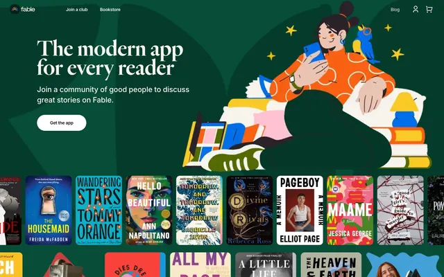
Fable embraces a playful, illustrative aesthetic with strong, inviting typography and a limited but impactful color palette. Bold, contrasting backgrounds in rich greens and blues create distinct sections, often paired with white or near-black text for high readability. Imagery is organic and character-driven, feeling integrated rather than overlaid. Components feature generous padding and distinct, rounded shapes, projecting a friendly and approachable digital experience.
The page model alternates between full-bleed background sections (especially the hero) and maximum-width contained content blocks, creating a dynamic progression. The hero typically features a centered headline over a brand-colored background, accompanied by a large illustrative element. Section rhythm is established by alternating large blocks of Forest Canopy green and Ocean Deep blue with white or parchment-colored sections. Content is often arranged in a split text-left/image-right pattern or centered stacks. Book displays utilize a dense grid of product cards. The layout feels spacious with comfortable breathing room between sections, and the navigation is a minimal sticky header at the top.
The visual language is characterized by custom, expressive illustrations featuring human-like characters engaging with books or digital devices. These illustrations are typically full-color, organic, and often occupy significant visual space as hero elements or section dividers. They are not contained within strict bounding boxes but rather interact with the text and layout. Photography, when present, tends to be product-focused (e.g., book covers) or subtle lifestyle imagery. Icons are generally filled and have a moderate stroke weight, matching the friendly, approachable aesthetic. Imagery serves both decorative atmosphere and explanatory content, emphasizing community and product interaction, and contributes to a visual density that feels rich but not overwhelming.
Reminiscent of Goodreads, Blinkist, Wattpad, Headspace, Calm.
# Fable — Style Reference
> whimsical storybook canvas

**Theme:** light

**Site:** https://fable.co

Fable embraces a playful, illustrative aesthetic with strong, inviting typography and a limited but impactful color palette. Bold, contrasting backgrounds in rich greens and blues create distinct sections, often paired with white or near-black text for high readability. Imagery is organic and character-driven, feeling integrated rather than overlaid. Components feature generous padding and distinct, rounded shapes, projecting a friendly and approachable digital experience.

## Tokens — Colors

| Name | Value | Token | Role |
|------|------|------|------|
| Forest Canopy | `#064c37` | `--color-forest-canopy` | Hero section backgrounds, prominent page sections — grounding but vibrant, setting a rich, inviting tone |
| Ocean Deep | `#43a1d7` | `--color-ocean-deep` | Illustrative accents, secondary section backgrounds — a bright, moderating contrast to the darker greens |
| Midnight Ink | `#161015` | `--color-midnight-ink` | Primary text, darker card backgrounds, bold headings — provides strong contrast against lighter surfaces |
| Deep Space | `#070607` | `--color-deep-space` | Footer background, secondary text, accents against light backgrounds — nearly black, used for maximum contrast |
| Slate Shadow | `#292229` | `--color-slate-shadow` | Button backgrounds, dark text on lighter surfaces — a slightly softer dark than pure black |
| Pearl White | `#ffffff` | `--color-pearl-white` | Primary background for cards and lighter sections, button text, body text on dark backgrounds — a stark contrast element |
| Parchment | `#f7f4ee` | `--color-parchment` | Card backgrounds, secondary container surfaces — a subtle, warm off-white that adds depth without being stark |
| Ghost Gray | `#ededed` | `--color-ghost-gray` | Subtle image backgrounds, borders for contained elements — a very light, almost invisible gray |
| Ink Wash | `#3f383d` | `--color-ink-wash` | Muted body text, secondary icon colors — a dark gray for softer text details |

## Tokens — Typography

### Inter
- **Substitute:** system-ui, sans-serif
- **Weights:** 400, 500, 600, 700
- **Sizes:** 8px, 10px, 12px, 14px, 15px, 16px, 18px, 20px, 24px, 30px
- **Line height:** 1, 1.13, 1.17, 1.25, 1.33, 1.42, 1.43, 1.5, 1.6
- **Letter spacing:** -0.0420em at 30px, -0.0330em at 24px, -0.0200em at 20px, -0.0180em at 18px, -0.0170em at 16px, -0.0150em at 15px, -0.0140em at 14px, -0.0120em at 12px, -0.0110em at 10px, normal at 8px
- **Role:** Primary body text, labels, small print, and various interface elements. The tight tracking at larger sizes gives it a modern, compact feel.

### Heldane Display
- **Substitute:** serif
- **Weights:** 400, 500
- **Sizes:** 22px, 26px, 48px, 72px, 80px
- **Line height:** 0.86, 0.88, 0.94, 1.08, 1.09
- **Letter spacing:** normal
- **Role:** Striking, large-scale headlines. The generous x-height and tight line-height create presence, conveying a sense of classic literature with a modern twist, especially effective at very large sizes like 72px and 80px for hero sections.

### Aktiv Grotesk
- **Substitute:** system-ui, sans-serif
- **Weights:** 400
- **Sizes:** 13px
- **Line height:** 1.5
- **Letter spacing:** normal
- **Role:** Used sparingly for specific informational text, like small captions or sub-labels, complementing Inter without overtly competing.

## Tokens — Type Scale

Perfect Fourth (1.333) from 14px base.

| Role | Size | Line height | Letter spacing |
|------|------|------|------|
| caption | 10px | 1.43 | -0.11px |
| body | 14px | 1.43 | -0.14px |
| body-lg | 18px | 1.25 | -0.18px |
| subheading | 22px | 1.09 | — |
| heading | 26px | 1.08 | — |
| heading-lg | 48px | 0.94 | — |
| display | 72px | 0.88 | — |
| display-lg | 80px | 0.86 | — |

## Tokens — Spacing

- **Section gap:** 24px
- **Card padding:** 24px
- **Element gap:** 24px

## Tokens — Radius

- **Buttons:** 60px
- **Cards:** 12px
- **largeCards:** 48px
- **mediumCards:** 24px

## Tokens — Elevation

- **Card with Shadow:** `rgba(0, 0, 0, 0.6) 0px 4px 20px 0px`
- **Button Shadow:** `rgba(0, 0, 0, 0.4) 0px 4px 20px 0px`

## Layout

The page model alternates between full-bleed background sections (especially the hero) and maximum-width contained content blocks, creating a dynamic progression. The hero typically features a centered headline over a brand-colored background, accompanied by a large illustrative element. Section rhythm is established by alternating large blocks of Forest Canopy green and Ocean Deep blue with white or parchment-colored sections. Content is often arranged in a split text-left/image-right pattern or centered stacks. Book displays utilize a dense grid of product cards. The layout feels spacious with comfortable breathing room between sections, and the navigation is a minimal sticky header at the top.

## Imagery

The visual language is characterized by custom, expressive illustrations featuring human-like characters engaging with books or digital devices. These illustrations are typically full-color, organic, and often occupy significant visual space as hero elements or section dividers. They are not contained within strict bounding boxes but rather interact with the text and layout. Photography, when present, tends to be product-focused (e.g., book covers) or subtle lifestyle imagery. Icons are generally filled and have a moderate stroke weight, matching the friendly, approachable aesthetic. Imagery serves both decorative atmosphere and explanatory content, emphasizing community and product interaction, and contributes to a visual density that feels rich but not overwhelming.

## Components

### Primary Filled Button
*Call to action button*

Solid background button for 'Get the app'. Background: Slate Shadow (#292229). Text: Pearl White (#ffffff). Radius: 60px (pill shape). Minimal padding is observed but contextually implies text is internally padded by font-size and line-height.

### Navigation Link
*Header and footer navigation*

Text link on transparent background. Text: Deep Space (#070607) on light backgrounds, Pearl White (#ffffff) on dark backgrounds. No explicit border or radius. Used for 'Join a club', 'Bookstore', 'Blog'.

### Light Theme Filled Button
*Secondary call to action, interactive elements on dark backgrounds*

Solid background button. Background: Pearl White (#ffffff). Text: Midnight Ink (#161015). Radius: 60px (pill shape).

### Card with Shadow
*Featured content card, elevated interactive elements*

Solid background card. Background: Midnight Ink (#161015). Radius: 12px. Shadow: rgba(0, 0, 0, 0.6) 0px 4px 20px 0px. No explicit padding.

### Product Display Card
*Book cover display, content grid item*

Transparent background card, typically used to display images. No explicit radius, shadow, or padding. Content is directly an image or specific product item. (e.g. book covers).

### Parchment Content Card
*Informational cards, content blocks*

Solid background card. Background: Parchment (#f7f4ee). Radius: 48px or 24px (depends on context). Padding: 40px top, 24px right, 34px bottom, 24px left for large cards; 12px all around for smaller cards.

## Guidelines

### Do

- Use Forest Canopy (#064c37) or Ocean Deep (#43a1d7) for full-width section backgrounds to establish clear visual breaks.
- Apply Heldane Display for all headings, using sizes 48px, 72px, or 80px with weight 500 for maximum impact.
- Default to Inter weight 400 for body text with line-height of 1.42 or 1.43, and letter-spacing adjusted per size for comfortable reading.
- Employ a 60px border-radius for all primary and secondary buttons to maintain a pill-like, friendly aesthetic.
- Pad card elements generously with 40px top, 24px right, 34px bottom, 24px left for primary content cards, and 12px for smaller, tighter content.
- Use Slate Shadow (#292229) for primary button backgrounds with Pearl White (#ffffff) text.
- Incorporate subtle shadows rgba(0, 0, 0, 0.6) 0px 4px 20px 0px for elevated cards, ensuring visual hierarchy without heavy bordering.

### Don't

- Avoid using multiple chromatic colors in close proximity; the palette is designed for distinct section separation.
- Do not use generic sans-serif fonts for headlines; Heldane Display is essential for brand personality.
- Refrain from using hard-edged rectangles for interactive elements; all buttons and many cards require significant border-radius.
- Do not clutter pages with excessive imagery; allow illustrations to breathe and serve as focal points.
- Avoid thin borders for cards and buttons; rely on solid background colors or shadows for definition.
- Do not use letter-spacing: normal for text larger than 16px; Inter requires specific negative tracking for optimal appearance at varied sizes.
- Do not use pure black body text on white backgrounds, opt for Midnight Ink (#161015) or Deep Space (#070607) for softer contrast.

## Agent Prompt Guide

Quick Color Reference:
text: #161015
background: #43a1d7
border: no distinct border color
accent: #43a1d7
primary action: #292229 (filled action)

Example Component Prompts:
1. Create a Primary Filled Button: background Slate Shadow (#292229), text Pearl White (#ffffff), 60px border-radius, font Inter weight 500, size 16px, line-height 1.43.
2. Create a Hero Headline: Text 'The modern app for every reader' in Heldane Display weight 500, size 72px, line-height 0.88, color Pearl White (#ffffff).
3. Create a Parchment Content Card (large): background Parchment (#f7f4ee), 48px border-radius, padding 40px top, 24px right, 34px bottom, 24px left.
4. Create a Navigation Link: Text 'Join a club' in Inter weight 400, size 18px, color Deep Space (#070607) on light backgrounds, or Pearl White (#ffffff) on dark backgrounds.
5. Create a Shadowed Card: background Midnight Ink (#161015), 12px border-radius, box-shadow rgba(0, 0, 0, 0.6) 0px 4px 20px 0px.
More like this







Keep what you find
A free account saves references to boards and can send you a weekly email of picks based on what you save.
To see every result, go Pro.