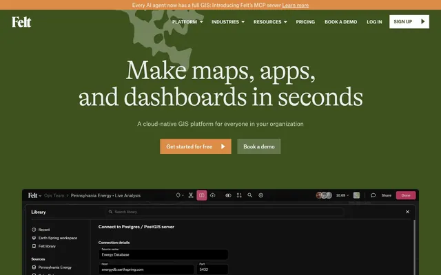
Preview image. Unlock full-res
Deep forest data canvas
Color palette
Primary action color for buttons, links, and interactive elements — a vivid highlight that guides user interaction. This serves as the brand's key accent color
Primary page background, large surface areas, and section dividers — establishes the deep, nature-inspired base hue
Secondary surface background for cards and elevated components, providing a slight visual lift from the main canvas
Primary text color for headlines and main content — offers strong contrast against dark backgrounds
Secondary text and critical UI elements like navigation links and active states, providing maximum visibility
Muted text for secondary information, helper text, and subtle details, typically reserved for light-on-dark scenarios (e.g. within a UI window)
Subtle interactive backgrounds and borders for ghost buttons or less prominent calls to action
Darkest background for UI elements like input fields or specialized dark mode components, providing maximum depth
Base layer for overlaying dark components or deepest UI sections, establishing the lowest visual point
Typography
- Weights
- 300, 400
- Sizes
- 28px, 36px, 43px, 46px, 50px, 86px
- Line height
- 0.8, 0.96, 1, 1.11, 1.33
- Letter spacing
- -0.04em at 86px, -0.033em at 50px
- Fallback
- Georgia
Headlines and prominent display text — weight 300 offers a counter-intuitive lightness for large sizes, creating an effect of authority through restraint rather than volume. Weight 400 rounds out the display usage.
- Weights
- 300, 400, 500, 700
- Sizes
- 12px, 14px, 16px, 18px, 19px, 20px
- Line height
- 1, 1.11, 1.2, 1.25, 1.3, 1.33, 1.43, 1.5, 1.56
- Letter spacing
- 0.033em
- Fallback
- Inter
Body text, navigation, and functional UI elements — the slight 0.033em letter-spacing adds a subtle spaciousness, optimizing legibility for interface-heavy content.
- Weights
- 400
- Sizes
- 14px, 16px
- Line height
- 1.25, 1.33, 1.43
- Letter spacing
- normal
- Fallback
- sans-serif
Fallback and specific utility text — used sparingly for system-level information and certain UI labels.
- Weights
- 400
- Sizes
- 36px, 101px
- Line height
- 0.88, 2.46
- Letter spacing
- normal
- Fallback
- serif
Decorative or highly specific, content-driven callouts, leveraging its traditional serif feel for emphasis.
Spacing & shape
Elevation
Components
Background: Warm Ember (#dc8c46), Text: Text Primary (#eeeeee), Padding: 16px vertical, 20px horizontal. Radius: 20px. Font: Atlasgrotesk Cy Web, weight 400.
Background: rgba(255, 255, 255, 0.2), Text: Text Secondary (#ffffff), Border: 1px solid Text Primary (#eeeeee - inferred, data indicates white border on transparent button). Padding: 16px vertical, 20px horizontal. Radius: 20px. Font: Atlasgrotesk Cy Web, weight 400.
Background: transparent, Text: Text Secondary (#ffffff), Border: 1px solid White (#ffffff), Padding: 16px vertical, 32px horizontal (adjusts for text length). Radius: 0px. Font: Atlasgrotesk Cy Web, weight 400.
Background: transparent, Text: Warm Ember (#dc8c46), Border: 1px solid Warm Ember (#dc8c46), Padding: 14px vertical, 14px horizontal. Radius: 0px. Font: Atlasgrotesk Cy Web, weight 400.
Background: transparent, Text: rgba(255, 255, 255, 0.8), Radius: 0px.
Background: Felt Deepest Green (#212f0c), Padding: typically 12px or 24px vertical, 24px horizontal. Radius: 6px. Shadow: rgba(0, 0, 0, 0.2) 0px 2px 5px 0px.
Guidelines
- Prioritize Forest Canvas (#3d521e) as the dominant background color for most sections, establishing the brand's deep green aesthetic.
- Use Warm Ember (#dc8c46) exclusively for primary calls to action and critical interactive elements to maintain its high visual impact.
- Employ Gt Alpina Standard weight 300 for all major headings to convey authority through subtle, elegant typography.
- Always use Atlasgrotesk Cy Web with 0.033em letter-spacing for body text and UI labels to ensure clarity and consistency.
- Apply a 20px border-radius to all filled buttons to create a softer, more approachable interactive element.
- Maintain a clear distinction between surface levels using Felt Darkest Base (#18210c), Felt Deepest Green (#212f0c), and Nightfall Surface (#314218) for progressively elevated elements.
- Utilize 12px for `elementGap` to ensure comfortable spacing between interactive elements and components.
- Do not use saturated colors other than Warm Ember for accentuation; maintain the muted green and achromatic palette elsewhere.
- Avoid large, uncontained blocks of light or white content; surfaces should primarily be dark or muted green.
- Do not vary the letter-spacing for Atlasgrotesk Cy Web; the 0.033em value is a signature characteristic.
- Do not use standard serif fonts for UI elements; Times New Roman should be reserved for decorative text.
- Avoid excessive use of drop shadows; limit them to clearly elevated UI components like deep container cards.
- Never use `0px` border-radius for action buttons, as 20px is core to their visual identity.
- Do not introduce strong gradients in backgrounds; the system relies on solid color fields and subtle shifts in dark green tones.
About this system
ShowHide
Felt employs a dark, command-center aesthetic, with a cool green canvas creating a sense of depth and focus for data visualization. Typography is crisp and authoritative, striking a balance between traditional elegance and modern clarity. Functional elements are highlighted with a warm amber tone, contrasting effectively with the predominantly muted green and deep grayscale palette. Components are lightweight and precise, often featuring subtle borders and minimal radii to maintain a structured yet unobtrusive interface.
The page uses a maximum-width contained layout, though the hero section often spills into a full-bleed background. The hero features a large centered headline and calls to action over a dark green background. Content sections follow a vertical rhythm with consistent spacing, often alternating between centered stacks and split layouts with text on one side and a visual (map, screenshot) on the other. A notable element is the embedded dark UI panel, which frequently overlays sections for dynamic product showcasing. The navigation is a sticky top bar with ghost buttons and a prominent 'Sign Up' button.
Imagery primarily consists of maps and GIS data visualizations, often presented as embedded UI elements or product screenshots. When present, images are contained within the dark UI, sometimes with subtle shadows. There's a minimal use of abstract graphics or photography. Icons are generally simple, outlined, and monochromatic, used functionally to represent actions or categories within the dark UI.
Reminiscent of Linear, Replit, Figma (dark mode), Vercel.
# Felt — Style Reference
> Deep forest data canvas

**Theme:** dark

**Site:** https://www.felt.com

Felt employs a dark, command-center aesthetic, with a cool green canvas creating a sense of depth and focus for data visualization. Typography is crisp and authoritative, striking a balance between traditional elegance and modern clarity. Functional elements are highlighted with a warm amber tone, contrasting effectively with the predominantly muted green and deep grayscale palette. Components are lightweight and precise, often featuring subtle borders and minimal radii to maintain a structured yet unobtrusive interface.

## Tokens — Colors

| Name | Value | Token | Role |
|------|------|------|------|
| Warm Ember | `#dc8c46` | `--color-warm-ember` | Primary action color for buttons, links, and interactive elements — a vivid highlight that guides user interaction. This serves as the brand's key accent color |
| Forest Canvas | `#3d521e` | `--color-forest-canvas` | Primary page background, large surface areas, and section dividers — establishes the deep, nature-inspired base hue |
| Nightfall Surface | `#314218` | `--color-nightfall-surface` | Secondary surface background for cards and elevated components, providing a slight visual lift from the main canvas |
| Text Primary | `#eeeeee` | `--color-text-primary` | Primary text color for headlines and main content — offers strong contrast against dark backgrounds |
| Text Secondary | `#ffffff` | `--color-text-secondary` | Secondary text and critical UI elements like navigation links and active states, providing maximum visibility |
| Text Tertiary | `#333333` | `--color-text-tertiary` | Muted text for secondary information, helper text, and subtle details, typically reserved for light-on-dark scenarios (e.g. within a UI window) |
| Muted Sage | `#64754b` | `--color-muted-sage` | Subtle interactive backgrounds and borders for ghost buttons or less prominent calls to action |
| Felt Deepest Green | `#212f0c` | `--color-felt-deepest-green` | Darkest background for UI elements like input fields or specialized dark mode components, providing maximum depth |
| Felt Darkest Base | `#18210c` | `--color-felt-darkest-base` | Base layer for overlaying dark components or deepest UI sections, establishing the lowest visual point |

## Tokens — Typography

### Gt Alpina Standard
- **Substitute:** Georgia
- **Weights:** 300, 400
- **Sizes:** 28px, 36px, 43px, 46px, 50px, 86px
- **Line height:** 0.8, 0.96, 1, 1.11, 1.33
- **Letter spacing:** -0.04em at 86px, -0.033em at 50px
- **Role:** Headlines and prominent display text — weight 300 offers a counter-intuitive lightness for large sizes, creating an effect of authority through restraint rather than volume. Weight 400 rounds out the display usage.

### Atlasgrotesk Cy Web
- **Substitute:** Inter
- **Weights:** 300, 400, 500, 700
- **Sizes:** 12px, 14px, 16px, 18px, 19px, 20px
- **Line height:** 1, 1.11, 1.2, 1.25, 1.3, 1.33, 1.43, 1.5, 1.56
- **Letter spacing:** 0.033em
- **Role:** Body text, navigation, and functional UI elements — the slight 0.033em letter-spacing adds a subtle spaciousness, optimizing legibility for interface-heavy content.

### Arial
- **Substitute:** sans-serif
- **Weights:** 400
- **Sizes:** 14px, 16px
- **Line height:** 1.25, 1.33, 1.43
- **Letter spacing:** normal
- **Role:** Fallback and specific utility text — used sparingly for system-level information and certain UI labels.

### Times New Roman
- **Substitute:** serif
- **Weights:** 400
- **Sizes:** 36px, 101px
- **Line height:** 0.88, 2.46
- **Letter spacing:** normal
- **Role:** Decorative or highly specific, content-driven callouts, leveraging its traditional serif feel for emphasis.

## Tokens — Type Scale

Perfect Fourth (1.333) from 16px base.

| Role | Size | Line height | Letter spacing |
|------|------|------|------|
| caption | 12px | 1.5 | 0.33px |
| body-sm | 14px | 1.43 | 0.46px |
| body | 16px | 1.33 | 0.53px |
| subheading | 18px | 1.25 | 0.59px |
| heading-sm | 20px | 1.2 | 0.66px |
| heading | 28px | 1.11 | -1.12px |
| heading-lg | 50px | 1 | -1.65px |
| display | 86px | 0.8 | -3.44px |

## Tokens — Spacing

- **Section gap:** 24px
- **Card padding:** 12px
- **Element gap:** 12px

## Tokens — Radius

- **Default:** 6px
- **Buttons:** 20px

## Tokens — Elevation

- **UI Container Card:** `rgba(0, 0, 0, 0.2) 0px 2px 5px 0px`

## Layout

The page uses a maximum-width contained layout, though the hero section often spills into a full-bleed background. The hero features a large centered headline and calls to action over a dark green background. Content sections follow a vertical rhythm with consistent spacing, often alternating between centered stacks and split layouts with text on one side and a visual (map, screenshot) on the other. A notable element is the embedded dark UI panel, which frequently overlays sections for dynamic product showcasing. The navigation is a sticky top bar with ghost buttons and a prominent 'Sign Up' button.

## Imagery

Imagery primarily consists of maps and GIS data visualizations, often presented as embedded UI elements or product screenshots. When present, images are contained within the dark UI, sometimes with subtle shadows. There's a minimal use of abstract graphics or photography. Icons are generally simple, outlined, and monochromatic, used functionally to represent actions or categories within the dark UI.

## Components

### Primary Action Button
*Main call-to-action button, drawing attention with the brand's accent color.*

Background: Warm Ember (#dc8c46), Text: Text Primary (#eeeeee), Padding: 16px vertical, 20px horizontal. Radius: 20px. Font: Atlasgrotesk Cy Web, weight 400.

### Secondary Action Button
*Subtle button with a transparent background, used for secondary actions or navigation.*

Background: rgba(255, 255, 255, 0.2), Text: Text Secondary (#ffffff), Border: 1px solid Text Primary (#eeeeee - inferred, data indicates white border on transparent button). Padding: 16px vertical, 20px horizontal. Radius: 20px. Font: Atlasgrotesk Cy Web, weight 400.

### Ghost Navigation Button
*Navigation items in the header, acting as ghost buttons.*

Background: transparent, Text: Text Secondary (#ffffff), Border: 1px solid White (#ffffff), Padding: 16px vertical, 32px horizontal (adjusts for text length). Radius: 0px. Font: Atlasgrotesk Cy Web, weight 400.

### Outline Link Button (Warm Ember)
*Outlined button or link, using the brand accent color for border and text.*

Background: transparent, Text: Warm Ember (#dc8c46), Border: 1px solid Warm Ember (#dc8c46), Padding: 14px vertical, 14px horizontal. Radius: 0px. Font: Atlasgrotesk Cy Web, weight 400.

### Badge Neutral
*Inline labels or small informational markers.*

Background: transparent, Text: rgba(255, 255, 255, 0.8), Radius: 0px.

### UI Container Card
*Small, contained UI panels like the footer or specific data widgets.*

Background: Felt Deepest Green (#212f0c), Padding: typically 12px or 24px vertical, 24px horizontal. Radius: 6px. Shadow: rgba(0, 0, 0, 0.2) 0px 2px 5px 0px.

## Guidelines

### Do

- Prioritize Forest Canvas (#3d521e) as the dominant background color for most sections, establishing the brand's deep green aesthetic.
- Use Warm Ember (#dc8c46) exclusively for primary calls to action and critical interactive elements to maintain its high visual impact.
- Employ Gt Alpina Standard weight 300 for all major headings to convey authority through subtle, elegant typography.
- Always use Atlasgrotesk Cy Web with 0.033em letter-spacing for body text and UI labels to ensure clarity and consistency.
- Apply a 20px border-radius to all filled buttons to create a softer, more approachable interactive element.
- Maintain a clear distinction between surface levels using Felt Darkest Base (#18210c), Felt Deepest Green (#212f0c), and Nightfall Surface (#314218) for progressively elevated elements.
- Utilize 12px for `elementGap` to ensure comfortable spacing between interactive elements and components.

### Don't

- Do not use saturated colors other than Warm Ember for accentuation; maintain the muted green and achromatic palette elsewhere.
- Avoid large, uncontained blocks of light or white content; surfaces should primarily be dark or muted green.
- Do not vary the letter-spacing for Atlasgrotesk Cy Web; the 0.033em value is a signature characteristic.
- Do not use standard serif fonts for UI elements; Times New Roman should be reserved for decorative text.
- Avoid excessive use of drop shadows; limit them to clearly elevated UI components like deep container cards.
- Never use `0px` border-radius for action buttons, as 20px is core to their visual identity.
- Do not introduce strong gradients in backgrounds; the system relies on solid color fields and subtle shifts in dark green tones.

## Agent Prompt Guide

Quick Color Reference:
- Text: #eeeeee
- Background: #3d521e
- Border: #eeeeee (neutral), #dc8c46 (accent)
- Accent: #dc8c46
- primary action: #ffffff (filled action)

Example Component Prompts:
1. Create a Primary Action Button: #ffffff background, #eeeeee text, 9999px radius, compact pill padding. Use this filled treatment for the main CTA.
More like this









Keep what you find
A free account saves references to boards and can send you a weekly email of picks based on what you save.
To see every result, go Pro.