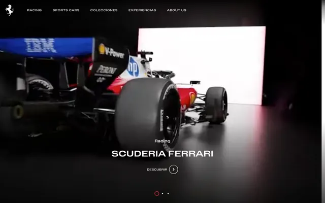
Preview image. Unlock full-res
Precision engineered machinery. Like the interior of a sleek, high-performance engine, where every component is black or silver, and only critical indicators glow red.
Color palette
Accent color for interactive elements, progress indicators, underlines on active navigation items - the iconic visual signature of the brand, used sparingly for impact.
Page backgrounds, navigation bars, dramatic photographic backdrops for product showcases.
Primary text, prominent page sections, content cards, and interactive elements – providing crisp contrast against dark backgrounds.
Secondary text in navigation, footer elements, and subtle background shading to create depth without overt shadows.
Minor dividers, borders, and backgrounds for less prominent UI elements, establishing a subtle hierarchy within dark themes.
Supportive text, icon fills, and subtle hints where softer contrast is desired, such as secondary information or disabled states.
Typography
- Sizes
- 11px, 12px, 13px
- Line height
- 1.27, 1.5, 1.78, 2
- Letter spacing
- 0.0150em, 0.0220em, 0.0280em, 0.0830em, 0.0910em
- Fallback
- Arial, Helvetica, sans-serif
Primary typeface for all body text, navigational links, buttons, and footers. The intentional wide letter-spacing across all sizes is a distinctive characteristic, giving each word room to breathe and contributing to the premium, measured feel.
Spacing & shape
Components
Text link with no background. Text color `Polar White` (#ffffff), `Body-Font` weight 400, size 13px. On hover/active, a 1px `Rosso Corsa` (#FF0000) bottom border appears. Padding is 5px top/bottom, 0px left/right. Letter spacing 0.0830em.
Transparent background button with `Polar White` (#ffffff) text and an integrated arrow icon. No border-radius, `Body-Font` weight 400. Text is uppercase. Associated with a line-based active state indicator (e.g., a short red underline appearing on interaction).
Small, horizontally oriented pills. Inactive indicators are thin gray outlines or filled with `Ash Mist` (#8f8f8f). Active indicator is a `Rosso Corsa` (#FF0000) filled pill, signaling current slide without heavy branding.
Large, bold `Polar White` (#ffffff) text using the `Body-Font` with wide letter-spacing, set against a dark background or on a `Polar White` content card. Accompanied by a smaller `Body-Font` body text.
Light gray `Ash Mist` (#8f8f8f) or `Polar White` (#ffffff) body text at 12px with a line-height of 1.78 to 2.00, and letter-spacing of 0.0150em or 0.0220em, providing comfortable readability on both dark and light sections.
`Shadow Graphite` (#181818) text on a dark background, or `Polar White` (#ffffff) text where more emphasis is needed. Uses `Body-Font` at 11px or 12px, with a generous line-height and medium letter-spacing.
Guidelines
- Do utilize a high-contrast palette of `Obsidian Black` (#000000) and `Polar White` (#ffffff) as the primary background and text colors to maintain a dramatic and luxurious feel.
- Do apply `Rosso Corsa` (#FF0000) as the sole accent color, reserving it exclusively for interactive elements and key indicators to command attention.
- Do apply custom `Body-Font` with generous letter-spacing (e.g., 0.0830em for navigation) for headlines and navigation to emphasize precision and exclusivity.
- Do use a 'comfortably spaced' rhythm with `elementGap` of `10px` and `cardPadding` of `20px` to maintain order and focus.
- Do maintain sharp, `0px` radius on all interactive elements and containers to reinforce the engineered aesthetic.
- Do use the `Shadow Graphite` (#181818) and `Steel Gray` (#303030) as subtle surface variations rather than relying on drop shadows for depth.
- Don't introduce additional chromatic colors; the system is built on a black-and-white foundation with a single `Rosso Corsa` accent.
- Don't use rounded corners or soft edges on any components; the design demands sharp, precise lines (`0px` radius).
- Don't use drop shadows for elevation; rely on shifts in neutral background colors (`#000000`, `#181818`, `#ffffff`) to create hierarchy and depth.
- Don't use tight letter-spacing; the custom `Body-Font`'s inherent wide spacing is a core part of the brand's typographic identity.
- Don't embed images with external context; use tightly cropped, abstract, or studio-shot product imagery that isolates the subject.
- Don't deviate from the `Body-Font` for text elements; the system relies on this single typeface for typographic consistency and brand identity.
About this system
ShowHide
This design system evokes precision engineering and focused luxury through a high-contrast, almost entirely achromatic palette. Deep blacks and stark whites create a dramatic stage for the content, focusing attention on high-performance imagery. Subtle gray variations provide surface differentiation, akin to different finishes on precision metal, rather than relying on chromatic accents for visual hierarchy. The custom typography, characterized by its wide letter-spacing, projects a sense of deliberate pacing and exclusivity, ensuring every word commands attention.
The page exhibits a mixed layout: the hero is a full-bleed dark video/image with centered text and call to action. Subsequent sections alternate between dark and light backgrounds, using a flexible, full-width model. Content is primarily arranged in two-column layouts, often with text on one side and a large, impactful image on the other. Vertical spacing between logical sections is consistent, around `48px`. The overall impression is information-rich but carefully composed, guiding the eye through high-impact visuals and concise text blocks.
Photography focuses almost exclusively on high-performance vehicles, often in dramatic, dark studio settings with stark lighting (e.g., single spotlight revealing lines). Images are full-bleed within sections or large, contained blocks, presented with sharp, unmasked edges (0px radius). They serve a dual role: showcasing product and creating an aspirational, atmospheric mood. The visual density is high, with images frequently dominating sections and often carrying the primary visual weight over text.
Reminiscent of Porsche, Lamborghini, Aston Martin.
# Ferrari — Style Reference
> Precision engineered machinery. Like the interior of a sleek, high-performance engine, where every component is black or silver, and only critical indicators glow red.

**Theme:** mixed

**Site:** https://ferrari.com

This design system evokes precision engineering and focused luxury through a high-contrast, almost entirely achromatic palette. Deep blacks and stark whites create a dramatic stage for the content, focusing attention on high-performance imagery. Subtle gray variations provide surface differentiation, akin to different finishes on precision metal, rather than relying on chromatic accents for visual hierarchy. The custom typography, characterized by its wide letter-spacing, projects a sense of deliberate pacing and exclusivity, ensuring every word commands attention.

## Tokens — Colors

| Name | Value | Token | Role |
|------|------|------|------|
| Rosso Corsa | `#FF0000` | `--color-rosso-corsa` | Accent color for interactive elements, progress indicators, underlines on active navigation items - the iconic visual signature of the brand, used sparingly for impact. |
| Obsidian Black | `#000000` | `--color-obsidian-black` | Page backgrounds, navigation bars, dramatic photographic backdrops for product showcases. |
| Polar White | `#ffffff` | `--color-polar-white` | Primary text, prominent page sections, content cards, and interactive elements – providing crisp contrast against dark backgrounds. |
| Shadow Graphite | `#181818` | `--color-shadow-graphite` | Secondary text in navigation, footer elements, and subtle background shading to create depth without overt shadows. |
| Steel Gray | `#303030` | `--color-steel-gray` | Minor dividers, borders, and backgrounds for less prominent UI elements, establishing a subtle hierarchy within dark themes. |
| Ash Mist | `#8f8f8f` | `--color-ash-mist` | Supportive text, icon fills, and subtle hints where softer contrast is desired, such as secondary information or disabled states. |

## Tokens — Typography

### custom
- **Substitute:** Arial, Helvetica, sans-serif
- **Sizes:** 11px, 12px, 13px
- **Line height:** 1.27, 1.5, 1.78, 2
- **Letter spacing:** 0.0150em, 0.0220em, 0.0280em, 0.0830em, 0.0910em
- **Role:** Primary typeface for all body text, navigational links, buttons, and footers. The intentional wide letter-spacing across all sizes is a distinctive characteristic, giving each word room to breathe and contributing to the premium, measured feel.

## Tokens — Type Scale

Minor Second (1.067) from 13px base.

| Role | Size | Line height | Letter spacing |
|------|------|------|------|
| caption | 11px | 1.78 | — |
| body-sm | 12px | 1.78 | — |
| body | 13px | 1.78 | — |

## Tokens — Spacing

- **Section gap:** 48px
- **Card padding:** 20px
- **Element gap:** 10px

## Tokens — Radius

- **all:** 0px

## Layout

The page exhibits a mixed layout: the hero is a full-bleed dark video/image with centered text and call to action. Subsequent sections alternate between dark and light backgrounds, using a flexible, full-width model. Content is primarily arranged in two-column layouts, often with text on one side and a large, impactful image on the other. Vertical spacing between logical sections is consistent, around `48px`. The overall impression is information-rich but carefully composed, guiding the eye through high-impact visuals and concise text blocks.

## Imagery

Photography focuses almost exclusively on high-performance vehicles, often in dramatic, dark studio settings with stark lighting (e.g., single spotlight revealing lines). Images are full-bleed within sections or large, contained blocks, presented with sharp, unmasked edges (0px radius). They serve a dual role: showcasing product and creating an aspirational, atmospheric mood. The visual density is high, with images frequently dominating sections and often carrying the primary visual weight over text.

## Components

### Hero Slide Indicator & CTA

### News Feature Card

### Navigation Link Group & Carousel Pagination

### Ghost Navigation Link
*Primary navigation item*

Text link with no background. Text color `Polar White` (#ffffff), `Body-Font` weight 400, size 13px. On hover/active, a 1px `Rosso Corsa` (#FF0000) bottom border appears. Padding is 5px top/bottom, 0px left/right. Letter spacing 0.0830em.

### Hero Action Arrow Button
*Call to action in hero section*

Transparent background button with `Polar White` (#ffffff) text and an integrated arrow icon. No border-radius, `Body-Font` weight 400. Text is uppercase. Associated with a line-based active state indicator (e.g., a short red underline appearing on interaction).

### Minimal Pill Indicator
*Carousel/slider pagination*

Small, horizontally oriented pills. Inactive indicators are thin gray outlines or filled with `Ash Mist` (#8f8f8f). Active indicator is a `Rosso Corsa` (#FF0000) filled pill, signaling current slide without heavy branding.

### Feature Card Headline
*Editorial content headline*

Large, bold `Polar White` (#ffffff) text using the `Body-Font` with wide letter-spacing, set against a dark background or on a `Polar White` content card. Accompanied by a smaller `Body-Font` body text.

### Body Text Paragraph
*Standard informational text*

Light gray `Ash Mist` (#8f8f8f) or `Polar White` (#ffffff) body text at 12px with a line-height of 1.78 to 2.00, and letter-spacing of 0.0150em or 0.0220em, providing comfortable readability on both dark and light sections.

### Footer Link
*Secondary navigation and informational links*

`Shadow Graphite` (#181818) text on a dark background, or `Polar White` (#ffffff) text where more emphasis is needed. Uses `Body-Font` at 11px or 12px, with a generous line-height and medium letter-spacing.

## Guidelines

### Do

- Do utilize a high-contrast palette of `Obsidian Black` (#000000) and `Polar White` (#ffffff) as the primary background and text colors to maintain a dramatic and luxurious feel.
- Do apply `Rosso Corsa` (#FF0000) as the sole accent color, reserving it exclusively for interactive elements and key indicators to command attention.
- Do apply custom `Body-Font` with generous letter-spacing (e.g., 0.0830em for navigation) for headlines and navigation to emphasize precision and exclusivity.
- Do use a 'comfortably spaced' rhythm with `elementGap` of `10px` and `cardPadding` of `20px` to maintain order and focus.
- Do maintain sharp, `0px` radius on all interactive elements and containers to reinforce the engineered aesthetic.
- Do use the `Shadow Graphite` (#181818) and `Steel Gray` (#303030) as subtle surface variations rather than relying on drop shadows for depth.

### Don't

- Don't introduce additional chromatic colors; the system is built on a black-and-white foundation with a single `Rosso Corsa` accent.
- Don't use rounded corners or soft edges on any components; the design demands sharp, precise lines (`0px` radius).
- Don't use drop shadows for elevation; rely on shifts in neutral background colors (`#000000`, `#181818`, `#ffffff`) to create hierarchy and depth.
- Don't use tight letter-spacing; the custom `Body-Font`'s inherent wide spacing is a core part of the brand's typographic identity.
- Don't embed images with external context; use tightly cropped, abstract, or studio-shot product imagery that isolates the subject.
- Don't deviate from the `Body-Font` for text elements; the system relies on this single typeface for typographic consistency and brand identity.

## Agent Prompt Guide

### Quick Color Reference
- Text: `Polar White` (#ffffff)
- Background (dark): `Obsidian Black` (#000000)
- Background (light): `Polar White` (#ffffff)
- CTA/Accent: `Rosso Corsa` (#FF0000)
- Secondary Text/Icon: `Shadow Graphite` (#181818)

### Example Component Prompts
1. Create a full-width hero section: `Obsidian Black` (#000000) background. Centered primary heading: `Polar White` (#ffffff), custom `Body-Font` weight 400, size 48px, letter-spacing 0.091em. Below it, a 'Hero Action Arrow Button' (transparent, `Polar White` text, `Body-Font`, 0px radius, 5px vertical padding).
2. Create a content card for an editorial feature: `Polar White` (#ffffff) background. 20px padding. Headline: `Shadow Graphite` (#181818), custom `Body-Font` weight 400, size 24px, letter-spacing 0.083em. Body text below: `Ash Mist` (#8f8f8f), custom `Body-Font` weight 400, size 12px, line-height 1.78, letter-spacing 0.015em. No border or shadow.
3. Generate a horizontal pagination component for a carousel: Three 'Minimal Pill Indicators'. Two are filled `Ash Mist` (#8f8f8f), the third (active) is `Rosso Corsa` (#FF0000) filled. All are 0px radius.
4. Design a footer section: `Obsidian Black` (#000000) background. Section gap around elements is 10px. Footernavigation links: `Shadow Graphite` (#181818), custom `Body-Font` weight 400, size 11px, letter-spacing 0.028em. Social media icons are `Polar White` (#ffffff).
More like this







Keep what you find
A free account saves references to boards and can send you a weekly email of picks based on what you save.
To see every result, go Pro.