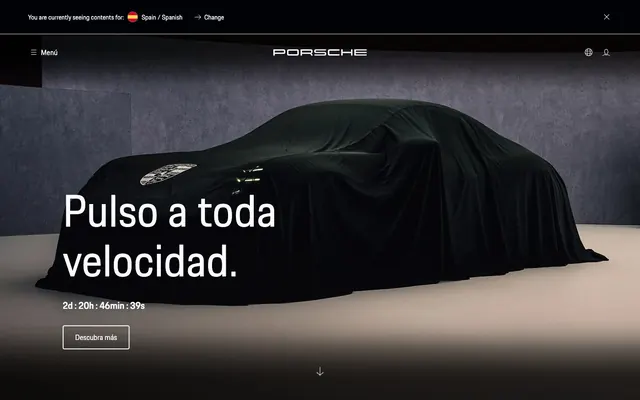
Preview image. Unlock full-res
Precision engineered sleekness – every element is a calculated, high-contrast decision on a clean canvas.
Color palette
Major text, site background for dark sections, button text on light backgrounds, card surfaces in dark mode, significant border colors.
Default page background, text on dark backgrounds, interactive element backgrounds.
Secondary text in dark sections, subtle background variations to create depth.
Supporting text, input placeholder text.
Primary headings and prominent body text on light backgrounds.
Placeholder text for input fields, light borders.
Typography
- Weights
- 400, 600
- Sizes
- 14px, 16px, 33px, 43px, 73px, 95px
- Line height
- 1.19, 1.21, 1.26, 1.31, 1.5, 1.55, 1.88
- Letter spacing
- normal
- Fallback
- Inter, Montserrat
The sole typeface, used across all elements from headings to body text and interactive components. The variable weights and sizes allow for a highly refined typographic hierarchy without introducing additional families, prioritizing brand consistency.
Spacing & shape
Components
Set in Porsche Next, weight 400 or 600, size 73px or 95px on a dark background, using Ghost White text. Positioned left-aligned on the hero image.
Background transparent, text Obsidian, border Obsidian, 12px border radius. Padding is not explicitly defined but appears minimal around text.
Background Obsidian, 8px border radius, no box-shadow. Zero padding, with image content filling the card. Inner text is Ghost White, Porsche Next, typically 33px or 43px.
Background transparent, text Input Placeholder (#949598), border Input Placeholder (#949598), 4px border radius. Padding 8px vertical, 49px horizontal.
Background transparent, text Obsidian, 0px border radius for most variants, 4px for some. Minimal padding for text-only, or significant bottom padding for larger, image-related badges.
Small arrow icon pointing up, with 'Volver arriba' (Go back up) text. Text is Ghost White on an Obsidian background, Porsche Next, weight 400, size 14px or 16px.
Guidelines
- Use Obsidian (#000000) for all primary body text and most UI elements on light backgrounds.
- Maintain a clear visual hierarchy with Porsche Next, reserving larger sizes (73px, 95px) for hero headlines and smaller sizes (14px, 16px) for details and navigation.
- Apply 8px radius consistently to all content cards and larger visual containers.
- Employ the 12px radius for interactive elements like buttons, creating a subtle contrast with card radii.
- Prioritize generous vertical section gaps of 63px or 81px to ensure a spacious and premium feel.
- Leverage the pure contrast of #000000 and #ffffff for text and background pairings to achieve maximum readability and a bold aesthetic.
- Avoid using multiple font families; adhere strictly to Porsche Next for all typography.
- Do not introduce decorative shadows; the design relies on flat, high-contrast surfaces and careful spacing for depth.
- Refrain from using saturated accent colors; the palette is strictly achromatic to maintain sophistication.
- Do not deviate from the established radii of 8px (cards), 12px (buttons), and 4px (inputs/badges); consistent subtle shaping is key.
- Avoid dense information blocks; use spacious layouts with ample white (or black) space around content.
- Do not use gradients; the system employs flat colors for a crisp, unambiguous presentation.
About this system
ShowHide
This system projects an image of controlled power and exclusivity, reflecting the Porsche brand. The primary visual tension arises from the interplay of stark black and white surfaces, punctuated by crisp, minimal typography. Design decisions lean towards functional elegance, conveying luxury through restraint and precise spacing rather than overt embellishment, often employing photography within geometric containers.
The layout combines full-bleed visual sections with contained content blocks. The hero features a large, dark, full-viewport image with white, left-aligned typography. Subsequent sections alternate between full-width black backgrounds and pure white content areas. Content frequently uses a two-column distribution with text on one side and an image or card on the other, or grids of product cards. A consistent pageMaxWidth is not imposed, with elements adapting to fill available space or aligning to a logical content core. Vertical spacing is generous, creating distinct visual breaks between sections.
Photography is paramount, featuring product (cars) either tightly cropped and pristine, often under a dark veil to hint at new releases, or in epic, dynamic landscape settings. Images are mostly full-bleed within sections or large product cards, with sharp, unmasked edges. No illustrations or abstract graphics are present; the visual focus is entirely on the vehicles themselves and their aspirational context. The icons are universally outlined and achromatic, blending seamlessly into the UI.
Reminiscent of Aston Martin, Mercedes-Benz, Rimowa, Apple.
# Porsche — Style Reference
> Precision engineered sleekness – every element is a calculated, high-contrast decision on a clean canvas.

**Theme:** mixed

**Site:** https://porsche.com

This system projects an image of controlled power and exclusivity, reflecting the Porsche brand. The primary visual tension arises from the interplay of stark black and white surfaces, punctuated by crisp, minimal typography. Design decisions lean towards functional elegance, conveying luxury through restraint and precise spacing rather than overt embellishment, often employing photography within geometric containers.

## Tokens — Colors

| Name | Value | Token | Role |
|------|------|------|------|
| Obsidian | `#000000` | `--color-obsidian` | Major text, site background for dark sections, button text on light backgrounds, card surfaces in dark mode, significant border colors. |
| Ghost White | `#ffffff` | `--color-ghost-white` | Default page background, text on dark backgrounds, interactive element backgrounds. |
| Charcoal Accent | `#0e0e12` | `--color-charcoal-accent` | Secondary text in dark sections, subtle background variations to create depth. |
| Slate Text | `#535457` | `--color-slate-text` | Supporting text, input placeholder text. |
| Deep Black Text | `#010205` | `--color-deep-black-text` | Primary headings and prominent body text on light backgrounds. |
| Input Placeholder | `#949598` | `--color-input-placeholder` | Placeholder text for input fields, light borders. |

## Tokens — Typography

### Porsche Next
- **Substitute:** Inter, Montserrat
- **Weights:** 400, 600
- **Sizes:** 14px, 16px, 33px, 43px, 73px, 95px
- **Line height:** 1.19, 1.21, 1.26, 1.31, 1.5, 1.55, 1.88
- **Letter spacing:** normal
- **Role:** The sole typeface, used across all elements from headings to body text and interactive components. The variable weights and sizes allow for a highly refined typographic hierarchy without introducing additional families, prioritizing brand consistency.

## Tokens — Spacing

- **Card padding:** 0px

## Tokens — Radius

- **Buttons:** 12px
- **Inputs:** 4px
- **Cards:** 8px
- **badges:** 4px

## Layout

The layout combines full-bleed visual sections with contained content blocks. The hero features a large, dark, full-viewport image with white, left-aligned typography. Subsequent sections alternate between full-width black backgrounds and pure white content areas. Content frequently uses a two-column distribution with text on one side and an image or card on the other, or grids of product cards. A consistent pageMaxWidth is not imposed, with elements adapting to fill available space or aligning to a logical content core. Vertical spacing is generous, creating distinct visual breaks between sections.

## Imagery

Photography is paramount, featuring product (cars) either tightly cropped and pristine, often under a dark veil to hint at new releases, or in epic, dynamic landscape settings. Images are mostly full-bleed within sections or large product cards, with sharp, unmasked edges. No illustrations or abstract graphics are present; the visual focus is entirely on the vehicles themselves and their aspirational context. The icons are universally outlined and achromatic, blending seamlessly into the UI.

## Components

### Countdown Teaser Banner

### Model Cards Grid

### Footer Scroll Indicator & Section Title

### Hero Headline
*Primary visual weight on section introductions.*

Set in Porsche Next, weight 400 or 600, size 73px or 95px on a dark background, using Ghost White text. Positioned left-aligned on the hero image.

### Transparent Border Button
*Secondary call to action.*

Background transparent, text Obsidian, border Obsidian, 12px border radius. Padding is not explicitly defined but appears minimal around text.

### Dark Overlay Card
*Content container for showcasing product categories.*

Background Obsidian, 8px border radius, no box-shadow. Zero padding, with image content filling the card. Inner text is Ghost White, Porsche Next, typically 33px or 43px.

### Standard Input Field
*User data entry.*

Background transparent, text Input Placeholder (#949598), border Input Placeholder (#949598), 4px border radius. Padding 8px vertical, 49px horizontal.

### Ghost Badge
*Category labels or navigation items.*

Background transparent, text Obsidian, 0px border radius for most variants, 4px for some. Minimal padding for text-only, or significant bottom padding for larger, image-related badges.

### Footer Scroll Indicator
*Navigation cue for returning to top.*

Small arrow icon pointing up, with 'Volver arriba' (Go back up) text. Text is Ghost White on an Obsidian background, Porsche Next, weight 400, size 14px or 16px.

## Guidelines

### Do

- Use Obsidian (#000000) for all primary body text and most UI elements on light backgrounds.
- Maintain a clear visual hierarchy with Porsche Next, reserving larger sizes (73px, 95px) for hero headlines and smaller sizes (14px, 16px) for details and navigation.
- Apply 8px radius consistently to all content cards and larger visual containers.
- Employ the 12px radius for interactive elements like buttons, creating a subtle contrast with card radii.
- Prioritize generous vertical section gaps of 63px or 81px to ensure a spacious and premium feel.
- Leverage the pure contrast of #000000 and #ffffff for text and background pairings to achieve maximum readability and a bold aesthetic.

### Don't

- Avoid using multiple font families; adhere strictly to Porsche Next for all typography.
- Do not introduce decorative shadows; the design relies on flat, high-contrast surfaces and careful spacing for depth.
- Refrain from using saturated accent colors; the palette is strictly achromatic to maintain sophistication.
- Do not deviate from the established radii of 8px (cards), 12px (buttons), and 4px (inputs/badges); consistent subtle shaping is key.
- Avoid dense information blocks; use spacious layouts with ample white (or black) space around content.
- Do not use gradients; the system employs flat colors for a crisp, unambiguous presentation.

## Agent Prompt Guide

### Quick Color Reference
- Text (Dark BG): #ffffff (Ghost White)
- Text (Light BG): #000000 (Obsidian)
- Page Background (Light): #ffffff (Ghost White)
- Page Background (Dark): #000000 (Obsidian)
- Input Border: #949598 (Input Placeholder)

### 3-5 Example Component Prompts
1.  **Create a hero section:** 100vh height, full-width image background (dark toned), with a white headline 'Pulso a toda velocidad.' in Porsche Next, weight 400, size 95px, positioned bottom-left. Below the headline, add a transparent button 'Descubra más' with white text, 12px radius, 1px white border.
2.  **Generate a product card:** Dark background (#000000), 8px border-radius, zero padding. Inside, place a full-bleed product image. Overlay the top-left of the image with text '911' in Porsche Next, weight 600, size 43px, color #ffffff. The card should have 12px right margin when in a grid.
3.  **Design an input field:** Transparent background, 4px border-radius. Border color and placeholder text are both #949598. Text input color should be #535457. Add 8px vertical padding and 49px horizontal padding.
4.  **Create a footer section:** Full-width, #000000 background. Center an 'up' arrow icon in #ffffff and below it, the text 'Volver arriba' in Porsche Next, weight 400, size 14px, color #ffffff. Ensure ample top padding of 63px.
More like this





Keep what you find
A free account saves references to boards and can send you a weekly email of picks based on what you save.
To see every result, go Pro.