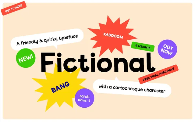
Preview image. Unlock full-res
Whimsical Sticker Bomb
Color palette
Card backgrounds, section separators, bringing a playful and energetic accent
Spot illustrations, card backgrounds, accentuating elements with vibrant energy
Card backgrounds, decorative fills, button hover states, expressing cheerfulness
Card backgrounds, small highlight elements, used sparingly for a fresh pop
Decorative text outlines and accent strokes, providing depth without heaviness
Main page background — a warm, inviting canvas for playful elements
Card surfaces, speech bubbles, primary text on dark backgrounds, ghost button borders
Primary text, prominent headings, strong outlines, and decorative fills
Secondary text, link borders, subtler interface elements
Muted button backgrounds and subtle dividers
Input text and borders
Typography
- Weights
- 400
- Sizes
- 16px, 22px, 29px, 36px, 37px, 40px, 43px, 48px, 50px, 72px, 115px, 202px, 346px
- Line height
- 0.9, 1, 1.1, 1.2, 1.3, 1.4, 1.67, 1.71, 1.88
- Letter spacing
- 0.0120em
- Fallback
- Comic Sans MS
The primary and only typeface, designed to be quirky and highly expressive. Its wide range of sizes and single weight imply a focus on visual impact over traditional typographic hierarchy, with stylistic alternates for a custom feel.
Spacing & shape
Components
Transparent background, Paper White text, Paper White 5px rounded border. No padding specified, implying text-only. Used for navigation and internal links.
Paper White background, with an exaggerated 144px border-radius, giving it a speech bubble shape. Internal padding of 28.8px vertical and 43.2px horizontal. No shadow.
Features a 100% border-radius for a perfect circle shape, with color fills like Grape Punch, Leafy Green. Padding is often asymmetrical or zero depending on content. No shadow.
Light Gray background, Type Black text, 15px border-radius for moderately rounded corners. No padding specified, implying text-only. Used for labels like 'T'.
Transparent background, Input Gray text, Input Gray 0px border. No padding specified. A simple, unobtrusive input style.
Backgrounds in Grape Punch, Sunshine Yellow, Bullet Red, Leafy Green. Features a 15px border-radius. Internal padding of 8px on all sides. No shadow.
Bubblegum Red background with Paper White text. Rectangular with 15px border-radius. Used for 'GET IT HERE' or 'FREE TRIAL AVAILABLE'.
Guidelines
- Always use the Fictional typeface for all text elements to maintain brand personality.
- Utilize Canvas Almond (#ffe9ce) as the primary page background color for a warm, inviting foundation.
- Apply a 15px border-radius for general cards and rectangular accent elements, reserving 5px for smaller buttons and 144px for speech bubble shapes.
- Employ Type Black (#000000) for all primary text content to ensure high contrast against light backgrounds.
- Incorporate vibrant accent colors like Grape Punch (#8a53ff), Sunshine Yellow (#ffd80c), and Bubblegum Red (#fd4b38) for card backgrounds and highlight elements to create visual energy and playfulness.
- Space elements using multiples of the 6px base unit, with a preference for `elementGap` of 12px for tight clusters and `cardPadding` of 29px for content blocks.
- Use ghost buttons with Paper White text and borders for navigation and secondary actions to maintain a light, non-obtrusive interface.
- Avoid using traditional box-shadows; instead, rely on vibrant background colors and irregular shapes for element definition.
- Do not introduce additional font families; the Fictional typeface is the sole typographic voice of the brand.
- Refrain from using heavily structured grid layouts; allow elements to be positioned more organically, like 'sticker bombing'.
- Do not use dark, desaturated colors as primary background elements; the system thrives on a light, warm canvas with vivid accents.
- Avoid strictly symmetrical or rigid component designs; embrace rounded corners and slightly irregular forms.
- Never use generic blue for primary interactive elements; leverage the brand's vibrant palette, especially Grape Punch, Leafy Green, or Bubblegum Red.
- Do not apply padding to ghost buttons; they should appear as text-only interactive elements framed by their borders.
About this system
ShowHide
The Fictional design system embodies a playful and energetic aesthetic, reminiscent of a vibrant children's book. It leverages a lively palette of saturated brand colors against a warm, neutral background. Typography is central to the visual identity, using a custom font that radiates personality. Components feature rounded, often irregular shapes, minimal shadows, and bold color accents, creating an approachable and whimsical user experience.
The page layout is full-bleed, extending content to the edges, creating an expansive feel. The hero section is characterized by a central, oversized headline on the Canvas Almond background, surrounded by 'sticker-bombed' accent cards and speech bubbles. Sections then alternate between full-width colored blocks and more contained multi-column arrangements. Vertical spacing is generous, leveraging sectionGap of 30px, giving visual elements ample breathing room, contributing to a spacious, non-dense feel. Navigation appears as simple ghost buttons, often minimal and contextual.
The site primarily uses iconography and stylistic text as its visual language, rather than traditional imagery. Icons are filled, mono-color, and often appear within circular or starburst shapes. Text itself is treated as a major visual element, with large, expressive characters. Illustrations include speech bubbles and starbursts, filled with solid brand colors, conveying a playful, sticker-like aesthetic. There are no photographs or complex 3D renders; all visuals are graphic and flat, serving to amplify the typeface's friendly and quirky character. Imagery is used decoratively, enhancing the overall cheerful and cartoonish atmosphere.
Reminiscent of Playful typefoundries (e.g. Typewolf's more whimsical selections), Children's book websites, Certain indie game studios, Marketing for 'fun' consumer products.
# Fictional — Style Reference
> Whimsical Sticker Bomb

**Theme:** light

**Site:** https://fictional-typeface.com

The Fictional design system embodies a playful and energetic aesthetic, reminiscent of a vibrant children's book. It leverages a lively palette of saturated brand colors against a warm, neutral background. Typography is central to the visual identity, using a custom font that radiates personality. Components feature rounded, often irregular shapes, minimal shadows, and bold color accents, creating an approachable and whimsical user experience.

## Tokens — Colors

| Name | Value | Token | Role |
|------|------|------|------|
| Grape Punch | `#8a53ff` | `--color-grape-punch` | Card backgrounds, section separators, bringing a playful and energetic accent |
| Bubblegum Red | `#fd4b38` | `--color-bubblegum-red` | Spot illustrations, card backgrounds, accentuating elements with vibrant energy |
| Sunshine Yellow | `#ffd80c` | `--color-sunshine-yellow` | Card backgrounds, decorative fills, button hover states, expressing cheerfulness |
| Leafy Green | `#3ccb09` | `--color-leafy-green` | Card backgrounds, small highlight elements, used sparingly for a fresh pop |
| Deep Indigo | `#0500a3` | `--color-deep-indigo` | Decorative text outlines and accent strokes, providing depth without heaviness |
| Canvas Almond | `#ffe9ce` | `--color-canvas-almond` | Main page background — a warm, inviting canvas for playful elements |
| Paper White | `#ffffff` | `--color-paper-white` | Card surfaces, speech bubbles, primary text on dark backgrounds, ghost button borders |
| Type Black | `#000000` | `--color-type-black` | Primary text, prominent headings, strong outlines, and decorative fills |
| Ash Gray | `#666666` | `--color-ash-gray` | Secondary text, link borders, subtler interface elements |
| Light Gray | `#dddddd` | `--color-light-gray` | Muted button backgrounds and subtle dividers |
| Input Gray | `#101010` | `--color-input-gray` | Input text and borders |

## Tokens — Typography

### Fictional
- **Substitute:** Comic Sans MS
- **Weights:** 400
- **Sizes:** 16px, 22px, 29px, 36px, 37px, 40px, 43px, 48px, 50px, 72px, 115px, 202px, 346px
- **Line height:** 0.9, 1, 1.1, 1.2, 1.3, 1.4, 1.67, 1.71, 1.88
- **Letter spacing:** 0.0120em
- **Role:** The primary and only typeface, designed to be quirky and highly expressive. Its wide range of sizes and single weight imply a focus on visual impact over traditional typographic hierarchy, with stylistic alternates for a custom feel.

## Tokens — Type Scale

| Role | Size | Line height | Letter spacing |
|------|------|------|------|
| body-sm | 16px | 1.71 | — |
| body | 22px | 1.4 | — |
| subheading | 29px | 1.3 | — |
| heading-sm | 36px | 1.2 | — |
| heading | 48px | 1.2 | — |
| heading-lg | 72px | 1.1 | — |
| display | 346px | 0.9 | — |

## Tokens — Spacing

- **Section gap:** 30px
- **Card padding:** 29px
- **Element gap:** 12px

## Tokens — Radius

- **Buttons:** 5px
- **Cards:** 15px
- **speechBubbles:** 144px

## Layout

The page layout is full-bleed, extending content to the edges, creating an expansive feel. The hero section is characterized by a central, oversized headline on the Canvas Almond background, surrounded by 'sticker-bombed' accent cards and speech bubbles. Sections then alternate between full-width colored blocks and more contained multi-column arrangements. Vertical spacing is generous, leveraging sectionGap of 30px, giving visual elements ample breathing room, contributing to a spacious, non-dense feel. Navigation appears as simple ghost buttons, often minimal and contextual.

## Imagery

The site primarily uses iconography and stylistic text as its visual language, rather than traditional imagery. Icons are filled, mono-color, and often appear within circular or starburst shapes. Text itself is treated as a major visual element, with large, expressive characters. Illustrations include speech bubbles and starbursts, filled with solid brand colors, conveying a playful, sticker-like aesthetic. There are no photographs or complex 3D renders; all visuals are graphic and flat, serving to amplify the typeface's friendly and quirky character. Imagery is used decoratively, enhancing the overall cheerful and cartoonish atmosphere.

## Components

### Ghost Button
*Interactive elements with minimal visual footprint, relying on text and soft borders.*

Transparent background, Paper White text, Paper White 5px rounded border. No padding specified, implying text-only. Used for navigation and internal links.

### Speech Bubble Card
*Informative elements or callouts, designed with a hand-drawn, cartoonish feel.*

Paper White background, with an exaggerated 144px border-radius, giving it a speech bubble shape. Internal padding of 28.8px vertical and 43.2px horizontal. No shadow.

### Colorful Round Card
*Highlighting key features or interactive elements, often with vivid colors.*

Features a 100% border-radius for a perfect circle shape, with color fills like Grape Punch, Leafy Green. Padding is often asymmetrical or zero depending on content. No shadow.

### Accent Filled Button
*Secondary action buttons or tags, visually distinct from ghost buttons.*

Light Gray background, Type Black text, 15px border-radius for moderately rounded corners. No padding specified, implying text-only. Used for labels like 'T'.

### Interactive Input
*Basic text input field allowing user data entry.*

Transparent background, Input Gray text, Input Gray 0px border. No padding specified. A simple, unobtrusive input style.

### Quirky Card
*Containers for content, using a variety of vibrant brand colors with a consistent rounded edge.*

Backgrounds in Grape Punch, Sunshine Yellow, Bullet Red, Leafy Green. Features a 15px border-radius. Internal padding of 8px on all sides. No shadow.

### Callout Label (Red)
*Small, urgent, or promotional tags, drawing immediate attention.*

Bubblegum Red background with Paper White text. Rectangular with 15px border-radius. Used for 'GET IT HERE' or 'FREE TRIAL AVAILABLE'.

## Guidelines

### Do

- Always use the Fictional typeface for all text elements to maintain brand personality.
- Utilize Canvas Almond (#ffe9ce) as the primary page background color for a warm, inviting foundation.
- Apply a 15px border-radius for general cards and rectangular accent elements, reserving 5px for smaller buttons and 144px for speech bubble shapes.
- Employ Type Black (#000000) for all primary text content to ensure high contrast against light backgrounds.
- Incorporate vibrant accent colors like Grape Punch (#8a53ff), Sunshine Yellow (#ffd80c), and Bubblegum Red (#fd4b38) for card backgrounds and highlight elements to create visual energy and playfulness.
- Space elements using multiples of the 6px base unit, with a preference for `elementGap` of 12px for tight clusters and `cardPadding` of 29px for content blocks.
- Use ghost buttons with Paper White text and borders for navigation and secondary actions to maintain a light, non-obtrusive interface.

### Don't

- Avoid using traditional box-shadows; instead, rely on vibrant background colors and irregular shapes for element definition.
- Do not introduce additional font families; the Fictional typeface is the sole typographic voice of the brand.
- Refrain from using heavily structured grid layouts; allow elements to be positioned more organically, like 'sticker bombing'.
- Do not use dark, desaturated colors as primary background elements; the system thrives on a light, warm canvas with vivid accents.
- Avoid strictly symmetrical or rigid component designs; embrace rounded corners and slightly irregular forms.
- Never use generic blue for primary interactive elements; leverage the brand's vibrant palette, especially Grape Punch, Leafy Green, or Bubblegum Red.
- Do not apply padding to ghost buttons; they should appear as text-only interactive elements framed by their borders.

## Agent Prompt Guide

Quick Color Reference:
text: #000000
background: #ffe9ce
border: #ffffff
accent: #8a53ff
primary action: no distinct CTA color

Example Component Prompts:
1. Create a hero section with 'Fictional' as the main headline: use Canvas Almond (#ffe9ce) background. Headline 'Fictional' is Type Black (#000000) using Fictional font at 346px, with a 0.9 lineHeight. Overlay a circular accent card behind 'NEW!' with Leafy Green (#3ccb09) background and Paper White text at 16px Fictional. This card should have a 100% border-radius and 8px padding.
2. Design a feature block: Full-width section with Grape Punch (#8a53ff) background. Display 'Fictional Light' as a heading (Fictional font, 48px, Paper White text, 1.2 lineHeight). Center this text vertically.
3. Create an informational speech bubble: Paper White (#ffffff) background with exaggerated 144px border-radius, 28.8px vertical and 43.2px horizontal padding. Body text 'A friendly & quirky typeface' in Type Black (#000000) at 22px Fictional, 1.4 lineHeight.
More like this









Keep what you find
A free account saves references to boards and can send you a weekly email of picks based on what you save.
To see every result, go Pro.