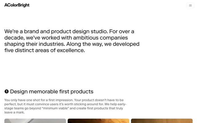
Preview image. Unlock full-res
Gallery Canvas
Color palette
Background for bold branding blocks and case study thumbnails
Accent for case study thumbnails, creating visual pop in grids
Primary text, prominent headings, borders for structural elements, hero content text
Secondary text, muted links, subtle decorative backgrounds, borders for content hierarchy
Tertiary text, button text for ghost buttons, subtle borders
Subtle surface background for alternating sections or distinct content blocks
Page background, primary card surfaces, active button backgrounds, selected items
Icon fills, some body text, accents in contrast to white surfaces
Hairline borders, subtle dividers, ghost button borders
Filled button backgrounds, dark interactive states
Typography
- Weights
- 400
- Sizes
- 12px, 16px, 18px, 24px, 40px
- Line height
- 1.15, 1.2, 1.25
- Letter spacing
- -0.01
- Fallback
- system-ui
The primary typeface for all text content, from headings to body text. Its singular 400 weight across all sizes contributes to a consistent, restrained textual presence. The slight negative letter-spacing gives it a refined, tightly-set feel, even at display sizes.
- Weights
- 400
- Sizes
- 13px
- Line height
- 1.2
Arial — detected in extracted data but not described by AI
Spacing & shape
Components
Background: Paper White (#ffffff), Text: Pure Black (#000000), Border: 1px solid Silver Tone (#e6e6e6), Radius: 8px, Padding: 1px top/bottom, 6px left/right. Font: RiformaLLWeb 400, size based on context.
Background: Deep Graphite (#262626), Text: Ash Gray (#999999), Border: 1px solid Ash Gray (#999999), Radius: 8px, Padding: 12px top/bottom, 16px left/right. Font: RiformaLLWeb 400, size based on context.
Background: transparent (#00000000), Border: none, Radius: 0px, Padding: 0px. Used in grid layouts with prominent imagery.
Background: Vivid Violet (#6a0dad) or Lush Green (#a3ff00), Text: white (assumed based on screenshot), Radius: 12px, Padding varies by content. Imagery within these has a 12px radius.
Text: Ink (#1a1a1a), Font: RiformaLLWeb 400, 40px, Line Height 1.15. Prefixed with a numerical identifier (e.g., '➊') to provide clear section hierarchy.
Guidelines
- Use RiformaLLWeb at weight 400 for all text, varying size for hierarchy and setting letter-spacing to -0.01em.
- Maintain a monochromatic palette with Paper White (#ffffff) as the dominant background and Ink (#1a1a1a) for primary text.
- Apply 12px border radius to all images and larger content cards, and 8px to buttons and small list items.
- Utilize Charcoal Mist (#666666) for secondary text and subtle background fills to introduce visual depth without strong contrast.
- Employ Deep Graphite (#262626) for filled buttons when a clear, direct action is needed.
- Structure page content using a consistent 64px vertical gap between main sections.
- Ensure interactive elements are clearly delineated through subtle borders with Silver Tone (#e6e6e6) or background shifts to Deep Graphite (#262626).
- Avoid introducing additional saturated colors beyond Vivid Violet (#6a0dad) and Lush Green (#a3ff00) as they are reserved for specific brand elements and imagery.
- Do not use heavy shadows or gradients; rely on flat surfaces, clear typography, and subtle borders for hierarchy.
- Refrain from using varied font weights; RiformaLLWeb 400 is the only typeface weight permitted.
- Do not break the clear vertical rhythm of 64px section spacing with arbitrary gaps.
- Avoid overly bold or aggressive calls to action; buttons should be understated but functionally clear.
- Do not use fully justified text; left-align content for a clean reading experience.
- Avoid making content elements look like primary actions when they are not; reserve button styling for explicit interactive elements.
About this system
ShowHide
Acolorbright employs a sophisticated, minimalist aesthetic, using a clean, monochromatic canvas to highlight content and imagery. Typography is precise and confidently understated, defining hierarchy through size and nuanced weight rather than color. Interactive elements are sparse but clearly defined, often using soft borders and subtle background shifts to indicate affordance. The overall impression is one of grounded professionalism and clarity, with design choices geared towards content presentation and subtle interaction rather than overt brand expression through color.
Reminiscent of Stripe, Linear, Framer, Google Material Design.
# Acolorbright — Style Reference
> Gallery Canvas

**Theme:** light

**Site:** https://www.acolorbright.com

Acolorbright employs a sophisticated, minimalist aesthetic, using a clean, monochromatic canvas to highlight content and imagery. Typography is precise and confidently understated, defining hierarchy through size and nuanced weight rather than color. Interactive elements are sparse but clearly defined, often using soft borders and subtle background shifts to indicate affordance. The overall impression is one of grounded professionalism and clarity, with design choices geared towards content presentation and subtle interaction rather than overt brand expression through color.

## Tokens — Colors

| Name | Value | Token | Role |
|------|------|------|------|
| Vivid Violet | `#6a0dad` | `--color-vivid-violet` | Background for bold branding blocks and case study thumbnails |
| Lush Green | `#a3ff00` | `--color-lush-green` | Accent for case study thumbnails, creating visual pop in grids |
| Ink | `#1a1a1a` | `--color-ink` | Primary text, prominent headings, borders for structural elements, hero content text |
| Charcoal Mist | `#666666` | `--color-charcoal-mist` | Secondary text, muted links, subtle decorative backgrounds, borders for content hierarchy |
| Ash Gray | `#999999` | `--color-ash-gray` | Tertiary text, button text for ghost buttons, subtle borders |
| Cloud White | `#f2f2f2` | `--color-cloud-white` | Subtle surface background for alternating sections or distinct content blocks |
| Paper White | `#ffffff` | `--color-paper-white` | Page background, primary card surfaces, active button backgrounds, selected items |
| Pure Black | `#000000` | `--color-pure-black` | Icon fills, some body text, accents in contrast to white surfaces |
| Silver Tone | `#e6e6e6` | `--color-silver-tone` | Hairline borders, subtle dividers, ghost button borders |
| Deep Graphite | `#262626` | `--color-deep-graphite` | Filled button backgrounds, dark interactive states |

## Tokens — Typography

### RiformaLLWeb
- **Substitute:** system-ui
- **Weights:** 400
- **Sizes:** 12px, 16px, 18px, 24px, 40px
- **Line height:** 1.15, 1.2, 1.25
- **Letter spacing:** -0.01
- **Role:** The primary typeface for all text content, from headings to body text. Its singular 400 weight across all sizes contributes to a consistent, restrained textual presence. The slight negative letter-spacing gives it a refined, tightly-set feel, even at display sizes.

### Arial
- **Weights:** 400
- **Sizes:** 13px
- **Line height:** 1.2
- **Role:** Arial — detected in extracted data but not described by AI

## Tokens — Type Scale

Perfect Fourth (1.333) from 16px base.

| Role | Size | Line height | Letter spacing |
|------|------|------|------|
| caption | 12px | 1.25 | -0.12px |
| body | 16px | 1.25 | -0.16px |
| subheading | 18px | 1.25 | -0.18px |
| heading | 24px | 1.2 | -0.24px |
| display | 40px | 1.15 | -0.4px |

## Tokens — Spacing

- **Section gap:** 64px
- **Card padding:** 16px
- **Element gap:** 16px

## Tokens — Radius

- **Buttons:** 8px
- **Cards:** 12px
- **Images:** 12px
- **lists:** 8px

## Components

### Ghost Button
*Secondary action button for low-priority interactions.*

Background: Paper White (#ffffff), Text: Pure Black (#000000), Border: 1px solid Silver Tone (#e6e6e6), Radius: 8px, Padding: 1px top/bottom, 6px left/right. Font: RiformaLLWeb 400, size based on context.

### Filled Button (Dark)
*Primary action button for important interactions.*

Background: Deep Graphite (#262626), Text: Ash Gray (#999999), Border: 1px solid Ash Gray (#999999), Radius: 8px, Padding: 12px top/bottom, 16px left/right. Font: RiformaLLWeb 400, size based on context.

### Feature Card
*Container for showcasing projects or service areas.*

Background: transparent (#00000000), Border: none, Radius: 0px, Padding: 0px. Used in grid layouts with prominent imagery.

### Case Study Thumbnail
*Visual link to detailed case studies within grids.*

Background: Vivid Violet (#6a0dad) or Lush Green (#a3ff00), Text: white (assumed based on screenshot), Radius: 12px, Padding varies by content. Imagery within these has a 12px radius.

### Service Section Header
*Numbered heading for main content sections.*

Text: Ink (#1a1a1a), Font: RiformaLLWeb 400, 40px, Line Height 1.15. Prefixed with a numerical identifier (e.g., '➊') to provide clear section hierarchy.

## Guidelines

### Do

- Use RiformaLLWeb at weight 400 for all text, varying size for hierarchy and setting letter-spacing to -0.01em.
- Maintain a monochromatic palette with Paper White (#ffffff) as the dominant background and Ink (#1a1a1a) for primary text.
- Apply 12px border radius to all images and larger content cards, and 8px to buttons and small list items.
- Utilize Charcoal Mist (#666666) for secondary text and subtle background fills to introduce visual depth without strong contrast.
- Employ Deep Graphite (#262626) for filled buttons when a clear, direct action is needed.
- Structure page content using a consistent 64px vertical gap between main sections.
- Ensure interactive elements are clearly delineated through subtle borders with Silver Tone (#e6e6e6) or background shifts to Deep Graphite (#262626).

### Don't

- Avoid introducing additional saturated colors beyond Vivid Violet (#6a0dad) and Lush Green (#a3ff00) as they are reserved for specific brand elements and imagery.
- Do not use heavy shadows or gradients; rely on flat surfaces, clear typography, and subtle borders for hierarchy.
- Refrain from using varied font weights; RiformaLLWeb 400 is the only typeface weight permitted.
- Do not break the clear vertical rhythm of 64px section spacing with arbitrary gaps.
- Avoid overly bold or aggressive calls to action; buttons should be understated but functionally clear.
- Do not use fully justified text; left-align content for a clean reading experience.
- Avoid making content elements look like primary actions when they are not; reserve button styling for explicit interactive elements.

## Agent Prompt Guide

Quick Color Reference:
text: #1a1a1a
background: #ffffff
border: #e6e6e6
accent: #6a0dad
primary action: no distinct CTA color

Example Component Prompts:
1. Create a primary text header: 'Our Work' in RiformaLLWeb 400 at 40px, Ink (#1a1a1a), letter-spacing -0.01em, line-height 1.15. Place it centered with a 64px top margin.
2. Create a ghost button: Text 'View Details' in RiformaLLWeb 400 16px, Pure Black (#000000). Background is Paper White (#ffffff), with a 1px solid Silver Tone (#e6e6e6) border, and 8px radius. Padding 1px top/bottom, 6px left/right.
3. Create a Case Study Thumbnail card: Background Lush Green (#a3ff00), with a 12px border radius. Include a section for an image which also has a 12px radius, and a title on top of it, in RiformaLLWeb 400 18px and white text. Leave internal padding and specific image details to the agent, assume image is full width of card.
More like this









Keep what you find
A free account saves references to boards and can send you a weekly email of picks based on what you save.
To see every result, go Pro.