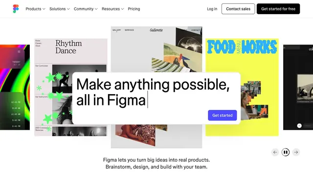
Preview image. Unlock full-res
monochrome chassis for chromatic chaos
Color palette
Localized primary CTA within utility panels—a singular interruptive color defining the focal execution point
Decorative sweeps, loading indicators, and active cursor visuals
Page background, floating toolbars, elevated panel bases
Primary typography, global solid button backgrounds, outlined button strokes
Secondary author text, localized component subtext, placeholder values
Subtle hair-line dividers and inactive input field bounds
Typography
- Weights
- 320, 330, 340, 400, 450, 480, 520, 700
- Sizes
- 16px, 18px, 24px, 56px, 72px
- Line height
- 1
- Letter spacing
- -0.0200em, -0.0150em, -0.0100em, -0.0090em, -0.0080em, -0.0070em, -0.0050em
- Fallback
- Inter
Universal workhorse driving everything from display headers to navigational labels. Defines personality through varying optical negative tracking.
- Weights
- 400
- Sizes
- 12px, 16px
- Line height
- 1, 1.3
- Letter spacing
- 0.0300em, 0.0500em
- Fallback
- JetBrains Mono
Micro-labels, coordinate tracking, and technical subtext functioning as UI chrome rather than content.
Spacing & shape
Components
backgroundColor #000000, color #ffffff, extreme borderRadius 50px, padding 8px 18px. Typographically set in 16px weight 480.
Transparent background with a 1.5px solid #000000 border, text #000000. borderRadius 50px, padding 8px 18px.
backgroundColor #ffffff, borderRadius 16px. Padding 16px all around, defined by an aggressive standalone shadow: rgba(0,0,0,0.1) 0px 24px 70px 0px.
backgroundColor #4d49fc, color #ffffff. Notably distinct borderRadius of 8px (differentiating it from 50px global pills), padding 8px 16px.
Strict 0px borderRadius grid cell. Image spans 100% full width to bleed at the top, bottom metadata stack uses 12px vertical gaps and no horizontal bounding padding against the grid frame.
Guidelines
- Enforce absolute #000000 for primary typography matrices—rely on weight and harsh negative tracking (-1.44px at display sizes) for hierarchy instead of greys.
- Pair the 50px pill paradigm explicitly and exclusively with global navbar / page-level navigation elements.
- Maintain raw 0px corners on community and gallery containers to strip away UI artifacts from structural content layouts.
- Use #4d49fc strictly as an inner-panel interruptive signal, never for global headers or marketing backgrounds.
- Limit drop shadows strictly to workspace/prompt panels that float structurally above the canvas; do not apply baseline shadows to grid items.
- Do not dilute body content with #595959 text; force high contrast #000000 on #ffffff for all core structural strings.
- Do not mix button border geometries—never use an 8px radius in the header, and never use 50px pills within an elevated prompt panel.
- Do not frame or stroke image artwork thumbnails; let the unstyled edge define the visual rectangle inside the card space.
- Never apply hover elevation—use pure background-color offsets or opacity changes, reserving box-shadow for persistent Z-index tiers.
- Avoid decorative colored blocks in the UI system—constrain #24cb71, #00b6ff, #ff7237 exclusively to actual artwork or avatar renders.
About this system
ShowHide
The interface operates as a strict, high-contrast structural container that entirely defers visual dominance to user-generated content. A stark #000000 on #ffffff palette forms the baseline, eschewing subtle grays in favor of absolute maximum contrast for primary boundaries and text. Typographic hierarchy relies almost purely on size and aggressive negative tracking rather than color variation, turning large text strings into dense graphical blocks. The border-radius logic enforces a severe dichotomy: 50px extreme pills for global navigation elements clashing intentionally against completely sharp 0px corners on content containers.
Compositions rely on extreme maximum-width boundaries (1440px max) centering the viewport, utilizing tight clusters of content separated by massive macro-whitespace (96-120px section gaps). The hero archetype frequently stacks an asymmetric gallery-wall of images pinned dynamically beneath a floating, perfectly-centered UI block. Below the fold, information conforms immediately to strict 4-column unpadded grid architecture framing repeated card clusters, maximizing object density while eliminating frame padding.
User-centric outputs completely govern the image domain. Assets appear as flat, unbordered 0px squares or scattered, overlapping physical-like cuts set against a stark void. The imagery operates as the only source of chroma on the site. There are zero lifestyle photography elements or generic corporate illustrations—every graphic is an exact, literal snapshot of a digital canvas creation, functioning both as proof of product and primary aesthetic payload.
Reminiscent of Apple, Notion, Vercel.
# Figma — Style Reference
> monochrome chassis for chromatic chaos

**Theme:** light

**Site:** https://figma.com

The interface operates as a strict, high-contrast structural container that entirely defers visual dominance to user-generated content. A stark #000000 on #ffffff palette forms the baseline, eschewing subtle grays in favor of absolute maximum contrast for primary boundaries and text. Typographic hierarchy relies almost purely on size and aggressive negative tracking rather than color variation, turning large text strings into dense graphical blocks. The border-radius logic enforces a severe dichotomy: 50px extreme pills for global navigation elements clashing intentionally against completely sharp 0px corners on content containers.

## Tokens — Colors

| Name | Value | Token | Role |
|------|------|------|------|
| Context Action Violet | `#4d49fc` | `--color-context-action-violet` | Localized primary CTA within utility panels—a singular interruptive color defining the focal execution point |
| Angular Teal | `#33dfdf` | `--color-angular-teal` | Decorative sweeps, loading indicators, and active cursor visuals |
| Absolute Canvas | `#ffffff` | `--color-absolute-canvas` | Page background, floating toolbars, elevated panel bases |
| Structural Ink | `#000000` | `--color-structural-ink` | Primary typography, global solid button backgrounds, outlined button strokes |
| Graphite Metadata | `#595959` | `--color-graphite-metadata` | Secondary author text, localized component subtext, placeholder values |
| Boundary Frame | `#e2e2e2` | `--color-boundary-frame` | Subtle hair-line dividers and inactive input field bounds |

## Tokens — Typography

### figmaSans
- **Substitute:** Inter
- **Weights:** 320, 330, 340, 400, 450, 480, 520, 700
- **Sizes:** 16px, 18px, 24px, 56px, 72px
- **Line height:** 1
- **Letter spacing:** -0.0200em, -0.0150em, -0.0100em, -0.0090em, -0.0080em, -0.0070em, -0.0050em
- **Role:** Universal workhorse driving everything from display headers to navigational labels. Defines personality through varying optical negative tracking.

### figmaMono
- **Substitute:** JetBrains Mono
- **Weights:** 400
- **Sizes:** 12px, 16px
- **Line height:** 1, 1.3
- **Letter spacing:** 0.0300em, 0.0500em
- **Role:** Micro-labels, coordinate tracking, and technical subtext functioning as UI chrome rather than content.

## Tokens — Type Scale

Augmented Fourth (1.414) from 18px base.

| Role | Size | Line height | Letter spacing |
|------|------|------|------|
| caption | 12px | 1 | 0.36px |
| body-sm | 16px | 1.4 | -0.08em |
| body | 18px | 1.4 | -0.13px |
| subheading | 24px | 1.3 | -0.24px |
| heading | 56px | 1.1 | -0.5px |
| display | 72px | 1 | -1.44px |

## Tokens — Spacing

- **Max width:** 1440px
- **Section gap:** 96-120px
- **Card padding:** 16px
- **Element gap:** 24px

## Tokens — Radius

- **contentCards:** 0px
- **contextualButtons:** 8px
- **floatingPanels:** 16px
- **globalNavButtons:** 50px

## Layout

Compositions rely on extreme maximum-width boundaries (1440px max) centering the viewport, utilizing tight clusters of content separated by massive macro-whitespace (96-120px section gaps). The hero archetype frequently stacks an asymmetric gallery-wall of images pinned dynamically beneath a floating, perfectly-centered UI block. Below the fold, information conforms immediately to strict 4-column unpadded grid architecture framing repeated card clusters, maximizing object density while eliminating frame padding.

## Imagery

User-centric outputs completely govern the image domain. Assets appear as flat, unbordered 0px squares or scattered, overlapping physical-like cuts set against a stark void. The imagery operates as the only source of chroma on the site. There are zero lifestyle photography elements or generic corporate illustrations—every graphic is an exact, literal snapshot of a digital canvas creation, functioning both as proof of product and primary aesthetic payload.

## Components

### Button Group — Global Action Pills

### Prompt Input Panel

### Community Artifact Cards

### Global Action Pill
*Page-level CTA and authentication boundaries*

backgroundColor #000000, color #ffffff, extreme borderRadius 50px, padding 8px 18px. Typographically set in 16px weight 480.

### Navigation Utility Pill
*Secondary global actions structurally matched to primary pill*

Transparent background with a 1.5px solid #000000 border, text #000000. borderRadius 50px, padding 8px 18px.

### Prompt Input Panel
*The central elevated workspace orchestrator*

backgroundColor #ffffff, borderRadius 16px. Padding 16px all around, defined by an aggressive standalone shadow: rgba(0,0,0,0.1) 0px 24px 70px 0px.

### Panel Execution CTA
*The localized trigger within a Prompt Input Panel*

backgroundColor #4d49fc, color #ffffff. Notably distinct borderRadius of 8px (differentiating it from 50px global pills), padding 8px 16px.

### Community Artifact Card
*Container framework for raw user-generated output*

Strict 0px borderRadius grid cell. Image spans 100% full width to bleed at the top, bottom metadata stack uses 12px vertical gaps and no horizontal bounding padding against the grid frame.

## Guidelines

### Do

- Enforce absolute #000000 for primary typography matrices—rely on weight and harsh negative tracking (-1.44px at display sizes) for hierarchy instead of greys.
- Pair the 50px pill paradigm explicitly and exclusively with global navbar / page-level navigation elements.
- Maintain raw 0px corners on community and gallery containers to strip away UI artifacts from structural content layouts.
- Use #4d49fc strictly as an inner-panel interruptive signal, never for global headers or marketing backgrounds.
- Limit drop shadows strictly to workspace/prompt panels that float structurally above the canvas; do not apply baseline shadows to grid items.

### Don't

- Do not dilute body content with #595959 text; force high contrast #000000 on #ffffff for all core structural strings.
- Do not mix button border geometries—never use an 8px radius in the header, and never use 50px pills within an elevated prompt panel.
- Do not frame or stroke image artwork thumbnails; let the unstyled edge define the visual rectangle inside the card space.
- Never apply hover elevation—use pure background-color offsets or opacity changes, reserving box-shadow for persistent Z-index tiers.
- Avoid decorative colored blocks in the UI system—constrain #24cb71, #00b6ff, #ff7237 exclusively to actual artwork or avatar renders.

## Agent Prompt Guide

### Quick Color Reference
- Canvas Background: `#ffffff`
- Structural Text & Actions: `#000000`
- Contextual Brand CTA: `#4d49fc`
- Subtext Metadata: `#595959`
- Field Bounds: `#e2e2e2`

### Example Component Prompts
1. **Build a Global Navigation Action:** Create a solid black (#000000) pill button with white (#ffffff) text 'Get started for free' set in figmaSans 16px lock-up. Assign a 50px border-radius and use 8px top/bottom, 18px left/right padding.
2. **Generate the Floating Prompt Box:** Layout an absolute white (#ffffff) container with 16px padding and an exact 16px border-radius. Apply the mandatory focal box-shadow of `rgba(0,0,0,0.1) 0px 24px 70px 0px`. Inside, set a large prompt text 'Make anything possible' at size 56px, tracking at -0.5px. Add an internal 'Get started' button using #4d49fc background, white text, and a rigid 8px border-radius.
3. **Assemble a Community Card Array:** Create a 4-column grid using a 24px element gap. Each card must have exactly a 0px border-radius and background transparent. The top half is an image bleeding literally to all boundary edges. Below, write a bold structural title in #000000 at 16px, immediately followed underneath by an author string in #595959 at 12px figmaMono.
More like this









Keep what you find
A free account saves references to boards and can send you a weekly email of picks based on what you save.
To see every result, go Pro.