Preview image. Unlock full-res
Editorial canvas, artful typography
Color palette
Key accent color, used for prominent graphic elements and visual focal points, particularly within imagery or abstract shapes
Primary text, borders for outlines, decorative accents, button outlines. Creates a stark contrast against light backgrounds
Dominant page background, providing a soft, warm base for content
Subtle background for alternate sections or elements, offering a slight visual break from the main canvas
Typography
- Weights
- 400
- Sizes
- 18px, 70px
- Line height
- 0.8, 1.25
- Fallback
- Montserrat Thin
Headlines and prominent display text. The light weight at large sizes creates an airy, elegant, and almost whisper-like presence, contrasting typical bold headline conventions.
- Weights
- 400
- Sizes
- 14px, 18px
- Line height
- 1.25
- Fallback
- Montserrat
Body text, links, and button labels. Provides clarity and an understated yet distinctive feel, complementing the lighter headline variant.
- Weights
- 400
- Sizes
- 18px, 70px
- Line height
- 0.8, 1.25
- Fallback
- Playfair Display
Decorative text and stylistic elements, often used for wordmark or specific typographic flourishes due to its unique character.
Spacing & shape
Components
Transparent background, text color 'Ink' (#000000), no border or padding initially, adapting to content naturally. Provides functionality without visual weight.
Circular button with 'Ink' (#000000) border, 9999px border-radius, transparent background, and 'Ink' (#000000) text. Text 'M e n u' implies an open character spacing.
Each line of text is typically 'Moche Light' at 70px, weight 400, color 'Ink' (#000000), with a line-height of 0.8. They are arranged vertically with the element gap of 20px.
Guidelines
- Prioritize 'Ink' (#000000) for all text and UI outlines, establishing strong contrast against light backgrounds.
- Utilize 'Canvas' (#fef7ef) as the predominant background color for all main content areas.
- Employ 'Moche Light' for all primary headings at 70px to convey a light, elegant tone, using a line-height of 0.8.
- Maintain uniform 0px border-radius for all primary UI elements to preserve a crisp, angular aesthetic.
- Implement the 71px 'sectionGap' consistently between major content blocks for generous vertical rhythm.
- Embed the 'Art Blue' (#3d50ff) accent selectively, primarily for artistic graphic elements or distinctive visual highlights, not for general UI.
- Keep interactive controls like buttons simple with transparent backgrounds and 'Ink' (#000000) text as ghost elements.
- Avoid using bold or heavy font weights for headlines; the lightness of 'Moche Light' is a signature characteristic.
- Do not introduce strong saturations or hues beyond 'Art Blue' and the muted neutrals; the palette is intentionally restrained.
- Refrain from using shadows or strong elevation effects; the design emphasizes flat surfaces and crisp outlines.
- Do not deviate from the 0px border-radius for non-circular components; sharp edges are essential to the aesthetic.
- Do not fill buttons with solid colors; all primary interactive elements should remain ghosted or outlined.
- Avoid dense information layouts; spaciousness between elements is crucial for the design's breathability and elegance.
- Do not use generic system fonts; custom fonts 'Moche', 'Moche Light', and 'Forno-r' are integral to the brand's typographic identity.
About this system
ShowHide
Studio Tumulte employs a minimal, artistic design language centered around a muted, almost-achromatic palette, punctuated by a single, strong blue accent. The layout is spacious, with content given ample room to breathe. Typography is a core expressive element, featuring custom fonts that lend a distinctive, editorial feel, while components are kept understated and border-focused, allowing content and subtle visual flair to dominate.
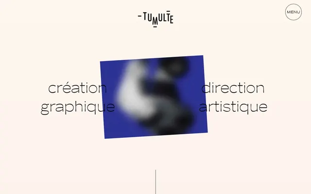
The page adheres to a max-width 1354px contained layout, centered on a background of 'Canvas'. The hero section features a centered, multi-line typographic headline (Moche Light) with an abstract art piece slightly rotated and layered within it, setting a unique, editorial tone. Sections maintain a consistent 'sectionGap' of 71px, creating a spacious vertical rhythm. Content arrangement is typically centered or in two-column structures with text and imagery, favoring an artful, asymmetrical balance over strict grids. Navigation is minimal, limited to a circular menu toggle in the top right. The overall impression is one of artful curation and generous breathing room.
The site uses a mix of abstract, artistic photography, and product-focused imagery. Photography often features blurred or distorted subjects, sometimes tinted with brand accent colors like 'Art Blue' or soft gradients, creating an ethereal and artistic mood rather than descriptive realism. Imagery is frequently contained within distinct shapes, sometimes rotated slightly, breaking free from traditional grid alignment. Icons, if visible, are minimalist outlines. Image density is moderate, used to punctuate textual content and establish atmospheric breaks rather than illustrate every point.
Reminiscent of AIGA, Pentagram, Actual Source, Kerning Cultures.
# Studio Tumulte — Style Reference
> Editorial canvas, artful typography

**Theme:** light

**Site:** https://studio-tumulte.com

Studio Tumulte employs a minimal, artistic design language centered around a muted, almost-achromatic palette, punctuated by a single, strong blue accent. The layout is spacious, with content given ample room to breathe. Typography is a core expressive element, featuring custom fonts that lend a distinctive, editorial feel, while components are kept understated and border-focused, allowing content and subtle visual flair to dominate.

## Tokens — Colors

| Name | Value | Token | Role |
|------|------|------|------|
| Art Blue | `#3d50ff` | `--color-art-blue` | Key accent color, used for prominent graphic elements and visual focal points, particularly within imagery or abstract shapes |
| Ink | `#000000` | `--color-ink` | Primary text, borders for outlines, decorative accents, button outlines. Creates a stark contrast against light backgrounds |
| Canvas | `#fef7ef` | `--color-canvas` | Dominant page background, providing a soft, warm base for content |
| Soft Taupe | `#eedfd9` | `--color-soft-taupe` | Subtle background for alternate sections or elements, offering a slight visual break from the main canvas |

## Tokens — Typography

### Moche Light
- **Substitute:** Montserrat Thin
- **Weights:** 400
- **Sizes:** 18px, 70px
- **Line height:** 0.8, 1.25
- **Role:** Headlines and prominent display text. The light weight at large sizes creates an airy, elegant, and almost whisper-like presence, contrasting typical bold headline conventions.

### Moche
- **Substitute:** Montserrat
- **Weights:** 400
- **Sizes:** 14px, 18px
- **Line height:** 1.25
- **Role:** Body text, links, and button labels. Provides clarity and an understated yet distinctive feel, complementing the lighter headline variant.

### Forno-r
- **Substitute:** Playfair Display
- **Weights:** 400
- **Sizes:** 18px, 70px
- **Line height:** 0.8, 1.25
- **Role:** Decorative text and stylistic elements, often used for wordmark or specific typographic flourishes due to its unique character.

## Tokens — Spacing

- **Max width:** 1354px
- **Section gap:** 71px
- **Card padding:** 18px
- **Element gap:** 20px

## Tokens — Radius

- **Buttons:** 0px
- **menuIcon:** 9999px

## Layout

The page adheres to a max-width 1354px contained layout, centered on a background of 'Canvas'. The hero section features a centered, multi-line typographic headline (Moche Light) with an abstract art piece slightly rotated and layered within it, setting a unique, editorial tone. Sections maintain a consistent 'sectionGap' of 71px, creating a spacious vertical rhythm. Content arrangement is typically centered or in two-column structures with text and imagery, favoring an artful, asymmetrical balance over strict grids. Navigation is minimal, limited to a circular menu toggle in the top right. The overall impression is one of artful curation and generous breathing room.

## Imagery

The site uses a mix of abstract, artistic photography, and product-focused imagery. Photography often features blurred or distorted subjects, sometimes tinted with brand accent colors like 'Art Blue' or soft gradients, creating an ethereal and artistic mood rather than descriptive realism. Imagery is frequently contained within distinct shapes, sometimes rotated slightly, breaking free from traditional grid alignment. Icons, if visible, are minimalist outlines. Image density is moderate, used to punctuate textual content and establish atmospheric breaks rather than illustrate every point.

## Components

### Ghost Button
*Interactive elements, navigations, often appearing as plain text with hover states.*

Transparent background, text color 'Ink' (#000000), no border or padding initially, adapting to content naturally. Provides functionality without visual weight.

### Menu Toggle Circle
*Primary navigation trigger, always visible with a distinct visual style.*

Circular button with 'Ink' (#000000) border, 9999px border-radius, transparent background, and 'Ink' (#000000) text. Text 'M e n u' implies an open character spacing.

### Headline Stack
*Prominent textual content sections, often appearing in two lines.*

Each line of text is typically 'Moche Light' at 70px, weight 400, color 'Ink' (#000000), with a line-height of 0.8. They are arranged vertically with the element gap of 20px.

## Guidelines

### Do

- Prioritize 'Ink' (#000000) for all text and UI outlines, establishing strong contrast against light backgrounds.
- Utilize 'Canvas' (#fef7ef) as the predominant background color for all main content areas.
- Employ 'Moche Light' for all primary headings at 70px to convey a light, elegant tone, using a line-height of 0.8.
- Maintain uniform 0px border-radius for all primary UI elements to preserve a crisp, angular aesthetic.
- Implement the 71px 'sectionGap' consistently between major content blocks for generous vertical rhythm.
- Embed the 'Art Blue' (#3d50ff) accent selectively, primarily for artistic graphic elements or distinctive visual highlights, not for general UI.
- Keep interactive controls like buttons simple with transparent backgrounds and 'Ink' (#000000) text as ghost elements.

### Don't

- Avoid using bold or heavy font weights for headlines; the lightness of 'Moche Light' is a signature characteristic.
- Do not introduce strong saturations or hues beyond 'Art Blue' and the muted neutrals; the palette is intentionally restrained.
- Refrain from using shadows or strong elevation effects; the design emphasizes flat surfaces and crisp outlines.
- Do not deviate from the 0px border-radius for non-circular components; sharp edges are essential to the aesthetic.
- Do not fill buttons with solid colors; all primary interactive elements should remain ghosted or outlined.
- Avoid dense information layouts; spaciousness between elements is crucial for the design's breathability and elegance.
- Do not use generic system fonts; custom fonts 'Moche', 'Moche Light', and 'Forno-r' are integral to the brand's typographic identity.

## Agent Prompt Guide

Quick Color Reference:
text: #000000
background: #fef7ef
border: #000000
accent: #3d50ff
primary action: no distinct CTA color

Example Component Prompts:
1. Create a hero section: 'Canvas' (#fef7ef) background. Centered headline 'création graphique' in two lines, 'Moche Light' weight 400, 70px, lineHeight 0.8, color 'Ink' (#000000). Embed a 400x400px image with a slight rotation at its center, using 'Art Blue' (#3d50ff) as a dominant color.
2. Create a navigation toggle: Circular button with a 9999px border-radius, 'Ink' (#000000) 1px border, transparent background, and text 'M e n u' in 'Moche' weight 400, 14px, #000000.
3. Create a content section with a subtle background: Use 'Soft Taupe' (#eedfd9) for the background. Include a block of body text (e.g., promotional text) in 'Moche' weight 400, 18px, 'Ink' (#000000), with 'cardPadding' of '18px'. Max-width should be '1354px' and centered.
More like this









Keep what you find
A free account saves references to boards and can send you a weekly email of picks based on what you save.
To see every result, go Pro.