Preview image. Unlock full-res
Punchy Pulp Comic
Color palette
Page background, large hero sections
Yellow accent for outlined action borders, linked labels, and lightweight interactive emphasis. Do not promote it to the primary CTA color
Secondary brand accent for text, outlined elements, and some card elements
Card backgrounds, creating visual breaks from the main Grape Soda background
Footer background, providing a grounding, darker tone
Specific card backgrounds, adding variety to the color palette for content blocks
Specific card backgrounds, puncturing the palette with a bold red
Muted accent for borders and text, offering a softer alternative to the main brand colors
Muted accent for borders and text, providing a natural tone amidst the more vivid brand colors
Primary text, borders, and icon fills
Hairline borders, dividers, input outlines, and card edges on light surfaces. Do not promote it to the primary CTA color
Muted text, some borders, and secondary backgrounds
Typography
- Weights
- 800, 900
- Sizes
- 18px, 20px, 30px, 100px, 113px, 130px, 133px, 149px, 184px, 241px, 244px, 341px
- Line height
- 0.8, 0.9, 1
- Letter spacing
- 0.02em
Primary display and heading font. Its heavy weights and wide letter-spacing create a bold, impactful, and almost stamped visual style.
- Weights
- 400
- Sizes
- 10px
- Line height
- 1
- Letter spacing
- normal
Body text and functional labels, providing a clean, legible contrast to the expressive headings.
- Weights
- 700
- Sizes
- 16px
- Line height
- 1
- Letter spacing
- 0.05em
Subheadings and emphasized text, offering a slightly more pronounced weight and tracking than regular body text.
- Weights
- 400, 600
- Sizes
- 12px, 14px
- Line height
- 0.8, 1
- Letter spacing
- normal
- Fallback
- Space Mono
Navigation and utility text, contributing a technical, legible feel with its monospaced origin.
Spacing & shape
Components
Transparent background with a 3px Lemon Drop (#f4ed36) border, 0px border-radius, and Licorice Stick (#000000) text. Padding is implied by text size as 0px from raw data.
Transparent background with a 3px Licorice Stick (#000000) border, 0px border-radius, and Licorice Stick (#000000) text. Padding is implied by text size as 0px from raw data.
Transparent background with no border, Whipped Cream (#f9f5f2) text. Padding is implied by text size as 0px from raw data.
Transparent background with no border, Licorice Stick (#000000) text. Padding is implied by text size as 0px from raw data.
Transparent background, 6px border-radius, no shadow, with 17px padding on all sides. Primarily houses content without a distinct background color.
Solid Deep Plum (#61609a) background, 6px border-radius, no shadow, with 17px padding on all sides.
Solid Orchid Bloom (#ac4f98) background, 6px border-radius, no shadow, with 17px padding on all sides.
Solid Crimson Pop (#c94245) background, 6px border-radius, no shadow, with 17px padding on all sides.
Guidelines
- Use Grape Soda (#8584bd) as the default background for full-page sections to uphold the brand's energetic foundation.
- Apply Lemon Drop (#f4ed36) exclusively for high-impact headlines and outlined calls-to-action, balancing its vividness with the background.
- Utilize ObviouslyVariable Bold for all headlines, employing letter-spacing 0.02em and scaling sizes to achieve visual dominance.
- Always apply a 3px solid border to interactive elements, preferring Lemon Drop (#f4ed36) for primary actions and Licorice Stick (#000000) for secondary options.
- Ensure all card elements have a border-radius of 6px, providing a subtle softness against otherwise sharp edges.
- Employ Licorice Stick (#000000) as the primary text color on light backgrounds and Lemon Drop (#f4ed36) or Whipped Cream (#f9f5f2) on dark backgrounds for accessibility.
- Maintain a default element gap of 17px and card padding of 17px for consistent visual breathing room within components.
- Do not use generic system shadows or subtle gradients; the design relies on flat blocks and sharp contrasts for its personality.
- Avoid solid filled buttons for primary actions; prioritize the outlined button style with a 3px border in brand colors.
- Do not introduce new typefaces; restrict typography to ObviouslyVariable, DegularVariable, and bergen_monoregular as specified.
- Do not use neutral colors as primary accents; color should always convey energy and brand personality.
- Do not vary card radii; all cards should consistently use a 6px border-radius.
- Avoid dense, information-heavy layouts; sections should breathe with ample vertical and horizontal spacing.
- Do not use subtle color variations for hierarchy; use distinct chromatic colors or strong achromatic contrast for clear differentiation.
About this system
ShowHide
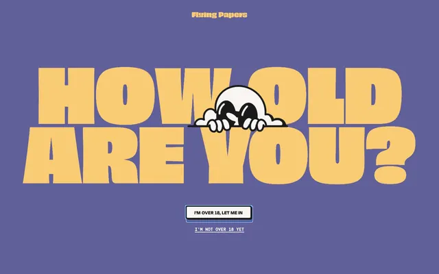
Flying Papers uses a vibrant, playful visual language with high-contrast color pairings and bold, expressive typography. The design emphasizes chunky, outlined elements and a distinct personality, favoring blocky shapes and thick borders over subtle gradients or shadows. Color is used to define graphic blocks and highlight key information, rather than for deep hierarchy or functional states. The overall impression is energetic and almost cartoonish.
The page employs a full-bleed layout for its main sections, with content often centered or using large, blocky elements. The hero section is dominated by a large, centered headline and a graphic element against a full-width brand background. Subsequent sections follow a consistent vertical rhythm, often featuring alternating background colors. Content is typically arranged in clear, stacked blocks or occasionally in two-column layouts. The presence of card variants suggests a grid-like arrangement for some content blocks, breaking up the full-width flow. Navigation is generally a minimal top bar, suggesting an informal approach, and the footer is clearly defined with a distinct background.
The site's imagery focuses on an almost cartoonish, often abstract, and slightly mischievous aesthetic. This is exemplified by the peering character on the hero screen. There's a strong preference for icons over photography and a visual language that feels illustrative and graphic, almost like a bold sticker or comic book art. Graphics are typically filled, not outlined, and utilize the brand's vivid color palette. They serve a decorative and brand-reinforcing role rather than providing literal product showcases or realistic context. Imagery density is moderate, with key graphics acting as focal points.
Reminiscent of Brainpop, Mailchimp (old branding), Bravado, Liquid Death.
# Flying Papers — Style Reference
> Punchy Pulp Comic

**Theme:** light

**Site:** https://www.flyingpapers.com

Flying Papers uses a vibrant, playful visual language with high-contrast color pairings and bold, expressive typography. The design emphasizes chunky, outlined elements and a distinct personality, favoring blocky shapes and thick borders over subtle gradients or shadows. Color is used to define graphic blocks and highlight key information, rather than for deep hierarchy or functional states. The overall impression is energetic and almost cartoonish.

## Tokens — Colors

| Name | Value | Token | Role |
|------|------|------|------|
| Grape Soda | `#8584bd` | `--color-grape-soda` | Page background, large hero sections |
| Lemon Drop | `#f4ed36` | `--color-lemon-drop` | Yellow accent for outlined action borders, linked labels, and lightweight interactive emphasis. Do not promote it to the primary CTA color |
| Warm Dough | `#f9cc73` | `--color-warm-dough` | Secondary brand accent for text, outlined elements, and some card elements |
| Deep Plum | `#61609a` | `--color-deep-plum` | Card backgrounds, creating visual breaks from the main Grape Soda background |
| Forest Floor | `#375027` | `--color-forest-floor` | Footer background, providing a grounding, darker tone |
| Orchid Bloom | `#ac4f98` | `--color-orchid-bloom` | Specific card backgrounds, adding variety to the color palette for content blocks |
| Crimson Pop | `#c94245` | `--color-crimson-pop` | Specific card backgrounds, puncturing the palette with a bold red |
| Rose Blush | `#f8c1ba` | `--color-rose-blush` | Muted accent for borders and text, offering a softer alternative to the main brand colors |
| Sage Clay | `#b5c995` | `--color-sage-clay` | Muted accent for borders and text, providing a natural tone amidst the more vivid brand colors |
| Licorice Stick | `#000000` | `--color-licorice-stick` | Primary text, borders, and icon fills |
| Whipped Cream | `#f9f5f2` | `--color-whipped-cream` | Hairline borders, dividers, input outlines, and card edges on light surfaces. Do not promote it to the primary CTA color |
| Deep Charcoal | `#1a1a1a` | `--color-deep-charcoal` | Muted text, some borders, and secondary backgrounds |

## Tokens — Typography

### ObviouslyVariable
- **Weights:** 800, 900
- **Sizes:** 18px, 20px, 30px, 100px, 113px, 130px, 133px, 149px, 184px, 241px, 244px, 341px
- **Line height:** 0.8, 0.9, 1
- **Letter spacing:** 0.02em
- **Role:** Primary display and heading font. Its heavy weights and wide letter-spacing create a bold, impactful, and almost stamped visual style.

### DegularVariable
- **Weights:** 400
- **Sizes:** 10px
- **Line height:** 1
- **Letter spacing:** normal
- **Role:** Body text and functional labels, providing a clean, legible contrast to the expressive headings.

### DegularDisplay-Bold
- **Weights:** 700
- **Sizes:** 16px
- **Line height:** 1
- **Letter spacing:** 0.05em
- **Role:** Subheadings and emphasized text, offering a slightly more pronounced weight and tracking than regular body text.

### bergen_monoregular
- **Substitute:** Space Mono
- **Weights:** 400, 600
- **Sizes:** 12px, 14px
- **Line height:** 0.8, 1
- **Letter spacing:** normal
- **Role:** Navigation and utility text, contributing a technical, legible feel with its monospaced origin.

## Tokens — Type Scale

| Role | Size | Line height | Letter spacing |
|------|------|------|------|
| caption | 10px | 1 | — |
| body | 14px | 0.8 | — |
| heading | 18px | 1 | 0.36px |
| heading-lg | 20px | 1 | 0.4px |
| display-sm | 30px | 0.9 | 0.6px |
| display-md | 100px | 0.8 | 2px |
| display | 341px | 0.8 | 6.82px |

## Tokens — Spacing

- **Section gap:** 40px
- **Card padding:** 17px
- **Element gap:** 17px

## Tokens — Radius

- **Buttons:** 0px
- **Cards:** 6px
- **elements:** 6px
- **roundElements:** 100px

## Layout

The page employs a full-bleed layout for its main sections, with content often centered or using large, blocky elements. The hero section is dominated by a large, centered headline and a graphic element against a full-width brand background. Subsequent sections follow a consistent vertical rhythm, often featuring alternating background colors. Content is typically arranged in clear, stacked blocks or occasionally in two-column layouts. The presence of card variants suggests a grid-like arrangement for some content blocks, breaking up the full-width flow. Navigation is generally a minimal top bar, suggesting an informal approach, and the footer is clearly defined with a distinct background.

## Imagery

The site's imagery focuses on an almost cartoonish, often abstract, and slightly mischievous aesthetic. This is exemplified by the peering character on the hero screen. There's a strong preference for icons over photography and a visual language that feels illustrative and graphic, almost like a bold sticker or comic book art. Graphics are typically filled, not outlined, and utilize the brand's vivid color palette. They serve a decorative and brand-reinforcing role rather than providing literal product showcases or realistic context. Imagery density is moderate, with key graphics acting as focal points.

## Components

### Primary Outlined Button
*Main call-to-action button.*

Transparent background with a 3px Lemon Drop (#f4ed36) border, 0px border-radius, and Licorice Stick (#000000) text. Padding is implied by text size as 0px from raw data.

### Secondary Outlined Button (Neutral)
*Secondary action or ghost button.*

Transparent background with a 3px Licorice Stick (#000000) border, 0px border-radius, and Licorice Stick (#000000) text. Padding is implied by text size as 0px from raw data.

### Text Link (Light)
*Interactive text link on dark backgrounds.*

Transparent background with no border, Whipped Cream (#f9f5f2) text. Padding is implied by text size as 0px from raw data.

### Text Link (Dark)
*Interactive text link on light backgrounds.*

Transparent background with no border, Licorice Stick (#000000) text. Padding is implied by text size as 0px from raw data.

### Neutral Card
*Basic content container.*

Transparent background, 6px border-radius, no shadow, with 17px padding on all sides. Primarily houses content without a distinct background color.

### Deep Plum Card
*Prominent content card with brand color background.*

Solid Deep Plum (#61609a) background, 6px border-radius, no shadow, with 17px padding on all sides.

### Orchid Bloom Card
*Accent content card to provide visual variation.*

Solid Orchid Bloom (#ac4f98) background, 6px border-radius, no shadow, with 17px padding on all sides.

### Crimson Pop Card
*Highlight content card for emphasis.*

Solid Crimson Pop (#c94245) background, 6px border-radius, no shadow, with 17px padding on all sides.

## Guidelines

### Do

- Use Grape Soda (#8584bd) as the default background for full-page sections to uphold the brand's energetic foundation.
- Apply Lemon Drop (#f4ed36) exclusively for high-impact headlines and outlined calls-to-action, balancing its vividness with the background.
- Utilize ObviouslyVariable Bold for all headlines, employing letter-spacing 0.02em and scaling sizes to achieve visual dominance.
- Always apply a 3px solid border to interactive elements, preferring Lemon Drop (#f4ed36) for primary actions and Licorice Stick (#000000) for secondary options.
- Ensure all card elements have a border-radius of 6px, providing a subtle softness against otherwise sharp edges.
- Employ Licorice Stick (#000000) as the primary text color on light backgrounds and Lemon Drop (#f4ed36) or Whipped Cream (#f9f5f2) on dark backgrounds for accessibility.
- Maintain a default element gap of 17px and card padding of 17px for consistent visual breathing room within components.

### Don't

- Do not use generic system shadows or subtle gradients; the design relies on flat blocks and sharp contrasts for its personality.
- Avoid solid filled buttons for primary actions; prioritize the outlined button style with a 3px border in brand colors.
- Do not introduce new typefaces; restrict typography to ObviouslyVariable, DegularVariable, and bergen_monoregular as specified.
- Do not use neutral colors as primary accents; color should always convey energy and brand personality.
- Do not vary card radii; all cards should consistently use a 6px border-radius.
- Avoid dense, information-heavy layouts; sections should breathe with ample vertical and horizontal spacing.
- Do not use subtle color variations for hierarchy; use distinct chromatic colors or strong achromatic contrast for clear differentiation.

## Agent Prompt Guide

**Quick Color Reference**
- text: #000000
- background: #8584bd
- border: #000000
- accent: #2d8ebc
- primary action: #f4ed36 (outlined action border)

**3-5 Example Component Prompts**
- Create a hero section: Grape Soda (#8584bd) background, main headline 'HOW OLD ARE YOU?' in Lemon Drop (#f4ed36), ObviouslyVariable Bold 341px, letter-spacing 6.82px. Include a Secondary Outlined Button with 'I'M OVER 18, LET ME IN' text in Licorice Stick (#000000), 3px #000000 border, no radius, 0px padding. Below it, a Text Link (Light) saying 'I'M NOT OVER 18 YET' in Whipped Cream (#f9f5f2).
- Create a Deep Plum Card: Deep Plum (#61609a) background, 6px radius, 17px padding. Inside, 'Product Title' in Licorice Stick (#000000) (ObviouslyVariable 30px, letter-spacing 0.6px) and 'Short description of product' in body text style Licorice Stick (#000000) (DegularVariable 10px).
- Create a footer section: Forest Floor (#375027) background, with navigation links 'Shop', 'About us' styled as Text Link (Light) in Whipped Cream (#f9f5f2), bergen_monoregular 12px.
More like this








Keep what you find
A free account saves references to boards and can send you a weekly email of picks based on what you save.
To see every result, go Pro.