Preview image. Unlock full-res
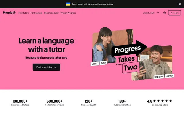
Vibrant Tutorial Pop: a playful pink canvas with bold, inviting type.
Color palette
Hero section background, highlighting the brand's energetic and inviting approach.
Accent for progress indicators or secondary call-to-actions, signaling growth.
Accents, borders, drawing attention with its vivid contrast.
Interactive elements, links, and primary call-to-actions, standing out distinctly.
Background for certain buttons or subtle interactive states.
Primary text, darkest background for footer, navigation elements.
Page backgrounds, card surfaces, secondary text on dark backgrounds.
Subtle background sections to provide visual separation.
Button borders, input borders — a light, subtle separator.
Secondary text, icons, borders, providing contrast to white without being stark black.
Typography
- Weights
- 400, 600, 700
- Sizes
- 14px, 16px, 20px, 24px, 32px, 48px, 64px, 96px
- Line height
- 1, 1.06, 1.08, 1.13, 1.2, 1.33, 1.5
- Letter spacing
- -0.005em at 96px, 0.017em at 14px
- Fallback
- Montserrat
Headlines and emphasis text. The tight letter-spacing (-0.005em) at larger sizes makes headings feel compact and assertive.
- Weights
- 400, 600
- Sizes
- 12px, 13px, 14px, 16px, 18px, 20px
- Line height
- 1, 1.14, 1.2, 1.33, 1.4, 1.43, 1.5, 1.71
- Letter spacing
- -0.005em at 13px, 0.012em at 12px
- Fallback
- Inter
Body copy, link text, secondary navigation, and button labels. Provides high legibility for smaller text with a neutral, friendly character.
Spacing & shape
Components
Black text on a white background, with a subtle border for definition. `background: #ffffff`, `color: #0000ee` (browser default link color, but text is #121117 as observed in content), `border: 1px solid #dcdce5`, `border-radius: 4px`, `padding: 0px 24px`.
Transparent background with Blackboard Ink text and border. `background: rgba(0, 0, 0, 0)`, `color: #121117`, `border: 1px solid #121117`, `border-radius: 0px`, `padding: 0px 4px 0px 16px`.
Transparent background with Blackboard Ink text, slightly rounded. `background: rgba(0, 0, 0, 0)`, `color: #121117`, `border: none` typically, `border-radius: 8px`, `padding: 6px 24px`.
Unstyled text link that functions as a button. `background: rgba(0, 0, 0, 0)`, `color: #000000`, `border: none`, `border-radius: 0px`, `padding: 0px`.
White background, sharp edges, no shadow. `background: #ffffff`, `border-radius: 4px`, `box-shadow: none`, `padding: 32px`.
Bordered element often containing text and icon indicating selection. `background: rgba(0, 0, 0, 0)`, `border-radius: 0px`, `box-shadow: none`, `padding: 0px`.
Transparent background, no radius or shadow, used in information-dense footer columns. `background: rgba(0, 0, 0, 0)`, `border-radius: 0px`, `box-shadow: none`, `padding: 0px`.
Guidelines
- Use 'Tutor Pink' (#ff7aac) exclusively for hero backgrounds or significant brand statements.
- Apply 'Platform' font for all headings, using weights 600 or 700 with letter-spacing adjusted per size for visual impact.
- Maintain 'Figtree' font for all body text, links, and functional labels, typically at 400 weight for readability.
- Utilize 'Blackboard Ink' (#121117) for primary text and main navigation elements, ensuring strong contrast.
- Ensure interactive components like buttons and cards consistently use 4px or 8px border-radii for subtle softening.
- Use `padding: 0px 24px` for primary call-to-action buttons for consistent horizontal spacing.
- Employ 'Outline Gray' (#dcdce5) for subtle borders on interactive elements to provide definition without harshness.
- Avoid using shadows on cards; the design relies on background color shifts and borders for separation.
- Do not deviate from the core color palette. Introducing new chromatic colors will dilute the brand identity.
- Do not use generic system fonts; 'Platform' and 'Figtree' are critical to the typographic brand.
- Avoid excessive rounding; limit border-radius to 4px or 8px on specific interactive elements, not general containers.
- Do not use letter-spacing on 'Figtree' body text that deviates from its inherent values, as this compromises legibility.
- Do not use `padding: 0px` for buttons, unless it is a pure text link button with no background.
About this system
ShowHide
This system feels like a vibrant, welcoming learning space, merging playful energy with professional clarity. The dominant 'Tutor Pink' background of the hero immediately signals a dynamic, approachable brand. Typography uses a distinctive contrast: the custom 'Platform' font for headlines with tight letter spacing creates punchy, impactful statements, while 'Figtree' provides warm, readable body copy. Subtle 4px and 8px radii are used sparingly on functional elements, maintaining a crisp aesthetic.
The page primarily uses a max-width contained layout, typically with content centered within the browser. The hero section is a full-bleed block of 'Tutor Pink' with a large, left-aligned headline and a right-aligned lifestyle image. Content sections below often feature a clean, single-column stack, sometimes alternating with multi-column card grids for features or categories. There's a consistent vertical spacing model. The navigation is a sticky top bar, providing context and quick access, while the footer is dense, dark, and multi-column, providing comprehensive links.
The site uses a mix of lifestyle photography and playful, custom illustrations. Photography is generally bright and candid, depicting authentic interactions between tutors and learners. Illustrations, like the 'Progress Takes Two' graphic, are often brand-colored, featuring chunky, bold shapes with clear outlines and a slight 3D pop, conveying energy and approachability. Icons are line-based (outline style) and mono-color (often 'Graphite' #4d4c5c or 'Blackboard Ink' #121117), serving an explanatory and navigational role. The overall density is balanced, with imagery used strategically in hero sections and feature explanations without overwhelming content.
Reminiscent of Duolingo, Udemy, Coursera, Figma.
# Preply — Style Reference
> Vibrant Tutorial Pop: a playful pink canvas with bold, inviting type.

**Theme:** light

**Site:** https://preply.com

This system feels like a vibrant, welcoming learning space, merging playful energy with professional clarity. The dominant 'Tutor Pink' background of the hero immediately signals a dynamic, approachable brand. Typography uses a distinctive contrast: the custom 'Platform' font for headlines with tight letter spacing creates punchy, impactful statements, while 'Figtree' provides warm, readable body copy. Subtle 4px and 8px radii are used sparingly on functional elements, maintaining a crisp aesthetic.

## Tokens — Colors

| Name | Value | Token | Role |
|------|------|------|------|
| Tutor Pink | `#ff7aac` | `--color-tutor-pink` | Hero section background, highlighting the brand's energetic and inviting approach. |
| Progress Teal | `#3ddabe` | `--color-progress-teal` | Accent for progress indicators or secondary call-to-actions, signaling growth. |
| Highlight Yellow | `#ffdf3d` | `--color-highlight-yellow` | Accents, borders, drawing attention with its vivid contrast. |
| Action Blue | `#2885fd` | `--color-action-blue` | Interactive elements, links, and primary call-to-actions, standing out distinctly. |
| Light Blue | `#99c5ff` | `--color-light-blue` | Background for certain buttons or subtle interactive states. |
| Blackboard Ink | `#121117` | `--color-blackboard-ink` | Primary text, darkest background for footer, navigation elements. |
| Paper White | `#ffffff` | `--color-paper-white` | Page backgrounds, card surfaces, secondary text on dark backgrounds. |
| Pale Canvas | `#f4f4f8` | `--color-pale-canvas` | Subtle background sections to provide visual separation. |
| Outline Gray | `#dcdce5` | `--color-outline-gray` | Button borders, input borders — a light, subtle separator. |
| Graphite | `#4d4c5c` | `--color-graphite` | Secondary text, icons, borders, providing contrast to white without being stark black. |

## Tokens — Typography

### Platform
- **Substitute:** Montserrat
- **Weights:** 400, 600, 700
- **Sizes:** 14px, 16px, 20px, 24px, 32px, 48px, 64px, 96px
- **Line height:** 1, 1.06, 1.08, 1.13, 1.2, 1.33, 1.5
- **Letter spacing:** -0.005em at 96px, 0.017em at 14px
- **Role:** Headlines and emphasis text. The tight letter-spacing (-0.005em) at larger sizes makes headings feel compact and assertive.

### Figtree
- **Substitute:** Inter
- **Weights:** 400, 600
- **Sizes:** 12px, 13px, 14px, 16px, 18px, 20px
- **Line height:** 1, 1.14, 1.2, 1.33, 1.4, 1.43, 1.5, 1.71
- **Letter spacing:** -0.005em at 13px, 0.012em at 12px
- **Role:** Body copy, link text, secondary navigation, and button labels. Provides high legibility for smaller text with a neutral, friendly character.

## Tokens — Type Scale

| Role | Size | Line height | Letter spacing |
|------|------|------|------|
| caption | 12px | 1.43 | 0.144px |
| body | 14px | 1.4 | — |
| body-lg | 16px | 1.5 | — |
| subheading | 20px | 1.33 | — |
| heading | 24px | 1.08 | — |
| heading-lg | 32px | 1.13 | — |
| display | 48px | 1.06 | — |
| display-xl | 64px | 1 | — |
| display-xxl | 96px | 1 | -0.48px |

## Tokens — Spacing

- **Section gap:** 48px

## Tokens — Radius

- **Default:** 4px
- **Buttons:** 4px
- **Cards:** 4px
- **tags:** 8px

## Layout

The page primarily uses a max-width contained layout, typically with content centered within the browser. The hero section is a full-bleed block of 'Tutor Pink' with a large, left-aligned headline and a right-aligned lifestyle image. Content sections below often feature a clean, single-column stack, sometimes alternating with multi-column card grids for features or categories. There's a consistent vertical spacing model. The navigation is a sticky top bar, providing context and quick access, while the footer is dense, dark, and multi-column, providing comprehensive links.

## Imagery

The site uses a mix of lifestyle photography and playful, custom illustrations. Photography is generally bright and candid, depicting authentic interactions between tutors and learners. Illustrations, like the 'Progress Takes Two' graphic, are often brand-colored, featuring chunky, bold shapes with clear outlines and a slight 3D pop, conveying energy and approachability. Icons are line-based (outline style) and mono-color (often 'Graphite' #4d4c5c or 'Blackboard Ink' #121117), serving an explanatory and navigational role. The overall density is balanced, with imagery used strategically in hero sections and feature explanations without overwhelming content.

## Components

### Stats Bar

### Language Tutor Card Grid

### Announcement Banner + CTA Button

### Primary CTA Button
*Primary Call to Action*

Black text on a white background, with a subtle border for definition. `background: #ffffff`, `color: #0000ee` (browser default link color, but text is #121117 as observed in content), `border: 1px solid #dcdce5`, `border-radius: 4px`, `padding: 0px 24px`.

### Ghost Button
*Secondary Action*

Transparent background with Blackboard Ink text and border. `background: rgba(0, 0, 0, 0)`, `color: #121117`, `border: 1px solid #121117`, `border-radius: 0px`, `padding: 0px 4px 0px 16px`.

### Rounded Ghost Button
*Tertiary or Filter Action*

Transparent background with Blackboard Ink text, slightly rounded. `background: rgba(0, 0, 0, 0)`, `color: #121117`, `border: none` typically, `border-radius: 8px`, `padding: 6px 24px`.

### Text Link Button
*Inline Action*

Unstyled text link that functions as a button. `background: rgba(0, 0, 0, 0)`, `color: #000000`, `border: none`, `border-radius: 0px`, `padding: 0px`.

### Basic Card
*Content Grouping*

White background, sharp edges, no shadow. `background: #ffffff`, `border-radius: 4px`, `box-shadow: none`, `padding: 32px`.

### Language Selector Item
*Filter Item*

Bordered element often containing text and icon indicating selection. `background: rgba(0, 0, 0, 0)`, `border-radius: 0px`, `box-shadow: none`, `padding: 0px`.

### Footer Link Block
*Informational Grouping*

Transparent background, no radius or shadow, used in information-dense footer columns. `background: rgba(0, 0, 0, 0)`, `border-radius: 0px`, `box-shadow: none`, `padding: 0px`.

## Guidelines

### Do

- Use 'Tutor Pink' (#ff7aac) exclusively for hero backgrounds or significant brand statements.
- Apply 'Platform' font for all headings, using weights 600 or 700 with letter-spacing adjusted per size for visual impact.
- Maintain 'Figtree' font for all body text, links, and functional labels, typically at 400 weight for readability.
- Utilize 'Blackboard Ink' (#121117) for primary text and main navigation elements, ensuring strong contrast.
- Ensure interactive components like buttons and cards consistently use 4px or 8px border-radii for subtle softening.
- Use `padding: 0px 24px` for primary call-to-action buttons for consistent horizontal spacing.
- Employ 'Outline Gray' (#dcdce5) for subtle borders on interactive elements to provide definition without harshness.

### Don't

- Avoid using shadows on cards; the design relies on background color shifts and borders for separation.
- Do not deviate from the core color palette. Introducing new chromatic colors will dilute the brand identity.
- Do not use generic system fonts; 'Platform' and 'Figtree' are critical to the typographic brand.
- Avoid excessive rounding; limit border-radius to 4px or 8px on specific interactive elements, not general containers.
- Do not use letter-spacing on 'Figtree' body text that deviates from its inherent values, as this compromises legibility.
- Do not use `padding: 0px` for buttons, unless it is a pure text link button with no background.

## Agent Prompt Guide

Quick Color Reference:
- Text: #121117
- Background: #ffffff
- CTA: #ff7aac (or #2885fd for secondary)
- Border: #dcdce5
- Accent: #3ddabe

Example Component Prompts:
1. Create a hero section: full-bleed background #ff7aac. Left-aligned headline 'Learn with a tutor' (Platform, #121117, 96px weight 700 letter-spacing -0.48px). Subtext 'Because real progress takes two' (Figtree, #121117, 20px weight 400). Button 'Find your tutor ->' (background #ffffff, text #121117, border 1px solid #dcdce5, border-radius 4px, padding 0px 24px) centered below subtext.
2. Create a 'Language Tutor Card': 12px total padding. Background #ffffff, border-radius 8px. Title 'English tutors' (Figtree, #121117, 16px weight 600). Subtext '33,602 teachers' (Figtree, #4d4c5c, 13px weight 400 letter-spacing -0.065px). Include a right-aligned arrow icon (outline, #121117).
3. Create a footer section: Background #121117. Text #ffffff. Links (Figtree, white, 14px weight 400). Ensure columns are separated by 32px margin-bottom.
More like this






Keep what you find
A free account saves references to boards and can send you a weekly email of picks based on what you save.
To see every result, go Pro.