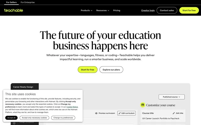
Preview image. Unlock full-res
High-contrast digital chalkboard with a neon highlighter.
Color palette
Primary action buttons, active navigation indicators – provides a vivid, energetic accent point
Illustrative elements, specific card backgrounds – a deep, rich secondary branding color
Highlight badges, decorative icons – a warm, muted accent for informational or decorative elements
Illustrative backgrounds, testimonial section accents – a strong, warm secondary accent
Primary text, surface backgrounds, borders, icons – establishes strong contrast and grounded presence
Page backgrounds, card surfaces, secondary text, borders – provides visual breathing room and clarity
Subtle background for cards and UI components, borders – offers a hint of separation without harshness
Alternative card backgrounds, elevated surfaces – provides slight visual depth from the lightest backgrounds
Muted text, secondary links, helper text – for less prominent information
Dark secondary text, prominent links – offers a softer alternative to pure black for body content
Typography
- Weights
- 400, 500, 600, 700, 800
- Sizes
- 13px, 15px, 17px, 19px, 22px, 26px
- Line height
- 1, 1.1, 1.2, 1.3, 1.5
- Fallback
- Inter
Primary text for body, captions, links, and buttons. Its clean, utilitarian appearance provides excellent legibility for all functional interface elements.
- Weights
- 400
- Sizes
- 30px, 34px, 41px, 45px, 52px, 60px, 75px
- Line height
- 0.9, 1, 1.1, 1.5
- Fallback
- Playfair Display
Display font for large headings and hero sections. Its elegant, slightly condensed forms provide a distinctive brand voice, signaling authority with a touch of sophistication.
- Weights
- 400
- Sizes
- 15px
- Line height
- 1.5
- Fallback
- Roboto Mono
Used for code snippets or specific UI elements requiring a fixed-width, technical aesthetic.
Spacing & shape
Components
Filled button with Electric Lime background (#e6ff32) and Midnight Ink (#000000) text. Uses full pill radius (900px) and Peridotpenormvf font at normal weight. Padding is 15px vertical, 22px horizontal.
Outlined button with Canvas White (#ffffff) background and Midnight Ink (#000000) text. Has a 1px Midnight Ink (#000000) border, full pill radius (900px), and Peridotpenormvf font at normal weight. Padding is 15px vertical, 22px horizontal.
Solid Midnight Ink (#000000) background with Canvas White (#ffffff) text. Uses full pill radius (900px) and Peridotpenormvf font. Padding is 15px vertical, 22px horizontal.
Filled button with Light Fog (#f0f0f0) background and Midnight Ink (#000000) text. Uses full pill radius (900px) and Peridotpenormvf font. Padding is 15px vertical, 22px horizontal.
Card with Canvas White (#ffffff) background, 8.98px border-radius, and no shadow. Contains content blocks with 15px internal padding.
Card with Warm Gray (#f5f5f5) background, 8.98px border-radius, and no shadow. Used to provide a subtle visual break for sections or feature groups.
Badge with Amber Glow (#fae6b6) background and Midnight Ink (#000000) text. Uses 8.98px border-radius. Padding is 7.48px vertical, 14.96px horizontal.
Text link using Peridotpenormvf with Midnight Ink (#000000) color. Hover states often involve a 1px Electric Lime (#e6ff32) or Midnight Ink border.
Guidelines
- Use Electric Lime (#e6ff32) exclusively for primary calls to action or active states to maintain its high impact.
- Employ Ivyprestoheadline for all prominent headings, leveraging its unique character to establish brand voice at sizes 30px to 75px.
- Maintain high contrast ratios for all text against backgrounds, ensuring legibility with Midnight Ink (#000000) on Canvas White (#ffffff) or Light Fog (#f0f0f0).
- Apply a 900px radius to all buttons and prominent tags to achieve a consistent pill-shaped aesthetic.
- Utilize Peridotpenormvf for all body copy and functional UI text, keeping its weight at 400 for optimal readability.
- Distinguish content sections using subtle background shifts, such as Canvas White (#ffffff), Light Fog (#f0f0f0), and Warm Gray (#f5f5f5) for layering.
- Ensure interactive elements have clear visual feedback, often a 1px border of Midnight Ink (#000000) or Electric Lime (#e6ff32).
- Do not use Electric Lime (#e6ff32) for decorative elements or non-interactive text; reserve its use for actionable items.
- Avoid applying heavy drop shadows; the design relies on flat surfaces and border definitions for depth.
- Do not introduce additional body fonts; Peridotpenormvf should handle all standard text to maintain typographic consistency.
- Refrain from using very dark backgrounds for main content areas; maintain the light theme with Canvas White (#ffffff) or Light Fog (#f0f0f0) as the dominant surfaces.
- Do not use highly saturated colors for large background areas; save saturation for brand accents like Electric Lime (#e6ff32).
- Avoid arbitrary border-radius values; stick to 8.98px for cards and 900px for buttons to maintain consistent shaping.
- Do not use excessive visual flourishes or gradients unless specifically indicated for a background accent; the core UI remains flat and functional.
About this system
ShowHide
Teachable employs a modern, self-assured design language centered on crisp typography and a functional, high-contrast palette. Black and white are dominant, providing a clean canvas for content, while a vibrant, almost neon yellow acts as the primary accent, signaling interactive elements and brand energy. The visual system balances strong display headlines with practical, legible body text. Cards and interactive elements use slightly rounded corners or full pills, creating a friendly yet professional feel.
Reminiscent of Podia, ConvertKit, Stripe.
# Teachable — Style Reference
> High-contrast digital chalkboard with a neon highlighter.

**Theme:** light

**Site:** https://teachable.com

Teachable employs a modern, self-assured design language centered on crisp typography and a functional, high-contrast palette. Black and white are dominant, providing a clean canvas for content, while a vibrant, almost neon yellow acts as the primary accent, signaling interactive elements and brand energy. The visual system balances strong display headlines with practical, legible body text. Cards and interactive elements use slightly rounded corners or full pills, creating a friendly yet professional feel.

## Tokens — Colors

| Name | Value | Token | Role |
|------|------|------|------|
| Electric Lime | `#e6ff32` | `--color-electric-lime` | Primary action buttons, active navigation indicators – provides a vivid, energetic accent point |
| Deep Ocean | `#1c4774` | `--color-deep-ocean` | Illustrative elements, specific card backgrounds – a deep, rich secondary branding color |
| Amber Glow | `#fae6b6` | `--color-amber-glow` | Highlight badges, decorative icons – a warm, muted accent for informational or decorative elements |
| Cardinal Red | `#7f2a23` | `--color-cardinal-red` | Illustrative backgrounds, testimonial section accents – a strong, warm secondary accent |
| Midnight Ink | `#000000` | `--color-midnight-ink` | Primary text, surface backgrounds, borders, icons – establishes strong contrast and grounded presence |
| Canvas White | `#ffffff` | `--color-canvas-white` | Page backgrounds, card surfaces, secondary text, borders – provides visual breathing room and clarity |
| Light Fog | `#f0f0f0` | `--color-light-fog` | Subtle background for cards and UI components, borders – offers a hint of separation without harshness |
| Warm Gray | `#f5f5f5` | `--color-warm-gray` | Alternative card backgrounds, elevated surfaces – provides slight visual depth from the lightest backgrounds |
| Ash Gray | `#a0a0a0` | `--color-ash-gray` | Muted text, secondary links, helper text – for less prominent information |
| Graphite | `#222222` | `--color-graphite` | Dark secondary text, prominent links – offers a softer alternative to pure black for body content |

## Tokens — Typography

### Peridotpenormvf
- **Substitute:** Inter
- **Weights:** 400, 500, 600, 700, 800
- **Sizes:** 13px, 15px, 17px, 19px, 22px, 26px
- **Line height:** 1, 1.1, 1.2, 1.3, 1.5
- **Role:** Primary text for body, captions, links, and buttons. Its clean, utilitarian appearance provides excellent legibility for all functional interface elements.

### Ivyprestoheadline
- **Substitute:** Playfair Display
- **Weights:** 400
- **Sizes:** 30px, 34px, 41px, 45px, 52px, 60px, 75px
- **Line height:** 0.9, 1, 1.1, 1.5
- **Role:** Display font for large headings and hero sections. Its elegant, slightly condensed forms provide a distinctive brand voice, signaling authority with a touch of sophistication.

### monospace
- **Substitute:** Roboto Mono
- **Weights:** 400
- **Sizes:** 15px
- **Line height:** 1.5
- **Role:** Used for code snippets or specific UI elements requiring a fixed-width, technical aesthetic.

## Tokens — Type Scale

| Role | Size | Line height | Letter spacing |
|------|------|------|------|
| caption | 13px | 1.5 | — |
| body-sm | 15px | 1.5 | — |
| body | 17px | 1.3 | — |
| subheading | 22px | 1.2 | — |
| heading-sm | 30px | 1.1 | — |
| heading | 45px | 1 | — |
| heading-lg | 60px | 0.9 | — |
| display | 75px | 0.9 | — |

## Tokens — Spacing

- **Max width:** 1200px
- **Section gap:** 64px
- **Card padding:** 15px
- **Element gap:** 15px

## Tokens — Radius

- **Buttons:** 900px
- **Cards:** 8.98px
- **badges:** 8.98px
- **input:** 4.49px

## Components

### Primary Action Button
*Primary Call to Action*

Filled button with Electric Lime background (#e6ff32) and Midnight Ink (#000000) text. Uses full pill radius (900px) and Peridotpenormvf font at normal weight. Padding is 15px vertical, 22px horizontal.

### Secondary Ghost Button
*Secondary Call to Action*

Outlined button with Canvas White (#ffffff) background and Midnight Ink (#000000) text. Has a 1px Midnight Ink (#000000) border, full pill radius (900px), and Peridotpenormvf font at normal weight. Padding is 15px vertical, 22px horizontal.

### Dark Filled Button
*Navigation and secondary actions*

Solid Midnight Ink (#000000) background with Canvas White (#ffffff) text. Uses full pill radius (900px) and Peridotpenormvf font. Padding is 15px vertical, 22px horizontal.

### Tertiary Light Button
*Tertiary actions, less prominent links*

Filled button with Light Fog (#f0f0f0) background and Midnight Ink (#000000) text. Uses full pill radius (900px) and Peridotpenormvf font. Padding is 15px vertical, 22px horizontal.

### Standard Content Card
*Information grouping*

Card with Canvas White (#ffffff) background, 8.98px border-radius, and no shadow. Contains content blocks with 15px internal padding.

### Gray Background Card
*Feature grouping or subtle distinction*

Card with Warm Gray (#f5f5f5) background, 8.98px border-radius, and no shadow. Used to provide a subtle visual break for sections or feature groups.

### Amber Badge
*Highlighting tags or categories*

Badge with Amber Glow (#fae6b6) background and Midnight Ink (#000000) text. Uses 8.98px border-radius. Padding is 7.48px vertical, 14.96px horizontal.

### Navigation Link
*Top-level navigation items*

Text link using Peridotpenormvf with Midnight Ink (#000000) color. Hover states often involve a 1px Electric Lime (#e6ff32) or Midnight Ink border.

## Guidelines

### Do

- Use Electric Lime (#e6ff32) exclusively for primary calls to action or active states to maintain its high impact.
- Employ Ivyprestoheadline for all prominent headings, leveraging its unique character to establish brand voice at sizes 30px to 75px.
- Maintain high contrast ratios for all text against backgrounds, ensuring legibility with Midnight Ink (#000000) on Canvas White (#ffffff) or Light Fog (#f0f0f0).
- Apply a 900px radius to all buttons and prominent tags to achieve a consistent pill-shaped aesthetic.
- Utilize Peridotpenormvf for all body copy and functional UI text, keeping its weight at 400 for optimal readability.
- Distinguish content sections using subtle background shifts, such as Canvas White (#ffffff), Light Fog (#f0f0f0), and Warm Gray (#f5f5f5) for layering.
- Ensure interactive elements have clear visual feedback, often a 1px border of Midnight Ink (#000000) or Electric Lime (#e6ff32).

### Don't

- Do not use Electric Lime (#e6ff32) for decorative elements or non-interactive text; reserve its use for actionable items.
- Avoid applying heavy drop shadows; the design relies on flat surfaces and border definitions for depth.
- Do not introduce additional body fonts; Peridotpenormvf should handle all standard text to maintain typographic consistency.
- Refrain from using very dark backgrounds for main content areas; maintain the light theme with Canvas White (#ffffff) or Light Fog (#f0f0f0) as the dominant surfaces.
- Do not use highly saturated colors for large background areas; save saturation for brand accents like Electric Lime (#e6ff32).
- Avoid arbitrary border-radius values; stick to 8.98px for cards and 900px for buttons to maintain consistent shaping.
- Do not use excessive visual flourishes or gradients unless specifically indicated for a background accent; the core UI remains flat and functional.

## Agent Prompt Guide

Quick Color Reference:
text: #000000 (Midnight Ink)
background: #f0f0f0 (Light Fog)
border: #000000 (Midnight Ink)
accent: #e6ff32 (Electric Lime)
primary action: #e6ff32 (filled action)

Example Component Prompts:
1. Create a Hero section with a centered headline: 'The Future of Learning' in Ivyprestoheadline 75px, Midnight Ink (#000000), normal lineHeight. Below it, a Peridotpenormvf 17px body paragraph in Graphite (#222222). Include a Primary Action Button ('Start Now') using Electric Lime (#e6ff32) background, Midnight Ink (#000000) text, 900px radius, 15px vertical and 22px horizontal padding. Beside it, a Secondary Ghost Button ('Learn More') with Canvas White (#ffffff) background, Midnight Ink (#000000) text, 1px Midnight Ink (#000000) border, 900px radius, 15px vertical and 22px horizontal padding.
2. Design a Feature Card: Background Canvas White (#ffffff), 8.98px radius. Title: 'Intuitive Management' in Peridotpenormvf 22px, Midnight Ink (#000000). Body: 'Easily create and manage your products.' in Peridotpenormvf 15px, Graphite (#222222). Keep 15px padding inside the card.
3. Create a Primary Action Button: #e6ff32 background, #000000 text, 9999px radius, compact pill padding. Use this filled treatment for the main CTA.
More like this









Keep what you find
A free account saves references to boards and can send you a weekly email of picks based on what you save.
To see every result, go Pro.