Preview image. Unlock full-res
Terminal black-on-white grid
Color palette
Page background — a saturated, energetic base that amplifies the stark achromatic foreground elements
Supporting palette color for small decorative accents when the core palette needs contrast. Do not promote it to the primary CTA color
Dark borders and separators for elevated surfaces and inverted UI. Do not promote it to the primary CTA color
Dark borders and separators for elevated surfaces and inverted UI. Do not promote it to the primary CTA color
Muted text elements, decorative borders, and subtle list item dividers, providing a tertiary level of visual hierarchy
Typography
- Weights
- 400
- Sizes
- 13px
- Line height
- 1.3
- Fallback
- Space Mono
Primary UI text for links, body content, and lists. Its monospaced nature contributes to the utilitarian, code-like aesthetic.
- Weights
- 400
- Sizes
- 15px
- Line height
- 1.65
- Fallback
- system-ui
Secondary text used for general content and supplementary links, providing system-font accessibility where native monospaced options are less prevalent.
Spacing & shape
Components
A rectangular container with a 1px 'Ink Black' border, a default radius of 12.96px, and internal padding of 26px around its content. Background defaults to 'Canvas Yellow'.
Lists of interactive links, each item has 6px left padding. Active/current items are distinguished by an 'Ink Black' border. Text is 'Monument Grotesk Mono Variable' at 13px, 400 weight.
Simple text labels, typically 'Monument Grotesk Mono Variable' at 13px, 400 weight, in 'Graphite' or 'Ink Black', often found adjacent to a thin border.
Uses '-apple-system' font at 15px, 400 weight, in 'Graphite', providing a slightly more readable, less stark contrast for secondary information.
Guidelines
- Use 'Canvas Yellow' #ffff00 as the foundational background color for all page sections.
- Apply 'Ink Black' #000000 for primary text, structural borders, and the most prominent interactive states.
- Utilize 'Monument Grotesk Mono Variable' at 13px/1.30 line-height for all lists and core navigation items.
- Employ a sparse border radius, with a default of 12.96px for defining card-like containers, maintaining a rectilinear, functional aesthetic.
- Maintain high contrast (minimum 9.7:1) between text ('Ink Black' or 'Graphite') and 'Canvas Yellow' backgrounds.
- Use 26px for vertical and horizontal padding around distinct content blocks and inside card components.
- Differentiate clickable links and hover states with 'Link Blue' #0064E1 where color is permitted to break the achromatic palette.
- Avoid using shadows or complex elevation; the design system relies on flat surfaces and high-contrast borders for separation.
- Do not introduce gradients; the system exclusively uses solid colors.
- Refrain from using decorative imagery or photography; the visual language is text-dominant and utilitarian.
- Do not vary font families beyond 'Monument Grotesk Mono Variable' and '-apple-system' for text content.
- Avoid using padding values other than 6px, 13px, 26px, 39px, 45px, 65px; consistency is built on these foundational units.
- Do not use color for emotional emphasis (e.g., green for success, red for error) unless explicitly defined; color is for brand and interaction only.
- Avoid large, editorial headlines; the system prefers compact, functional text sizes across the board.
About this system
ShowHide
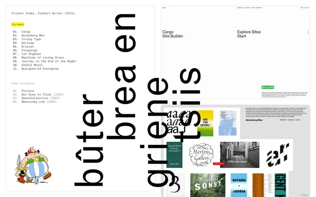
Folkert Gorter employs a stark, almost brutalist approach, reminiscent of early web interfaces or terminal UIs. The design emphasizes content over adornment, featuring a high-contrast achromatic palette with text-heavy layouts. Typography is functional and monospace-leaning, creating a spartan, technical feel. Minimalist borders and an absence of shadows highlight a flat-design ethos, where visual cues are direct and unembellished.
The page structure is full-bleed, adapting to the viewport width without a maximum content width, lending an expansive feel. The hero section often presents a centered, oversized, rotating text element over the 'Canvas Yellow' background. Content sections generally follow a vertical rhythm with distinct blocks of information using thin borders as dividers. Navigation appears as simple text lists horizontally or vertically. The overall density is spacious, with ample padding separating content elements.
Minimal imagery is present; the design prioritizes plain UI elements. When images are used, as seen in the project preview section, they appear as small, unstylized rectangular thumbnails. Iconography is extremely sparse, with a single instance of a classic comic character illustration used decoratively, not integrally. The system is text-dominant with visuals serving secondary, illustrative roles within content blocks rather than being primary drivers of engagement.
Reminiscent of Are.na, Brendan Dawes, Cargo Site Builder, Supersystem.
# Folkert Gorter — Style Reference
> Terminal black-on-white grid

**Theme:** light

**Site:** https://folkert.link

Folkert Gorter employs a stark, almost brutalist approach, reminiscent of early web interfaces or terminal UIs. The design emphasizes content over adornment, featuring a high-contrast achromatic palette with text-heavy layouts. Typography is functional and monospace-leaning, creating a spartan, technical feel. Minimalist borders and an absence of shadows highlight a flat-design ethos, where visual cues are direct and unembellished.

## Tokens — Colors

| Name | Value | Token | Role |
|------|------|------|------|
| Canvas Yellow | `#ffff00` | `--color-canvas-yellow` | Page background — a saturated, energetic base that amplifies the stark achromatic foreground elements |
| Link Blue | `#0064E1` | `--color-link-blue` | Supporting palette color for small decorative accents when the core palette needs contrast. Do not promote it to the primary CTA color |
| Ink Black | `#000000` | `--color-ink-black` | Dark borders and separators for elevated surfaces and inverted UI. Do not promote it to the primary CTA color |
| Graphite | `#404040` | `--color-graphite` | Dark borders and separators for elevated surfaces and inverted UI. Do not promote it to the primary CTA color |
| Ash Gray | `#999999` | `--color-ash-gray` | Muted text elements, decorative borders, and subtle list item dividers, providing a tertiary level of visual hierarchy |

## Tokens — Typography

### Monument Grotesk Mono Variable
- **Substitute:** Space Mono
- **Weights:** 400
- **Sizes:** 13px
- **Line height:** 1.3
- **Role:** Primary UI text for links, body content, and lists. Its monospaced nature contributes to the utilitarian, code-like aesthetic.

### -apple-system
- **Substitute:** system-ui
- **Weights:** 400
- **Sizes:** 15px
- **Line height:** 1.65
- **Role:** Secondary text used for general content and supplementary links, providing system-font accessibility where native monospaced options are less prevalent.

## Tokens — Spacing

- **Section gap:** 45px
- **Card padding:** 26px
- **Element gap:** 6px

## Tokens — Radius

- **Default:** 12.96px

## Layout

The page structure is full-bleed, adapting to the viewport width without a maximum content width, lending an expansive feel. The hero section often presents a centered, oversized, rotating text element over the 'Canvas Yellow' background. Content sections generally follow a vertical rhythm with distinct blocks of information using thin borders as dividers. Navigation appears as simple text lists horizontally or vertically. The overall density is spacious, with ample padding separating content elements.

## Imagery

Minimal imagery is present; the design prioritizes plain UI elements. When images are used, as seen in the project preview section, they appear as small, unstylized rectangular thumbnails. Iconography is extremely sparse, with a single instance of a classic comic character illustration used decoratively, not integrally. The system is text-dominant with visuals serving secondary, illustrative roles within content blocks rather than being primary drivers of engagement.

## Components

### Content Card
*Information container, project listing block*

A rectangular container with a 1px 'Ink Black' border, a default radius of 12.96px, and internal padding of 26px around its content. Background defaults to 'Canvas Yellow'.

### Navigational Link List
*Primary navigation and project indexing*

Lists of interactive links, each item has 6px left padding. Active/current items are distinguished by an 'Ink Black' border. Text is 'Monument Grotesk Mono Variable' at 13px, 400 weight.

### Section Heading
*Categorization of content groups*

Simple text labels, typically 'Monument Grotesk Mono Variable' at 13px, 400 weight, in 'Graphite' or 'Ink Black', often found adjacent to a thin border.

### Project Metadata Text
*Supplemental information or descriptions*

Uses '-apple-system' font at 15px, 400 weight, in 'Graphite', providing a slightly more readable, less stark contrast for secondary information.

## Guidelines

### Do

- Use 'Canvas Yellow' #ffff00 as the foundational background color for all page sections.
- Apply 'Ink Black' #000000 for primary text, structural borders, and the most prominent interactive states.
- Utilize 'Monument Grotesk Mono Variable' at 13px/1.30 line-height for all lists and core navigation items.
- Employ a sparse border radius, with a default of 12.96px for defining card-like containers, maintaining a rectilinear, functional aesthetic.
- Maintain high contrast (minimum 9.7:1) between text ('Ink Black' or 'Graphite') and 'Canvas Yellow' backgrounds.
- Use 26px for vertical and horizontal padding around distinct content blocks and inside card components.
- Differentiate clickable links and hover states with 'Link Blue' #0064E1 where color is permitted to break the achromatic palette.

### Don't

- Avoid using shadows or complex elevation; the design system relies on flat surfaces and high-contrast borders for separation.
- Do not introduce gradients; the system exclusively uses solid colors.
- Refrain from using decorative imagery or photography; the visual language is text-dominant and utilitarian.
- Do not vary font families beyond 'Monument Grotesk Mono Variable' and '-apple-system' for text content.
- Avoid using padding values other than 6px, 13px, 26px, 39px, 45px, 65px; consistency is built on these foundational units.
- Do not use color for emotional emphasis (e.g., green for success, red for error) unless explicitly defined; color is for brand and interaction only.
- Avoid large, editorial headlines; the system prefers compact, functional text sizes across the board.

## Agent Prompt Guide

Quick Color Reference:
text: #000000
background: #ffff00
border: #000000
accent: #ffff00
primary action: no distinct CTA color

Example Component Prompts:
Create a project index card: background #ffff00, 1px border #000000, 12.96px radius, 26px internal padding. Title 'Project XYZ' in Monument Grotesk Mono Variable, 13px, 400 weight, #000000. List items in Monument Grotesk Mono Variable, 13px, 400 weight, #000000, with 6px left padding.
Create a section divider: 1px solid border #000000 at full width.
Create a secondary text block: Text in -apple-system, 15px, 400 weight, #404040, with 45px top/bottom padding.
More like this








Keep what you find
A free account saves references to boards and can send you a weekly email of picks based on what you save.
To see every result, go Pro.