Preview image. Unlock full-res
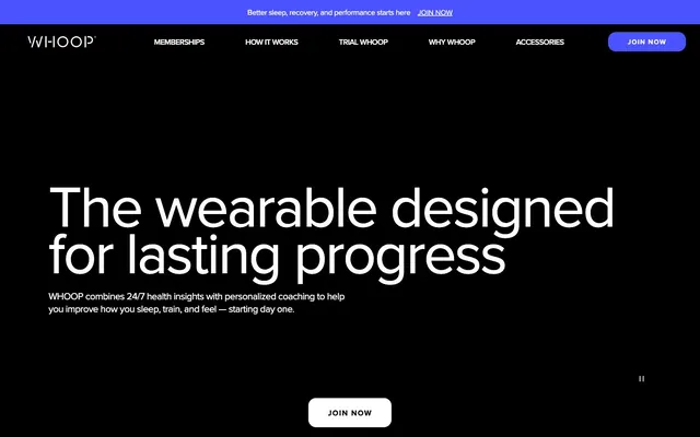
High-contrast digital readout. Like numbers on a precision laboratory instrument, the design is clear, direct, and offers no visual ambiguity.
Color palette
Focus indicators, subtle interactive elements, and key brand accents. Its vivid blue stands out sparingly against the dominant black and white.
Page backgrounds, section backgrounds, primary text for light sections, input background in dark sections.
Page backgrounds for light sections, card surfaces, primary text for dark sections.
Subtle borders, container edges, background for very light elements. Creates separation without harshness.
Elevated card backgrounds, secondary page sections. Provides a slightly warmer white than Daylight Canvas.
Secondary text, subtle details, icons. Offers a softer contrast than Midnight Base.
Tertiary text, disabled button text, subtle icons. A lighter neutral for less prominent information.
Internal illustration detail. Not used for UI elements.
Internal illustration detail. Not used for UI elements.
Internal illustration detail. Not used for UI elements.
Typography
- Weights
- 400, 500, 600, 700
- Sizes
- 14px, 15px, 16px, 19px, 20px, 24px, 32px, 35px, 50px, 120px
- Line height
- 0.8, 1, 1.09, 1.1, 1.13, 1.29, 1.3, 1.33, 1.49, 1.5, 1.59
- Letter spacing
- -0.0400em, -0.0370em, -0.0300em, 0.1000em
- Fallback
- system-ui, sans-serif
Primary typeface for all text content, from display headlines to body text and navigation. Its geometric clarity reinforces the data-driven brand. Letter spacing is subtly tightened on larger text to maintain visual density.
Spacing & shape
Elevation
Components
White background, #000000 text, 60px border radius, 15px vertical and 25px horizontal padding. Font: proxima-nova, weight 400.
White background, #000000 text, 20px border radius, 10px padding all sides. Font: proxima-nova, weight 400.
White background, #000000 text, 50% border radius (effectively a pill), no explicit padding value, suggests automatic browser spacing. Used for 'Join Now'.
Transparent background, #ffffff text, #ffffff border, 0px border radius. Font: proxima-nova, weight 400. Used in dark hero sections.
Transparent background, 0px border radius, 43px top, 50px right, 30px bottom, 50px left padding. No shadow by default.
#ffffff background, 24px border radius, 40px top padding. No shadow by default.
#f3f5f9 background, 24px border radius. Uses a subtle shadow: rgba(199, 199, 199, 0.25) 0px 4px 15px 0px.
#000000 background, #ffffff text, #ffffff border, 0px border radius. No explicit padding provided.
Guidelines
- Use proxima-nova for all typography, adjusting weights (400, 500, 600, 700) and sizes according to the type scale.
- Maintain a high-contrast ratio for text: #000000 on light backgrounds (#ffffff, #f3f5f9, #e5e7eb) and #ffffff on dark backgrounds (#000000, #191919).
- Apply 24px border radius to all informational cards and image containers, maintaining visual softness.
- Utilize 'Deep Indigo' (#4a53ff) exclusively for interactive states or key emphasis to draw attention.
- Ensure buttons adhere to either 60px (pill-like), 20px, or 50% (circular) border-radius, differentiating their roles.
- Use 'Ghost Gray' (#e5e7eb) for subtle borders and dividers to softly define sections without strong lines.
- Apply negative letter spacing to display text (e.g., -4.8px at 120px) to enhance visual impact and tighten headlines.
- Do not introduce new color tones; stick to the established achromatic palette with 'Deep Indigo' (#4a53ff) as the sole brand accent.
- Avoid using drop shadows on cards unless it's for 'Card Elevated Shadowed' to maintain a flat, modern aesthetic.
- Do not deviate from proxima-nova; all text should remain within this font family to preserve brand consistency.
- Prevent mixing border radii on interactive elements; buttons should have distinct radii (60px, 20px, 50%) for clear identity.
- Do not use highly saturated colorful backgrounds for UI elements; maintain the neutral background schema.
- Avoid excessive use of the vivid semantic colors (#d03433, #fbca46, #a41517) as they are reserved for internal illustration detail.
About this system
ShowHide
WHOOP's design evokes a sense of precise, data-driven health monitoring. The dominant use of stark black and crisp white, punctuated by a deep indigo (#4a53ff), creates a high-contrast environment, mirroring the clarity of performance data. Softly rounded cards and buttons suggest an approachable interface for complex health metrics, while sharp, geometric typography reinforces the technical precision.
The page alternates between full-bleed dark sections and max-width contained light sections. The hero is full-bleed black with a centered, oversized white headline and subtext, creating a strong initial impact. Sections generally flow with consistent vertical spacing, often showcasing content in two-column arrangements (text alongside image/card) or three-column card grids. There's a clear visual rhythm established by the alternating background colors. The layout is centered within its contained sections, maintaining balance. Navigation is a sticky top bar with prominent 'JOIN NOW' button.
This site uses product photography and lifestyle imagery, often tightly cropped to focus on the WHOOP device in action. Photography features individuals engaging in athletic or everyday activities, conveying health and wellness. The images are typically vibrant, with natural lighting. Illustrations appear in some contexts, using a flat, vector-based style with muted but defined color palettes, serving a decorative role to break up text-heavy sections or highlight concepts. Images are generally contained within rounded cards (24px radius) rather than full-bleed, preventing them from dominating the page and maintaining focus on the surrounding UI. Icons are simple, monochrome, and filled.
Reminiscent of Nike Training Club, Peloton, Oura Ring.
# WHOOP — Style Reference
> High-contrast digital readout. Like numbers on a precision laboratory instrument, the design is clear, direct, and offers no visual ambiguity.

**Theme:** mixed

**Site:** https://whoop.com

WHOOP's design evokes a sense of precise, data-driven health monitoring. The dominant use of stark black and crisp white, punctuated by a deep indigo (#4a53ff), creates a high-contrast environment, mirroring the clarity of performance data. Softly rounded cards and buttons suggest an approachable interface for complex health metrics, while sharp, geometric typography reinforces the technical precision.

## Tokens — Colors

| Name | Value | Token | Role |
|------|------|------|------|
| Deep Indigo | `#4a53ff` | `--color-deep-indigo` | Focus indicators, subtle interactive elements, and key brand accents. Its vivid blue stands out sparingly against the dominant black and white. |
| Midnight Base | `#000000` | `--color-midnight-base` | Page backgrounds, section backgrounds, primary text for light sections, input background in dark sections. |
| Daylight Canvas | `#ffffff` | `--color-daylight-canvas` | Page backgrounds for light sections, card surfaces, primary text for dark sections. |
| Ghost Gray | `#e5e7eb` | `--color-ghost-gray` | Subtle borders, container edges, background for very light elements. Creates separation without harshness. |
| Arctic Mist | `#f3f5f9` | `--color-arctic-mist` | Elevated card backgrounds, secondary page sections. Provides a slightly warmer white than Daylight Canvas. |
| Stone Accent | `#808080` | `--color-stone-accent` | Secondary text, subtle details, icons. Offers a softer contrast than Midnight Base. |
| Gravel Scale | `#999999` | `--color-gravel-scale` | Tertiary text, disabled button text, subtle icons. A lighter neutral for less prominent information. |
| Warning Red | `#d03433` | `--color-warning-red` | Internal illustration detail. Not used for UI elements. |
| Glow Yellow | `#fbca46` | `--color-glow-yellow` | Internal illustration detail. Not used for UI elements. |
| Ruby Streak | `#a41517` | `--color-ruby-streak` | Internal illustration detail. Not used for UI elements. |

## Tokens — Typography

### proxima-nova
- **Substitute:** system-ui, sans-serif
- **Weights:** 400, 500, 600, 700
- **Sizes:** 14px, 15px, 16px, 19px, 20px, 24px, 32px, 35px, 50px, 120px
- **Line height:** 0.8, 1, 1.09, 1.1, 1.13, 1.29, 1.3, 1.33, 1.49, 1.5, 1.59
- **Letter spacing:** -0.0400em, -0.0370em, -0.0300em, 0.1000em
- **Role:** Primary typeface for all text content, from display headlines to body text and navigation. Its geometric clarity reinforces the data-driven brand. Letter spacing is subtly tightened on larger text to maintain visual density.

## Tokens — Type Scale

Perfect Fourth (1.333) from 16px base.

| Role | Size | Line height | Letter spacing |
|------|------|------|------|
| caption | 14px | 1.49 | — |
| body | 16px | 1.5 | — |
| subheading | 19px | 1.29 | — |
| heading | 24px | 1.13 | -0.48px |
| heading-lg | 32px | 1.1 | -1.2px |
| display-sm | 35px | 1.09 | -1.3px |
| display-md | 50px | 1 | -1.5px |
| display | 120px | 0.8 | -4.8px |

## Tokens — Spacing

- **Section gap:** 48-80px
- **Card padding:** 20-50px
- **Element gap:** 8-25px

## Tokens — Radius

- **Default:** 24px
- **actionable:** 16px
- **button:** 60px
- **media:** 24px
- **pill:** 300px
- **smallCard:** 8px

## Tokens — Elevation

- **Card Elevated Shadowed:** `box-shadow: rgba(199, 199, 199, 0.25) 0px 4px 15px 0px`

## Layout

The page alternates between full-bleed dark sections and max-width contained light sections. The hero is full-bleed black with a centered, oversized white headline and subtext, creating a strong initial impact. Sections generally flow with consistent vertical spacing, often showcasing content in two-column arrangements (text alongside image/card) or three-column card grids. There's a clear visual rhythm established by the alternating background colors. The layout is centered within its contained sections, maintaining balance. Navigation is a sticky top bar with prominent 'JOIN NOW' button.

## Imagery

This site uses product photography and lifestyle imagery, often tightly cropped to focus on the WHOOP device in action. Photography features individuals engaging in athletic or everyday activities, conveying health and wellness. The images are typically vibrant, with natural lighting. Illustrations appear in some contexts, using a flat, vector-based style with muted but defined color palettes, serving a decorative role to break up text-heavy sections or highlight concepts. Images are generally contained within rounded cards (24px radius) rather than full-bleed, preventing them from dominating the page and maintaining focus on the surrounding UI. Icons are simple, monochrome, and filled.

## Components

### Announcement Banner

### Free Trial Card

### Feature Cards Grid

### Standard Button Bold
*Primary Call to Action*

White background, #000000 text, 60px border radius, 15px vertical and 25px horizontal padding. Font: proxima-nova, weight 400.

### Rounded Button Compact
*Secondary Call to Action, Internal Navigation*

White background, #000000 text, 20px border radius, 10px padding all sides. Font: proxima-nova, weight 400.

### Floating Pill Button
*Contextual Call to Action*

White background, #000000 text, 50% border radius (effectively a pill), no explicit padding value, suggests automatic browser spacing. Used for 'Join Now'.

### Ghost Button Inverse
*Tertiary Action, Navigation Link*

Transparent background, #ffffff text, #ffffff border, 0px border radius. Font: proxima-nova, weight 400. Used in dark hero sections.

### Card Default
*Informational Content Block*

Transparent background, 0px border radius, 43px top, 50px right, 30px bottom, 50px left padding. No shadow by default.

### Card Elevated
*Engaging Content Block, Feature Showcase*

#ffffff background, 24px border radius, 40px top padding. No shadow by default.

### Card Elevated Shadowed
*Interactive or Prominent Card*

#f3f5f9 background, 24px border radius. Uses a subtle shadow: rgba(199, 199, 199, 0.25) 0px 4px 15px 0px.

### Input Dark
*Text Input Fields in Dark Sections*

#000000 background, #ffffff text, #ffffff border, 0px border radius. No explicit padding provided.

## Guidelines

### Do

- Use proxima-nova for all typography, adjusting weights (400, 500, 600, 700) and sizes according to the type scale.
- Maintain a high-contrast ratio for text: #000000 on light backgrounds (#ffffff, #f3f5f9, #e5e7eb) and #ffffff on dark backgrounds (#000000, #191919).
- Apply 24px border radius to all informational cards and image containers, maintaining visual softness.
- Utilize 'Deep Indigo' (#4a53ff) exclusively for interactive states or key emphasis to draw attention.
- Ensure buttons adhere to either 60px (pill-like), 20px, or 50% (circular) border-radius, differentiating their roles.
- Use 'Ghost Gray' (#e5e7eb) for subtle borders and dividers to softly define sections without strong lines.
- Apply negative letter spacing to display text (e.g., -4.8px at 120px) to enhance visual impact and tighten headlines.

### Don't

- Do not introduce new color tones; stick to the established achromatic palette with 'Deep Indigo' (#4a53ff) as the sole brand accent.
- Avoid using drop shadows on cards unless it's for 'Card Elevated Shadowed' to maintain a flat, modern aesthetic.
- Do not deviate from proxima-nova; all text should remain within this font family to preserve brand consistency.
- Prevent mixing border radii on interactive elements; buttons should have distinct radii (60px, 20px, 50%) for clear identity.
- Do not use highly saturated colorful backgrounds for UI elements; maintain the neutral background schema.
- Avoid excessive use of the vivid semantic colors (#d03433, #fbca46, #a41517) as they are reserved for internal illustration detail.

## Agent Prompt Guide

### Quick Color Reference
- Text (Dark): #000000
- Text (Light): #ffffff
- Background (Dark): #000000
- Background (Light): #ffffff
- Accent: #4a53ff
- Border: #e5e7eb

### 3-5 Example Component Prompts
1. Create a hero section: black background. Headline 'The wearable designed for lasting progress' in proxima-nova, size 50px, weight 600, #ffffff, letter-spacing -1.5px. Subtext 'WHOOP combines 24/7 health insights with personalized coaching...' in proxima-nova, size 16px, weight 400, #ffffff. Include a 'Join Now' button: white background, #000000 text, 50% border radius, proxima-nova 400.
2. Construct an informational card: #ffffff background, 24px border radius. Title 'Get started for free' in proxima-nova, size 24px, weight 600, #000000, line-height 1.13, letter-spacing -0.48px. Body text below it in proxima-nova, size 16px, weight 400, #000000. Include an image slot (24px border radius for the image itself) and a secondary button 'TRY WHOOP FOR FREE': white background, #000000 text, 20px border radius, 10px padding.
3. Design a feature spotlight card: 'Arctic Mist' (#f3f5f9) background, 24px border radius, shadow rgba(199, 199, 199, 0.25) 0px 4px 15px 0px. Internal content with a headline (proxima-nova, size 20px, weight 600, #000000) and short descriptive text (proxima-nova, size 15px, weight 400, #000000), and a small icon.
More like this








Keep what you find
A free account saves references to boards and can send you a weekly email of picks based on what you save.
To see every result, go Pro.