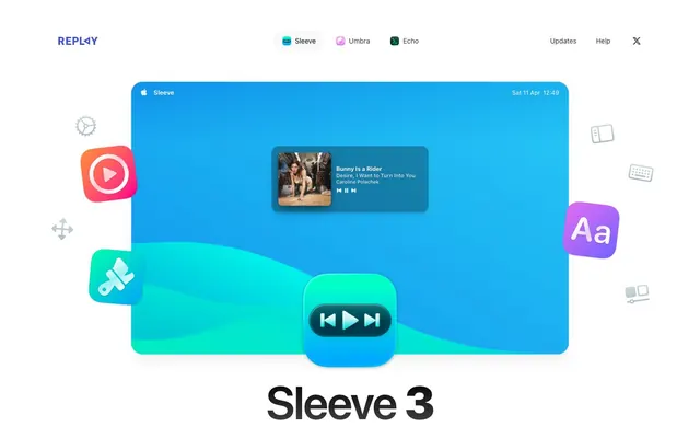
Preview image. Unlock full-res
Macintosh desktop app on white marble. The design system feels like a carefully crafted macOS application brought to a website, with crisp, clean elements resting on a bright, uncluttered surface.
Color palette
Vivid gradient for primary product showcase, evoking a digital, oceanic depth.
Highlight color for specific icons or interactive elements, provides a vibrant focal point.
Page backgrounds, card surfaces, primary text — a pristine canvas.
Subtle background for UI elements like buttons, providing a slight variance from the main white.
Light borders for cards and buttons, delineating elements with a soft touch.
Primary text color for headings and body, providing strong contrast on light backgrounds.
Secondary text color, slightly softer than Ash Text for longer body copy.
Subtle accent text and icon color, often used for secondary controls.
Indicates positive feedback or successful actions, appearing on icons and links.
Signifies critical errors or warnings, used for text and iconography.
Typography
- Weights
- 400, 500, 600, 700, 900
- Sizes
- 12px, 13px, 14px, 15px, 16px, 18px, 20px, 24px, 48px, 96px
- Line height
- 1, 1.33, 1.4, 1.43, 1.5, 1.56
- Fallback
- system-ui, sans-serif
Primary text across all elements. Weight 900 for display headlines provides visual punch, while 400-500 is used for readability in body text and interface elements. Letter spacing is subtly tightened at display sizes and normalized for body text, contributing to a refined, compact feel.
Spacing & shape
Elevation
Components
Transparent background (rgba(0, 0, 0, 0)), Ash Text (#000000) or Steel Accent (#374151) text color, no border, 9999px border-radius, 8px vertical padding, 16px horizontal padding. Text uses ui-sans-serif weight 400.
Transparent background (rgba(0, 0, 0, 0)), Ash Text (#000000) text color, Border Fog (#e5e7eb) border, 9999px border-radius, 0px vertical padding, 16px horizontal padding. This style provides visual separation for grouped actions without heavy emphasis.
Ash Text (#000000) background, White Marble (#ffffff) text color, a subtle rgba(0, 0, 0, 0.2) border, 12px border-radius, 0px vertical padding, 24px horizontal padding. This solid dark button stands out against the light background.
Cloud Gray (#f9fafb) background, Ash Text (#000000) text color, a subtle rgba(0, 0, 0, 0.1) border, 12px border-radius, 0px vertical padding, 24px horizontal padding. Offers a softer interaction than the primary dark button.
White Marble (#ffffff) background, Border Fog (#e5e7eb) border, 24px border-radius, 32px 36px padding. Elevated with a multi-layered shadow (rgba(0, 0, 0, 0.1) 0px 10px 15px -3px, rgba(0, 0, 0, 0.1) 0px 4px 6px -4px) providing a distinct floating effect.
Similar to Feature Card with a 24px border-radius but features a more substantial multi-layered shadow stack (rgba(0, 0, 0, 0.1) 0px 0px 0px 1px, rgba(0, 0, 0, 0.4) 0px 12px 24px -8px, rgba(0, 0, 0, 0.2) 0px 8px 24px 0px, rgba(0, 0, 0, 0.2) 0px 2px 4px 0px) to indicate highest elevation and importance.
Subtle grayish-white background (e.g. #f9fafb or #e5e7eb), 9999px radius for pill shape, with light Border Fog border at #e5e7eb. Contains text like 'Sleeve 3 has arrived — refreshed for macOS Tahoe'.
Guidelines
- Prioritize ui-sans-serif at weight 900 for all large display headings (48px, 96px) with tightened letter-spacing (-0.96px, -2.4px) for impact.
- Use Border Fog (#e5e7eb) for all visible borders on cards and buttons, maintaining a soft, consistent edge.
- Apply 24px border-radius to all content cards and product display elements to create a consistent 'app window' aesthetic.
- Elevate primary content cards using the comprehensive shadow stack of rgba(0, 0, 0, 0.1) 0px 0px 0px 1px, rgba(0, 0, 0, 0.4) 0px 12px 24px -8px, rgba(0, 0, 0, 0.2) 0px 8px 24px 0px, rgba(0, 0, 0, 0.2) 0px 2px 4px 0px.
- Utilize 9999px border-radius for all interactive pill-shaped elements and tags to signify interactivity and a distinct form language.
- Maintain a clear page structure using a max-width of 1264px for content and section gaps of approximately 96px for breathing room.
- Employ Deep Sea Gradient (linear-gradient(to right top, rgb(14, 149, 238), rgb(39, 201, 245))) for primary hero sections or prominent visual accents to infuse vibrancy.
- Avoid using harsh, high-contrast borders; all borders should be subtle, like Border Fog (#e5e7eb) or a similar desaturated gray.
- Do not introduce strong, saturated colors for backgrounds of major content sections; stick to White Marble (#ffffff) or Cloud Gray (#f9fafb).
- Refrain from using heavily decorative fonts; ui-sans-serif is the sole typographic voice, emphasizing clarity and system-level integration.
- Avoid arbitrary rounding; use 24px for cards, 12px for primary/secondary buttons, and 9999px for pill-shaped elements exclusively.
- Do not clutter layouts with too many differing shadow styles; adhere to the defined card elevation shadows.
- Exclude any imagery that is not either a product screenshot, a UI icon, or an abstract graphic; avoid lifestyle photography.
- Do not use letter-spacing on body text; it should primarily be applied to large headings for stylistic effect.
About this system
ShowHide
Sleeve's design evokes a polished, app-native desktop experience, blending macOS aesthetics with thoughtful detail. Its most distinctive feature is the interplay between sharp, angular content blocks and the soft, organic forms of the app's UI elements, specifically the deeply rounded 'pill' buttons and window-like card backgrounds. Typography is restrained and precise, anchored by system sans-serif fonts, ensuring legibility and a familiar feel. Shadows are crucial here, providing subtle elevation to card-like containers, mimicking floating UI elements without heavy borders, creating depth while maintaining a clean, white background.
The page adheres to a centered maximum width (1264px) for most content, providing ample whitespace on larger screens. The hero section is a full-bleed block with a large, central product visual, immediately conveying the product's purpose. Sections typically alternate between either a two-column layout (image/illustration on one side, text on the other) or a centered stack of text followed by a grid of feature cards. Vertical spacing between main sections is generous (around 96px), creating a comfortable, unhurried rhythm. Navigation is a minimalist top bar with ghost buttons, consistent with a clean app-focused style.
Imagery primarily consists of highly polished product screenshots of the 'Sleeve' application, often presented within a macOS window frame, sometimes floating in 3D space with subtle shadow effects. Abstract graphical elements and app icons with vibrant gradients and soft shadows are used decoratively to frame product shots or illustrate concepts. The style is dimensional and clean, with a focus on showcasing the software's UI in a detailed and aspirational manner. There is an absence of photography, relying entirely on product and UI visuals to communicate value.
Reminiscent of Apple, Linear, Raycast, Superhuman.
# Sleeve — Style Reference
> Macintosh desktop app on white marble. The design system feels like a carefully crafted macOS application brought to a website, with crisp, clean elements resting on a bright, uncluttered surface.

**Theme:** light

**Site:** https://replay.software/sleeve

Sleeve's design evokes a polished, app-native desktop experience, blending macOS aesthetics with thoughtful detail. Its most distinctive feature is the interplay between sharp, angular content blocks and the soft, organic forms of the app's UI elements, specifically the deeply rounded 'pill' buttons and window-like card backgrounds. Typography is restrained and precise, anchored by system sans-serif fonts, ensuring legibility and a familiar feel. Shadows are crucial here, providing subtle elevation to card-like containers, mimicking floating UI elements without heavy borders, creating depth while maintaining a clean, white background.

## Tokens — Colors

| Name | Value | Token | Role |
|------|------|------|------|
| Deep Sea Gradient | `#0e95ee` | `--color-deep-sea-gradient` | Vivid gradient for primary product showcase, evoking a digital, oceanic depth. |
| Accent Violet | `#783af5` | `--color-accent-violet` | Highlight color for specific icons or interactive elements, provides a vibrant focal point. |
| White Marble | `#ffffff` | `--color-white-marble` | Page backgrounds, card surfaces, primary text — a pristine canvas. |
| Cloud Gray | `#f9fafb` | `--color-cloud-gray` | Subtle background for UI elements like buttons, providing a slight variance from the main white. |
| Border Fog | `#e5e7eb` | `--color-border-fog` | Light borders for cards and buttons, delineating elements with a soft touch. |
| Ash Text | `#000000` | `--color-ash-text` | Primary text color for headings and body, providing strong contrast on light backgrounds. |
| Slate Text | `#333333` | `--color-slate-text` | Secondary text color, slightly softer than Ash Text for longer body copy. |
| Steel Accent | `#374151` | `--color-steel-accent` | Subtle accent text and icon color, often used for secondary controls. |
| Success Leaf | `#53bc2a` | `--color-success-leaf` | Indicates positive feedback or successful actions, appearing on icons and links. |
| Error Ember | `#750d0d` | `--color-error-ember` | Signifies critical errors or warnings, used for text and iconography. |

## Tokens — Typography

### ui-sans-serif
- **Substitute:** system-ui, sans-serif
- **Weights:** 400, 500, 600, 700, 900
- **Sizes:** 12px, 13px, 14px, 15px, 16px, 18px, 20px, 24px, 48px, 96px
- **Line height:** 1, 1.33, 1.4, 1.43, 1.5, 1.56
- **Role:** Primary text across all elements. Weight 900 for display headlines provides visual punch, while 400-500 is used for readability in body text and interface elements. Letter spacing is subtly tightened at display sizes and normalized for body text, contributing to a refined, compact feel.

## Tokens — Type Scale

Perfect Fifth (1.5) from 16px base.

| Role | Size | Line height | Letter spacing |
|------|------|------|------|
| caption | 12px | 1.5 | 0.6px |
| body | 16px | 1.5 | — |
| subheading | 20px | 1.6 | — |
| heading | 24px | 1.5 | — |
| heading-lg | 48px | 1.33 | -0.96px |
| display | 96px | 1 | -2.4px |

## Tokens — Spacing

- **Max width:** 1264px
- **Section gap:** 96px
- **Element gap:** 8px

## Tokens — Radius

- **Buttons:** 12px
- **Cards:** 24px
- **elements:** 12px
- **pillButtons:** 9999px

## Tokens — Elevation

- **Feature Card:** `rgba(0, 0, 0, 0.1) 0px 10px 15px -3px, rgba(0, 0, 0, 0.1) 0px 4px 6px -4px`
- **Product Display Card:** `rgba(0, 0, 0, 0.1) 0px 0px 0px 1px, rgba(0, 0, 0, 0.4) 0px 12px 24px -8px, rgba(0, 0, 0, 0.2) 0px 8px 24px 0px, rgba(0, 0, 0, 0.2) 0px 2px 4px 0px`
- **Small button (e.g. Nav Buttons):** `rgba(0, 0, 0, 0.05) 0px 1px 3px 0px, rgba(0, 0, 0, 0.05) 0px 1px 2px -1px`

## Layout

The page adheres to a centered maximum width (1264px) for most content, providing ample whitespace on larger screens. The hero section is a full-bleed block with a large, central product visual, immediately conveying the product's purpose. Sections typically alternate between either a two-column layout (image/illustration on one side, text on the other) or a centered stack of text followed by a grid of feature cards. Vertical spacing between main sections is generous (around 96px), creating a comfortable, unhurried rhythm. Navigation is a minimalist top bar with ghost buttons, consistent with a clean app-focused style.

## Imagery

Imagery primarily consists of highly polished product screenshots of the 'Sleeve' application, often presented within a macOS window frame, sometimes floating in 3D space with subtle shadow effects. Abstract graphical elements and app icons with vibrant gradients and soft shadows are used decoratively to frame product shots or illustrate concepts. The style is dimensional and clean, with a focus on showcasing the software's UI in a detailed and aspirational manner. There is an absence of photography, relying entirely on product and UI visuals to communicate value.

## Components

### CTA Button Group

### Feature Cards Grid

### Product Tab Selector

### Ghost Navigation Button
*Primary navigation and selection in header.*

Transparent background (rgba(0, 0, 0, 0)), Ash Text (#000000) or Steel Accent (#374151) text color, no border, 9999px border-radius, 8px vertical padding, 16px horizontal padding. Text uses ui-sans-serif weight 400.

### Bordered Pill Button
*Secondary navigation and filtering tags.*

Transparent background (rgba(0, 0, 0, 0)), Ash Text (#000000) text color, Border Fog (#e5e7eb) border, 9999px border-radius, 0px vertical padding, 16px horizontal padding. This style provides visual separation for grouped actions without heavy emphasis.

### Primary Dark Button
*Call to action for purchasing or key actions.*

Ash Text (#000000) background, White Marble (#ffffff) text color, a subtle rgba(0, 0, 0, 0.2) border, 12px border-radius, 0px vertical padding, 24px horizontal padding. This solid dark button stands out against the light background.

### Secondary Light Button
*Alternative call to action, less prominent than primary.*

Cloud Gray (#f9fafb) background, Ash Text (#000000) text color, a subtle rgba(0, 0, 0, 0.1) border, 12px border-radius, 0px vertical padding, 24px horizontal padding. Offers a softer interaction than the primary dark button.

### Feature Card
*Container for individual features or content blocks.*

White Marble (#ffffff) background, Border Fog (#e5e7eb) border, 24px border-radius, 32px 36px padding. Elevated with a multi-layered shadow (rgba(0, 0, 0, 0.1) 0px 10px 15px -3px, rgba(0, 0, 0, 0.1) 0px 4px 6px -4px) providing a distinct floating effect.

### Product Display Card
*Prominent showcase for product visuals and key information.*

Similar to Feature Card with a 24px border-radius but features a more substantial multi-layered shadow stack (rgba(0, 0, 0, 0.1) 0px 0px 0px 1px, rgba(0, 0, 0, 0.4) 0px 12px 24px -8px, rgba(0, 0, 0, 0.2) 0px 8px 24px 0px, rgba(0, 0, 0, 0.2) 0px 2px 4px 0px) to indicate highest elevation and importance.

### In-Page Status Badge
*Informational banner within a section.*

Subtle grayish-white background (e.g. #f9fafb or #e5e7eb), 9999px radius for pill shape, with light Border Fog border at #e5e7eb. Contains text like 'Sleeve 3 has arrived — refreshed for macOS Tahoe'.

## Guidelines

### Do

- Prioritize ui-sans-serif at weight 900 for all large display headings (48px, 96px) with tightened letter-spacing (-0.96px, -2.4px) for impact.
- Use Border Fog (#e5e7eb) for all visible borders on cards and buttons, maintaining a soft, consistent edge.
- Apply 24px border-radius to all content cards and product display elements to create a consistent 'app window' aesthetic.
- Elevate primary content cards using the comprehensive shadow stack of rgba(0, 0, 0, 0.1) 0px 0px 0px 1px, rgba(0, 0, 0, 0.4) 0px 12px 24px -8px, rgba(0, 0, 0, 0.2) 0px 8px 24px 0px, rgba(0, 0, 0, 0.2) 0px 2px 4px 0px.
- Utilize 9999px border-radius for all interactive pill-shaped elements and tags to signify interactivity and a distinct form language.
- Maintain a clear page structure using a max-width of 1264px for content and section gaps of approximately 96px for breathing room.
- Employ Deep Sea Gradient (linear-gradient(to right top, rgb(14, 149, 238), rgb(39, 201, 245))) for primary hero sections or prominent visual accents to infuse vibrancy.

### Don't

- Avoid using harsh, high-contrast borders; all borders should be subtle, like Border Fog (#e5e7eb) or a similar desaturated gray.
- Do not introduce strong, saturated colors for backgrounds of major content sections; stick to White Marble (#ffffff) or Cloud Gray (#f9fafb).
- Refrain from using heavily decorative fonts; ui-sans-serif is the sole typographic voice, emphasizing clarity and system-level integration.
- Avoid arbitrary rounding; use 24px for cards, 12px for primary/secondary buttons, and 9999px for pill-shaped elements exclusively.
- Do not clutter layouts with too many differing shadow styles; adhere to the defined card elevation shadows.
- Exclude any imagery that is not either a product screenshot, a UI icon, or an abstract graphic; avoid lifestyle photography.
- Do not use letter-spacing on body text; it should primarily be applied to large headings for stylistic effect.

## Agent Prompt Guide

### Quick Color Reference
- Text: #000000
- Background: #ffffff
- CTA Dark Button: #000000
- Border: #e5e7eb
- Accent Violet: #783af5
- Hero Gradient Start: #0e95ee

### 3-5 Example Component Prompts
1. **Create a hero section:** Full-bleed background with Deep Sea Gradient. Center align the display heading 'Sleeve 3' using ui-sans-serif, weight 900, size 96px, line-height 1.0, letter-spacing -2.4px, color #000000. Add body text below: 'The ultimate music accessory for your Mac.' using ui-sans-serif, weight 400, size 16px, line-height 1.5, color #000000. Underneath, center a primary dark button: background #000000, text #ffffff, border-radius 12px, padding 0px 24px, labeled 'Mac App Store'.
2. **Create a Feature Card:** Background #ffffff, border #e5e7eb, border-radius 24px, padding 32px 36px. Apply a shadow: rgba(0, 0, 0, 0.1) 0px 10px 15px -3px, rgba(0, 0, 0, 0.1) 0px 4px 6px -4px. Inside, place a heading (ui-sans-serif, 700, 24px, #000000) and body text (ui-sans-serif, 400, 16px, #000000).
3. **Create a Ghost Navigation Button:** Background rgba(0, 0, 0, 0), text #000000, border-radius 9999px, padding 8px 16px, using ui-sans-serif, weight 400, size 15px. Label it 'Updates'.
4. **Create a Product Display Card:** Background #ffffff, border #e5e7eb, border-radius 24px. Apply a comprehensive shadow: rgba(0, 0, 0, 0.1) 0px 0px 0px 1px, rgba(0, 0, 0, 0.4) 0px 12px 24px -8px, rgba(0, 0, 0, 0.2) 0px 8px 24px 0px, rgba(0, 0, 0, 0.2) 0px 2px 4px 0px. This card should primarily contain an image/screenshot of the application UI.
5. **Create an In-Page Status Badge:** Background #f9fafb, border #e5e7eb, border-radius 9999px, with minimal vertical padding and 16px horizontal padding. Text 'Sleeve 3 has arrived — refreshed for macOS Tahoe' using ui-sans-serif, weight 400, size 15px, color #000000.
More like this






Keep what you find
A free account saves references to boards and can send you a weekly email of picks based on what you save.
To see every result, go Pro.