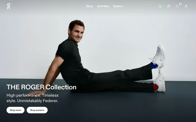
Preview image. Unlock full-res
Monochrome high-performance stadium
Color palette
Accent for UI components like carousels where interaction demands a distinct active state
Primary text, button backgrounds, interactive borders, iconic elements, surface accents
Page backgrounds, card surfaces, ghost button text and borders, secondary text in dark contexts
Secondary body text and subtle borders
Input text color and subtle background tint on form elements
Typography
- Weights
- 400, 500, 700
- Sizes
- 13px, 14px, 15px, 16px, 19px, 20px, 24px, 31px, 39px, 50px, 63px
- Line height
- 1, 1.1, 1.2, 1.25, 1.3, 1.38, 1.4, 1.5
- Letter spacing
- -0.0200em at large sizes, -0.0100em at medium, 0.0130em for smaller body text
- Fallback
- system-ui
Primary typeface for all headings, body text, buttons, and general UI elements. Its strong presence supports the brand's authoritative tone.
- Weights
- 500, 700
- Sizes
- 8px, 12px
- Line height
- 1, 1.5
- Letter spacing
- 0.0600em
- Fallback
- monospace
Used for compact navigational elements and specialized annotations, providing a technical, precise feel due to its monospace nature and increased letter spacing.
- Weights
- 400, 500
- Sizes
- 14px, 15px
- Line height
- 1
- Letter spacing
- 0.0600em
- Fallback
- monospace
Complementary monospace font for buttons, secondary navigation, and body text where a more technical or distinct tone is desired, often in compressed formats.
Spacing & shape
Components
Black background (#000000) with Cloud White (#ffffff) text, 40px border-radius, and 24px horizontal padding. Compact vertical padding is implicitly defined by font line-height. Used for primary calls to action.
Transparent background, Cloud White (#ffffff) text, Cloud White (#ffffff) border, with 50% border-radius. No explicit padding, text defines interaction area. Used for navigation or subtle actions within dark contexts.
Transparent background, Pitch Black (#000000) text, no border or explicit padding. Used for simple text-based actions or navigation within body content.
Transparent background with Cloud White (#ffffff) text/icon color and border, 50% border-radius. Zero explicit padding. Used for small, contextual actions like 'Play Video' in hero sections.
Transparent background with no border-radius or box-shadow. Content within adheres to the system's spacing and typography. Images are often full-bleed to the card's edge.
Subtle alpha-tinted background (rgba(0,0,0,0.05)), Fog Input (#666666) text color, no border-radius. 16px bottom padding, 4px right padding, 16px left padding.
Guidelines
- Use Pitch Black (#000000) for all primary body text, headings, and key icons.
- Apply Cloud White (#ffffff) as the dominant background for all main page content sections.
- Implement 24px of horizontal padding within primary filled buttons for a confident, compact feel.
- Utilize 'On' font family with specific letter-spacing for large headlines (e.g., -0.0200em for 63px type) to achieve a precise, condensed look.
- Maintain a clear hierarchy using solid fills and borders for component states, avoiding complex shadows.
- Employ 40px border-radius for all primary button shapes to ensure a soft, approachable pill-like form amidst the stark typography.
- Structure layouts using a 48px vertical gap between main sections to provide generous breathing room without excess.
- Do not introduce additional saturated colors; maintain the monochrome palette with minimal functional accents.
- Avoid decorative gradients or complex overlays; keep surfaces clean and flat.
- Do not use subtle variations of gray for primary backgrounds or text that compete with Pitch Black and Cloud White.
- Avoid system default links; ensure all interactive text uses explicit Pitch Black (#000000) or Cloud White (#ffffff) styling.
- Do not use drop shadows for elevation; rely on color contrast, borders, and spacing.
- Avoid pixel-perfect spacing and alignment that doesn't adhere to the 4px base unit or defined spacing tokens.
- Do not use generic font sizes; adhere to the defined type scale to maintain typographic rhythm.
About this system
ShowHide
On Shop embodies a stark, high-performance aesthetic: a monochrome canvas where bold black typography and clean product photography take center stage. Interaction is delivered with confident, compact components, relying on border treatments and solid fills rather than shadows for visual hierarchy. The design communicates authority through precise spacing and a focused absence of unnecessary visual noise.
The page primarily uses a full-bleed layout for hero sections, often with centered, large-scale typography overlaying a background image. Subsequent content sections alternate between full-width imagery and a contained, centered content area. Content arrangement frequently features juxtaposed text blocks and visuals. The overall density feels spacious due to generous section gaps (48px) and ample padding around elements. The navigation is a concise top bar that remains visible, prioritizing minimalism.
This site prominently features high-quality, product-focused photography and lifestyle shots of athletes. Images are often full-bleed within sections or contained in simple, unrounded frames. Photography is generally high-key with crisp focus on the product or subject, sometimes against a clean, minimal background (white or solid color). Product shots are direct and showcase utility. Icons are minimal, outlined, monochromatic, and used functionally.
Reminiscent of Apple, Nike, B&O, Acne Studios.
# On Shop — Style Reference
> Monochrome high-performance stadium

**Theme:** light

**Site:** https://theroger.com/en/products

On Shop embodies a stark, high-performance aesthetic: a monochrome canvas where bold black typography and clean product photography take center stage. Interaction is delivered with confident, compact components, relying on border treatments and solid fills rather than shadows for visual hierarchy. The design communicates authority through precise spacing and a focused absence of unnecessary visual noise.

## Tokens — Colors

| Name | Value | Token | Role |
|------|------|------|------|
| Swiper Accent | `#007aff` | `--color-swiper-accent` | Accent for UI components like carousels where interaction demands a distinct active state |
| Pitch Black | `#000000` | `--color-pitch-black` | Primary text, button backgrounds, interactive borders, iconic elements, surface accents |
| Cloud White | `#ffffff` | `--color-cloud-white` | Page backgrounds, card surfaces, ghost button text and borders, secondary text in dark contexts |
| Slate Gray | `#4d4d4d` | `--color-slate-gray` | Secondary body text and subtle borders |
| Fog Input | `#666666` | `--color-fog-input` | Input text color and subtle background tint on form elements |

## Tokens — Typography

### On
- **Substitute:** system-ui
- **Weights:** 400, 500, 700
- **Sizes:** 13px, 14px, 15px, 16px, 19px, 20px, 24px, 31px, 39px, 50px, 63px
- **Line height:** 1, 1.1, 1.2, 1.25, 1.3, 1.38, 1.4, 1.5
- **Letter spacing:** -0.0200em at large sizes, -0.0100em at medium, 0.0130em for smaller body text
- **Role:** Primary typeface for all headings, body text, buttons, and general UI elements. Its strong presence supports the brand's authoritative tone.

### On Semi Mono
- **Substitute:** monospace
- **Weights:** 500, 700
- **Sizes:** 8px, 12px
- **Line height:** 1, 1.5
- **Letter spacing:** 0.0600em
- **Role:** Used for compact navigational elements and specialized annotations, providing a technical, precise feel due to its monospace nature and increased letter spacing.

### On Mono
- **Substitute:** monospace
- **Weights:** 400, 500
- **Sizes:** 14px, 15px
- **Line height:** 1
- **Letter spacing:** 0.0600em
- **Role:** Complementary monospace font for buttons, secondary navigation, and body text where a more technical or distinct tone is desired, often in compressed formats.

## Tokens — Type Scale

| Role | Size | Line height | Letter spacing |
|------|------|------|------|
| caption | 13px | 1.4 | — |
| body | 16px | 1.5 | 0.013em |
| subheading | 19px | 1.3 | — |
| heading-sm | 24px | 1.25 | — |
| heading | 39px | 1.2 | -0.01em |
| display | 63px | 1 | -0.02em |

## Tokens — Spacing

- **Section gap:** 48px
- **Card padding:** 24px
- **Element gap:** 24px

## Tokens — Radius

- **Default:** 3px
- **Buttons:** 40px
- **circular:** 50%

## Layout

The page primarily uses a full-bleed layout for hero sections, often with centered, large-scale typography overlaying a background image. Subsequent content sections alternate between full-width imagery and a contained, centered content area. Content arrangement frequently features juxtaposed text blocks and visuals. The overall density feels spacious due to generous section gaps (48px) and ample padding around elements. The navigation is a concise top bar that remains visible, prioritizing minimalism.

## Imagery

This site prominently features high-quality, product-focused photography and lifestyle shots of athletes. Images are often full-bleed within sections or contained in simple, unrounded frames. Photography is generally high-key with crisp focus on the product or subject, sometimes against a clean, minimal background (white or solid color). Product shots are direct and showcase utility. Icons are minimal, outlined, monochromatic, and used functionally.

## Components

### Primary Filled Button
*Solid interactive element*

Black background (#000000) with Cloud White (#ffffff) text, 40px border-radius, and 24px horizontal padding. Compact vertical padding is implicitly defined by font line-height. Used for primary calls to action.

### Ghost Button
*Secondary/tertiary interactive element (large)*

Transparent background, Cloud White (#ffffff) text, Cloud White (#ffffff) border, with 50% border-radius. No explicit padding, text defines interaction area. Used for navigation or subtle actions within dark contexts.

### Text Link Button
*Minimal interactive element*

Transparent background, Pitch Black (#000000) text, no border or explicit padding. Used for simple text-based actions or navigation within body content.

### Icon Button (Ghost)
*Interactive element (small)*

Transparent background with Cloud White (#ffffff) text/icon color and border, 50% border-radius. Zero explicit padding. Used for small, contextual actions like 'Play Video' in hero sections.

### Product Card (Borderless)
*Content display*

Transparent background with no border-radius or box-shadow. Content within adheres to the system's spacing and typography. Images are often full-bleed to the card's edge.

### Input Field
*User input element*

Subtle alpha-tinted background (rgba(0,0,0,0.05)), Fog Input (#666666) text color, no border-radius. 16px bottom padding, 4px right padding, 16px left padding.

## Guidelines

### Do

- Use Pitch Black (#000000) for all primary body text, headings, and key icons.
- Apply Cloud White (#ffffff) as the dominant background for all main page content sections.
- Implement 24px of horizontal padding within primary filled buttons for a confident, compact feel.
- Utilize 'On' font family with specific letter-spacing for large headlines (e.g., -0.0200em for 63px type) to achieve a precise, condensed look.
- Maintain a clear hierarchy using solid fills and borders for component states, avoiding complex shadows.
- Employ 40px border-radius for all primary button shapes to ensure a soft, approachable pill-like form amidst the stark typography.
- Structure layouts using a 48px vertical gap between main sections to provide generous breathing room without excess.

### Don't

- Do not introduce additional saturated colors; maintain the monochrome palette with minimal functional accents.
- Avoid decorative gradients or complex overlays; keep surfaces clean and flat.
- Do not use subtle variations of gray for primary backgrounds or text that compete with Pitch Black and Cloud White.
- Avoid system default links; ensure all interactive text uses explicit Pitch Black (#000000) or Cloud White (#ffffff) styling.
- Do not use drop shadows for elevation; rely on color contrast, borders, and spacing.
- Avoid pixel-perfect spacing and alignment that doesn't adhere to the 4px base unit or defined spacing tokens.
- Do not use generic font sizes; adhere to the defined type scale to maintain typographic rhythm.

## Agent Prompt Guide

Quick Color Reference:
text: #000000
background: #ffffff
border: #000000
accent: #007aff
primary action: #000000 (filled action)

Example Component Prompts:
1. Create a hero section with a dark background: Headline 'THE ROGER Collection' in On font, 63px, weight 700, Cloud White (#ffffff), letter-spacing -0.02em. Below it, a Primary Filled Button with text 'Shop men's', Pitch Black (#000000) background, Cloud White (#ffffff) text, 40px radius, 24px horizontal padding.
2. Design a product feature block: Heading 'THE ROGER Pro 3' in On font, 39px, weight 700, Pitch Black (#000000), letter-spacing -0.01em. Followed by body text in On font, 16px, weight 400, Slate Gray (#4d4d4d). Below, two Primary Filled Buttons, 'Shop men's' and 'Shop women's', using Pitch Black (#000000) background, Cloud White (#ffffff) text, 40px radius, 24px horizontal padding.
3. Create an input field: Background rgba(0,0,0,0.05), border-radius 0px, text color Fog Input (#666666), with 16px left and bottom padding.
More like this
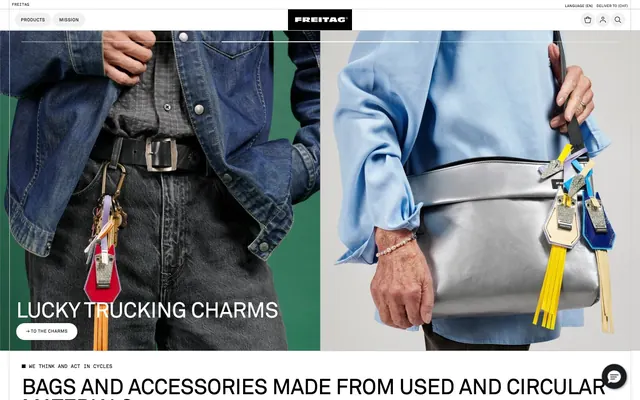









Keep what you find
A free account saves references to boards and can send you a weekly email of picks based on what you save.
To see every result, go Pro.