Preview image. Unlock full-res
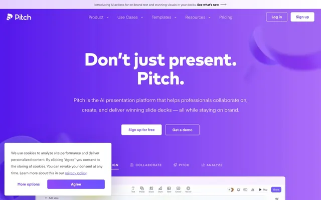
Vibrant Violet Gradient Canvas
Color palette
Primary brand color, used for active links, icons, and significant accents. It provides visual energy and indicates interactivity.
Secondary brand color, appearing in badges, card elements, and as a strong accent. It provides depth to the violet palette.
Specific text instances on lighter backgrounds, providing a contrasting, rich violet tone.
Primary gradient for hero sections and prominent background elements, creating a dynamic and immersive brand experience. Dominant color is #5318eb from `rgb(83, 24, 235)`.
Subtle background gradient for internal sections, adding a soft, branded layer. Dominant color is #e4cfff from `rgb(228, 207, 255)`.
Used for internal graphic accents and backgrounds, providing a dark-to-violet transition. Dominant color is #2b2a35 from `rgb(43, 42, 53)`.
Accentuating specific card backgrounds or illustrative elements that require high visibility, often paired with gradients.
Used for illustrative fills and minor accent details within graphics, adding vibrancy.
Used in fills and as a background accent in some graphic elements, pairing with Action Yellow to create a warm highlight.
Specific graphic fills and background accents, contributing to a broader vibrant palette.
Used for specific illustrative elements, creating a warm and inviting highlight effect. Dominant color is #ffd02c from `rgb(255, 208, 44)`.
Darkest text and card backgrounds, providing high contrast against light surfaces. Used where information density or visual weight is desired.
Used for subtle card shadows, providing a soft lift without harshness.
Mid-tone text and borders, offering a slightly softer alternative to Midnight Graphite for less prominent text.
Default text color for secondary buttons, balancing visibility with a muted appearance.
Dominant text color for headings and body copy across most light backgrounds, providing strong legibility.
Canvas background, text on dark elements, and primary button backgrounds.
Subtle background for main page canvas and sections, providing a near-white base without being stark.
Default border color for inputs and subtle dividers, creating clear separation without being heavy.
Slightly darker border choice for elements requiring more definition, like some button states.
Used for some link text and specific icons, offering an alternative to Rich Dark where maximum contrast is required.
Used for subtle button shadows, providing depth without visual weight.
Typography
- Weights
- 400, 600, 700, 800
- Sizes
- 13px, 14px, 15px, 16px, 18px, 22px, 24px, 28px
- Line height
- 1, 1.1, 1.2, 1.3, 1.4, 1.6, 1.69, 2, 2.25
- Letter spacing
- 0.1000em
- Fallback
- Inter
Primary UI and body text font. Its regular weights (400, 600) ensure readability for extensive copy, while its extended size range supports diverse UI elements from caption to sub-heading. Used for links, icons, buttons, and general informational text.
- Weights
- 700, 800
- Sizes
- 13px, 27px, 28px, 42px, 60px, 80px
- Line height
- 1, 1.1, 1.3, 1.4, 1.85
- Letter spacing
- -0.0200em
- Fallback
- Montserrat
Distinctive display font for headings and prominent card titles. Its heavier weights (700, 800) and tighter letter-spacing create a bold, modern statement without being aggressive, contributing significantly to brand identity. Used across major headings and highlighted content.
- Weights
- 400
- Sizes
- 13px
- Line height
- 1.2
- Letter spacing
- normal
- Fallback
- sans-serif
System fallback for specific button text, ensuring accessibility if custom fonts are unavailable. Used sparingly.
Spacing & shape
Elevation
Components
Filled button with Pure White background and Deep Violet text. Uses 20px border-radius, with 20px padding. Text is Eina01 400.
Transparent button with Button Gray text and border, no border-radius defined (inherits 0px). Uses 16px vertical and 20px horizontal padding. Text is Eina01 400.
Small, transparent button for inline interactions. Text is Pure White at 60% opacity with a matching border. No padding or border-radius.
White background button with Deep Violet text for primary navigation calls to action. Uses 20px border-radius, with 20px padding. Features a subtle Light Gray border (#dddfe5).
Standard content card with Pure White background, a subtle shadow of rgba(103, 110, 144, 0.2) 0px 8px 26px 0px, and 26px border-radius. Internal padding is 20px. Content elements within are spaced by 20px.
Transparent background badge with Midnight Graphite text, no border-radius. Displays concise information. Padding is 0px.
Light Deep Violet background (rgba(107, 83, 255, 0.05)) with Deep Violet text. Has a 20px border-radius and 4px vertical, 12px horizontal padding. Text is Eina01 400.
Large, eye-catching text using Mark Pro 800 with Riverbank Violet color, sizes from 42px to 80px and letter-spacing -0.0200em.
Implicitly Pure White background with the default Border Light Gray (#dddfe5) border ensuring clear definition against the canvas.
Small, Pure White circular button with 50% border-radius for icons. Minimal 1px padding for internal spacing.
Guidelines
- Prioritize Deep Violet (#6b53ff) for all primary interactive elements and brand accents.
- Use Eina01 for all body text, UI labels, and secondary information, maintaining consistency at weights 400-600.
- Apply Mark Pro 700 or 800 for all headlines and subheadings to maintain the brand's bold typographic voice.
- Utilize 26px border-radius for all primary display cards, and 20px for buttons and badges to enforce soft geometry.
- Implement Canvas Faint (#f0eff4) as the default page background to provide a consistent light theme base.
- Space elements with a default 20px elementGap, and content cards with 20px internal padding for comfortable density.
- Apply the Hero Gradient Purple to full-width hero sections to create visual impact and reinforce brand identity.
- Avoid using raw black (#000000) for body text; use Rich Dark (#2b2a35) or Midnight Graphite (#1e1d28) for softer contrast.
- Do not introduce new border-radius values beyond 3px, 6px, 10px, 16px, 20px, 26px, 56px to preserve shape consistency.
- Avoid using highly saturated colors for large text blocks; reserve them for accents and interactive elements.
- Do not deviate from Eina01 and Mark Pro font families; avoid using system default fonts unless for accessibility fallbacks.
- Refrain from adding arbitrary shadows; restrict shadow usage to the specified values and contexts for deliberate depth.
- Avoid tight spacing; maintain comfort and legibility by adhering to 20px element gaps and section separations.
- Do not use multiple accent colors simultaneously in proximity; allow Pitch Violet and specific accents (like Action Yellow) to stand out.
About this system
ShowHide
Pitch embodies an 'energetic professional' mood, achieved through a vibrant violet spectrum contrasted with clean whites and subtle grays. The hero section bursts with rich gradients, while content sections maintain clarity with ample negative space. A blend of sharp geometric forms and soft, rounded elements creates a dynamic yet approachable feel, balancing technical precision with modern friendliness. Custom typography provides distinct voices for headlines and body text, contributing to an overall sense of refined dynamism.
The page uses a maximum content width centered model, subtly implied by generous side padding on most sections. The hero section is a full-bleed, vibrant gradient background with centered, prominent headline and call-to-action. Content sections alternate between the Canvas Faint background and occasional gradient overlays. There's a consistent vertical rhythm created by explicit section gaps. Content is arranged using a mix of centered stacks for headlines and subtext, and alternating text-left/image-right or text-right/image-left for feature sections. A clear grid structure appears for displaying cards and badges, often in 3-column layouts where applicable. The layout prioritizes spaciousness, using ample negative space around content blocks. Navigation is a sticky top bar with a left-aligned logo and right-aligned actions (login, sign up).
The visual language primarily uses abstract 3D renders with soft, organic shapes and occasional product screenshots. The 3D elements, often in shades of violet and gray, are used decoratively to add a sense of depth and modernity, frequently appearing as background accents or overlapping UI elements. Product screenshots are contained within UI frameworks, highlighting features, and are treated with sharp edges, contrasting the softer 3D elements. Icons are filled, predominantly in Pitch Violet or white, with a consistent, moderate stroke weight, serving an explanatory and navigational role. The overall density is balanced, allowing imagery to complement text without overwhelming it.
Reminiscent of Figma, Linear, Notion, Canva.
# Pitch — Style Reference
> Vibrant Violet Gradient Canvas

**Theme:** light

**Site:** https://pitch.com

Pitch embodies an 'energetic professional' mood, achieved through a vibrant violet spectrum contrasted with clean whites and subtle grays. The hero section bursts with rich gradients, while content sections maintain clarity with ample negative space. A blend of sharp geometric forms and soft, rounded elements creates a dynamic yet approachable feel, balancing technical precision with modern friendliness. Custom typography provides distinct voices for headlines and body text, contributing to an overall sense of refined dynamism.

## Tokens — Colors

| Name | Value | Token | Role |
|------|------|------|------|
| Pitch Violet | `#8d49f7` | `--color-pitch-violet` | Primary brand color, used for active links, icons, and significant accents. It provides visual energy and indicates interactivity. |
| Deep Violet | `#6b53ff` | `--color-deep-violet` | Secondary brand color, appearing in badges, card elements, and as a strong accent. It provides depth to the violet palette. |
| Dark Violet Text | `#371789` | `--color-dark-violet-text` | Specific text instances on lighter backgrounds, providing a contrasting, rich violet tone. |
| Hero Gradient Purple | `#5318eb` | `--color-hero-gradient-purple` | Primary gradient for hero sections and prominent background elements, creating a dynamic and immersive brand experience. Dominant color is #5318eb from `rgb(83, 24, 235)`. |
| Light Gradient Overlay | `#e4cfff` | `--color-light-gradient-overlay` | Subtle background gradient for internal sections, adding a soft, branded layer. Dominant color is #e4cfff from `rgb(228, 207, 255)`. |
| Dark Gradient Accent | `#2b2a35` | `--color-dark-gradient-accent` | Used for internal graphic accents and backgrounds, providing a dark-to-violet transition. Dominant color is #2b2a35 from `rgb(43, 42, 53)`. |
| Action Yellow | `#ffd02c` | `--color-action-yellow` | Accentuating specific card backgrounds or illustrative elements that require high visibility, often paired with gradients. |
| Bright Violet | `#586ee0` | `--color-bright-violet` | Used for illustrative fills and minor accent details within graphics, adding vibrancy. |
| Sunset Orange | `#ffa000` | `--color-sunset-orange` | Used in fills and as a background accent in some graphic elements, pairing with Action Yellow to create a warm highlight. |
| Sky Blue | `#81d4fa` | `--color-sky-blue` | Specific graphic fills and background accents, contributing to a broader vibrant palette. |
| Warm Gradient Highlight | `#ffd02c` | `--color-warm-gradient-highlight` | Used for specific illustrative elements, creating a warm and inviting highlight effect. Dominant color is #ffd02c from `rgb(255, 208, 44)`. |
| Midnight Graphite | `#1e1d28` | `--color-midnight-graphite` | Darkest text and card backgrounds, providing high contrast against light surfaces. Used where information density or visual weight is desired. |
| Faded Shadow | `#b5b3cd` | `--color-faded-shadow` | Used for subtle card shadows, providing a soft lift without harshness. |
| Medium Gray | `#3f4250` | `--color-medium-gray` | Mid-tone text and borders, offering a slightly softer alternative to Midnight Graphite for less prominent text. |
| Button Gray | `#6f7387` | `--color-button-gray` | Default text color for secondary buttons, balancing visibility with a muted appearance. |
| Rich Dark | `#2b2a35` | `--color-rich-dark` | Dominant text color for headings and body copy across most light backgrounds, providing strong legibility. |
| Pure White | `#ffffff` | `--color-pure-white` | Canvas background, text on dark elements, and primary button backgrounds. |
| Canvas Faint | `#f0eff4` | `--color-canvas-faint` | Subtle background for main page canvas and sections, providing a near-white base without being stark. |
| Border Light Gray | `#dddfe5` | `--color-border-light-gray` | Default border color for inputs and subtle dividers, creating clear separation without being heavy. |
| Mid-tone Border | `#cfcfd0` | `--color-mid-tone-border` | Slightly darker border choice for elements requiring more definition, like some button states. |
| Coal Black | `#000000` | `--color-coal-black` | Used for some link text and specific icons, offering an alternative to Rich Dark where maximum contrast is required. |
| Faint Shadow Gray | `#95959a` | `--color-faint-shadow-gray` | Used for subtle button shadows, providing depth without visual weight. |

## Tokens — Typography

### Eina01
- **Substitute:** Inter
- **Weights:** 400, 600, 700, 800
- **Sizes:** 13px, 14px, 15px, 16px, 18px, 22px, 24px, 28px
- **Line height:** 1, 1.1, 1.2, 1.3, 1.4, 1.6, 1.69, 2, 2.25
- **Letter spacing:** 0.1000em
- **Role:** Primary UI and body text font. Its regular weights (400, 600) ensure readability for extensive copy, while its extended size range supports diverse UI elements from caption to sub-heading. Used for links, icons, buttons, and general informational text.

### Mark Pro
- **Substitute:** Montserrat
- **Weights:** 700, 800
- **Sizes:** 13px, 27px, 28px, 42px, 60px, 80px
- **Line height:** 1, 1.1, 1.3, 1.4, 1.85
- **Letter spacing:** -0.0200em
- **Role:** Distinctive display font for headings and prominent card titles. Its heavier weights (700, 800) and tighter letter-spacing create a bold, modern statement without being aggressive, contributing significantly to brand identity. Used across major headings and highlighted content.

### Arial
- **Substitute:** sans-serif
- **Weights:** 400
- **Sizes:** 13px
- **Line height:** 1.2
- **Letter spacing:** normal
- **Role:** System fallback for specific button text, ensuring accessibility if custom fonts are unavailable. Used sparingly.

## Tokens — Type Scale

Augmented Fourth (1.414) from 16px base.

| Role | Size | Line height | Letter spacing |
|------|------|------|------|
| caption | 13px | 1.2 | 0.1px |
| body | 16px | 1.6 | 0.1px |
| subheading | 22px | 1.4 | 0.1px |
| heading-sm | 27px | 1.3 | -0.02em |
| heading | 42px | 1.1 | -0.02em |
| display | 80px | 1 | -0.02em |

## Tokens — Spacing

- **Section gap:** 40px
- **Card padding:** 20px
- **Element gap:** 20px

## Tokens — Radius

- **Default:** 6px
- **Buttons:** 20px
- **Cards:** 26px
- **badges:** 20px
- **large:** 56px
- **small:** 3px

## Tokens — Elevation

- **Card:** `rgba(10, 3, 89, 0.3) 0px 20px 90px 0px, rgba(0, 0, 0, 0.02) 0px 0px 0px 1px`
- **Default Shadow:** `rgba(0, 0, 0, 0.15) 0px 3px 10px 0px`
- **Feature Card:** `rgba(103, 110, 144, 0.2) 0px 8px 26px 0px`
- **Button (Dark):** `rgba(43, 42, 53, 0.25) 0px 6px 27px 0px`
- **Button (Dark Pressed):** `rgba(43, 42, 53, 0.5) 0px 6px 27px 0px`

## Layout

The page uses a maximum content width centered model, subtly implied by generous side padding on most sections. The hero section is a full-bleed, vibrant gradient background with centered, prominent headline and call-to-action. Content sections alternate between the Canvas Faint background and occasional gradient overlays. There's a consistent vertical rhythm created by explicit section gaps. Content is arranged using a mix of centered stacks for headlines and subtext, and alternating text-left/image-right or text-right/image-left for feature sections. A clear grid structure appears for displaying cards and badges, often in 3-column layouts where applicable. The layout prioritizes spaciousness, using ample negative space around content blocks. Navigation is a sticky top bar with a left-aligned logo and right-aligned actions (login, sign up).

## Imagery

The visual language primarily uses abstract 3D renders with soft, organic shapes and occasional product screenshots. The 3D elements, often in shades of violet and gray, are used decoratively to add a sense of depth and modernity, frequently appearing as background accents or overlapping UI elements. Product screenshots are contained within UI frameworks, highlighting features, and are treated with sharp edges, contrasting the softer 3D elements. Icons are filled, predominantly in Pitch Violet or white, with a consistent, moderate stroke weight, serving an explanatory and navigational role. The overall density is balanced, allowing imagery to complement text without overwhelming it.

## Components

### Primary Button
*Action*

Filled button with Pure White background and Deep Violet text. Uses 20px border-radius, with 20px padding. Text is Eina01 400.

### Ghost Button
*Action*

Transparent button with Button Gray text and border, no border-radius defined (inherits 0px). Uses 16px vertical and 20px horizontal padding. Text is Eina01 400.

### Inline Text Button
*Navigation/Action*

Small, transparent button for inline interactions. Text is Pure White at 60% opacity with a matching border. No padding or border-radius.

### Navigation Button
*Navigation*

White background button with Deep Violet text for primary navigation calls to action. Uses 20px border-radius, with 20px padding. Features a subtle Light Gray border (#dddfe5).

### Feature Card
*Display*

Standard content card with Pure White background, a subtle shadow of rgba(103, 110, 144, 0.2) 0px 8px 26px 0px, and 26px border-radius. Internal padding is 20px. Content elements within are spaced by 20px.

### Badge Default
*Information*

Transparent background badge with Midnight Graphite text, no border-radius. Displays concise information. Padding is 0px.

### Violet Tag Badge
*Information/Categorization*

Light Deep Violet background (rgba(107, 83, 255, 0.05)) with Deep Violet text. Has a 20px border-radius and 4px vertical, 12px horizontal padding. Text is Eina01 400.

### Hero Headline
*Display*

Large, eye-catching text using Mark Pro 800 with Riverbank Violet color, sizes from 42px to 80px and letter-spacing -0.0200em.

### Input Field
*Form Element*

Implicitly Pure White background with the default Border Light Gray (#dddfe5) border ensuring clear definition against the canvas.

### Rounded Icon Button
*Action*

Small, Pure White circular button with 50% border-radius for icons. Minimal 1px padding for internal spacing.

## Guidelines

### Do

- Prioritize Deep Violet (#6b53ff) for all primary interactive elements and brand accents.
- Use Eina01 for all body text, UI labels, and secondary information, maintaining consistency at weights 400-600.
- Apply Mark Pro 700 or 800 for all headlines and subheadings to maintain the brand's bold typographic voice.
- Utilize 26px border-radius for all primary display cards, and 20px for buttons and badges to enforce soft geometry.
- Implement Canvas Faint (#f0eff4) as the default page background to provide a consistent light theme base.
- Space elements with a default 20px elementGap, and content cards with 20px internal padding for comfortable density.
- Apply the Hero Gradient Purple to full-width hero sections to create visual impact and reinforce brand identity.

### Don't

- Avoid using raw black (#000000) for body text; use Rich Dark (#2b2a35) or Midnight Graphite (#1e1d28) for softer contrast.
- Do not introduce new border-radius values beyond 3px, 6px, 10px, 16px, 20px, 26px, 56px to preserve shape consistency.
- Avoid using highly saturated colors for large text blocks; reserve them for accents and interactive elements.
- Do not deviate from Eina01 and Mark Pro font families; avoid using system default fonts unless for accessibility fallbacks.
- Refrain from adding arbitrary shadows; restrict shadow usage to the specified values and contexts for deliberate depth.
- Avoid tight spacing; maintain comfort and legibility by adhering to 20px element gaps and section separations.
- Do not use multiple accent colors simultaneously in proximity; allow Pitch Violet and specific accents (like Action Yellow) to stand out.

## Agent Prompt Guide

### Quick Color Reference
- **Text Primary:** #2b2a35 (Rich Dark)
- **Background:** #f0eff4 (Canvas Faint)
- **CTA Background:** #6b53ff (Deep Violet)
- **CTA Text:** #ffffff (Pure White)
- **Border Default:** #dddfe5 (Border Light Gray)
- **Accent:** #8d49f7 (Pitch Violet)

### Example Component Prompts
1. **Create a Hero Section:** Use `Hero Gradient Purple` as the background. Centered headline 'Don’t just present. Pitch.' using `Mark Pro` 800 at 80px, color `Pure White`. Below it, a subtext at `Eina01` 18px 400, color `Pure White`. Include two buttons: a 'Sign up for free' `Primary Button`, and a 'Get a demo' `Ghost Button` with `Pure White` text and `Pure White` border.
2. **Generate a Feature Card:** Use `Pure White` background with `26px` border-radius and the `Feature Card` shadow. Apply `20px` internal padding. Inside, place a headline 'Powerful Integrations' using `Mark Pro` 700 at 27px, color `Midnight Graphite`, and a paragraph of body text using `Eina01` 16px 400, color `Midnight Graphite`.
3. **Design a Navigation Bar Button:** Create a `Navigation Button` with 'Sign up' as its label. This button has a `Pure White` background with `Deep Violet` text, `20px` border-radius. Position it within a sticky header on `Canvas Faint` background.
4. **Create a Tag Badge:** Use the `Violet Tag Badge` for a categorical label 'New Feature'. It should have a background of `rgba(107, 83, 255, 0.05)`, `Deep Violet` text (`#6b53ff`), `20px` border-radius, and `4px` vertical, `12px` horizontal padding.
More like this









Keep what you find
A free account saves references to boards and can send you a weekly email of picks based on what you save.
To see every result, go Pro.